About • Layout • How to use • Tech Stack • Autor • License
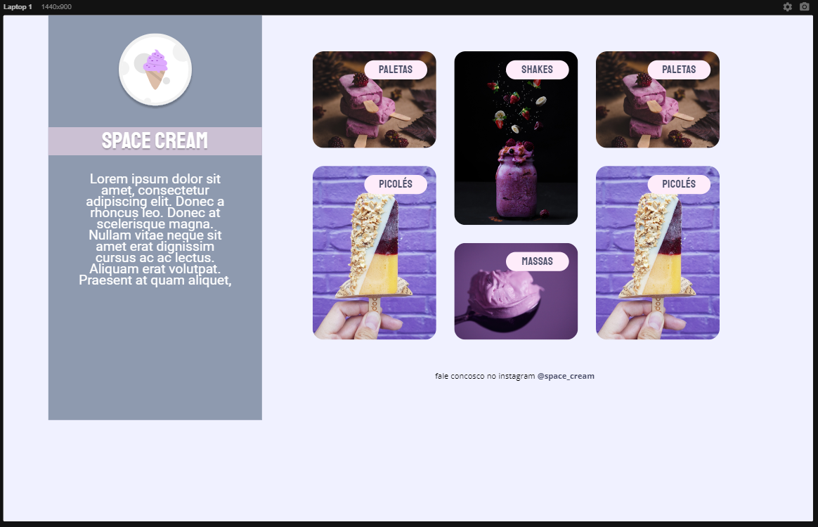
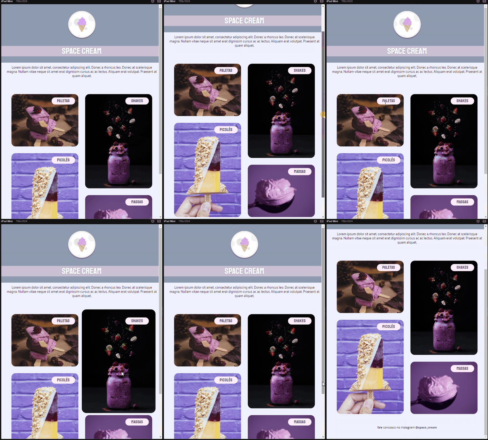
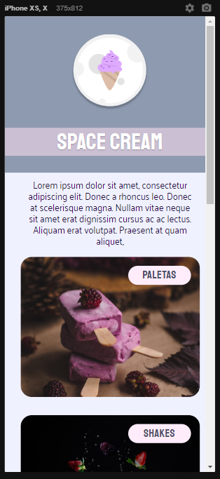
In this challenge, it was requested to create a a website with mobile first and after this step, to create a desktop version. As a extra mile I added a table version.
I had the oportunity to practice and study:
- Display Flex an Grid;
- Mobile first rule;
- Flexible units;
- CSS variables and HSL colors;
- CSS animation and transitions.
Just access the link bellow:
Made with 💖 by Daniel Padovani 👋 Entre em contato!
This project is under the MIT license. See the LICENSE for more information.


