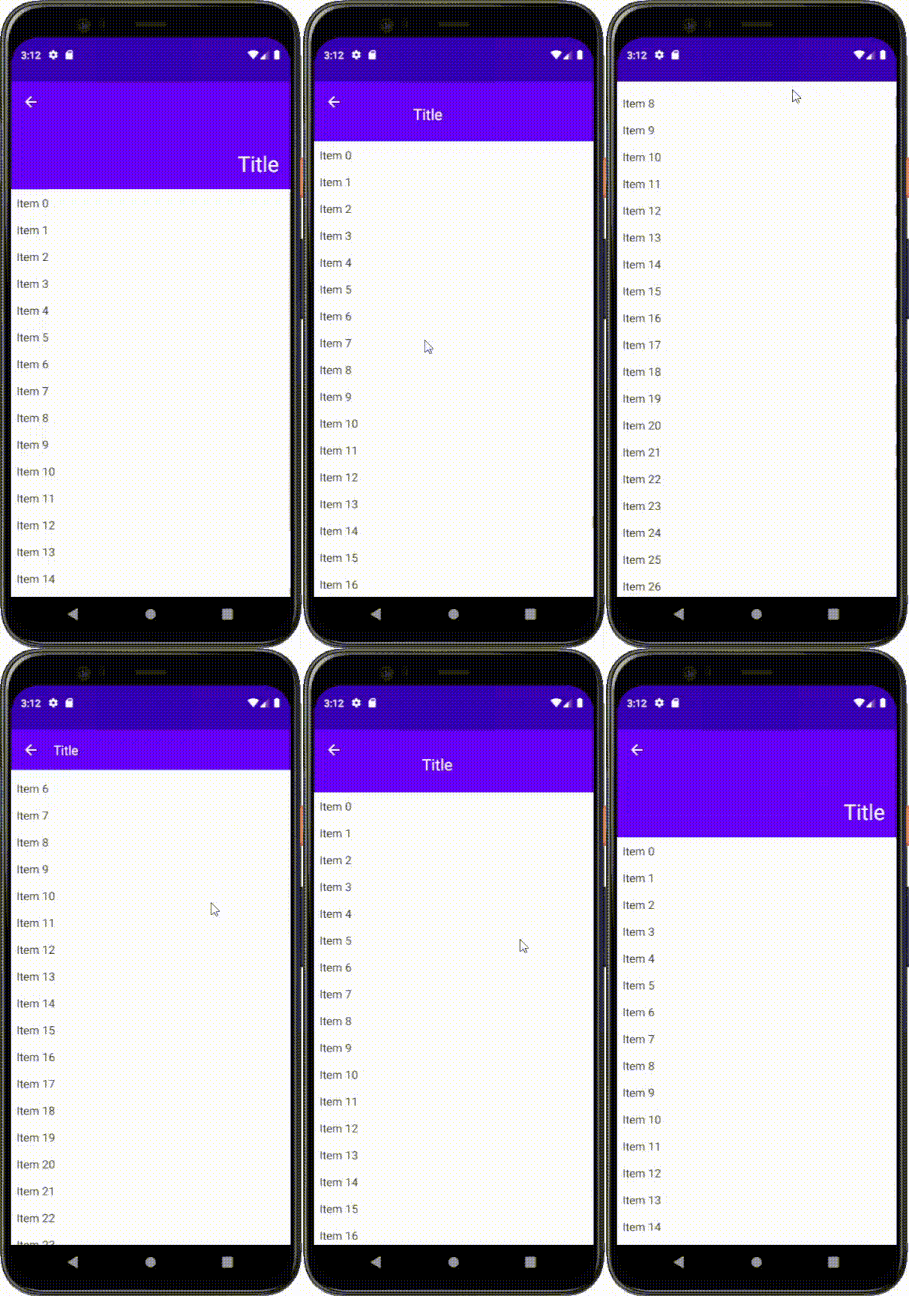
A simple implementation of CollapsingToolbarLayout for Jetpack Compose
You should add mavenCentral() repository before installation. Then add the following line to the dependencies block in your app level build.gradle:
implementation "me.onebone:toolbar-compose:2.3.5"or build.gradle.kts:
implementation("me.onebone:toolbar-compose:2.3.5")An example can be found here.
CollapsingToolbarScaffold is a container to help you place composables and move them as a user dispatches scroll. It provides two holes where you can place you components.
To use CollapsingToolbarScaffold you will need CollapsingToolbarScaffoldState which could be retrieved using rememberCollapsingToolbarScaffoldState().
CollapsingToolbarScaffold(
    state = rememberCollapsingToolbarScaffoldState(), // provide the state of the scaffold
    toolbar = {
        // contents of toolbar go here...
    }
) {
    // main contents go here...
}
The toolbar will collapse until it gets as small as the smallest child, and will expand as large as the largest child.
Also note that the content should be scrollable for the CollapsingToolbarScaffold to consume nested scroll. For LazyColumn, you don't have to care of anything because it is scrollable by default. Column, however, is not scrollable by default so you can provide Modifier.verticalScroll() to make a content dispatch nested scroll.
CollapsingToolbarScaffold(
    state = rememberCollapsingToolbarScaffoldState(), // provide the state of the scaffold
    toolbar = {
        // contents of toolbar go here...
    }
) {
    Column(
        modifier = Modifier
            .verticalScroll(rememberScrollState()) // main content should be scrollable for CollapsingToolbarScaffold to consume nested scroll
    ) {
        // ...
    }
}
By default, CollapsingToolbar clips content to its bounds. In order to disable it, set toolbarClipToBounds = false in CollapsingToolbarScaffold.
CollapsingToolbarScaffoldState is a holder of the scaffold state, such as the value of y offset and how much the toolbar has expanded. The field is public so you may use it as you need.
Note that the CollapsingToolbarScaffoldState is stable, which means that a change on a value of the state triggers a recomposition.
val state = rememberCollapsingToolbarScaffoldState()
val offsetY = state.offsetY // y offset of the layout
val progress = state.toolbarState.progress // how much the toolbar is expanded (0: collapsed, 1: expanded)

Text(
    text = "Hello World",
    textSize = (18 + (30 - 18) * progress).sp // text size depending on the progress
    // recomposed when the value of the progress is changed
)You can tell children of CollapsingToolbar how to deal with a collapse/expansion. This works almost the same way to the collapseMode in the CollapsingToolbarLayout except for the road modifier.
CollapsingToolbar(/* ... */) {
    Image(
        modifier = Modifier.parallax(ratio = 0.2f) // parallax, pin, road are available
    )
}The road() modifier allows you to place a child relatively to the toolbar. It receives two arguments: whenCollapsed and whenExpanded. As the name suggests, these describe how to place a child when the toolbar is collapsed or expanded, respectively.
This can be used to display a title text on the toolbar which is moving as the scroll is fed.
CollapsingToolbarScaffold(
    toolbar = {
	    Text(
            text = "Title",
            modifier = Modifier
                .road(
                    whenCollapsed = Alignment.CenterStart,
                    whenExpanded = Alignment.BottomEnd
                )
        )
    }
) {
    // ...
}
The above code orders the title Text to be placed at the CenterStart position when the toolbar is collapsed and BottomEnd position when it is expanded.
ScrollStrategy defines how CollapsingToolbar consumes scroll. You can set your desired behavior by providing scrollStrategy to CollapsingToolbarScaffold:
CollapsingToolbarScaffold(
    /* ... */
    scrollStrategy = ScrollStrategy.EnterAlways // EnterAlways, EnterAlwaysCollapsed, ExitUntilCollapsed are available
) {
    /* ... */
}

