Mason Powell https://a3-mason-powell.glitch.me/
This project shows a server that uses express, a results functionality from a logged-in user, a form/entry functionality that allows a user to add, delete, and modify assignments on the users account. It has persistant data storage through mongodb and uses bootstramp for a css framework/template.
The Goal of this project was to overhaul project 2 and enhance upon both the functionality and look of the website. I added the ability to modify data that was not in project 2 and added database connectivity.
The challenges I faced in this project was setting up the database and using express middleware I haven't worked with express or mongodb before and it was a little bit of a learning curve, since I haven't done any development with express or taken a database class here at WPI.
The authentication strategy I used was cookies because it was easy to implement and I understood the concept.
I used bootstrap as my CSS framework/template because I was recommended it by fellow students and it was very simple to setup and use.
The middleware I used was Body-Parser to parse requests,response-time to record response times for testing, connect-timeout to timeout a request, cookie-session to handle user sessions, and a custom login.html to redirect users to the login page after signing out
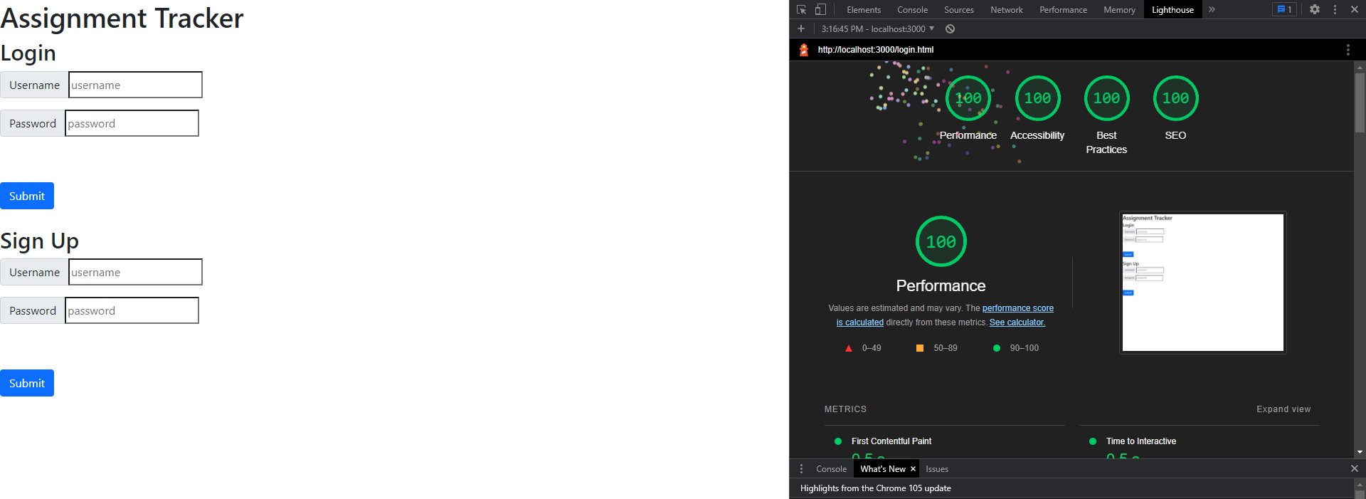
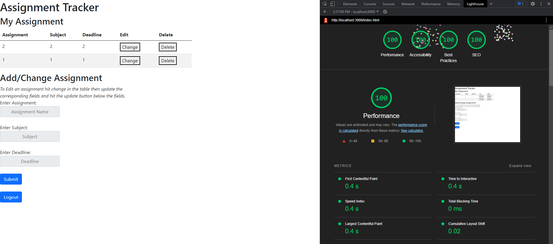
Technical Achievement #3: I got 100% in all four lighthouse tests on both pages of my website.
Login Page:
 Main Page:

Design Achievement #1:
- Use headings to convey meaning and structure - The table has headings to tell you what you are inputting and what you are looking at and the login page tells you where to login or signup
- Provide informative, unique page titles - The Login Page and Assignment Page clearly tells the user what the page is doing
- Ensure that all interactive elements are keyboard accessible - You may use tab and enter to navigate the website
- Don’t use color alone to convey information - I have alert pop-ups to inform the reader that the login is wrong
- Ensure that form elements include clearly associated labels - The labels to the input fields clearly tell you what you should input
- Provide clear instructions - The webpage is designed so that the user should be able to read the fields and understand how the website works
- Use headings and spacing to group related content - The "Assignment Tracker" title is the largest thing on each page while I use spacing and line breaks to keep other elements grouped
- Provide easily identifiable feedback - By using alert-pops this allows the user to get very identifiable feedback
- Ensure that interactive elements are easy to identify - The main buttons of the webpages are blue and are different from the table buttons to make them easy to identify
- Help users avoid and correct mistakes - When a user tries to signup with a username that is taken an alert pop-up will tell the user that the username is taken
- Keep content clear and concise - The two pages are relatively simple, there aren't large texts walls or anything to confuse the user
- Provide clear and consistent navigation options - I ensured that navigation across pages within a website has consistent naming, styling, and positioning all forms are on the left side