Proptech, the application of technology to real-estate markets, is an innovative domain in the fintech industry. Assume that you’re an analyst at a proptech company that wants to offer an instant, one-click service for people to buy properties and then rent them. The company wants to have a trial of this offering in the San Francisco real estate market. If the service proves popular, they can then expand to other markets.
Your job is to use your data visualisation skills, including aggregation, interactive visualisations, and geospatial analysis, to find properties in the San Francisco market that are viable investment opportunities.
For this homework assignment, you’ll need to create and submit the following deliverable:
- A Jupyter notebook that contains your analysis of the housing rental market data for San Francisco. The analysis will be complete with professionally styled and formatted interactive visualisations.
Remember to upload your Jupyter notebook for this assignment to your GitHub repository. Make sure to update the README.md file to explain your project and any information that’s needed to interact with your plots.
Use the san_francisco_housing.ipynb notebook to visualise and analyse the real-estate data.
Note that this assignment requires you to create a visualisation by using hvPlot and GeoViews. Additionally, you need to read the sfo_neighborhoods_census_data.csv file from the Resources folder into the notebook and create the DataFrame that you’ll use in the analysis.
The main task in this Challenge is to visualise and analyse the real-estate data in your Jupyter notebook. Use the san_francisco_housing.ipynb notebook to complete the following tasks:
-
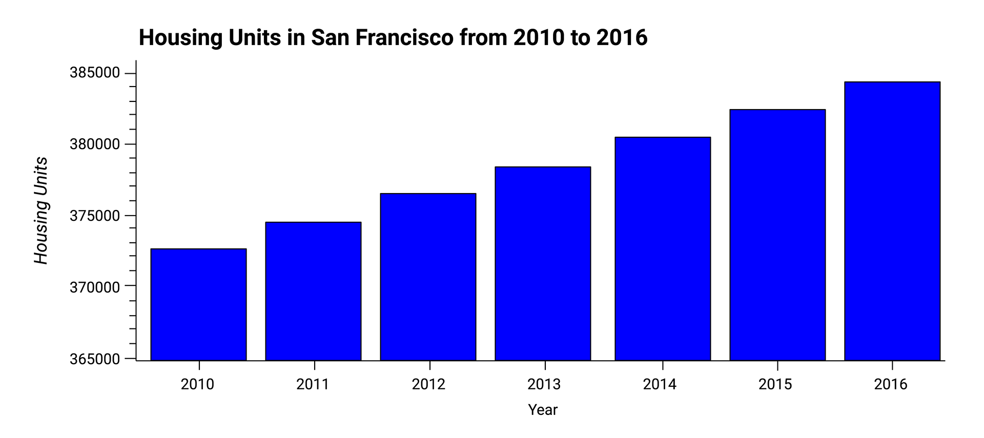
Calculate and plot the housing units per year.
-
Calculate and plot the average prices per square foot.
-
Compare the average prices by neighbourhood.
-
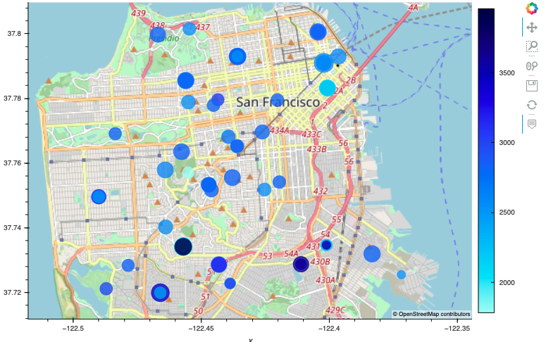
Build an interactive neighbourhood map.
-
Compose your data story.
For this part of the assignment, use numerical and visual aggregation to calculate the number of housing units per year, and then visualise the results as a bar chart. To do so, complete the following steps:
-
Use the
groupbyfunction to group the data by year. Aggregate the results by themeanof the groups. -
Use the
hvplotfunction to plot thehousing_units_by_yearDataFrame as a bar chart. Make the x-axis represent theyearand the y-axis represent thehousing_units. -
Style and format the line plot to ensure a professionally styled visualisation.
-
Note that your resulting plot should appear similar to the following image:
-
Answer the following question:
- What’s the overall trend in housing units over the period that you’re analysing?
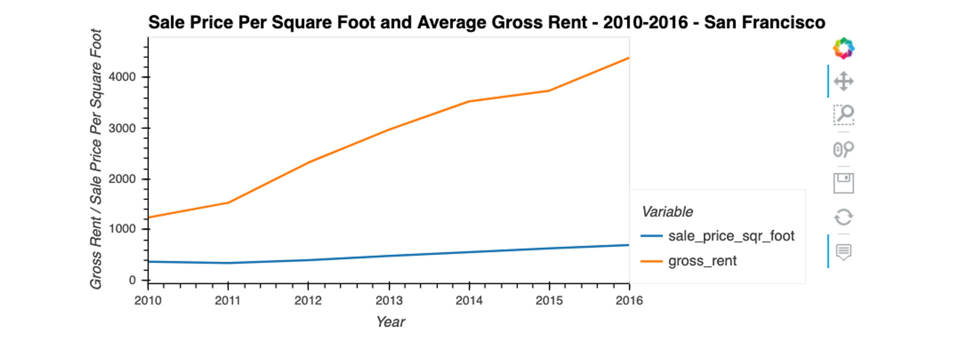
For this part of the assignment, use numerical and visual aggregation to calculate the average prices per square foot, and then visualise the results as a bar chart. To do so, complete the following steps:
-
Group the data by year, and then average the results. What’s the lowest gross rent that’s reported for the years that the DataFrame includes?
-
Create a new DataFrame named
prices_square_foot_by_yearby filtering out the “housing_units” column. The new DataFrame should include the averages per year for only the sale price per square foot and the gross rent. -
Use hvPlot to plot the
prices_square_foot_by_yearDataFrame as a line plot.Hint This single plot will include lines for both
sale_price_sqr_footandgross_rent. -
Style and format the line plot to ensure a professionally styled visualisation.
-
Note that your resulting plot should appear similar to the following image:
-
Use both the
prices_square_foot_by_yearDataFrame and interactive plots to answer the following questions:-
Did any year experience a drop in the average sale price per square foot compared to the previous year?
-
If so, did the gross rent increase or decrease during that year?
-
For this part of the assignment, use interactive visualisations and widgets to explore the average sale price per square foot by neighbourhood. To do so, complete the following steps:
-
Create a new DataFrame that groups the original DataFrame by year and neighbourhood. Aggregate the results by the
meanof the groups. -
Filter out the “housing_units” column to create a DataFrame that includes only the
sale_price_sqr_footandgross_rentaverages per year. -
Create an interactive line plot with hvPlot that visualises both
sale_price_sqr_footandgross_rent. Set the x-axis parameter to the year (x="year"). Use thegroupbyparameter to create an interactive widget forneighbourhood. -
Style and format the line plot to ensure a professionally styled visualisation.
-
Note that your resulting plot should appear similar to the following image:
-
Use the interactive visualisation to answer the following question:
- For the Anza Vista neighbourhood, is the average sale price per square foot for 2016 more or less than the price that’s listed for 2012?
For this part of the assignment, explore the geospatial relationships in the data by using interactive visualisations with hvPlot and GeoViews. To build your map, use the sfo_data_df DataFrame (created during the initial import), which includes the neighbourhood location data with the average prices. To do all this, complete the following steps:
-
Read the
neighborhood_coordinates.csvfile from theResourcesfolder into the notebook, and create a DataFrame namedneighborhood_locations_df. Be sure to set theindex_colof the DataFrame as “Neighborhood”. -
Using the original
sfo_data_dfDataframe, create a DataFrame namedall_neighbourhood_info_dfthat groups the data by neighbourhood. Aggregate the results by themeanof the group. -
Review the two code cells that concatenate the
neighborhood_locations_dfDataFrame with theall_neighbourhood_info_dfDataFrame. Note that the first cell uses the Pandas concat function to create a DataFrame namedall_neighbourhoods_df. The second cell cleans the data and sets the “Neighbourhood” column. Be sure to run these cells to create theall_neighbourhoods_dfDataFrame, which you’ll need to create the geospatial visualisation. -
Using hvPlot with GeoViews enabled, create a
pointsplot for theall_neighbourhoods_dfDataFrame. Be sure to do the following:-
Set the
sizeparameter to “sale_price_sqr_foot”. -
Set the
colorparameter to “gross_rent”. -
Set the
frame_widthparameter to 700. -
Set the
frame_heightparameter to 500. -
Include a descriptive title.
Note that your resulting plot should appear similar to the following image:
-
-
Use the interactive map to answer the following question:
- Which neighbourhood has the highest gross rent, and which has the highest sale price per square foot?
Based on the visualisations that you created, answer the following questions:
-
How does the trend in rental income growth compare to the trend in sales prices? Does this same trend hold true for all the neighbourhoods across San Francisco?
-
What insights can you share with your company about the potential one-click, buy-and-rent strategy that they're pursuing? Do neighbourhoods exist that you would suggest for investment, and why?
-
Use the
groupbyfunction to group the data by year. Aggregate the results by the mean of the groups. (2 points) -
Use the
hvplotfunction to plot thehousing_units_by_yearDataFrame as a bar chart. Make the x-axis represent the year and the y-axis represent the housing_units. (2 points) -
Style and format the line plot to ensure a professionally styled visualisation. (2 points)
-
Answer the following question:
- What’s the overall trend in housing units over the period that you’re analysing? (4 points)
-
Group the data by year, and then average the results. What’s the lowest gross rent that’s reported for the years that the DataFrame includes? (2 points)
-
Create a new DataFrame named
prices_square_foot_by_yearby filtering out the “housing_units” column. The new DataFrame should include the averages per year for only the sale price per square foot and the gross rent. (2 points) -
Use hvPlot to plot the
prices_square_foot_by_yearDataFrame as a line plot. (2 points) -
Style and format the line plot to ensure a professionally styled visualisation. (2 points)
-
Use both the
prices_square_foot_by_yearDataFrame and interactive plots to answer the following questions:-
Did any year experience a drop in the average sale price per square foot compared to the previous year? (1 point)
-
Did the gross rent increase or decrease during that year? (1 point)
-
-
Create a new DataFrame that groups the original DataFrame by year and neighbourhood. Aggregate the results by the mean of the groups. (4 points)
-
Filter out the “housing_units” column to create a DataFrame that includes only the
sale_price_sqr_footandgross_rent averagesper year. (4 points) -
Create an interactive line plot with hvPlot that visualises both
sale_price_sqr_footandgross_rent. Set the x-axis parameter to the year (x="year"). Use thegroupbyparameter to create an interactive widget forneighbourhood. (4 points) -
Style and format the line plot to ensure a professionally styled visualisation. (4 points)
-
Use the interactive visualisation to answer the following question:
- For the Anza Vista neighbourhood, is the average sale price per square foot for 2016 more or less than the price that’s listed for 2012? (4 points)
-
Read the
neighbourhood_coordinates.csvfile from theResourcesfolder into the notebook, and create a DataFrame namedneighbourhood_locations_df. Be sure to set theindex_colof the DataFrame as “Neighbourhood”. (3 points) -
Using the original
sfo_data_dfDataframe, create a DataFrame namedall_neighborhood_info_dfthat groups the data by neighbourhood. Aggregate the results by the mean of the group. (3 points) -
Review the two code cells that concatenate the
neighborhood_locations_dfDataFrame with theall_neighbourhood_info_dfDataFrame. Note that the first cell uses the Pandasconcatfunction to create a DataFrame namedall_neighbourhoods_df. The second cell cleans the data and sets the “Neighbourhood” column. Be sure to run these cells to create theall_neighbourhoods_dfDataFrame, which you’ll need to create the geospatial visualisation. (3 points) -
Create a
pointsplot for theall_neighbourhoods_dfDataFrame.-
Use the hvPlot
pointsfunction. (1 point) -
Set the
geoparameter to True. (1 point) -
Set the
sizeparameter to “sale_price_sqr_foot”. (1 point) -
Set the
colorparameter to “gross_rent”. (1 point) -
Set the
frame_widthparameter to 700. (1 point) -
Set the
frame_heightparameter to 500. (1 point) -
Include a descriptive title. (2 points)
-
-
Use the interactive map to answer the following question:
- Which neighbourhood has the highest gross rent, and which has the highest sale price per square foot? (3 points)
-
Based on the visualisations that you created, answer the following questions:
-
How does the trend in rental income growth compare to the trend in sales prices? Does this same trend hold true for all the neighbourhoods across San Francisco? (5 points)
-
What insights can you share with your company about the potential one-click, buy-and-rent strategy that they're pursuing? Do neighbourhoods exist that you would suggest for investment, and why? (5 points)
-
-
Place imports at the top of the file, just after any module comments and docstrings, and before module globals and constants. (3 points)
-
Name functions and variables with lowercase characters, with words separated by underscores. (2 points)
-
Follow DRY (Don't Repeat Yourself) principles, creating maintainable and reusable code. (3 points)
-
Use concise logic and creative engineering where possible. (2 points)
-
Submit a link to a GitHub repository that’s cloned to your local machine and contains your files. (4 points)
-
Use the command line to add your files the repository. (3 points)
-
Include appropriate commit messages in your files. (3 points)
- Be well commented with concise, relevant notes that other developers can understand. (10 points)
© 2022 Trilogy Education Services, a 2U, Inc. brand. All Rights Reserved.


