In this project, we would experimenting with building a automated cloud based data pipeline, exploring the Crypto data ecosystem, and practicing some analytics skills.
## Explore our dashboards here!
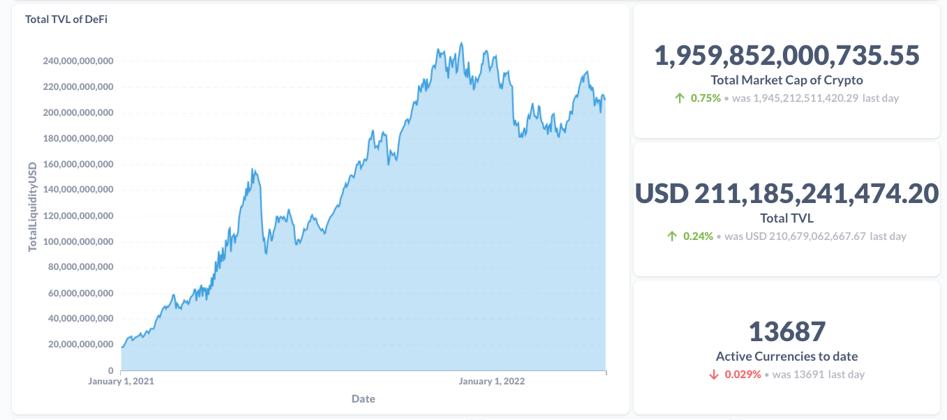
* 1 of 5: Start Page
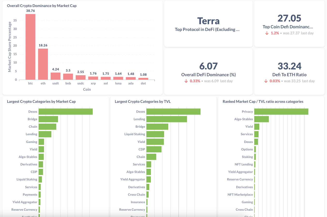
* 2 of 5: Overall DeFi
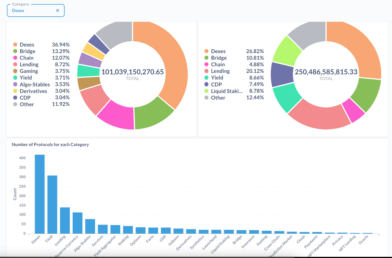
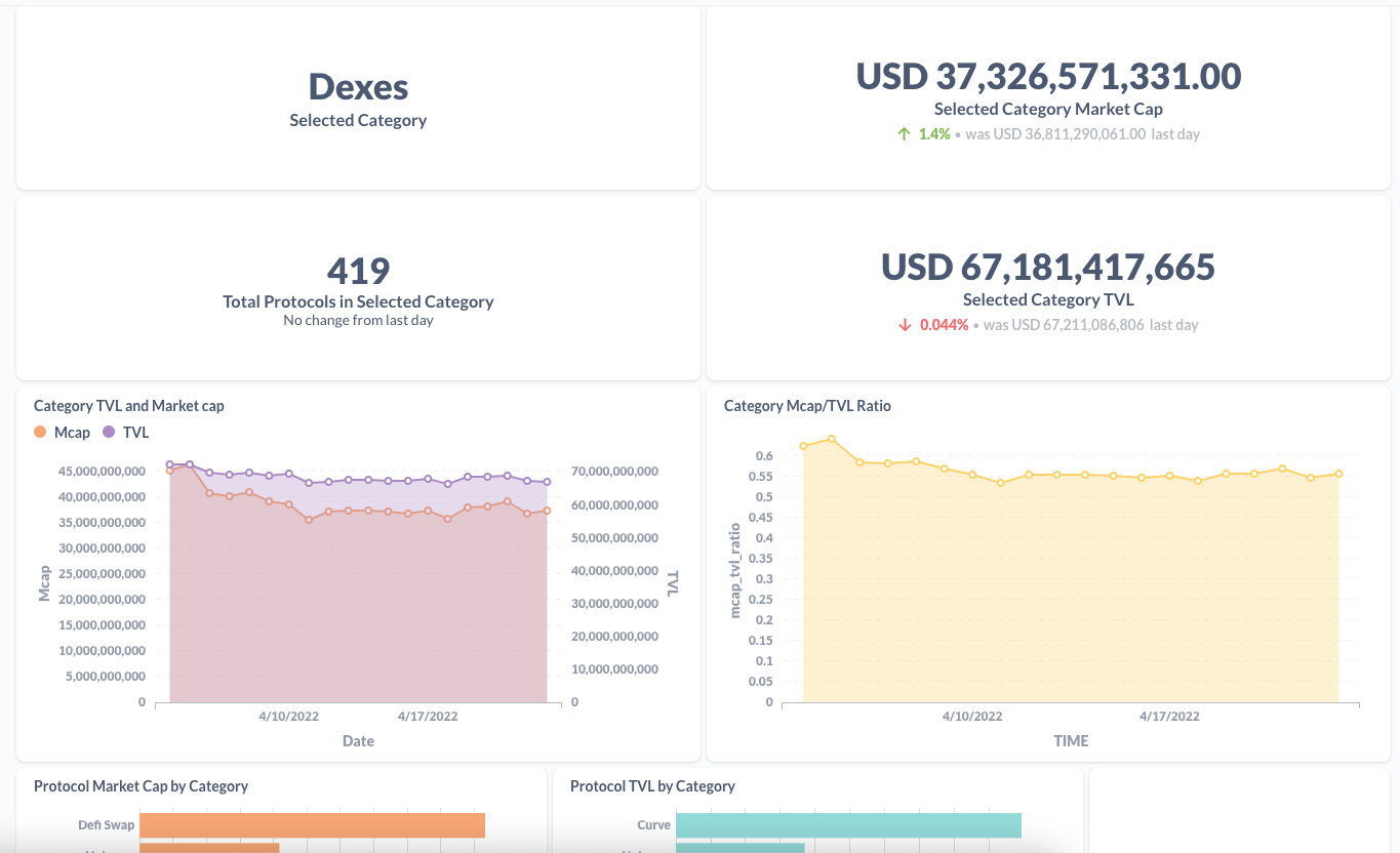
* 3 of 5: Category Drill Down
* 4 of 5: Native Chain Drill Down
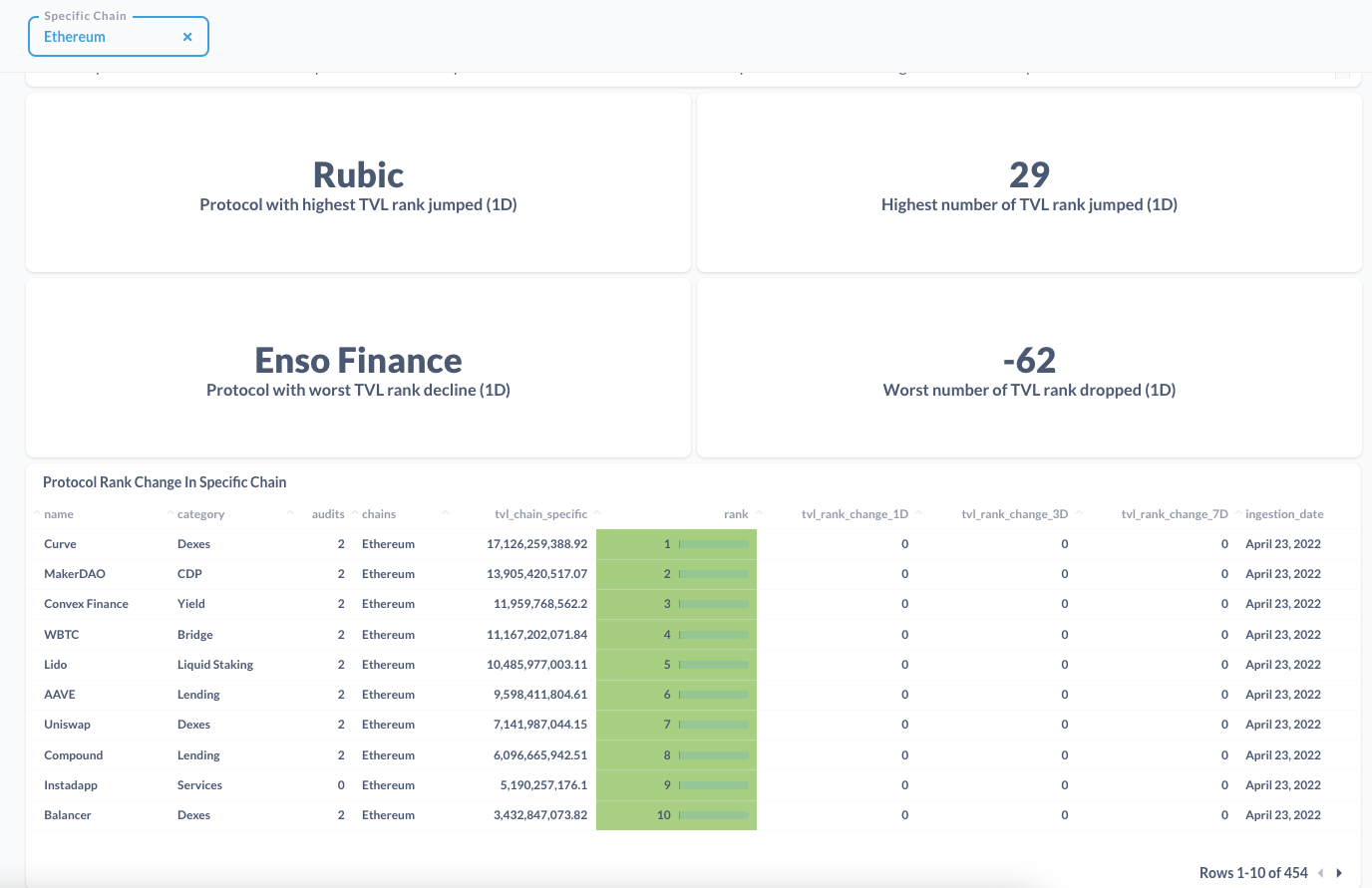
* 5 of 5: Specific Chain Drill Down
We noticed that many free crypto dashboards and data feeds do not provide analytical related data and have poor segmentation.
Our research question is:
- What is the status of the various sectors in the Defi market?
- What protocols are having a lot of activity in terms of the flow of money?
We've created a ranking metric to determine the relative performance of a protocol in a certain segment (category, native chain, specific chain). The metrics Mcap, TVL, and Mcap/TVL ratio are used to generate the ranks.
Why ranking? Initially, percentage change is commonly used to measure performance. However, this approach is more sensitive for detecting shitcoins as they have low market cap and would tend to have a larger percentage change as compared to large marketcap coins. Many times we know that large % change is usually nonsensical and meaningless. Very rarely do they flag out interesting projects.
Ranking is relatively more robust because it implicitly accounts for correlation and Mcap or TVL size. A large change in % does not mean that the protocol would have an increase in its rank especially when all other protocols are rising together.
As for Mcap/TVL ratio, we wanted to have relative valuation approach (like the Price/Book ratio) for you to determine for yourself if that protocol is undervalued or overvalued.
We believe that by ranking and measuring the shift of ranks will allow us to see the performance of protocols in a more relative manner.
One use case for ranking is the ability to find rising protocols that are 'off the radar'. We aim to find and report protocols with a drastic rise in Mcap or TVL relative to other protocols and thus help you find promising protocols for investment. Likewise, protocols that has a large exodus of capital, in Mcap or TVL, would be something interesting for you to be wary about
Category Highest and Worst and Rank Changes
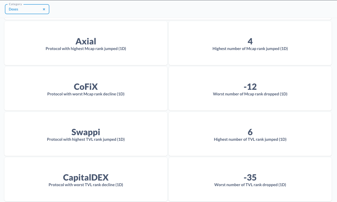
List of Category Highest and Worst and Rank Changes

Overall chain metrics and performance
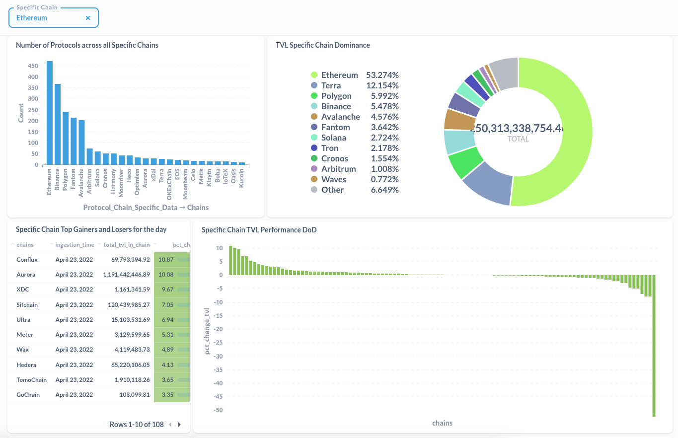
List of Chains Highest and Worst and Rank Changes
To keep the project simple because we wanted to complete in 3 weeks, the end product of the dashboard is more of business intelligence tool for you to keep an eye out on the DeFi space with data kindly provided for free by DefiLlama and CoinGecko.
As we were exploring other data sources, we did have ML ideas that would be cool to implement but we prioritize getting something out and running. For instance, NLP applications would be useful in crypto.
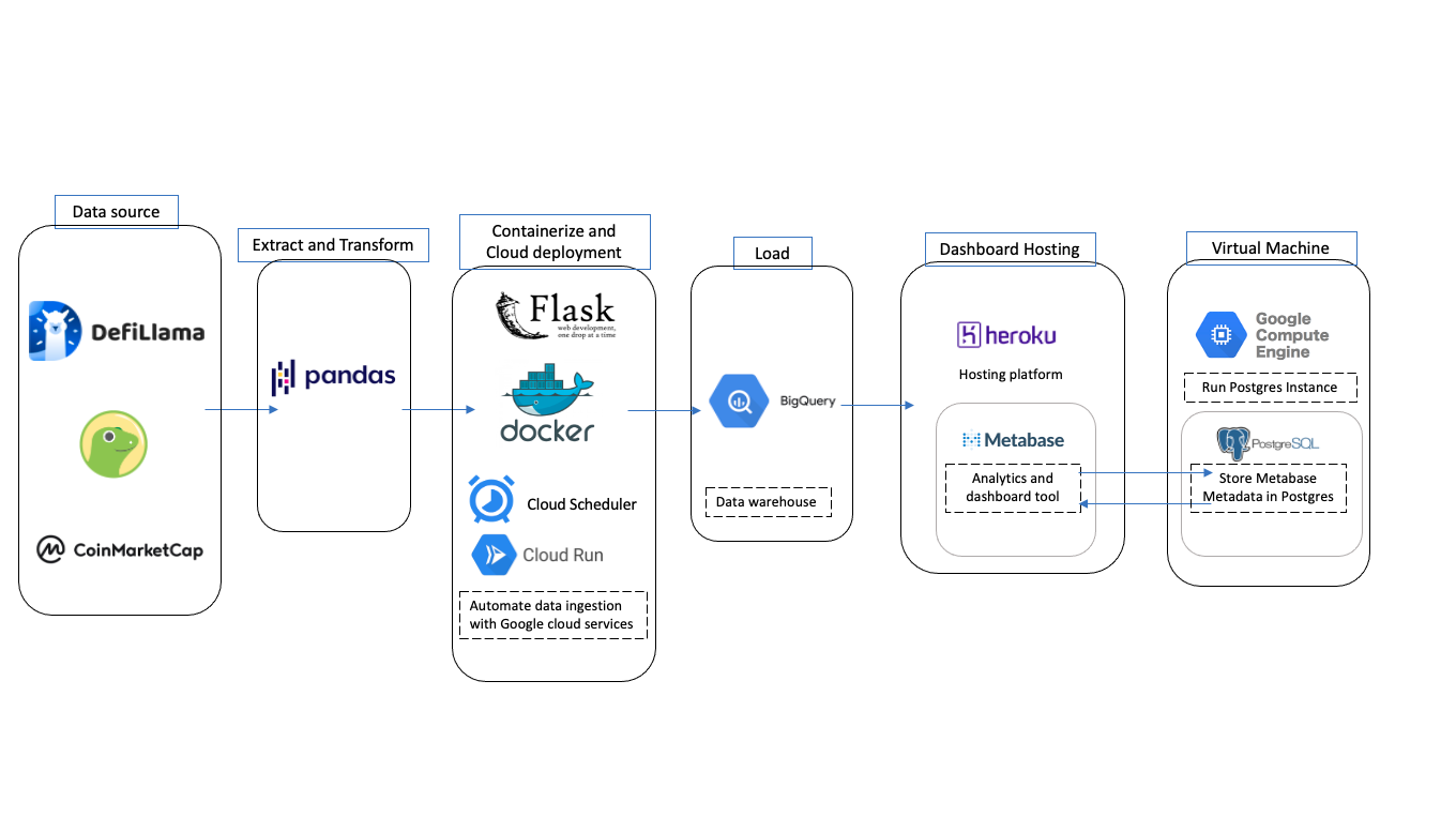
Admitedly, we were building a Cloud solution with 0 experience in just over a week and therefore it is sub-optimal. Here is how the the current pipeline looks like
In future iterations, we would be having a data lake that stores the raw ingested files and a staging area to hold the transformed tables before pushing the Bigquery.
And of course not forgetting data quality checks.
Here are the relevent tables
-
total_tvl
This contains data from DefiLlama that measures the Total TVL of Defi since 2018
-
cleaned_defillama
This contains the information of the protocols that exists in Defillama along with their TVL, Mcap, categories, native chains, and chain specific information (for multichain). However, it contains an array and a JSON in one of the fields that requires unnesting. Since unnesting it can result in duplicates, another table to hold this data was created in
protocol_chain_specific_data -
protocol_chain_specific_data
This table holds the TVL data of the protocol that exists on a certain chain. This is especially useful in understanding protocols that are on multiple chains such as Curve. We have also ranked protocols grouped by their TVL on the specific chain
-
protocol_data
This table is similar to cleaned_defillama and does not have the nesting fields thus making it suitable for analysis directly without joins. Also, we have added a rank column that Cloud Run would derive by grouping the protocols of the day and ranking their Market Cap, TVL, and Mcap/TVL ratio within a certain segment (in this case its either category or native chain)
-
category_agg
Sums the TVL and Mcap of all the protocols in a particular category for a day. Computes the Mcap/TVL ratio of each protocol and then averages it
-
native_chain_agg
Sums the TVL and Mcap of all the protocols in a particular native chain for a day Computes the Mcap/TVL ratio of each protocol and then averages it
-
chain_specific_agg
Sums the TVL and Mcap of all the protocols in a particular specific chain for a day
While this can morph into a blog on its own, here are some quick valuable lessons learnt:
-
We initially used Cloud SQL to store the metadata and to perform analytical queries but it was expensive. Furthermore, I felt guilty knowing that I was using a database as a data warehouse and then decided to change to Bigquery on a whim.
-
As I was learning on the go, some of the earlier idiosyncracies are not fixed as I slowly warmed up, this can be seen in the way I process dates in the ingested tables
-
Not having a data lake or staging area. Halfway in the project, we found that there was something wrong with the transformation steps. As there are no raw data for us to refer back to correct the mistake, we hard to restart the ingestion again.
-
Probably watch more Youtube tutorials and learning about how the Cloud solution works. I had a really really rough time figuring out how to run scripts in Cloud Run only to find out that it is in the Getting Started Documents/Videos
-
Don't miss the forest for the trees. We were too worried about the pipeline and neglected the very reason why the project started in the first place. Slowly the dashboard morphed into a dashboard that did visualisations for visualisation sake. It was a no-no in my books.
-
Keeping functions composable really helped in debugging. What I suggest is that you write your codes and experimentations in Jupyter. Then, convert them to functions. Next, run the notebook as though you are running scripts. Only then, convert the codes to scripts. As I am not as experienced in scripting, this has helped me gain visibility in the dataset I was transforming and debugging.
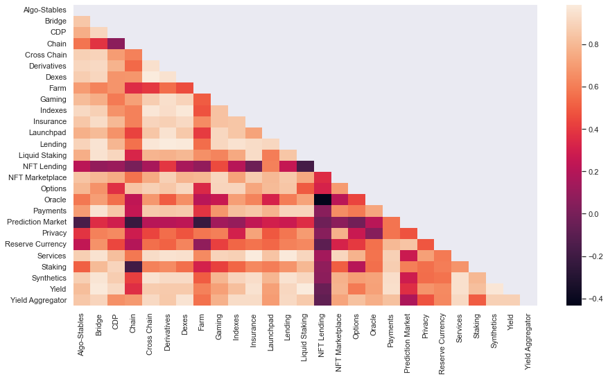
With raw data you can perform some time series analysis or even more advanced studies. For instance, you can run correlation analysis on the Protocol's Market Cap segmented by Categories. This can help determine what crypto categories are correlating. This may be helpful for diversification
