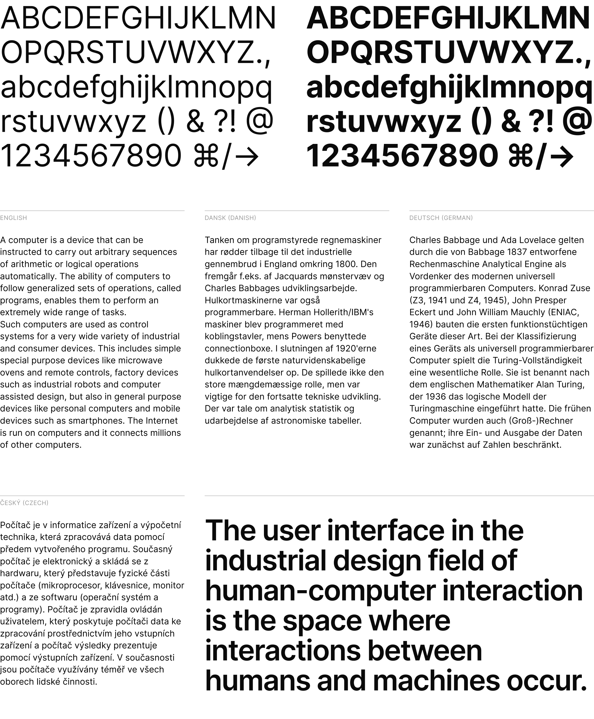
Inter Derp is a work-in-progress fork of the Inter typeface which has been carefully crafted & designed for computer screens; then modified according to my tastes. Inter Derp features a tall x-height to aid in readability of mixed-case and lower-case text. Inter Derp is a variable font with several OpenType features, like contextual alternates that adjusts punctuation depending on the shape of surrounding glyphs, slashed zero for when you need to disambiguate "0" from "o", tabular numbers. It is non-opinionated and does not force you to use a specific look and feel of text, allowing it to be a much more versatile, flexible font.
Download Inter Derp font files…
Inter Derp has changes which fit my own vision of Inter, and reverts some changes to Inter which I do not agree with. The list of planned changes is as follows:
- Alternate /t without a curved hook end
- Alternate /y without a curved hook end
- Alternate /j without a curved hook end
- Restores the old oblique-style italic glyphs to the Italic family as a stylistic set. (As of 4.0-beta 5, this applies only to /a, /e, and /f.)
- "Book" stylistic set which removes curved tails
- Inter Text Roman's /a has a straight terminal (Might expand to other characters as I see fit)
- Shape of /a changed slightly to have a straight junction, rather than the current curved look.
- Widening of Inter Light fonts slightly
This list of changes is only a roadmap, it will be ticked off as and when I finish each item.
*All diacritic/compound glyphs will also be changed with these.
- Where can I get Inter Derp? Here
- I think I found a bug. How can I let you know? Inter Derp is a forked version of Inter. If your issue pertains to the main font itself, open an issue on the original font here. Unless your issue is related to any changes which I have explicitly outlined here.
- I have a question. Where can I get help? Post in Discussions Q&A
- Why should I use Inter Derp? Inter Derp offers alternate character styles for the
tandycharacters which are more "casual" in nature, making it a good fit for casual designs such as website headers or children's books. If you however need a completely stable, professional font, I recommend that you use the official Inter font. - Can I legally use Inter Derp for my purpose? Most likely yes! Inter Der[] is free and open source. (Read the license for details.)
- Why did you make a derivative version of Inter? I wanted to make a version of the Inter font for my own uses and tastes, unencumbered by the more practical concerns and needs of the Inter project.
- Download the latest font files…
- No CDN is currently offered for webfont files of Inter Derp. You will have to self-host.
:root { font-family: 'Inter Derp', sans-serif; }
@supports (font-variation-settings: normal) {
  :root { font-family: 'Inter Derp var', sans-serif; }
}- None so far.
Have you made something nice with Inter Derp?
Please share in Show & Tell! →
A wholehearted Thank You to everyone who supports the Inter project!
Special thanks to @rsms, for creating and maintaining the original Inter font. @thundernixon and @KatjaSchimmel who have put in significant effort into making Inter what it is through their contributions ♡
See graphs/contributors for a complete list of all contributors.
For instructions on how to work with the source files and how to compile & build font files, refer to CONTRIBUTING.md.
Inter is licensed under the SIL Open Font License
This section discusses some of the design choices made for Inter.
Inter can be classified as a geometric neo-grotesque, similar in style to Roboto, Apple San Francisco, Akkurat, Asap, Lucida Grande and more. Some trade-offs were made in order to make this typeface work really well at small sizes:
-
Early versions of Inter was not suitable for very large sizes because of some small-scale glyph optimizations (like "pits" and "traps") that help rasterization at small sizes but stand out and interfere at large sizes. However today Inter works well at large sizes and a Display subfamily is in the works for really large "display" sizes.
-
Rasterized at sizes below 12px, some stems—like the horizontal center of "E", "F", or vertical center of "m"—are drawn with two semi-opaque pixels instead of one solid. This is because we "prioritize" (optimize for) higher-density rasterizations. If we move these stems to an off-center position—so that they can be drawn sharply at e.g. 11px—text will be less legible at higher resolutions.
Inter is a variable font and is in addition also distributed as a set of traditional distinct font files in the following styles:
| Roman (upright) name | Italic name | Weight |
|---|---|---|
| Thin | Thin Italic | 100 |
| Extra Light | Extra Light Italic | 200 |
| Light | Light Italic | 300 |
| Regular | Italic | 400 |
| Medium | Medium Italic | 500 |
| Semi Bold | Semi Bold Italic | 600 |
| Bold | Bold Italic | 700 |
| Extra Bold | Extra Bold Italic | 800 |
| Black | Black Italic | 900 |
