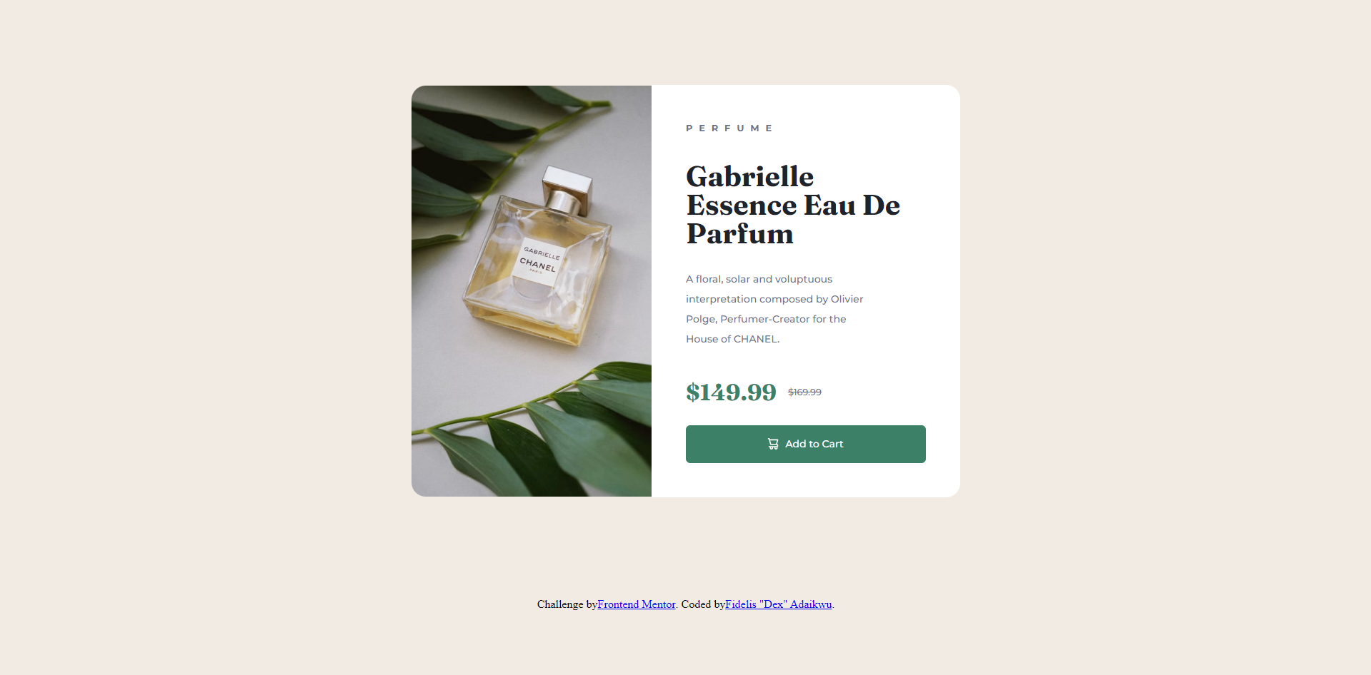
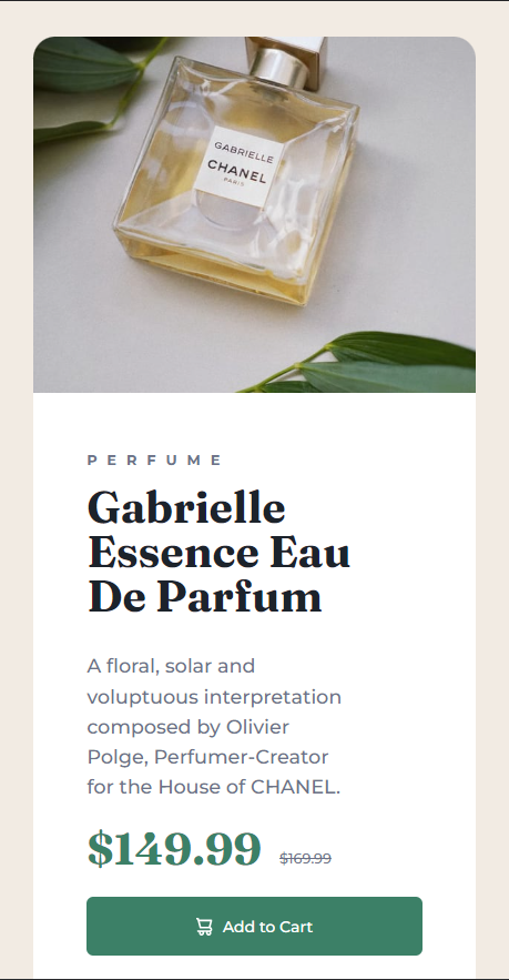
This is a solution to the Product preview card component challenge on Frontend Mentor. Frontend Mentor challenges help you improve your coding skills by building realistic projects.
Users should be able to:
- View the optimal layout depending on their device's screen size
- See hover and focus states for interactive elements
- Solution URL: My solution github repo link
- Live Site URL: Live site hosted on netlify
- HTML
- CSS
Had some challenges with keeping the content on the right hand side inside its container (white background) So after researching I realized that all I needed to do was to change my height settings to auto
.product-container {
  height: auto;
}
This worked like magic and made me learn to be careful when defining heights in CSS cos things could easily start getting messed up.
Part of the challenge I couldn't solve was how to get the image section to maintain the same height with the product container section as the viewport is being scaled down. If anyone could help me with this I'd really appreciate it.
I plan to take on more challenges to strengthen my HTML & CSS skills.
- Website - Fidelis "Dex" Adaikwu
- Frontend Mentor - @DexFA
- Twitter - @Fidelis_Adaikwu

