CSE 512 UW Homeworks
FP-astro-plan
Team members:
- Conor Sayres
- Dino Bektesevic
- Jessica Birky
- David Wang
Project Visualization: https://www.apo.nmsu.edu/CS/cse512/
Project video: https://www.youtube.com/watch?v=4mhJHX6-ywI&t=1s
SDSS-V: visualizing a telescopes' nightly plan
1. Motivation
The Sloan Digital Sky Survey (SDSS), is a robotic telescope that scans the sky every night. It seeks to map large areas of the sky over years-long baselines. SDSS has broken up the sky into small patches called "fields". Each field contains a collection of many faint targets (stars or galaxies) that are simultaneously measured in a single image. The night is discretized into 18 minute exposure chunks, one exposure per field. The night plan is the sequence of fields the telescope visits throughout the night. The goal of this project is to prototype a helpful visualization of an SDSS night plan to aid the observers collecting data on a nightly basis.
The "optimal" plan for each night is determined algorithmically for each day. When night operations are running smoothly, there is little reason to deviate from the plan. However, operations do not always run smoothly: weather or technical problems can interrupt observations, and often the telescope operators need to mitigate the situation and change the plan on the fly. We hope this tool provides a way for operators to quickly come up with alternate observing plans as conditions change throughout the night. A good visualization will aid quick accurate decision making, especially when the potential space of field options is large. The important factors for observing a field are "altitude" (how high in the sky the field is: higher altitude leads to better data due to less atmospheric distortion), and how far from the moon the field is (data quality suffers as fields near the moon due to its brightness!), field completion percentage (most fields require multiple re-visitations on different nights), and field priority (certain fields are deemed higher priority than other fields).
This project extends our A3 prototype by including an interface for 365 nights worth of data, additional interactive filters, and animated sky footage of weather conditions at the observing site. We revisited, rethought, and reorganized basic encodings, color scales, layouts and overall organization. The final product, we feel, is much improved and more effective than our earlier prototype.
2. Glossary
Time
- Modified Julian Day (MJD): Floating point days. A continuous timescale used by astronomers referenced to a certain epoch (May 23, 1968).
- Local Time: year, month, day, hours, minutes, seconds. Transformed from MJD to the local time at Apache Point Observatory in New Mexico.
Star
- ID: String. Unique identifier for a star in catalog.
- Right Ascension (RA): Degrees. Star location in equatorial coordinates.
- Declination (Dec): Degrees. Star location in equatorial coordinates.
- Apparent Magnitude: Apparent brightness of the star.
Moon
- Altitude (Alt): Degrees. Angle of moon above horizon. Transformed from RA/Dec given a time and the latitude/longitude of Apache Point Observatory.
- Azimuth (Az): Degrees. Cardinal/compass direction to the moon. Transformed from RA/Dec given a time and the latitude/longitude of Apache Point Observatory
- Phase: Float on [0,1]. The fraction of the moon that is illuminated at a certain time. 0 is a new moon, 1 is a full moon.
Field
- ID: Integer. Unique identifier for a field.
- Right Ascension (RA): Degrees. Field location in equatorial coordinates.
- Declination (Dec): Degrees. Field location in equatorial coordinates.
- Altitude (Alt): Degrees. Angle of field above horizon. Transformed from RA/Dec given a time and the latitude/longitude of Apache Point Observatory.
- Azimuth (Az): Degrees. Cardinal/compass direction to field. Transformed from RA/Dec given a time and the latitude/longitude of Apache Point Observatory
- Moon Separation: Degrees. Solid angle on the sky between field and moon at a specific time.
- Completion: Float on [0,1]. Amount of signal previously acquired on this field. Many fields require re-visitation on subsequent days for completion. This value is a proxy for how much time has been spent on this field already, and how much time is required to complete it. Effectively it is progress bar. For this work we've assigned this value randomly.
- Priority: Integer in [0,5]. 0 is highest priority, 5 is lowest. Certain fields may be prioritized above others for observing. For example fields that are only visible for short periods of time in the year may be assigned a higher priority due to their small observation windows to ensure they are visited. For this work we've assigned this value randomly.
- Scheduled: Boolean. True if the SDSS autoscheduling program picked this field for observation on a given night.
- ScheduledTime: MJD. If Scheduled: the MJD (point in night) at which the SDSS autoscheduling program desires this field to be observed.
3. Visualization
3.1 Sky Plot
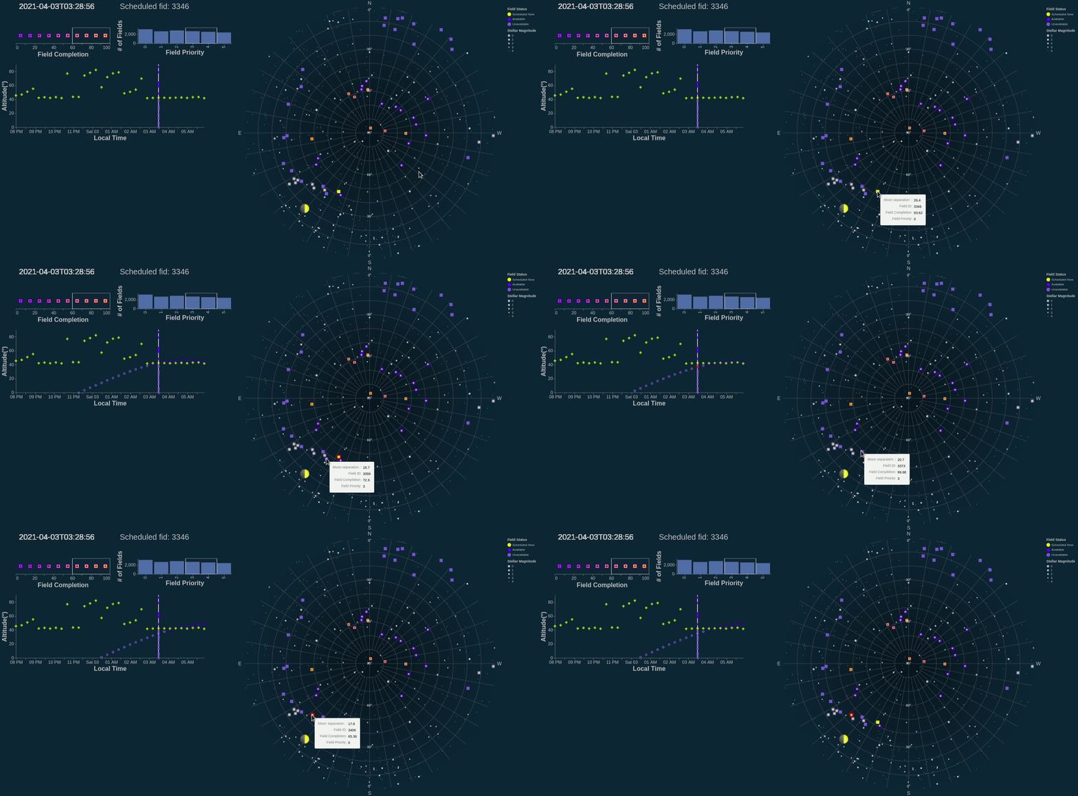
Field Interaction (right plot)
We can only choose to point the telescope at a small fraction of the sky at a time. On the sky plot you’ll find a number of dark or light blue squares representing observing “fields”, or regions containing an object (star, galaxy, quasar) that we want to collect data on. The dark blue squares represent the fields which are “available” to observe at a given time in the night, while the light blue squares represent “unavailable” fields. The yellow square represents the field being observed at that time. The availability of different fields changes over time based on the altitude: if a field is less than 40 degrees above the horizon, Earth’s atmosphere becomes too thick for the telescope to expose through.
To give an intuitive frame of reference, a few hundred stars are plotted in grey where size encodes the star’s brightness. All of these stars are bright enough to be seen by the human eye, so you may be able to recognize some constellation patterns among these background stars. The moon is shown as an emoji according to its phase that night.
Design rationale
We took advantage of altair’s projection functions to map our data onto the sky. By mapping azimuth to longitude and altitude to latitude, and projecting using a north pole centered azimuthal equidistant projection, we could produce a circular map of the sky equivalent to a 180 degree fisheye view. Coincidentally, this is the view the all-sky camera at the SDSS telescope sees the sky--for the final project, we may incorporate a feed of this camera and plot fields on top of the live view. We made the background very dark and plotted lighter elements on top. We found this both approximates the sky better, appears less cluttered, and is more visually appealing.
Fields planned for observation during the night are plotted as squares corresponding to the area on the sky that would be imaged by the telescope. The yellow field corresponds to the field currently being observed, and the luminous blue (the “opposite” of yellow in L*ab) corresponds to fields not currently being observed, but meeting criteria for observation. We distinguish fields not meeting criteria for observation at that time by coloring them in pale blue. As time progresses, the status of the fields will change, with the colors updating correspondingly. We use tooltips to display the ID of each field and its separation from the moon, which are the two features observers will likely want to reference.
Hovering over a field brings up more information a field highlights the edge in the sky plot in red, and makes the corresponding track in the altitude plot completely opaque, making these points immediately stand out. Points selected in the altitude plot will outline the sky plot as both are linked. The field currently being observed is always in the top layer: this makes them easier to click.
The sizes of background stars correspond to their brightnesses. Astronomers measure this in magnitudes, with 0 being the brightest magnitude and brightness decreasing thereafter. We only plot stars down to 4.5 magnitude: any more and the plot becomes slow and cluttered. This also simulates what the sky looks like in a suburban setting, which may be more familiar to most viewers. The moon is also plotted as a dark grey circle corresponding to the rough size of the moon. A label pops up on mouseover to inform the viewer that this object is the moon since its identity might not be immediately obvious.
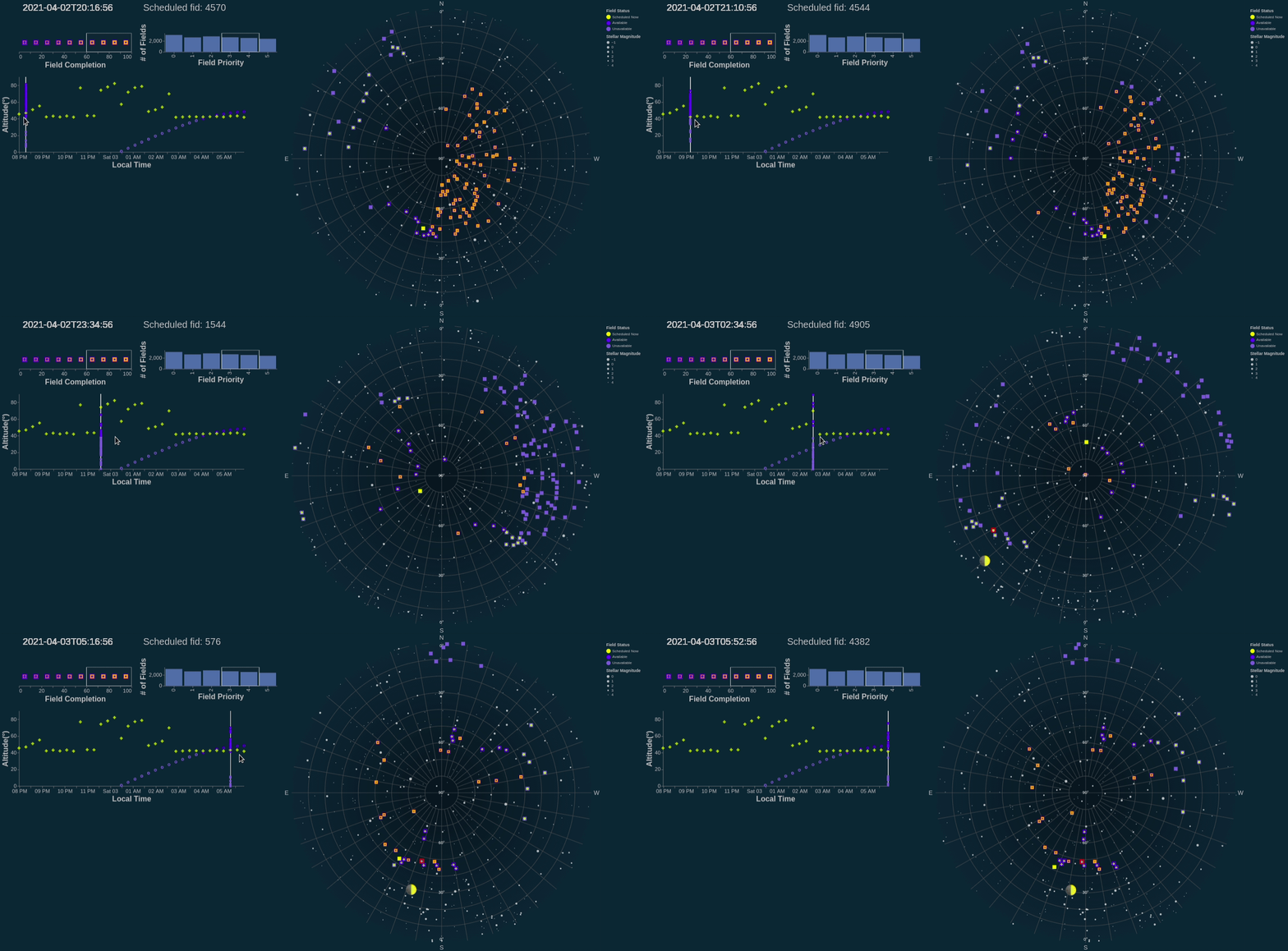
The sky plot updates to reflect the time selected in the time vs altitude plot - we found this offered more control, and was both more intuitive and informative, than using a slider.
3.2 Altitude vs Time Plot
Time Interaction (bottom left plot)
Mousing over the plot selects the closest time (x-axis) to the cursor. This updates the linked sky plot, which displays the sky at the time selected. Running the cursor horizontally through the bottom thus animates the sky plot to show the motion of the sky over the night. Text in the bottom left of the plot always displays the time selected and the ID of the field observed at that time which the user will often need to reference. Consistent with the sky plot, the yellow square represents the field being observed at that time.
Design rationale
Since we wish to optimize the altitude of each field during observation, we also plot the altitude of each field over time in a scatterplot below the sky plot. The initial renderings of these points are transparent, since we will usually only want to compare a few at a time. Selecting a field will cause the points corresponding to this field to become opaque.
The colors match the field statuses in the sky plot: yellow for currently observing, bright blue for not observing but available, and pale blue for unavailable. Points representing fields currently being observed (one for each time), are also larger and filled in to facilitate easier interaction.
3.3 Field Completion and Priority
Completeness/Priority Selections (top left plots)
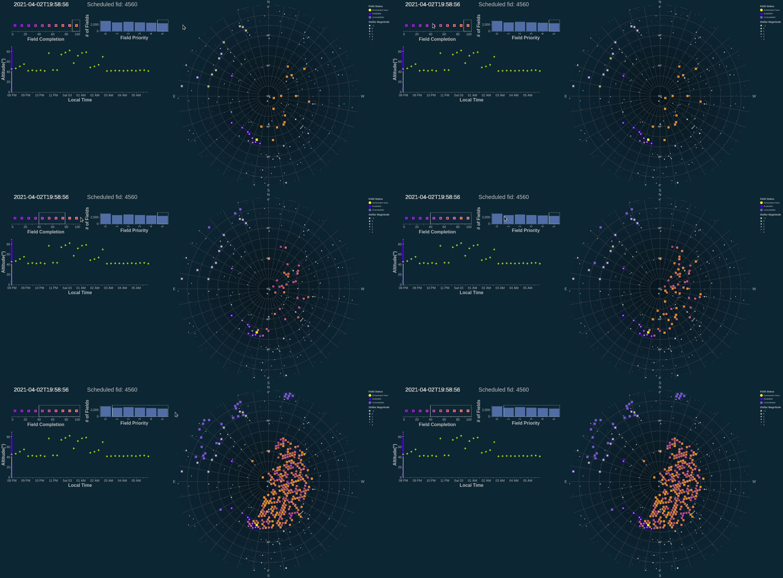
Available fields can also be filtered by completion (encoded with orange overlays on the fields) and priority, allowing astronomers to see alternatives to the scheduled fields.
3.4 Calendar
Select Different Dates
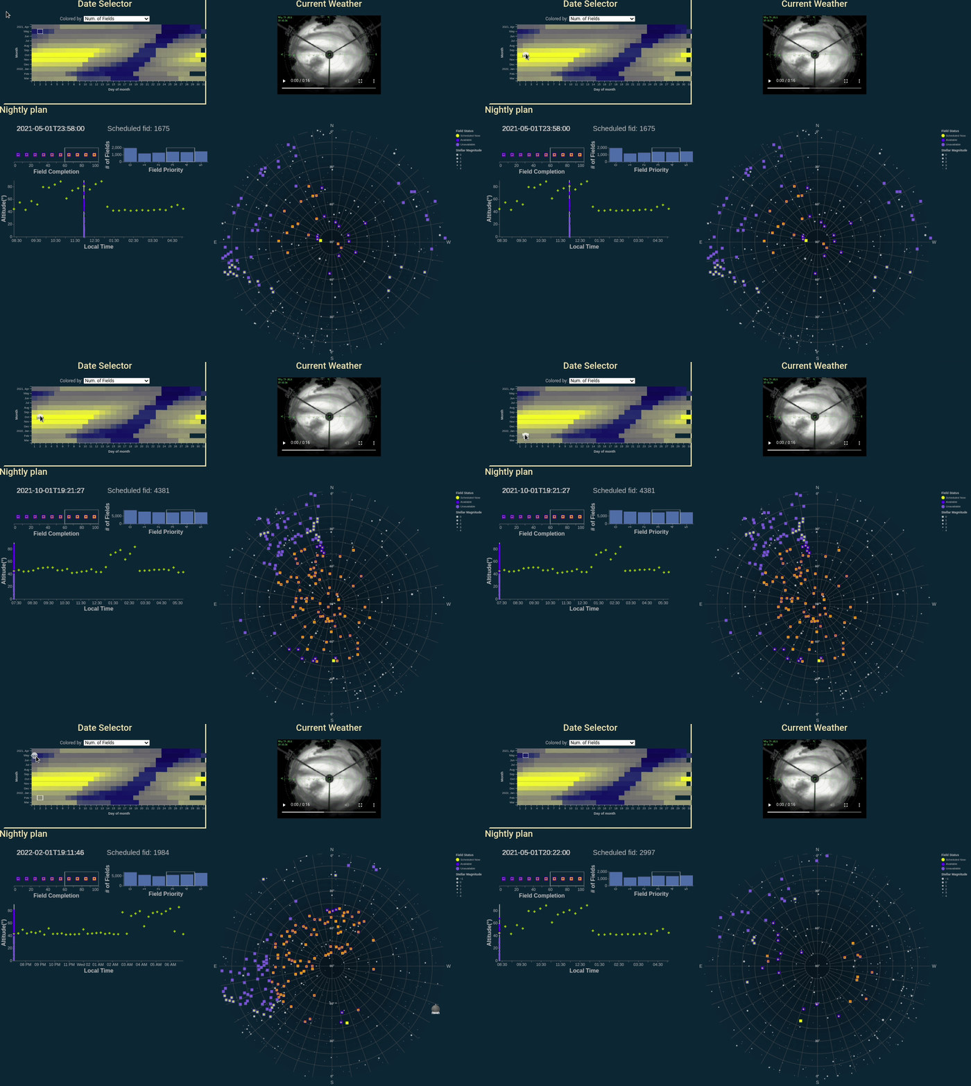
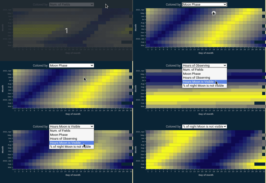
To facilitate exploration of the visualization, the user is provided with an 365 nights worth of simulated observing strategies. These are displayed in a calendar in the upper left corner, in which each rectangles represent a single observing night. The user can also change the date by clicking on the calendar, which will change the data displayed in the sky plot/altitude plot below to a different night. By encoding values of variables that affect an observing strategy as rectangle colors, the user is encouraged to interact and look for observing strategies of different complexity. Hovering over each date displays the value for the variable selected in the drop down menu above the calendar.
Design rationale
The addition of the date selection for a full year's worth of data was one of the major improvements from our A3 prototype (which only included one night's worth of data). The grid-like layout for the date selection is meant to sort of be like a calendar, where the y-axis displays 12 months (April 2021 to March 2022), and the x-axis displays the day of the month (1-31).
Select Color Encoding
The drop-down menu above the calendar allows the user to visualize different parameters that influence observing for each night, including: number of fields, moon phase, hours of observing, hours of the night moon is visible, and % of night moon is not visible.
Design rationale
Observing conditions change depending on the season of the year (which dictates how many hours of day/night there are), as well as the time of month (which affects the moon phase and what time the moon is up). Observing opportunity becomes more constrained during the summer months when there are less hours of night time, and during periods when the moon is visible and most bright (which can potentially drown out faint sources).
Additionally, we may want to know the number of fields visible in a given night. The more fields that are available to observe, the easier it is to utilize all of the observing time for collecting data, should the weather conditions block out parts of the sky.
The choice of a yellow-blue map for the color encoding was intended to match the yellow-blue theme used in the sky and altitude plots, and display high contrast. Instead of adding a colorbar to decipher the values associated with the colors (which becomes cluttered, and difficult to pick out individual values), we instead display them using a hover tool, where the value becomes visible when the mouse hovers over.
3.5 Cloud Cam Demo
Video
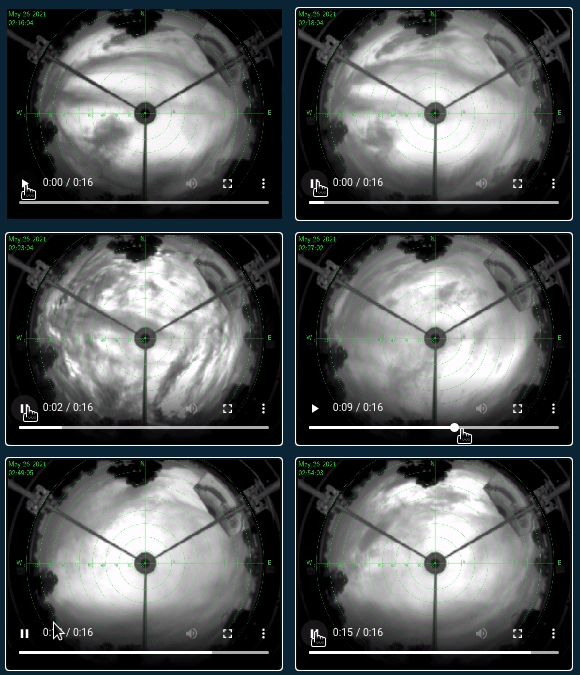
Sometimes, observing plans have to change on the fly due to varying weather conditions during the night. Cloud camera helps us direct the telescope to a part of the sky not covered by the clouds. As a demonstration of what this looks like, we've included an animation of the sky cam from a recent night (May 26, 2021), which can be played in the upper right of the page.
Design rationale
The orientation of the cloud cam feed is exactly the same as the sky plot. For the azimuthal labels (angular axis), the northern axis is at the top and western axis to the left. For the altitude labels (radial axis), 90 degrees at the center would be looking straight up at the sky, and 0 degrees at the edges would be looking towards the horizon.
The upper left hand corner of the aninmation labels the date and time of the frame. We also scaled the colormaps of the images in each frame to emphasize the contrast between clear and cloudy regions of sky.
On the horizon of the cam you can also see the domes of three other instruments at the site (the 0.5m, 1.0m, and 3.5m telescopes), as well as some trees:
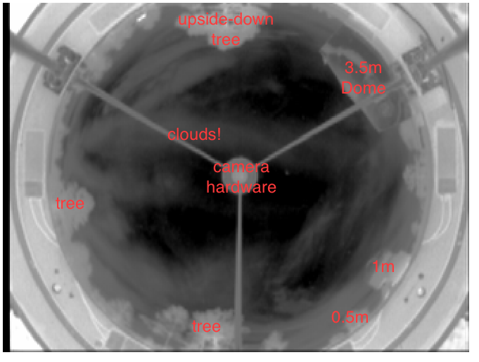
In a finalized version of this tool, if it were to be used by astronomers, we would replace this panel with the current live-feed image from the telescope site so that users could compare the sky plot to the weather conditions in real time. However, the live feed images are only served during night time at the observing site. So for the purposes of this data visualization assignment, we instead included an animation of a recent cloudy night, so people can get a sense of what challenging weather conditions astronomers might have to deal with.
4. Data
4.1 Data Collection and Computation
Field data was obtained from SDSS's roboscheduler product. The roboscheduler was asked to provide scheduled fields for a year beginning April 1 2020. Each night was discretized into 18 minute time slots, which is the typical telescope exposure time. For each timeslot on each night, the roboscheduler picks a scheduled field and additionally provides many (up to thousands) of alternate fields. Astropy routines were used to calculate the Alt/Az coordinates of the field for each timeslot at Apache Point Observatory.
Star data was drawn from the Yale Bright Star Catalog. We kept only stars brighter than an apparent magnitude of 4.5. These are all stars visible to the human eye on a dark night. Astropy routines were used to calculate the Alt/Az coordinates of stars for each timeslot at Apache Point Observatory.
Moon data was obtained from Astropy's built in solar system ephemerides. Moon phase was computed using astroplan. At each timeslot the solid angle between the moon and each field was computed.
Cloud Camera The cloud camera visualization was made from raw images stored in SDSS archives. The cloud camera is a fisheye, infrared all-sky camera that is mounted next to the telescopes at Apache Point Observatory. We intentionally picked a cloudy night to display as an example. Observers on site have a real-time feed from this camera during the night.
4.2 Data Organization
Data was initially stored in CSV format, one file per night of observation. Our initial attempts were aimed at porting our A3 homework visualization to D3, but we soon found out that would involve reformatting our data into a GEOJson format to be used with d3-geo or implementing our own projection. While the latter was possible to do, performance, integration and usage was not pleasant so we continued using Altair.
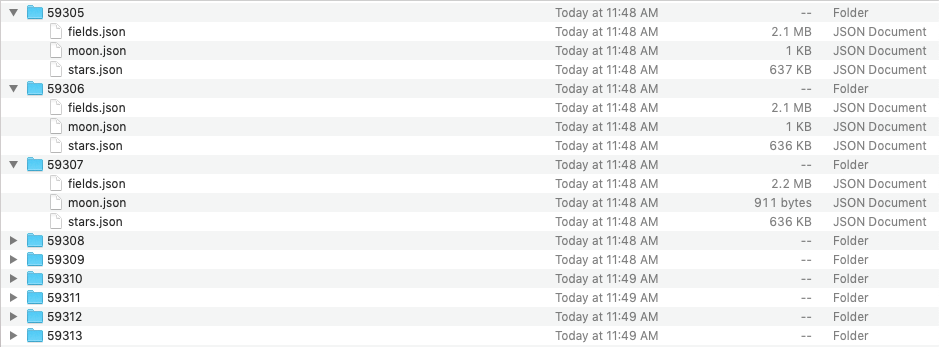
We split the data in each nightly CSV file and converted them into separate JSON format files for fields, stars and the moon. The separated files were placed into directories named after the MJD to which they belong. The rationale for these steps are covered in more depth in section 4.3.
The date selector/calendar is generated from a single json file that summarizes each available night.
4.3 Technical challenges.
Deciding to base our main visualization in Altair required us to: 1) either load the entire dataset into Altair when making the plot or 2) find a way to dynamically load new data and refresh the plot. As the performance of Altair plot suffered already even at a single-night data volumes, for certain nights, we decided to dynamically load data.
Unfortunately, the only way to update data dynamically, without replotting, with Altair was to use the Vega View API. This does not really represent how our data is structured, so even if we could have, which is not a certainty - as it's really hard to do so, we did not opt for this solution. Both of the remaining options we explored included the use of (vega-embed)[https://github.com/vega/vega-embed]. One was to create all of the plots, in advance, as JSONS and then reload the entire visualization and the other was to dynamically load the data and then intercept and replace appropriate values in the current JSON Vega or Vega-Lite specification object. Former option required us to remake all of our plots every time we adjusted our design or data and went against our original goal of being a useful tool for observers as, instead of just fetching or creating the new nightly data in JSON format, which is a trivial afair, they would additionally have to pre-process that fresh data to create a full Vega JSON plot specification. Therefore, we opted for the latter option to load and manally alter the Vega spec object before it got rendered.
This is the reasoning for splitting and organizing our data into that specific directory strucutre. The files are hosted on APO server, and relative links to them created dynamically after an event trigger. JQuery is used to retrieve JSON data from the server. We wanted to leverage the AJAX capabilities of jQuery as we were still aware that the data volumes of individual nights are relatively large in the context of webpage traffic. This is not the only way to retrieve the data, in fact, any mechanism can be substituted here as long as the end loaded data is in the expected JSON format, but this was the most practical mechanism for us.
The expected JSON format is, essentially, a list of objects that have the expected attributes which names match those used in our plotting script. For example:
[
{ alt: 2.27, az: 80.37, mS: 38.8, … }
{ alt: 6.02, az: 82.77, mS: 38.8, … }
…
]
This, however, created a different problem. Because Altair uses this, inefficient, record oriented data structure to represent plot data the produced JSONs were rather large. The main drivers of the data volume in the JSONs were the repeated attribute name entries. For example, "Time Stamp ID" attribute is worth 13 bytes but represents an ID, which is a single byte and this is repeated every element in the list. To address this issue we performed name mangling of the data attributes in order to shorten them, as well as putting the data itself through a pretty strict diet regimen. For example, by rounding to only the significant digits, encoding attribute names in Altair, or by using 1 character flag values etc. This makes the plotting code less user-friendly which is unfortunate, but not the data creation scripts since the mangling occurs just before plotting. This procedure reduced the cumulative data volume of the JSON files from 3GB to 1.6GB. In terms of individual files this represents a reduction from 15-17MB to 4-6MB and subsequently a decrease in loading time of the visualization of 30-50%, depending on the initial size of the data files (the larger they were, the larger the savings were).
We also attempted to fetch data from the APO server, while hosting on GitHub pages, but CORS policies did not allow us to easily and reliably perform this set up, so we opted to host everything on APO server.
5. Future Features
With more time, we would have experimented with providing a toggle-able cloud cam underlay for the main sky plot. This would allow observers to see exactly where fields land with respect to the current observing conditions, and form an intuition on which patches of sky are clearing up next for planning the next field in the sequence. Additionally we would have liked to experiment with a "collapsible view". This visualization shows a lot of data, and it's usually only necessary when changing plans on the fly. When everything's going "according to plan", there is little need for much of this display. Providing a concise and small representation of the night's observations may be preferred for these situations.
A significant improvement to the tool could also be achieved by adding a field selection and ordering box/list, into which we would be able to select frames directly from the sky-plot and then export in a format that is suitable to be ingested by the downstream observing software.
Further integration can be achieved with the nightly-planning tools by integrating the data wrangling functionality that exists in this code with the current workflow at APO observatory in order to help current and future observers. We believe that by engaging in this complicated technical setup we have made this integration easily achievable.
