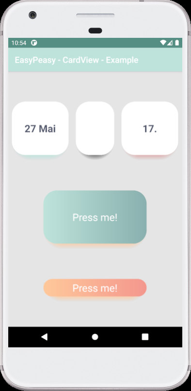
- Custom CardView shadow (colored shadow).
- Custom CardView background (one color or left-right gradient).
- Please give feedback an issue or pull request
You need to make sure you have the JCenter repository included in the build.gradle file in the root of your project:
repositories {
    jcenter()
}
Next add a dependency in the build.gradle file of your app module. The following will add a dependency to the library:
dependencies {
    implementation "com.github.dmitriykhalturin:customcardview:${latestVersion}"
}<easy.peasy.cardview.widget.CardView
android:layout_width="match_parent"
android:layout_height="match_parent"
app:cardShadowStartColor="#BFFEC89A"
app:cardBackgroundEndColor="#89B0AE"
app:cardBackgroundStartColor="#BEE3DB"
app:cardCornerRadius="@dimen/cornerRadius"
app:cardElevation="8dp">
</easy.peasy.cardview.widget.CardView>All attributes see in attrs.xml.
This component is based on android CardView. But has some differences. The main difference affecting the layout is overlap corners.
