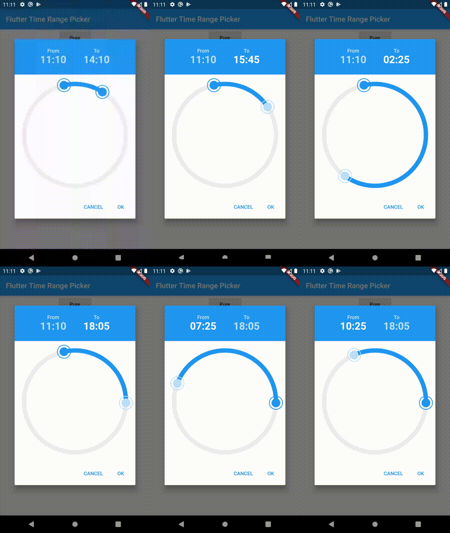
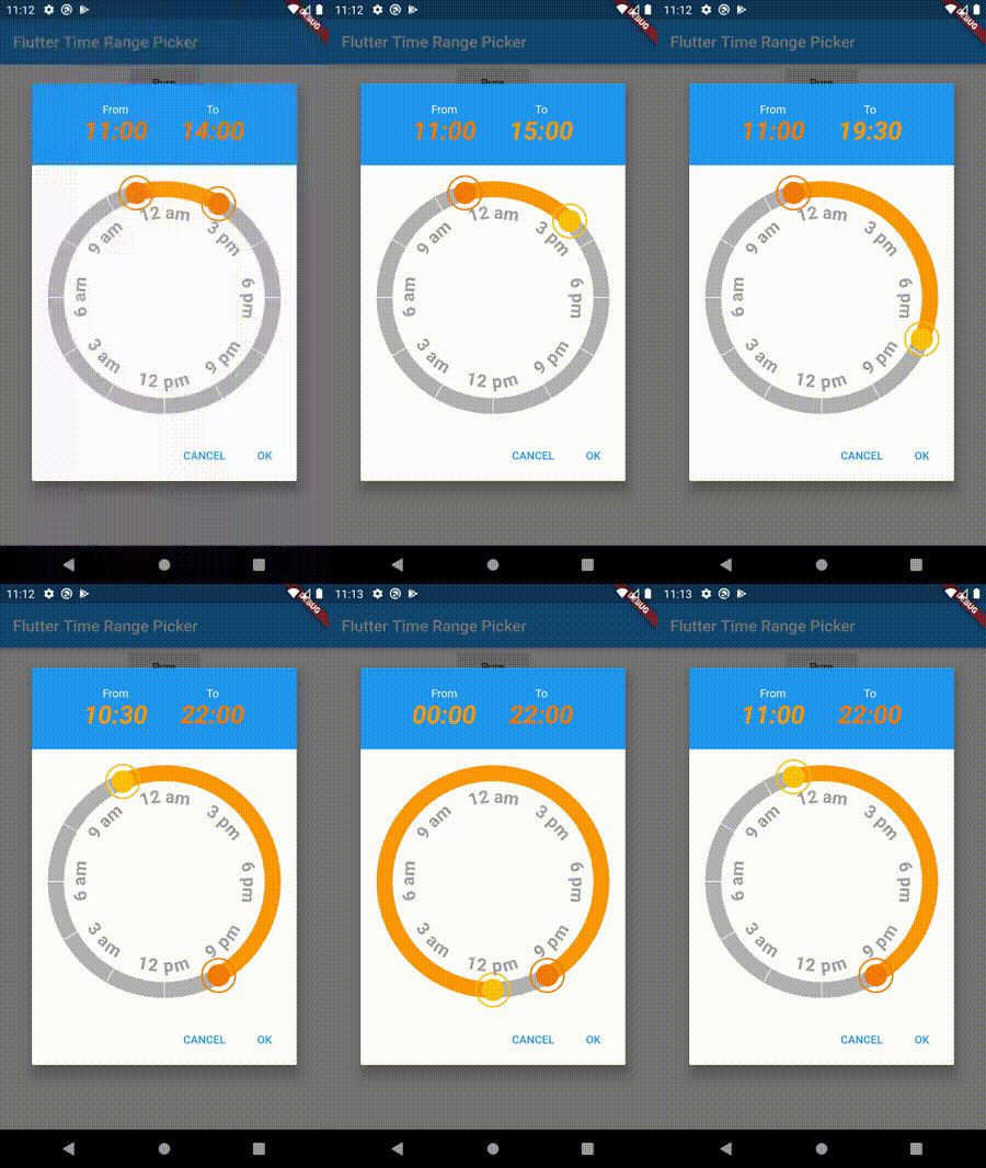
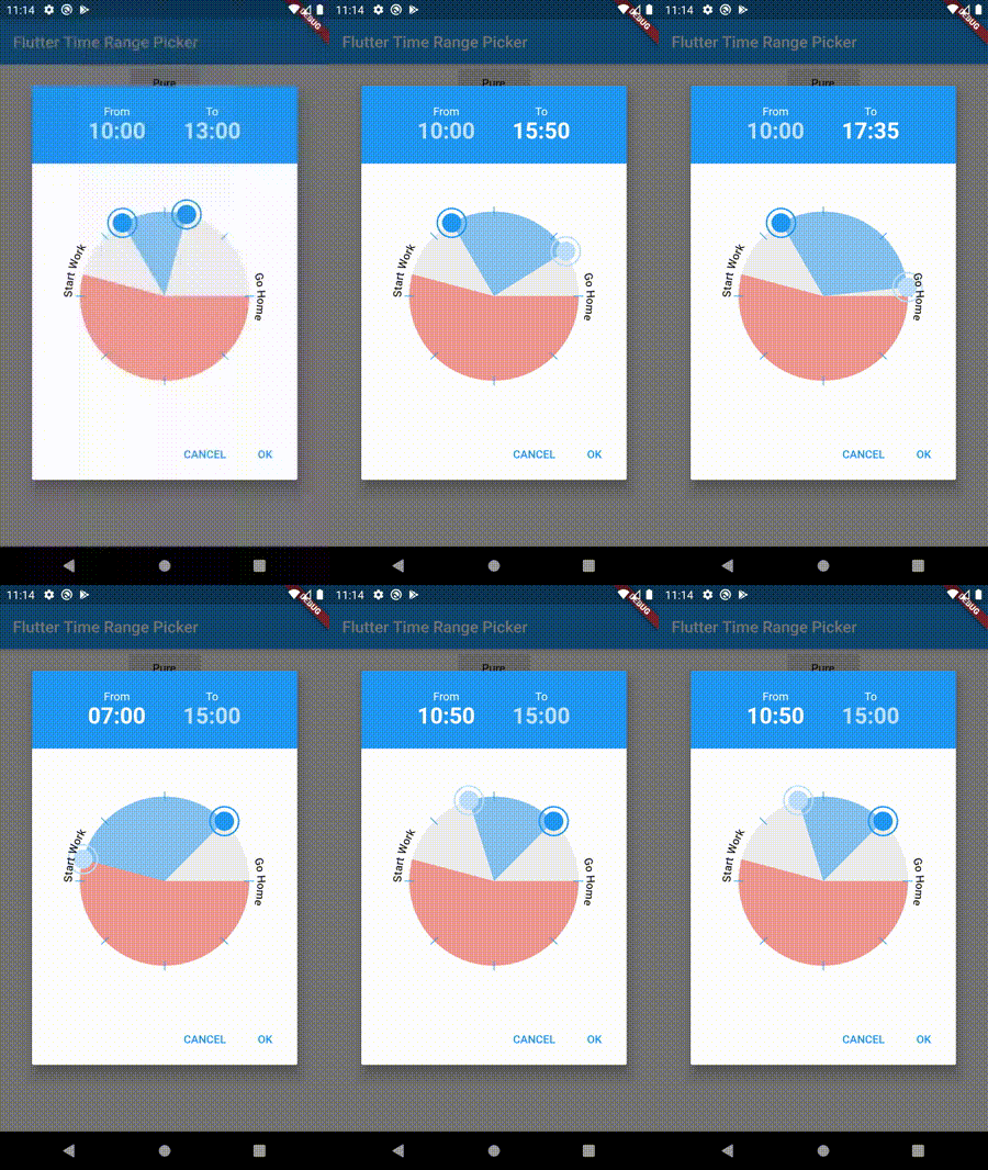
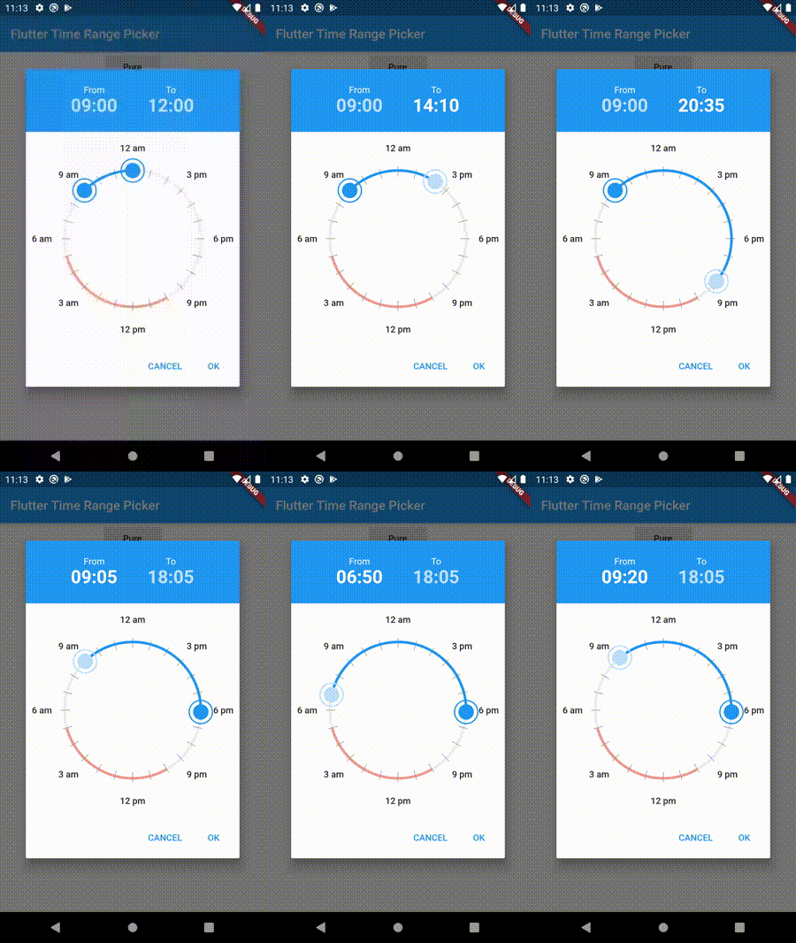
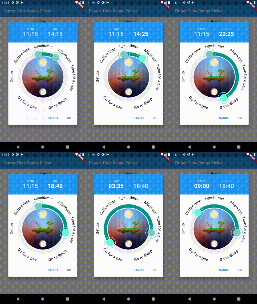
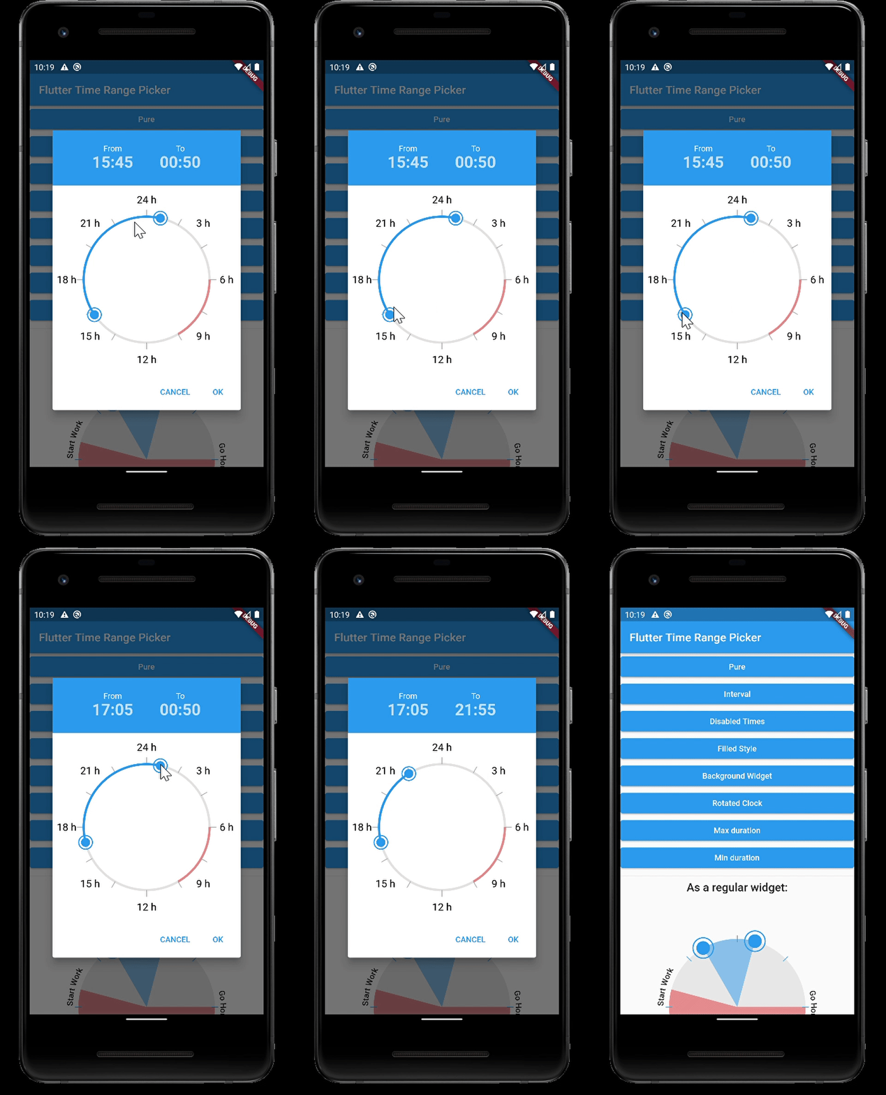
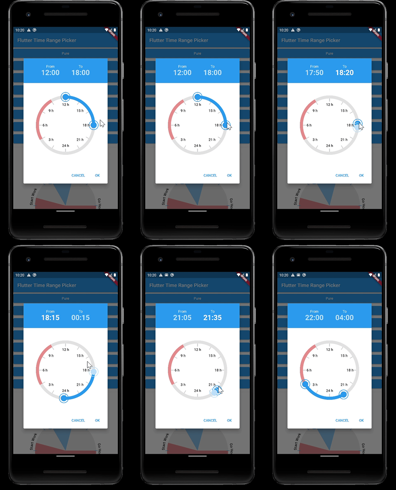
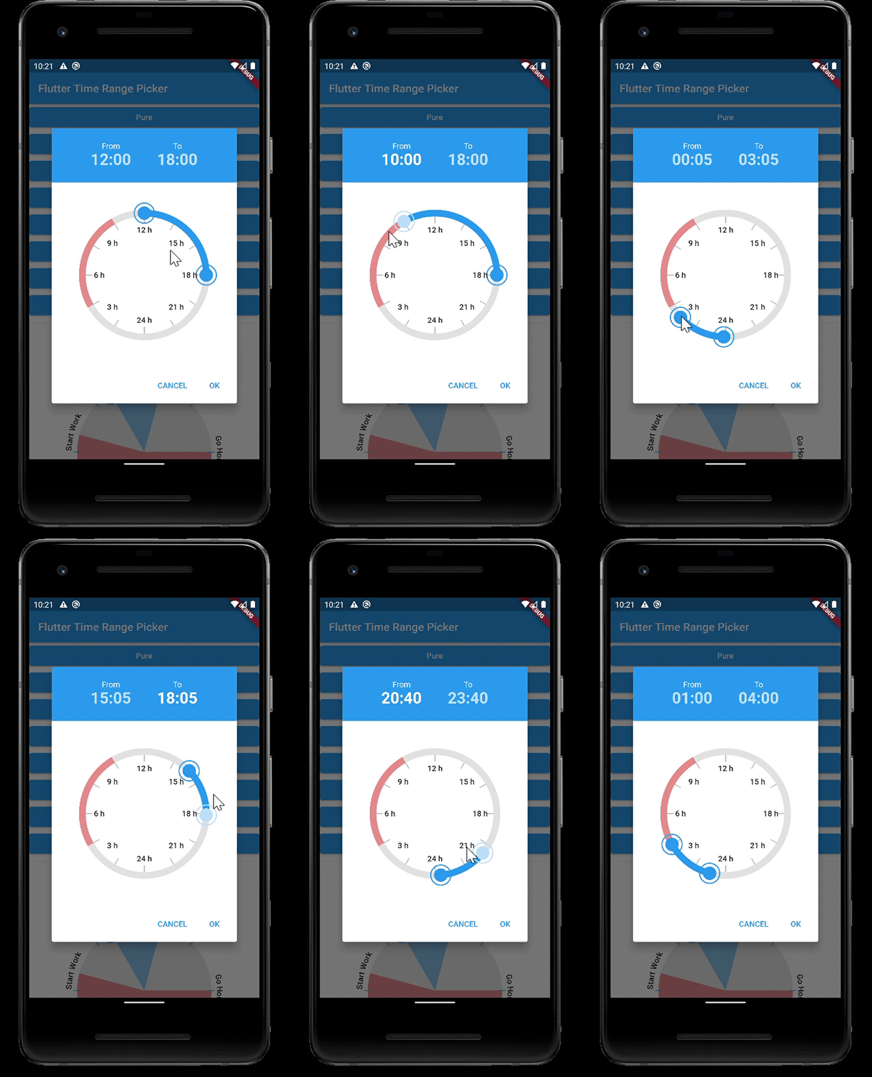
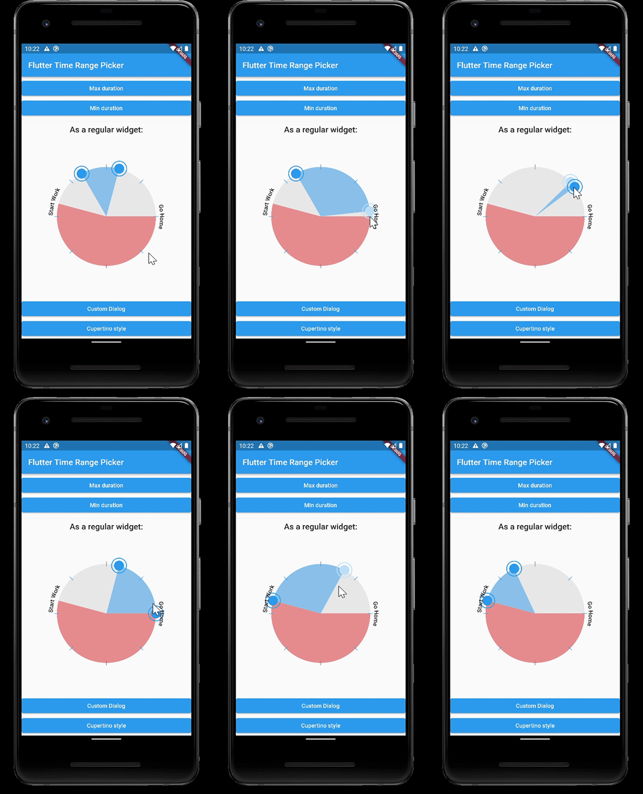
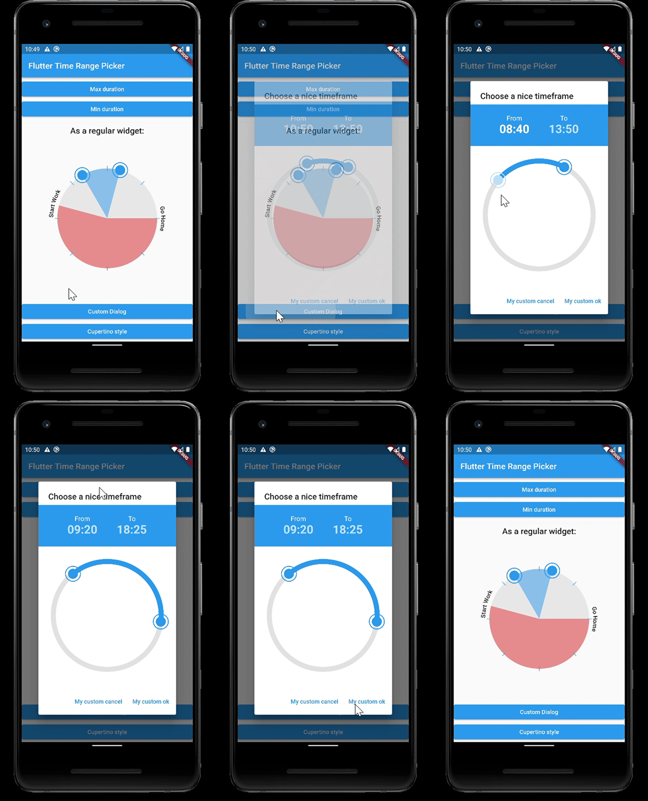
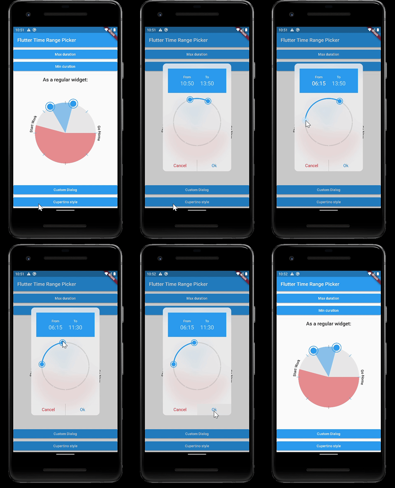
A time range picker for flutter.
Add
time_range_picker : any
to your pubspec.yaml, and run
flutter packages getin your project's root directory.
import 'package:flutter/material.dart';

import 'package:time_range_picker/time_range_picker.dart';

void main() => runApp(MyApp());

class MyApp extends StatelessWidget {
  @override
  Widget build(BuildContext context) {
    return MaterialApp(
      theme: ThemeData(
        primarySwatch: Colors.blue,
      ),
      home: MyHomePage(),
    );
  }
}

class MyHomePage extends StatelessWidget {
  @override
  Widget build(BuildContext context) {
    return Scaffold(
        backgroundColor: Colors.blueGrey,
        body: Center(
          child: RaisedButton(
            onPressed: () async {
              TimeRange result = await showTimeRangePicker(
                context: context,
              );
              print("result " + result.toString());
            },
            child: Text("Pure"),
          ),
        ));
  }
}| type | param | default | description | |
|---|---|---|---|---|
| TimeOfDay | start | TimeOfDay.now() | preselected start time | |
| TimeOfDay | end | now + 3h | preselected end time | |
| TimeRange | disabledTime | disabled time range (this time cannot be selected) | ||
| Color | disabledColor | Colors.red.withOpacity(0.5) | the color for the disabled section | |
| PaintingStyle | paintingStyle | PaintingStyle.stroke | Style of the arc (filled or stroke) | |
| Function(TimeOfDay) | onStartChange | |||
| Function(TimeOfDay) | onEndChange | |||
| Duration | interval | Duration(minutes: 5) | Minimum time steps that can be selected | |
| String | fromText | "From" | label for start time | |
| String | toText | "To" | label for end time | |
| bool | use24HourFormat | true | use 24 hours or am / pm | |
| double | padding | 36 | the padding of the ring | |
| double | strokeWidth | 12 | the thickness of the ring | |
| Color | strokeColor | primaryColor | the color of the active arc from start time to end time | |
| double | handlerRadius | 12 | the radius of the handler to drag the arc | |
| Color | handlerColor | primaryColor | the color of a handler | |
| Color | selectedColor | primaryColorLight | the color of a selected handler | |
| Color | backgroundColor | Colors.grey[200] | the color of the circle outline | |
| Widget | backgroundWidget | a widget displayed in the background, use e.g. an image | ||
| int | ticks | number of ticks displayed | ||
| double | ticksOffset | 0 | the offset for ticks | |
| double | ticksLength | strokeWidth | ticks length | |
| double | ticksWidth | 1 | ticks thickness | |
| Color | ticksColor | Colors.white | Color of ticks | |
| bool | snap | false | Snap time bar to interval | |
| List | labels | Show labels around the circle (start at 0 hours) | ||
| double | labelOffset | 20 | Offset of the labels | |
| bool | rotateLabels | true | rotate labels | |
| bool | autoAdjustLabels | true | flip labels if the angle woulb be upside down (only if rotate labels is active) | |
| TextStyle | labelStyle | Style of the labels | ||
| TextStyle | timeTextStyle | TextStyle of the time texts | ||
| TextStyle | activeTimeTextStyle | TextStyle of the currently moving time text | ||
| bool | hideTimes | false | hide the time texts | |
| double | clockRotation | 0 | rotate the clock around angle | |
| Duration | maxDuration | null | maximum Duration that can be picked | |
| Duration | minDuration | Duration(minutes: 30) | minimum Duration that can be picked | |
| bool | barrierDismissible | true | barrierDismissible false = user must tap button to close time range picker |
