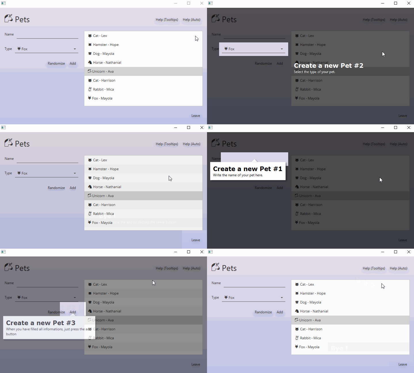
A Showcase/ Tour-guide component for JavaFx application inspired by Material Design guidelines.
<dependency>
    <groupId>com.dropsnorz</groupId>
    <artifactId>showcasefx</artifactId>
    <version>0.1.0</version>
</dependency>
Showcase showcase = new Showcase(root);
showcase.createStep(button, "This is a nice button.");
showcase.createStep(label, "A small and cute label.");
showcase.createStep(textField, "Oh, look at this awesome text field !");
showcase.start();Each Steps associates a target node and a content node. Target nodes are components to highlight and content nodes are extra information added to the scene. Each step can embed custom layout and layering strategies to override the Showcase defaults.
When your are using Showcase.createStep(Node target, String body, String title) it automatically creates a content node based on the SimpleShowcaseView class. You can still use your own components by calling Showcase.createStep(Node target, Node custom_content)
The Showcase component rendering is based on two main objects: Layer and Layout. The layer defines how a target node will be highlighted (the background and the associated shape). The layout manages the content placement strategy over the layer.
Built-In Layers
-
ShowcaseLayerShape: This type of layers allows you to define custom JavaFx shapes that will be subtracted to a background shape sized as the showcase. This will result in a transparent gap, highlighting a part of the scene.
-
ShowcaseLayerFill: Showcase fills allows you to submit background fills as layer. This si usefull to render gradients or background effects.
If built-in layers doesn't fit your needs you can always define new ones by extending the ShowcaseLayer, ShowcaseLayerShape or ShowcaseLayerFill classes.
NOTE: When you are working with built-in layouts you must fix the size of content nodes as the resizing behaviour is not handled by layouts. Use medhods setMaxSize() or setPrefSize() on content nodes or add css rules -fx-max-width, -fx-max-height, -fx-pref-width, -fx-pref-height.
Built-in Layout:
- AutoShowcaseLayout (Auto. placement strategy)
- Tooltip ShowcaseLayout (Put content node inside tooltips)
- RelativeShowcaseLayout (Place the content node with given
x.yoffsets from target) - AlignmentShowcaseLayout (Place the content node aligned with showcase bounds:
TOP,BOTTOM_LEFT,etc...)
Example
showcase.setDefaultLayout(new AutoShowcaseLayout());If built-in layouts doesn't fit your needs you can always define a new one by extending the ShowcaseLayout class.
//Creates an absolute layout
showcase.setDefaultLayout(new ShowcaseLayout() {
	Pane pane = new Pane();
	@Override
	public void addContentNode(Node content, Bounds targetBoundsInParent, double parentWidth,
			double parentHeight) {
		pane.getChildren().clear();
		pane.getChildren().add(content);
	}

	@Override
	public Node getNode() {
		return pane;
	}
});Showcase behaviour can be customized using Events handlers and Behaviours to quickly cover common use cases.
showcase.setOnClickBehaviour(ShowcaseBehaviour.NEXT);
Events handler properties: setOnShowcaseStarted, setOnShowcaseStopped, setOnShowcaseStepDisplay
| Component | Css classes |
|---|---|
| Showcase | showcase |
| Step | showcase-step-content, simple-step-view |
| Layer | showcase-layer, showcase-layer-shape, showcase-layer-fill |
| Layout | showcase-tooltip-content, showcase-tooltip-pointer |

