1652772 Xiao Rui
Script Language Programming - Course Project
School of Software Engineering
Shanghai Tongji University
2019 / 06 / 20
I've deployed the project to my online server.
The project is developed with chrome on PC in mobile device mode, and has past the test on Via browser on MEIZU 16th phone and Safari on iPhone 6s Plus.
The project is the final course project for the script language programming. It has realized the fundamental and some of the advanced requirements. And no frameworks or libraries are used.
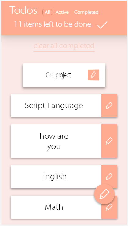
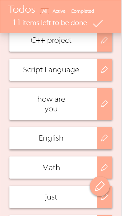
The primary functions such as creating, removing, editing todo items and local storage are completely supported. You could play with your phone-based browser. There're some advanced requirements that are implemented. They'are shown as following.
I've tried to construct the elements with material design style.
All the animations are made using css and js code. You could refer to the todoMVC.css and todoMVC.js.
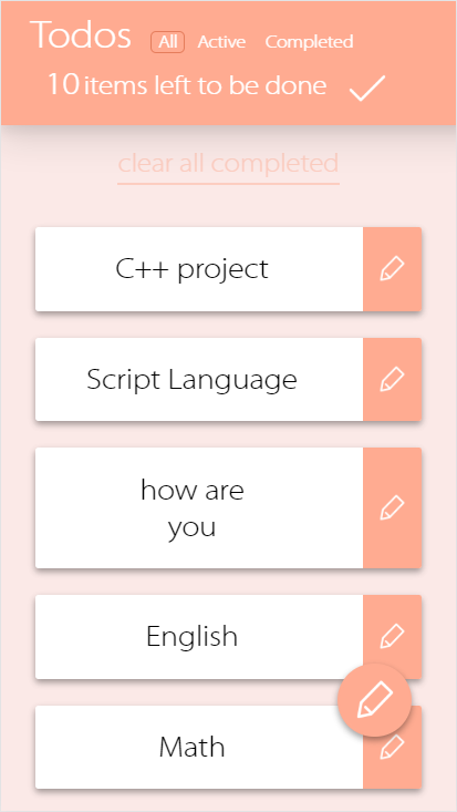
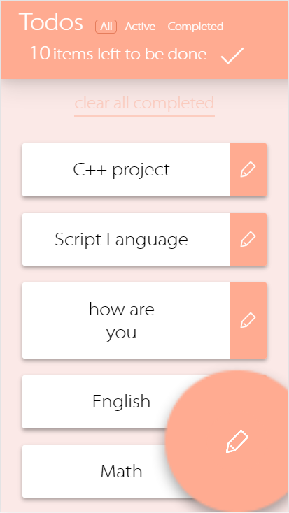
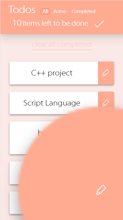
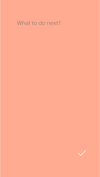
The write new item button bubble would quickly become large and show the write layer. I've used the bezier curve to describe the acceleration.
.rippling {
    animation: .3s rippling 1;
}

@keyframes rippling {
    25% {
        transform: scale(1.5);
        opacity: 1;
    }
    100% {
        transform: scale(2);
        opacity: 0;
    }
}

.button-wrapper.clicked .button-layer {
    transform: scale(30);
    transition: 1.5s cubic-bezier(.25,.8,.25,1);
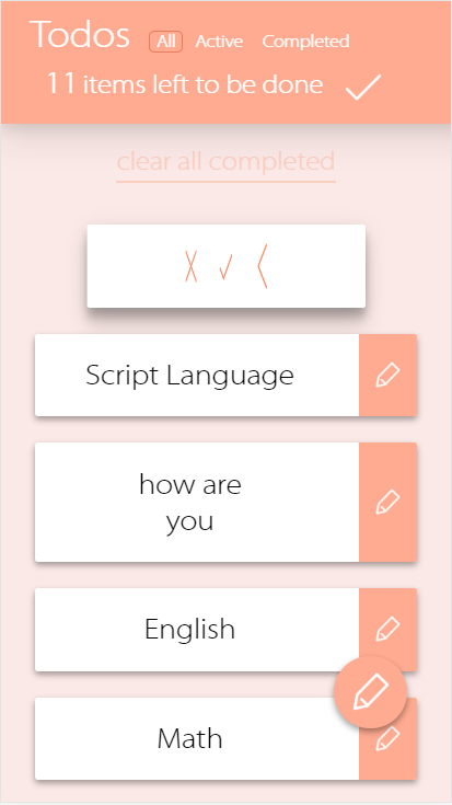
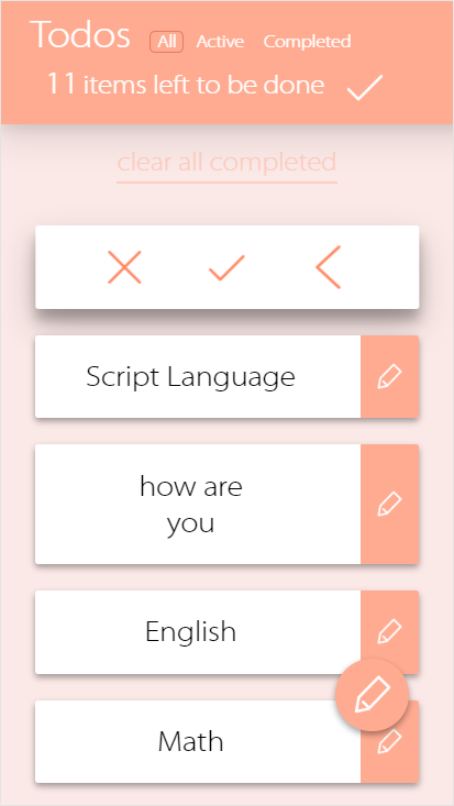
}Click the text content of the card and it would rotate to show the buttons.
.card-selected{
    transform: rotateY(-180deg);
    -webkit-transform: rotateY(-180deg);

    box-shadow: 0 14px 28px rgba(0,0,0,0.25), 0 10px 10px rgba(0,0,0,0.22);
}

.card-front{
    backface-visibility: hidden;
    -webkit-backface-visibility: hidden;

    transition: all 1s cubic-bezier(.25,.8,.25,1);
}

.card-selected .card-front{
    transform: rotateY(-180deg);
    -webkit-transform: rotateY(-180deg);
    transition: all 1s cubic-bezier(.25,.8,.25,1);
}

.card-back{
    position: absolute;
    margin-top: -15pt;
    margin-right: -150pt;
    top: 50%;
    right: 50%;
    width: 300pt;
    height: 20pt;

    transform: rotateY(-180deg);
    -webkit-transform: rotateY(-180deg);

    backface-visibility: hidden;
    -webkit-backface-visibility: hidden;

    transition: all .9s cubic-bezier(.25,.8,.25,1);
}

.card-selected .card-back{
    transform: scaleX(-1);
    -webkit-transform: scaleX(-1);
    transition: all .9s cubic-bezier(.25,.8,.25,1);
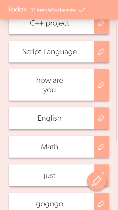
}When sliding down, the navigation bar would be folded.
And slide up to unfold it.
// begin touch event, to calculate the slide direction
document.addEventListener("touchstart", function(e){
    startx = e.touches[0].pageX;
    starty = e.touches[0].pageY;
}, false);

// end touch event
document.addEventListener("touchend", function(e) {
    var endx, endy;
    endx = e.changedTouches[0].pageX;
    endy = e.changedTouches[0].pageY;
    var direction = getDirection(startx, starty, endx, endy);
    switch (direction) {
        case 1:
            foldNav();
            break;
        case 2:
            unfoldNav();
            break;
        default:
    }
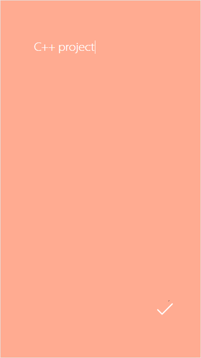
}, false);Click the edit button ( seem like a pencil ) at the right side of the card and enter the edit page of the todo item.
