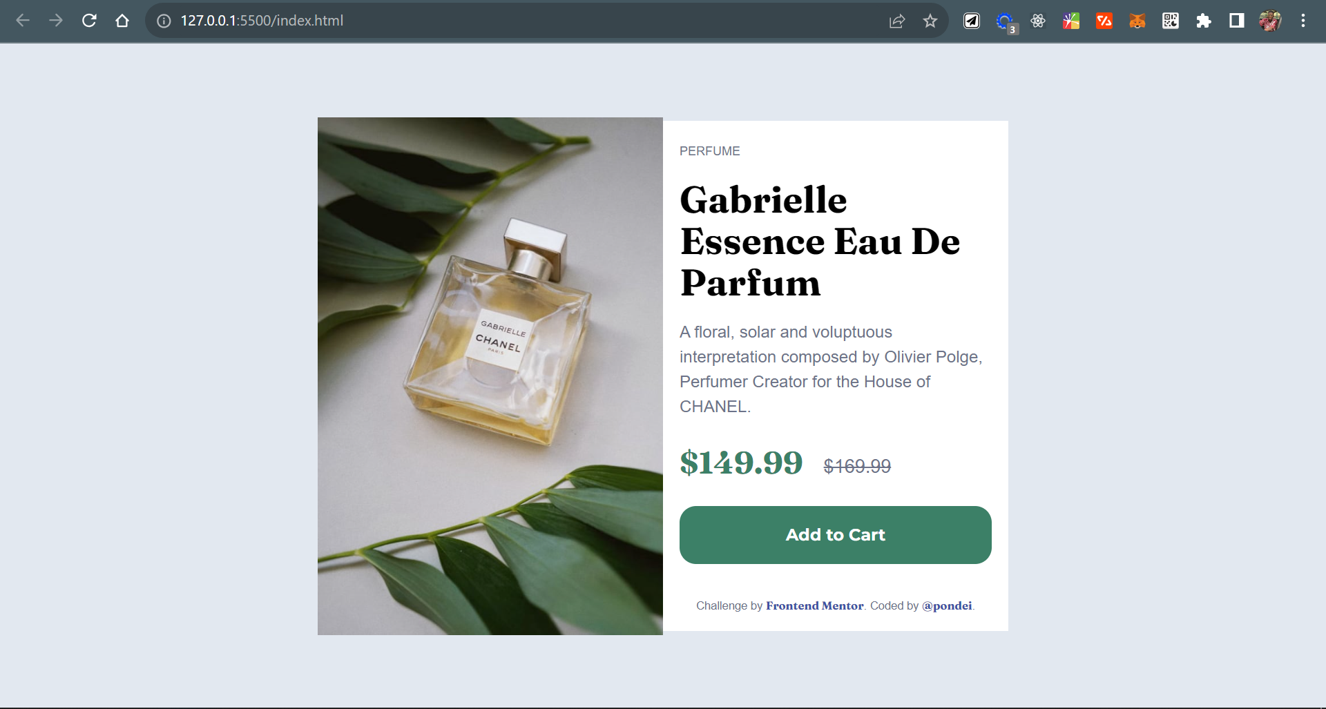
This is a solution to the Product preview card component challenge on Frontend Mentor.
Users should be able to:
- View the optimal layout depending on their device's screen size
- See hover and focus states for interactive elements
- Semantic HTML5 markup
- Flexbox
- Mobile-first workflow
- TailwindCSS - For css styling
I learnt to set up Tailwind in a plain HTML file.
Having used Tailwind extensively in react projects, it fun to implement same in a vanilla html project
- Ebimobowei Pondei
- Frontend Mentor - @ebimo21
- Twitter - @ebimopondei
