URL Link to website – https://edgarscar.github.io/OscarKennedySmith_T1-A3/
Like to GitHub Repo – https://github.com/EdgarScar/OscarKennedySmith_T1-A3
- Galaxy 5
- Browser 1280 x 698
The purpose of my portfolio website is to communicate and demonstrate my abilities to prospective employers by showcasing my talents, abilities and coding experience. Although employers take into consideration formal education qualifications, it is invaluable to be able to produce examples of practical work to demonstrate a comprehensive skill set. The website will be an amalgamation of the work I’ve produced so far as well as being an example itself of my front end development and design skills.
The design of the portfolio website is that of a futuristic feel with a simple, angular layout. Most components will incorporate geometric shapes and a colour scheme of dark greens and beige.
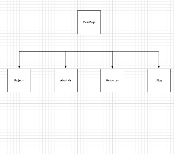
The functionality of the website will be straight forward, with a home page that has links to the four content pages. Each page will have an easily recognisable button to return the user to the main page.
The features of the website are as follows:
-
Navigation Menu Component – Location: Home Page – Style: Text, Graphic
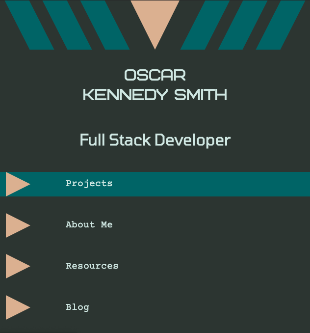
- The Navigation Menu will consist of four buttons positioned in a vertical stack. Each button will consist of a beige triangle graphic pointing right. To the right of each triangle graphic will be text, indicating the page to where the button, when clicked, will take the user. The purpose of this component is to allow the user to easily navigate the website through recognisable buttons.
-
Projects Component – Location: Projects Page – Style: Text, Graphic, Image
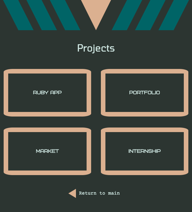
- The Projects Layout is a component that will be located front and centre on the Projects page. It will consist of four buttons, predominantly square shaped, arranged in a larger square layout. Text will be overlayed on the image and will used as a label for the project each button represents. When the mouse hovers over each button, a color change will occur. When each button is clicked, a modal window will pop up that will display further information and images about the selected project. A button, designed as a cross, will be located in the top right corner of the modal which, when clicked, will close the modal window.
-
About Me Component – Location: About Me Page – Style: Text, Image
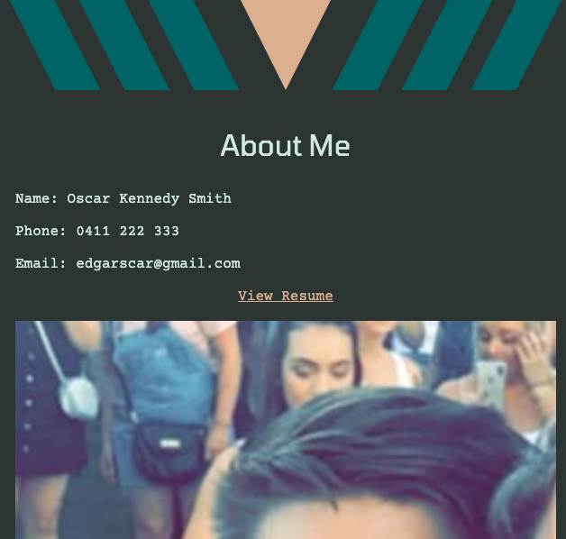
- The About Me page will feature a vertical scrolling component that will present a series of photos, accompanied by explanatory text. The component is designed to be enticing to scroll through, revealing additional information as the user scrolls lower. Above this component will be contact details. Additionally, a clearly labeled link will be displayed that when clicked, will open a PDF of my resume.
-
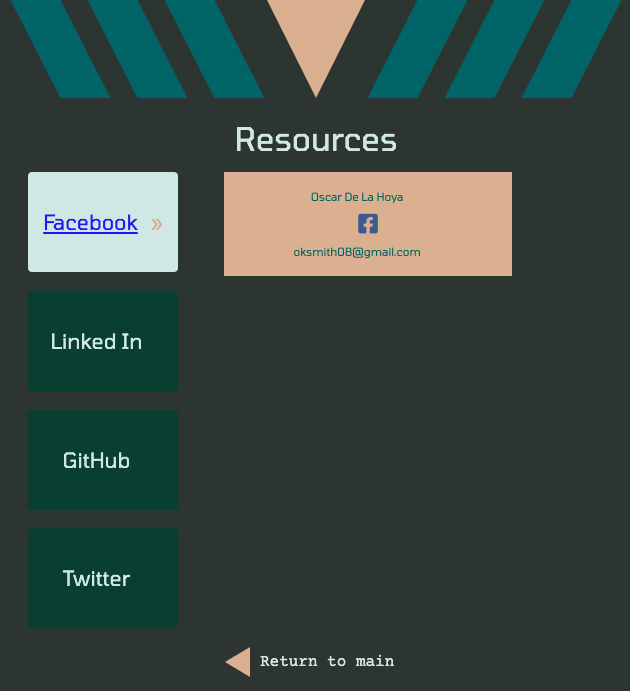
Resources Component – Location: Resources Page – Style: Text, Graphic, Icon
- The Resources Layout component will consist of four buttons, each labeled with a certain resource media. When the link is hovered over, a hidden box will appear displaying the contact/username details of the highlighted media and the accompanying logo of the specific media. The text of the bottom will also change to blue and become underlined when hovered over. This is to alert the user to the hyperlink function of each button. When clicked, each button will take the user to the selected media website.
-
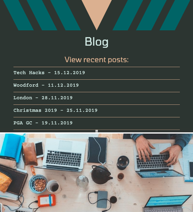
Blog Component – Location: Blog Page – Style: Text, Image
- The blog component will feature a list at the top of the page with the title and date of the most recent blog entries to have been added. When hovered over, the font will become larger and will change to indicate to the user that the title can be clicked. If clicked, it will take the user down the same page to the relevant blog post. The user can also choose to scroll down the page at will, browsing the most recent blog posts and the accompanying photo for each.
-
Graphical Header – Location: All Pages – Style: Graphic
- The Graphical Header component will consist of geometric graphics arranged in stylistic manner and will act as the main page decoration. The component will also be included at the top of every other page of the website to create consistency across the portfolio. It will be responsive as the user switches between screen resolutions.
The main page of the portfolio will consist of a large, vertical menu with four buttons. Each button will be clearly labeled and will take the user to the respective page. Once in each additional page, there will be a button at the bottom of the page that returns the user to the main page. The button will be very similar to the main navigation buttons on the home page so the user will instinctively know how to navigate back to the home page.
The target audience of the portfolio website is prospective employers in the IT industry. With the simplistic layout and design, the primary focus of the portfolio is to showcase my backend development skills, while demonstrating a worthy understanding of front end development. Narrowing the scope, the potential employers
- HTML
- CSS & SCSS
- Github (deployment)
- Trello Board
- Pencil (wire framing)
- Canva (mood board)
