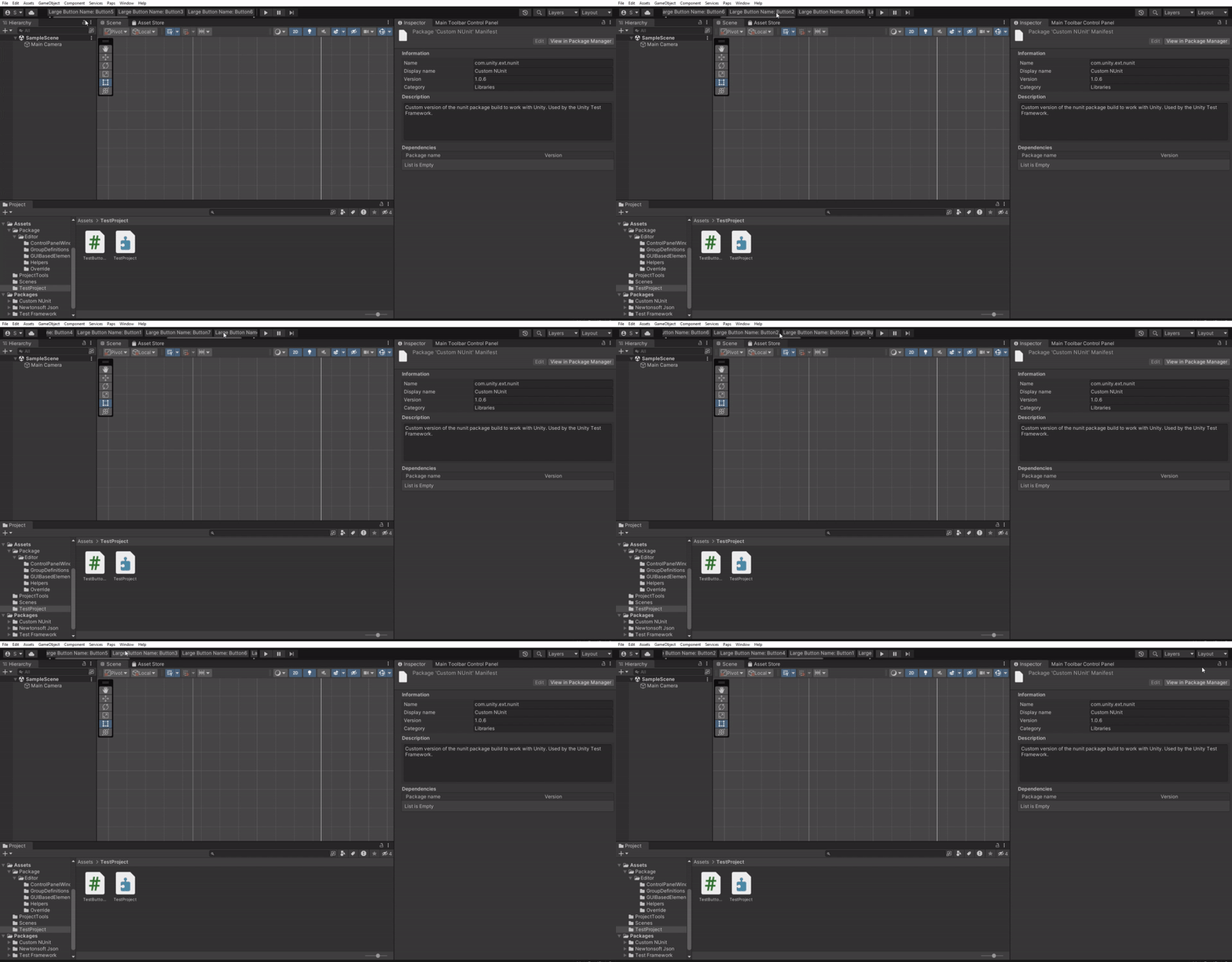
Inspired on marijnz's great Unity Toolbar Extender, Unity Toolbar Extender UI Toolkit allows you to extend Unity's main toolbar using Unity's UI Toolkit.
- Unity Toolbar Extender UI Toolkit
- Install
- Getting Started
- Group Your Elements to Save Space
- Hide Unity's Native Toolbar Visual Elements. Save Even More Space
- MainToolbar Class
- Styling Your Main Toolbar Elements
- Eligible Classes for Recommended Style Application
- Miscelaneous Information
- Tested Versions
- License
Open Packages/manifest.json with your favorite text editor. Add a scoped registry and following line to dependencies block:
{
  "scopedRegistries": [
    {
      "name": "npmjs",
      "url": "https://registry.npmjs.org/",
      "scopes": [
        "com.paps"
      ]
    }
  ],
  "dependencies": {
    "com.paps.unity-toolbar-extender-ui-toolkit": "1.0.0"
  }
}
Package should now appear in package manager.
The package is also available on the openupm registry. You can install it eg. via openupm-cli.
openupm add com.paps.unity-toolbar-extender-ui-toolkit
Open Package Manager window, Go to Top left plus icon -> Add package from git URL. There add the following: https://github.com/Sammmte/unity-toolbar-extender-ui-toolkit.git?path=/Assets/Package
It is recommended to import package samples in your project. To do this Open Package Manager -> Filter by In Project packages -> Click Unity Toolbar Extender UI Toolkit package -> In package window select Samples -> Click Import.
Inherit from any Unity's built-in visual element, tag it with MainToolbarElementAttribute and define an id. You can place the script in any Editor folder or subfolder or in a folder with an editor assembly definition.
using Paps.UnityToolbarExtenderUIToolkit;
using UnityEngine;
using UnityEngine.UIElements;

[MainToolbarElement(id: "TheAwesomeButton")]
public class MyAwesomeButton : Button
{
    public MyAwesomeButton()
    {
        text = "Awesome Button";
        clicked += () => Debug.Log("Awesome debug");
    }
}using Paps.UnityToolbarExtenderUIToolkit;
using UnityEngine.UIElements;
[MainToolbarElement(id: "LeftButton", ToolbarAlign.Left)]
public class MyLeftButton : Button
{
public MyLeftButton()
{
text = "Left Button";
}
}
[MainToolbarElement(id: "RightButton", ToolbarAlign.Right)]
public class MyRightButton : Button
{
public MyRightButton()
{
text = "Right Button";
}
}Left elements are ordered from right to left. Right elements from left to right.
using Paps.UnityToolbarExtenderUIToolkit;
using UnityEngine.UIElements;

[MainToolbarElement(id: "FirstLeftButton", ToolbarAlign.Left, order: 1)]
public class FirstLeftButton : Button
{
    public FirstLeftButton()
    {
        text = "1st Button";
    }
}

[MainToolbarElement(id: "SecondLeftButton", ToolbarAlign.Left, order: 2)]
public class SecondLeftButton : Button
{
    public SecondLeftButton()
    {
        text = "2nd Button";
    }
}

[MainToolbarElement(id: "FirstRightButton", ToolbarAlign.Right, order: 1)]
public class FirstRightButton : Button
{
    public FirstRightButton()
    {
        text = "1st Button";
    }
}

[MainToolbarElement(id: "SecondRightButton", ToolbarAlign.Right, order: 2)]
public class SecondRightButton : Button
{
    public SecondRightButton()
    {
        text = "2nd Button";
    }
}using Paps.UnityToolbarExtenderUIToolkit;
using UnityEngine.UIElements;
using System.Collections.Generic;
[MainToolbarElement(id: "AwesomeToggle", ToolbarAlign.Left)]
public class MyAwesomeToggle : Toggle
{
public MyAwesomeToggle() : base(label: "Awesome Toggle")
{
}
}
[MainToolbarElement(id: "AwesomeDropdownField", ToolbarAlign.Right)]
public class MyAwesomeDropdownField : DropdownField
{
public MyAwesomeDropdownField() : base(
label: "Awesome Dropdown",
choices: new List<string>() { "Option 1", "Option 2"},
defaultIndex: 0)
{
}
}
[MainToolbarElement(id: "AwesomeSlider", ToolbarAlign.Left)]
public class MyAwesomeSlider : Slider
{
public MyAwesomeSlider() : base(
label: "Awesome Slider",
start: 0,
end: 100)
{
}
}
[MainToolbarElement("MyAwesomeIntField", ToolbarAlign.Right)]
public class MyAwesomeIntegerField : IntegerField
{
public MyAwesomeIntegerField() : base("My Awesome Int")
{
}
}As long as your class inherits from VisualElement class, you can create whatever you want.
using Paps.UnityToolbarExtenderUIToolkit;
using UnityEngine.UIElements;

[MainToolbarElement(id: "AwesomeThing")]
public class MyAwesomeWhatever : VisualElement
{
    private Toggle _displaySliderToggle;
    private Slider _slider;

    public MyAwesomeWhatever()
    {
        _displaySliderToggle = new Toggle("Display slider");
        _slider = new Slider(0, 100);

        _displaySliderToggle.labelElement.style.minWidth = 0;

        _slider.style.display = DisplayStyle.None;
        _slider.style.minWidth = 150;

        _displaySliderToggle.RegisterCallback<ChangeEvent<bool>>(OnToggleValueChanged);

        style.minWidth = 300;
        style.flexDirection = FlexDirection.Row;

        Add(_displaySliderToggle);
        Add(_slider);
    }

    private void OnToggleValueChanged(ChangeEvent<bool> eventArgs)
    {
        var displayToggle = eventArgs.newValue;

        if (displayToggle)
            _slider.style.display = DisplayStyle.Flex;
        else
            _slider.style.display = DisplayStyle.None;
    }
}- If you want to apply custom style to your elements, please read Styling Your Main Toolbar Elements section.
- You can define a main toolbar element that inherits from
IMGUIContainerto render stuff withIMGUI. Remember to useGUILayout.BeginHorizontalandGUILayout.EndHorizontalto render your things in row. - Main toolbar elements may be instantiated more than once, whenever
MainToolbarAutomaticExtenderrefreshes. Take it into account if you need to make some heavy process with your elements.
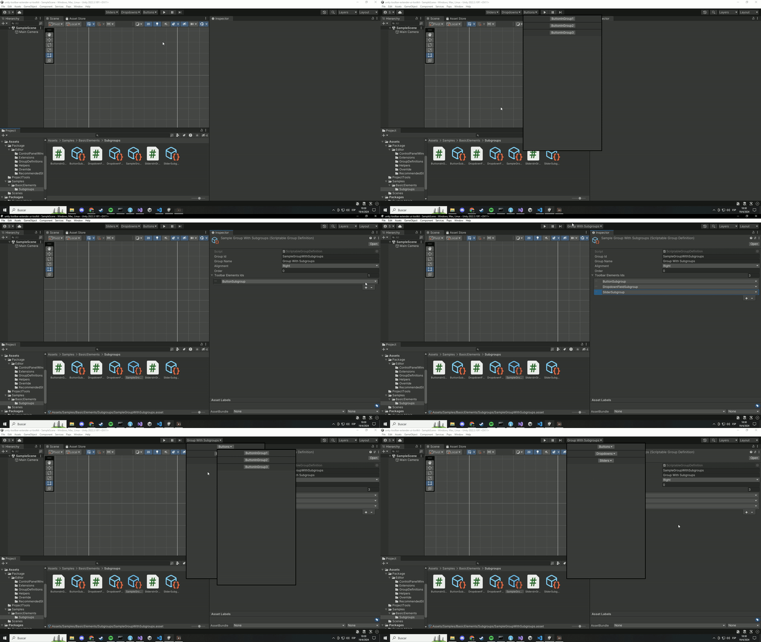
Create a Group Definition asset and group any visual element in it. They will be hidden and shown by a dropdown.
To create a Group Definition asset go to Project Window -> Right Click -> Create -> Paps -> Unity Toolbar Extender UI Toolkit -> Group Definition
When configuring ToolbarElementsIds property in your group definition asset, add a new element and select the id of other group asset.
Group elements display a small window that works almost like a popup window. If your custom element displays a window, by default the group element window will be closed. To tell group element window that your window is a subwindow mark your EditorWindow derived class with GroupPopupSubWindowAttribute. This attribute can also be used with classes derived from PopupWindowContent.
Example with EditorWindow
using Paps.UnityToolbarExtenderUIToolkit;
using UnityEditor;
using UnityEditor.Toolbars;
using UnityEngine;
using UnityEngine.UIElements;

[MainToolbarElement("MyDropdownWithWindow")]
public class DropdownInGroupWithWindow : EditorToolbarDropdown
{
    public DropdownInGroupWithWindow()
    {
        text = nameof(DropdownInGroupWithWindow);
        clicked += ShowDropdownWindow;
    }

    private void ShowDropdownWindow()
    {
        var newWindowDropdown = ScriptableObject.CreateInstance<DropdownWindow>();
        // Check important notes to know more about ShowAsDropdownForMainToolbar method
        newWindowDropdown.ShowAsDropdownForMainToolbar(worldBound, new Vector2(200, 200));
    }
}

[GroupPopupSubWindow]
public class DropdownWindow : EditorWindow
{
    private void CreateGUI()
    {
        var debugButton = new Button(() => Debug.Log("What a debug!"));
        debugButton.text = "Debug";

        var closeButton = new Button(() => Close());
        closeButton.text = "Close";

        rootVisualElement.Add(debugButton);
        rootVisualElement.Add(closeButton);
    }
}
Example with PopupWindowContent
using Paps.UnityToolbarExtenderUIToolkit;
using UnityEditor;
using UnityEditor.Toolbars;
using UnityEngine;
using UnityEngine.UIElements;

[MainToolbarElement("MyDropdownWithPopupWindowContent")]
public class DropdownInGroupWithPopupWindow : EditorToolbarDropdown
{
    public DropdownInGroupWithPopupWindow()
    {
        text = nameof(DropdownInGroupWithPopupWindow);
        clicked += ShowPopupWindow;
    }

    private void ShowPopupWindow()
    {
        UnityEditor.PopupWindow.Show(worldBound, new PopupWindowContentThatWorksInASubgroup());
    }
}

[GroupPopupSubWindow]
public class PopupWindowContentThatWorksInASubgroup : PopupWindowContent
{
    public override void OnOpen()
    {
        var debugButton = new Button(() => Debug.Log("What a debug!"));
        debugButton.text = "Debug";

        var closeButton = new Button(() => editorWindow.Close());
        closeButton.text = "Close";

        editorWindow.rootVisualElement.Add(debugButton);
        editorWindow.rootVisualElement.Add(closeButton);
    }

    public override void OnGUI(Rect rect)
    {

    }
}- Elements inside a group don't have alignment. The
Alignmentproperty on visual elements marked withMainToolbarElementAttributewill be ignored. - Groups display their inner elements in column.
- The order the inner elements are displayed is determined by the
ToolbarElementsIdsarray elements order. - Group popup windows won't close if focused window is
UI Toolkit Debugger, so you can analyze your elements inside these windows. - When showing a custom window as a dropdown, with
EditorWindow.ShowAsDropdownmethod, it is recommended to use a extension method provided in this package, namedShowAsDropdownForMainToolbar. This method uses the original inside but applies some position adjustments that would, otherwise, render the window at a wrong position. For some reason this does not happen withPopupWindow.Showmethod.
Open the Main Toolbar Control Panel Window. Go to Paps -> Unity Toolbar Extender UI Toolkit -> Windows -> Main Toolbar Control Panel.
Hide any toolbar visual element, either Unity's or yours.
MainToolbarAutomaticExtenderhides visual elements by setting their style propertydisplaytoDisplay.None.- There are 2 exceptions to the previous rule, Unity's
AccountDropdownandCloudButtonelements. These 2 elements can't be hidden by modifyingdisplayproperty, so the way this package hides them is by removing them from the hierarchy. - If you want to reset these overrides, go to
Paps -> Unity Toolbar Extender UI Toolkit -> Delete Actions -> Reset Overrides.
Everything covered in this article until now is managed by MainToolbarAutomaticExtender static class. If, by any chance, you don't want to manage your visual elements the way I meant, you can access the MainToolbar static class and manipulate Unity's main toolbar and its elements.
You can listen to OnInitialized event and apply your changes once initialized. To subscribe to this event you need to subscribe to it before the first editor update. The easiest way is to do it in the static constructor of a class marked with InitializeOnLoad attribute. You can also check the IsAvailable property to check if it is initialized.
using Paps.UnityToolbarExtenderUIToolkit;
using UnityEditor;

[InitializeOnLoad]
public static class MyOwnMainToolbarManager
{
    static MyOwnMainToolbarManager()
    {
        MainToolbar.OnInitialized += DoSomeStuff;
    }

    private static void DoSomeStuff()
    {
        // I do my stuff here
    }
}
You can access Unity's toolbar visual elements, like the play buttons container, the left (where the cloud button is) or the right (where the layouts dropdown is).
using Paps.UnityToolbarExtenderUIToolkit;
using UnityEditor;
using UnityEditor.Toolbars;

[InitializeOnLoad]
public static class MyOwnMainToolbarManager
{
    static MyOwnMainToolbarManager()
    {
        MainToolbar.OnInitialized += DoSomeStuff;
    }

    private static void DoSomeStuff()
    {
        var myOwnPlayButton = new EditorToolbarButton("My Play Button",
            () => EditorApplication.EnterPlaymode());

        MainToolbar.PlayModeButtonsContainer.Add(myOwnPlayButton);
    }
}
Unity's toolbar gets destroyed when the editor layout changes (through layout dropdown normally). When this happens MainToolbar class will try to get the new object. Because of this, any change made to the toolbar goes away, so you'll need to re-apply your changes. To do this, listen to OnRefresh event and you can do the same things you did when OnInitialized event happened.
- Visual elements with
MainToolbarElementAttributeare handled byMainToolbarAutomaticExtenderstatic class. Although you could, it's not officially supported to use this feature while manipulatingMainToolbarclass directly.
Some common built-in visual elements have some issues when added to the toolbar containers (e.g Button and DropdownField that are rendered with a white broken-like texture), and some other when they are added to the group element window (e.g EditorToolbarDropdown that doesn't render its foldout arrow).
Check this example.
To workaround this, MainToolbarAutomaticExtender applies some changes to style of most of your custom visual elements when they are added either to toolbar containers or to group element windows.
Because of this, if you want to style your custom visual elements yourself you should set MainToolbarElementAttribute parameter useRecommendedStyles to false. Otherwise, your overrides might collide with extender's overrides. You can check if your class will be styled with recommended styles in this list.
using Paps.UnityToolbarExtenderUIToolkit;
using UnityEngine.UIElements;

[MainToolbarElement(id: "StyledButton", useRecommendedStyles: false)]
public class MyStyledButton : Button
{
    public MyStyledButton()
    {
        // I change the style of my button here
    }
}If your custom main toolbar element meets at least one of the following criteria, it will be eligible to be styled with recommended styles:
- Inherits from
Buttonand does not inherits fromEditorToolbarButton - Inherits from
Toggleand does not inherits fromEditorToolbarToggle - Inherits from
Slider - Inherits from
DropdownField - Inherits from
EditorToolbarDropdown - Inherits from
IntegerField - Inherits from
FloatField - Inherits from
TextField
Remember that you can disable this feature by setting useRecommendedStyles to false in MainToolbarElementAttribute constructor.
- This is the main manager. Most of the magic happens inside.
- This class WON'T do anything, unless you mark at least one type derived from
VisualElementwithMainToolbarElementAttribute. - When this manager initializes it applies some changes to style of native containers of Unity's main toolbar. This means that those containers behave in a way when
MainToolbarAutomaticExtenderis initialized and other way when it is not.
- This package uses EditorPrefs and json tool from Newtonsoft. A single EditorPrefs key is used to save a json object and the other classes write to this json object. If you experience some weird behaviour and you suspect it could be this cache data, you can delete it to start over. To do this go to
Paps -> Unity Toolbar Extender UI Toolkit -> Delete Actions -> Delete package related EditorPrefs.
This package was tested in:
- Unity 2022.2
- Windows
- Unity 2022.3
- Windows
- Unity 2023.2
- Windows
MIT LICENSE


