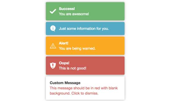
NOTE: Since version 1.1.0, ng2-toastr has added animation for displaying/dismissing toasts. For configuration, see Choose animation option. For some browsers, a polyfill is required. Grab web-animations.min.js and add it to your page.
The lib is inspired by [angular-toastr] (https://github.com/Foxandxss/angular-toastr), and will show bootstrap-like toasts. Please update Angular 2 to latest version to avoid any unexpected issues.
    // AppComponent.ts (Root component of your app)

    constructor(public toastr: ToastsManager, vRef: ViewContainerRef) {
        this.toastr.setRootViewContainerRef(vRef);
    }
-
Added
onClickToastobservable onToastManagerinstance. -
Now you can added custom data object to each toast.
Following example shows how to allow user to click on toast to navigate to new path:
this.toastr.onClickToast() .subscribe( toast => { if (toast.data && toast.data.url) { // navigate to this.router.navigate(toast.data.url); } }); this.toastr.success('You are awesome! Click to view details.', 'Success!', {data: {url: '/path/to/successUrl'}}); -
Each
Toastinstance includestimeoutId, which allows developer to stop auto-dismiss.if (toast.timeoutId) { clearTimeout(toast.timeoutId); // do something before dismiss the toast this.toastr.dismiss(toast); } -
Removed
autoDismissonToastOptions, usedismissinstead. -
Added
newestOnTopandshowCloseButtononToastOptions.
-
Install ng2-toastr using npm:
npm install ng2-toastr --save -
Include js and css files in html header
<link href="node_modules/ng2-toastr/bundles/ng2-toastr.min.css" rel="stylesheet" />
<script src="node_modules/ng2-toastr/bundles/ng2-toastr.min.js"></script>
NOTE: If you are using angular-cli you do not need to include 'node_modules/ng2-toastr/bundles/ng2-toastr.min.js', since adding 'import {ToastModule} from 'ng2-toastr/ng2-toastr';' to your module file (below) will allow it to be autoloaded.
-
Add ToastModule into your AppModule class.
app.module.tswould look like this:import {NgModule} from '@angular/core'; import {BrowserModule} from '@angular/platform-browser'; import {AppComponent} from './app.component'; import {ToastModule} from 'ng2-toastr/ng2-toastr'; @NgModule({ imports: [BrowserModule, ToastModule], declarations: [AppComponent], bootstrap: [AppComponent], }) export class AppModule { }
-
Inject 'ToastsManager' class in your component class.
    import { ToastsManager } from 'ng2-toastr/ng2-toastr';

    @Component({
      selector: 'awesome-component',
      template: '<button class="btn btn-default" (click)="showSuccess()">Toastr Tester</button>'
    })
    export class AppComponent {

      constructor(public toastr: ToastsManager) {
      }

      showSuccess() {
        this.toastr.success('You are awesome!', 'Success!');
      }

      showError() {
        this.toastr.error('This is not good!', 'Oops!');
      }

      showWarning() {
        this.toastr.warning('You are being warned.', 'Alert!');
      }

      showInfo() {
        this.toastr.info('Just some information for you.');
      }

      showCustom() {
        this.toastr.custom('<span style="color: red">Message in red.</span>', null, {enableHTML: true});
      }
    }
NOTE: Since version 1.2.0, all 'show' methods return Promise<Toast>.
Should you need specific logic to determine when a toaster will be dismissed you can store the displayed Toast.
Be cautious when the toaster can be dismissed in other ways such as dismiss: 'auto' or dismiss: 'click'.
    this.toastr.success('You are awesome!', 'Success!', {dismiss: 'controlled'})
        .then((toast: Toast) => {
            setTimeout(() => {
                this.toastr.dismissToast(toast);
            }, 10000);
        });
By default, the toastr will show up at top right corner of the page view, and will automatically dismiss in 3 seconds. You can configure the toasts using ToastOptions class. Currently we support following options:
Determines how long an auto-dismissed toast will be shown. Defaults to 3000 miliseconds.
Determine how a displayed toaster can be dismissed. Allowed values are: 'auto', 'click', 'controlled' (value should all be lowercase).
- auto: Toaster will auto dismiss in miliseconds (value specified by
toastLife). This is default value. - click: Toaster will be dismissed when user click on it.
- controlled: Toaster will be dismissed based on specific logic.
Determines whether new toast should show up on top of previous toast Defaults to false.
Determines whether toast should include 'x' close button. Defaults to false.
Determines maximum number of toasts can be shown on the page in the same time. Defaults to 5.
Determines where on the page the toasts should be shown. Here are list of values:
- toast-top-right (Default)
- toast-top-center
- toast-top-left
- toast-top-full-width
- toast-bottom-right
- toast-bottom-center
- toast-bottom-left
- toast-bottom-full-width
CSS class for message within toast.
CSS class for title within toast.
You have following choice: 'fade', 'flyLeft' or 'flyRight'.
- fade: makes every toast either fade in or fade out.
- flyLeft: makes every toast fly in from left side.
- flyRight: makes every toast fly in from right side.
Defaults to 'fade'. You can set
animate: nullto disable animations.
Allow input of message to be HTML. Default to false.
Use dependency inject for custom configurations. You can either inject into app.module.ts or any component class:
import {NgModule} from '@angular/core';
import {BrowserModule} from '@angular/platform-browser';
import {AppComponent} from './app.component';
import {ToastModule, ToastOptions} from 'ng2-toastr/ng2-toastr';

let options: ToastOptions = new ToastOptions({
  animate: 'flyRight',
  positionClass: 'toast-bottom-right',
});

@NgModule({
  imports: [BrowserModule,
        ToastModule.forRoot(options),
    ],
  declarations: [AppComponent],
  bootstrap: [AppComponent],
})
export class AppModule {

}
You can also override dismiss, toastLife, enableHTML, titleClass, messageClass options for individual toast:
this.toastr.sucess('This toast will dismiss in 10 seconds.', null, {toastLife: 10000});
this.toastr.info('<span style="color: red">Message in red.</span>', null, {enableHTML: true});
NOTE: specify a value for toastLife overrides dismiss and always set dismiss = 'auto'.
> cd demo/systemjs && npm install
> npm start
Then navigate your browser to http://localhost:3000
> cd demo/webpack && npm run install
> npm run build
> npm start

