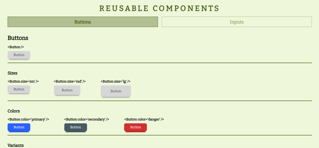
Page that shows a reusable component made with React. This component is a button with differents states that change his style.
The demo it is deployed on Vercel
- React
- Bootstrap Icons
- Semantic HTML
- CSS
This application/site was created as a submission to a DevChallenges challenge. The challenge was to build an application to complete the given user stories.
This React component require some props to render.
When you render the component without props obtains a default button.
<Button />To define a text to the button, we'll use the value prop.
<Button value='Click me' />The Button component has three sizes established to which we will have access from the size prop.
<Button size='sm' />
<Button size='md' />
<Button size='lg' />
It also features three different styles accessible with the variant prop.
<Button variant='default' />
<Button variant='outline' />
<Button variant='text' />
We can also choose between four different colors with the prop color.
<Button color='default' />
<Button color='primary' />
<Button color='secondary' />
<Button color='danger' />
The default button has a box-shadow that we can disable using the disableShadow prop.
<Button disablShadow />We have the option of put an icon using the props iconStart and iconEnd. This props recibe a string that corresponding the icon's name provided by Bootstrap Icons.
<Button iconStart='send-fill'/>
<Button iconEnd='send-fill'/>
Also we have access to the button attributes like type (default is 'button'), id, class, disabled and onClick from the props: type, id, customClass, disabled and onClick
<Button type='submit' />
<Button id='btn_send' />
<Button customClass='btn_visit' />
<Button disabled />
<Button onClick={() => {}} />As with the button, we will access the characteristics of the Input through props.
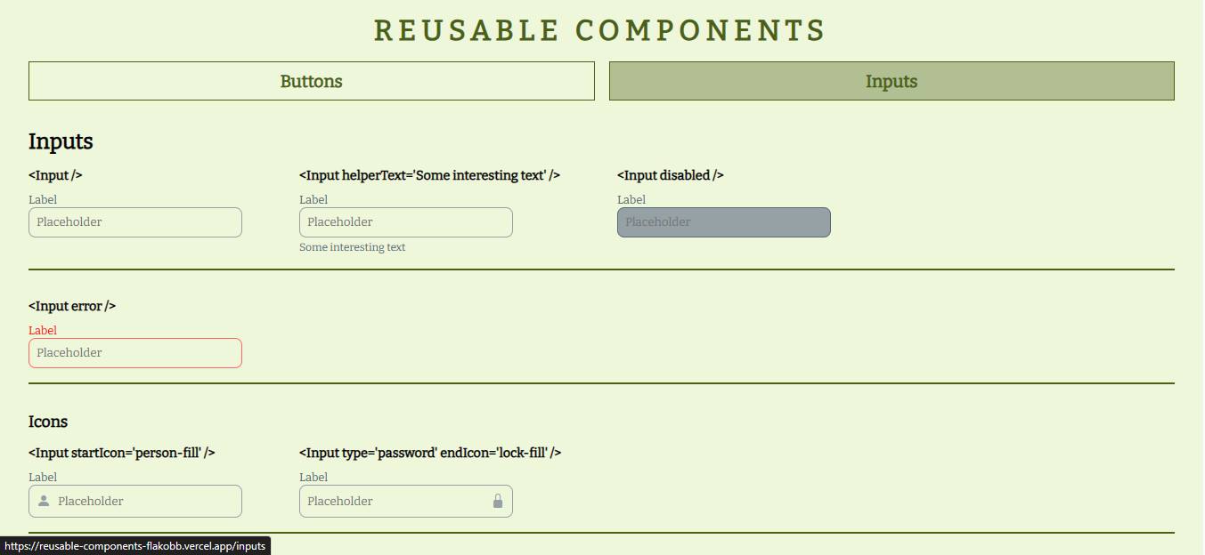
When you render the component without props obtains a default input.
<Input />To define a label and placeholder we use the label and placeholder props.
<Input label='Username' placeholder='@username_30' />We can put a help text at the bottom using the helperText prop.
<Input helperText='Min 6 characters' />Also we can define a initial value with the value prop.
<Input value='Hello World' />We have the possibility of placing an icon to the right or to the left of the input using the startIcon and endIcon props that receive a string that corresponds to the name of some Bootstrap icon.
<Input startIcon='person-fill' />
<Input endIcon='person-fill' />
We can choose between 3 specific sizes or put the width at 100% with the size prop.
<Input size='sm' />
<Input size='md' />
<Input size='lg' />
<Input size='fullWidth' />
Also can choose between four colors (blue, green, pink and purple) with the color prop.
<Input color='blue' />
<Input color='green' />
<Input color='pink' />
<Input color='purple' />
We can indicate that the input is multiline using the multiline prop and specifying the number of visible lines with the rows prop.
<Input multiline /> // default: rows='4'
<Input multiline rows='10' />
We have the error prop that provides the input with a group of different styles useful to validate the field in a form.
<Input error />in the same way we have the possibility of deactivating some field using the disabled prop.
<Input disabled />Finally, we also have access to different attributes of an input.
<Input id='user' />
<Input type='password' />
<Input name='description' />
<Input required />FlakoBB: Follow me

