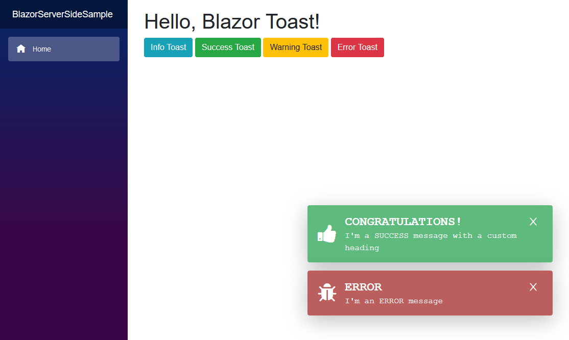
This is a JavaScript free toast implementation for Blazor and Razor Components applications. It supports icons that are either specified by class name (such as fontawesome) or by a specified element (Material Design).
You can install the package via the NuGet package manager just search for Blazored.Toast. You can also install via powershell using the following command.
Install-Package Blazored.ToastOr via the dotnet CLI.
dotnet add package Blazored.ToastYou will need to register the Blazored Toast service in your application
Add the following line to your applications Startup.ConfigureServices method.
public void ConfigureServices(IServiceCollection services)
{
    services.AddBlazoredToast();
}Add the following line to your applications Program.Main method.
builder.Services.AddBlazoredToast();Add the following to your _Imports.razor
@using Blazored.Toast
@using Blazored.Toast.ServicesAdd the <BlazoredToasts /> tag into your applications MainLayout.razor.
Toasts are configured using parameters on the <BlazoredToasts /> component. The following options are available.
- InfoClass
- InfoIcon
- SuccessClass
- SuccessIcon
- WarningClass
- WarningIcon
- ErrorClass
- ErrorIcon
- IconType (Default: IconType.FontAwesome)
- Position (Default: ToastPosition.TopRight)
- Timeout (Default: 5)
By default, you don't need to provide any settings everything will just work. But if you want to add icons to toasts or override the default styling then you can use the options above to do that.
For example, to add a icon from Font Awesome to all success toasts you can do the following.
<BlazoredToasts SuccessIcon="fa fa-thumbs-up"/>Setting the position also requires a reference to Blazored.Toast.Configuration, for example:
@using Blazored.Toast.Configuration

<BlazoredToasts Position="ToastPosition.BottomRight"
                Timeout="10"
                IconType="IconType.FontAwesome"
                SuccessClass="success-toast-override"
                SuccessIcon="fa fa-thumbs-up"
                ErrorIcon="fa fa-bug" />
The example above is from the client side samples.
<BlazoredToasts Position="ToastPosition.BottomRight"
                Timeout="10"
                IconType="IconType.Material"
                ErrorIcon="error_outline"
                InfoIcon="school"
                SuccessIcon="done_outline"
                WarningIcon="warning" />
The example above is from the server side samples and demonstrates the use of Material Design icons.
Add the following line to the head tag of your _Host.cshtml (Blazor Server app) or index.html (Blazor WebAssembly).
The blazored-toast.css includes the open-iconic-bootstrap.min.css.
We ship both minified and unminified CSS.
For minifed use:
<link href="_content/Blazored.Toast/blazored-toast.min.css" rel="stylesheet" />
For unminifed use:
<link href="_content/Blazored.Toast/blazored-toast.css" rel="stylesheet" />
Presumably, if you want to use the Material Icons your project already includes some form of the icons. If not see Material Design Icons for the available alternatives.
In order to show a toast you have to inject the IToastService into the component or service you want to trigger a toast. You can then call one of the following methods depending on what kind of toast you want to display, passing in a message and an optional heading.
ShowInfoShowSuccessShowWarningShowError
@page "/toastdemo"
@inject IToastService toastService

<h1>Toast Demo</h1>

To show a toast just click one of the buttons below.

<button class="btn btn-info" @onclick="@(() => toastService.ShowInfo("I'm an INFO message"))">Info Toast</button>
<button class="btn btn-success" @onclick="@(() => toastService.ShowSuccess("I'm a SUCCESS message with a custom title", "Congratulations!"))">Success Toast</button>
<button class="btn btn-warning" @onclick="@(() => toastService.ShowWarning("I'm a WARNING message"))">Warning Toast</button>
<button class="btn btn-danger" @onclick="@(() => toastService.ShowError("I'm an ERROR message"))">Error Toast</button>
Full examples for client and server-side Blazor are included in the samples.
You can display a progress bar which gives a visual indicator of the time remaining before the toast will disappear. In order to show the progress bar set the ShowProgressBar parameter to true.
<BlazoredToasts Position="ToastPosition.BottomRight"
                Timeout="10"
ShowProgressBar="true" />If you wish to clear any visible toasts when the user navigates to a new page you can enable the RemoveToastsOnNavigation parameter. Setting this to true will remove any visible toasts whenever the LocationChanged event fires.
- Check the
z-indexof your otherDOM Elements, make sure that the.blazored-toast-containerhas a higherz-indexthan the other components.
I upgraded my version of Blazored Toasts and I have errors in my razor file where I declare the BlazoredToasts component.
- The parameter IconType is a mandatory parameter. An exception will be thrown if any icon is specified.
- Check the icon parameter names if you have upgraded from a version prior to 2.0.10. Previous to this version the icons supported were specified by class and the parameters were of the form SuccessIconClass. With the addition of Material icon support the parameter form is now simply SuccessIcon.

