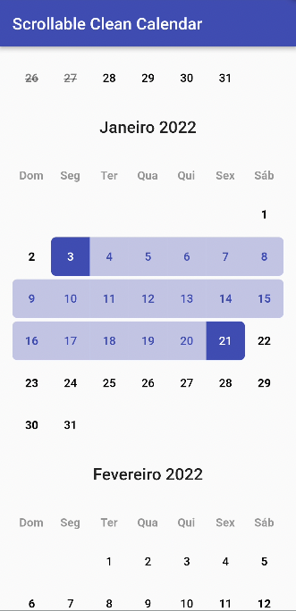
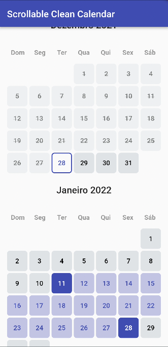
A clean calendar widget with vertical scroll, locale and range selection date.
|
Rodrigo Dobbin Fellows |
Eduardo Natale |
Fabio Fiuza |
Filippo Pizzicola |
Lucian Risso Correia |
Add
scrollable_clean_calendar: 1.4.1to your pubspec.yaml and run
flutter pub getin the project's main folder.
| Parameter | Type | Default | Description |
|---|---|---|---|
| calendarController | CleanCalendarController | required | The controller of ScrollableCleanCalendar |
| locale | String | en | The language locale |
| scrollController | ScrollController | null | Scroll controller, if you use this controller the Parameter initialFocusDate and the Functions scrollToMonth and jumpToMonth won't work since this override the scrollable list controller. Do not use them together or you will receive a nullPointer Exception |
| showWeekdays | bool | true | If is to show or not the weekdays in calendar |
| layout | Layout | null | What layout (design) is going to be used. Important: layout is required if you don't use all the layout builders |
| spaceBetweenMonthAndCalendar | double | 24 | The space between month and calendar |
| spaceBetweenCalendars | double | 24 | The space between calendars |
| initialFocusDate | DateTime | null | Initial date that the calendar scroll should focus when open |
| scrollToMonth | Function({required DateTime date, double alignment = 0, required Duration duration, Curve curve = Curves.linear, List<double> opacityAnimationWeights = const [40, 20, 40]}) | null | Animate the list over duration using the given curve such that the item at index ends up with its leading edge at the given alignment. |
| jumpToMonth | Function ({required DateTime date, double alignment = 0}) | null | Immediately, without animation, reconfigure the list so that the item at index's leading edge is at the given alignment. |
| calendarCrossAxisSpacing | double | 4 | The horizontal space in the calendar dates |
| calendarMainAxisSpacing | double | 4 | The vertical space in the calendar dates |
| padding | EdgeInsetsGeometry | EdgeInsets.symmetric(horizontal: 16, vertical: 32) | The parent padding |
| monthTextStyle | TextStyle | Theme.of(context).textTheme.headline6 | The label text style of month |
| monthTextAlign | TextAlign | TextAlign.left | The label text align of month |
| weekdayTextStyle | TextStyle | Theme.of(context).textTheme.bodyText1 | The label text align of month |
| dayTextStyle | TextStyle | Theme.of(context).textTheme.bodyText1 | The label text style of day |
| daySelectedBackgroundColor | Color | Theme.of(context).colorScheme.primary | The day selected background color |
| dayBackgroundColor | Color | Theme.of(context).colorScheme.surface | The day background color |
| daySelectedBackgroundColorBetween | Color | Theme.of(context).colorScheme.primary.withOpacity(.3) | The day selected background color that is between day selected edges |
| dayDisableBackgroundColor | Color | Theme.of(context).colorScheme.surface.withOpacity(.4) | The day disable background color |
| dayDisableColor | Color | Theme.of(context).colorScheme.onSurface.withOpacity(.5) | The day disable color |
| dayRadius | double | 6 | The radius of day items |
| monthBuilder | Widget Function(BuildContext context, String month) | null | A builder to make a customized month |
| weekdayBuilder | Widget Function(BuildContext context, String weekday) | null | A builder to make a customized weekday |
| dayBuilder | Widget Function(BuildContext context, DayValues values) | null | A builder to make a customized day of calendar |
| Parameter | Type | Default | Description |
|---|---|---|---|
| minDate | DateTime | required | Obrigatory: The mininimum date to show |
| maxDate | DateTime | required | Obrigatory: The maximum date to show |
| initialDateSelected | DateTime | null | An initial selected date |
| endDateSelected | DateTime | null | The end of selected range |
| weekdayStart | int | DateTime.monday | In what weekday position the calendar is going to start |
| onDayTapped | Function(DateTime date) | null | Function when a day is tapped |
| onRangeSelected | Function(DateTime minDate, DateTime? maxDate) | null | Function when a range is selected |
| onPreviousMinDateTapped | Function(DateTime date) | null | When a date before the min date is tapped |
| onAfterMaxDateTapped | Function(DateTime date) | null | When a date after max date is tapped |
| rangeMode | bool | true | If the range is enabled |
| readOnly | bool | false | If the Calendar Widget is on read-only mode |
ScrollableCleanCalendar(
  calendarController: calendarController,
  layout: Layout.DEFAULT,
),ScrollableCleanCalendar(
calendarController: calendarController,
layout: Layout.BEAUTY,
calendarCrossAxisSpacing: 0,
),


