
Readme here: Readme in English | Readme in Chinese (中文)
A Mendix widget provide simple and compact confirmation dialog of an action, which based on Ant Design Component Popconfirm. The difference with the confirm modal dialog is that it's more lightweight than the static popped full-screen confirm modal.
- The Title, OK/Confirm button text and Cancel button text can be modified.
- The Title can render based on Mendix textTemplate pluggable widget feature.
- There are 12 placement options available.。
- Customizing of dialog CSS style with the
Class Nameparameter. - To futher simplify the UX, only Confirm button but without Cancel button also available.
- Acting as a container to contain multi Mendix Widgets (need
OnClickevent).
- Download the mpk file from here.
- Copy the mpk file to your Mendix Project directory
{YourMendixProjectFolder}/widgets/. - Open your Mendix Project with Mendix Studio Pro and click on the menu
Menu > App > Synchronize App Directory.
-
Add widget
Antd PopConfirmto a Page. -
Add sub-widget in the
PopConfirmcontainer,can beButton,Antd Button,Badge,Text,Labeland etc. The Title can use some dynamic text in Mendix (need to put PopConfirm in a Data container).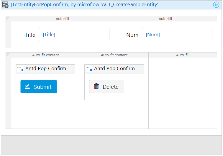
-
Config the parameters, including:
Title,Placement,Confirm Text,Confirm Event,Cancel Text,Cancel Event.
-
Run the project locally and check.
- You can access the online demo from here to show the features of this widget.
- You can also download the demo project to run it on your own PC.
- Title:Pop dialog title.
- Disabled:Disabled or not, default as
No. - Placement:Dialog placement.
- Class Name:CSS style.
- Confirm Text:OK/Confirm button text.
- On Confirm Event:OK/Confirm button event.
- Show Cancel:Show Cancel button or not, default as
Yes. - Cancel Text:Cancel button text.
- On Cancel Event:Cancel button event.
Here is a list of all the properties of Popconfirm in antd, with a description of whether this widget supports the property and why it does not. To see the meaning of the original property in antd, please move here。
| antd properties | Description | Supported | Comments |
|---|---|---|---|
| cancelText | Cancel button text | Y | |
| disabled | Whether show popconfirm dialog or not | Y | |
| icon | Customize icon of confirmation | N | WIP |
| okText | OK/Confirm button text | Y | |
| okType | OK/Confirm button type | N | No need in Mx Widget |
| showCancel | Show cancel button | Y | |
| title | Title of pop dialog | Y | |
| onCancel | Cancel button event | Y | |
| onConfirm | OK/Confirm button event | Y |
Besides, some properties from Tooltip are also available.
| antd properites | Description | Supported | Comments |
|---|---|---|---|
| overlayClassName | CSS style | Y | |
| Placement | Dialog placement with 12 options | Y |
[link to GitHub issues]
- Install NPM package dependencies by using:
npm install. If you use NPM v7.x.x, which can be checked by executingnpm -v, execute:npm install --legacy-peer-deps. - Run
npm startto watch for code changes. On every change:- the widget will be bundled;
- the bundle will be included in a
distfolder in the root directory of the project; - the bundle will be included in the
deploymentandwidgetsfolder of the Mendix test project.