Designed to complement Stream Deck plugins; sdpi-components provides a collection of web components that focuses on the plugin's property inspector, and makes persisting settings consistent, user-friendly, and hassle-free.
Getting started is easy; simply reference the following JavaScript file in your property inspector, and you're ready to start adding components.
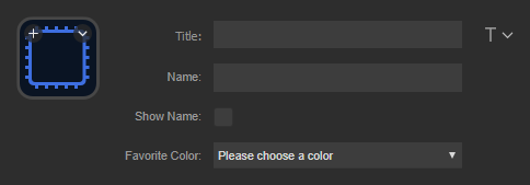
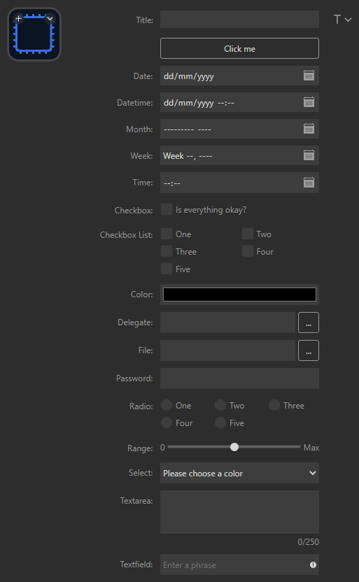
<script src="https://cdn.jsdelivr.net/gh/geekyeggo/sdpi-components@v2/dist/sdpi-components.js"></script>The example below highlights some of the components available; alternatively you can check out the property inspector in this repositories example plugin.
<!DOCTYPE html>
<head lang="en-gb">
    <meta charset="utf-8" />
    <script src="https://cdn.jsdelivr.net/gh/geekyeggo/sdpi-components@v2/dist/sdpi-components.js"></script>
</head>
<html>
    <body>
        <!--
            Given the following setup, the plugin's settings would look like this:
            {
                "name": string,
                "show_name": true | false,
                "fav_color": "red" | "green" | "blue"
            }
        -->

        <sdpi-item label="Name">
            <sdpi-textfield setting="name"></sdpi-textfield>
        </sdpi-item>

        <sdpi-item label="Show Name">
            <sdpi-checkbox setting="show_name"></sdpi-checkbox>
        </sdpi-item>

        <sdpi-item label="Favorite Color">
            <sdpi-select setting="fav_color" placeholder="Please choose a color">
                <option value="red">Red</option>
                <option value="green">Green</option>
                <option value="blue">Blue</option>
            </sdpi-select>
        </sdpi-item>
    </body>
</html>To discover all of the components available, check out the documentation.


