This is a CLI tool to help locally run docusaurus and show SDK documentation
To install the package follow the guide below:
# Clone the repository

git clone https://github.com/getstream/stream-chat-docusaurus-cli

# Move into the project directory

cd stream-chat-docusaurus-cli

# Install dependencies
yarn install

# Run the install command

npm install -g
Within the same directory level of your SDK that the docusaurus directory described above lives you can run CLI commands. Make sure you have at least the directory structure described above as well as at least 1 markdown file.
To run the site locally and see your documentation, run npx stream-chat-docusaurus -s.
In order to run the searching functionality, you need to add the Algolia env vars in your /docusaurus/.env file. Please remember to add it to .gitignore and you can have a list of required variables in our docusaurus/src/environment.js file.
To cut a new version of your docs simply type in npx stream-chat-docusaurus -nv NEW_VERSION SDK_NAME like this (SDK_NAME all lowercase with no spaces): npx stream-chat-docusaurus -nv 2.0.0-rc.0 reactnative.
To build the site in production mode, run npx stream-chat-docusaurus -b. The -b flag builds the static files to a build directory.
Imports for mdx files need to be after the --- section. For example:
---
slug: /
title: Getting Started
---

import Tabs from '@theme/Tabs';
import TabItem from '@theme/TabItem';
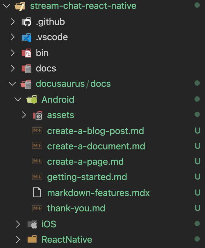
You should have a documentation directory structure starting from a docusaurus directory in your SDK. Within that there should be a docs directory. Within that should be a directory named for your SDK (ex: iOS or Android or ReactNative). All of your markdown documentation should live within that directory and you can feel free to use any additional directory structure you see fit for sectioning your docs. Note: each directory you have will become it's own url path. For instance, if you have this docusaurus/docs/Android/classes/some-doc.md file path then the url path for that markdown file will be {url}/chat/docs/sdk/android/classes/some-doc. Below is an example of this directory structure. Locally you should only need your individual SDK directory and contents.
The markdown file which you want to be the starting page (ex: {url}/chat/docs/sdk/android or {url}/chat/docs/sdk/ios) for your SDK docs should have this at the top of the file and be in the root of your doc SDK directory (ex: docusaurus/docs/Android/example.md or docusaurus/docs/iOS/example.md):
---
slug: /
---
You can add local assets to your docs by adding them within an assets folder within your SDK named directory (ex: docusaurus/docs/Android/assets/some-asset.png) and then utilize them through local paths within your markdown files. For more info, reference the docusaurus documentation here.
We have common configuration of docusaurus docs in docusaurus/docusaurus.config.js. To modify the configuration, you can create a plugin file in your docusaurus directory as described above, with one of the plugins using @docusaurus/plugin-content-docs as the plugin ID.
The object defined for the plugin will be merged with the default configuration.
For example for React Native, there is a file at /docusaurus/reactnative-docusaurus-content-docs.plugin.js with the following content:
module.exports = {
  plugins: [
    [
      "@docusaurus/plugin-content-docs",
      {
        lastVersion: "3.x.x",
        versions: {
          current: {
            label: "4.0.0",
            banner: "unreleased",
            path: "4.0.0",
          },
          "3.x.x": {
            label: "3.x.x",
          },
        },
      },
    ],
  ],
}You can add your own sidebar instead of the auto-generated default by creating a sidebars-{SDK_NAME}.(js|json) file within your docusaurus directory. For example on React the file would be sidebars-react.(js|json) and for React Native you would do sidebars-react-native.(js|json).
To share content between multiple SDKs, put markdown files in the shared directory. During run, it will be symlinked next to your content.
- shared
    - <your-shared-file> # this will be symlink to the shared directory
Then, import and render the shared content using mdx:
import SharedContent from "../../../shared/_example-shared-content.md"

<SharedContent />
NOTE: the stream-chat-docusaurus website uses the
stagingbranch ofstream-chat-docusaurus-clifor its staging deployment. To ensure that the setup works, you need to follow the following workflow:
- Write and test locally shared content using the
stagingbranch forstream-chat-docusaurus-cli(this repository). - Commit/push those changes before committing/pushing the staging content changes for your SDK.
- Once you're ready to publish to production, merge the staging branch of this repository to production first.
- Then, publish the SDK content as usual.
- Ensure that you monitor and check that the Github workflows have finished successfully.
Aside from Docusaurus' components, you can use our customized components.
Labels can be used inside headers to give them emphasis. This will add styles in the Header and ToC.
### <div class="label required">required</div> **Consequat deserunt**NOTE: It is mandatory to put the
labelbefore your Heading title. See this for design implementation.
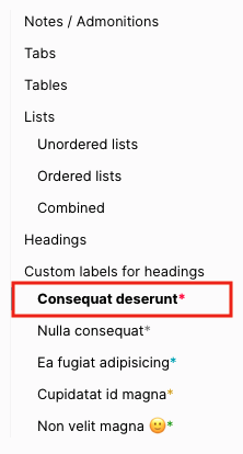
And you will also see the following style in the ToC
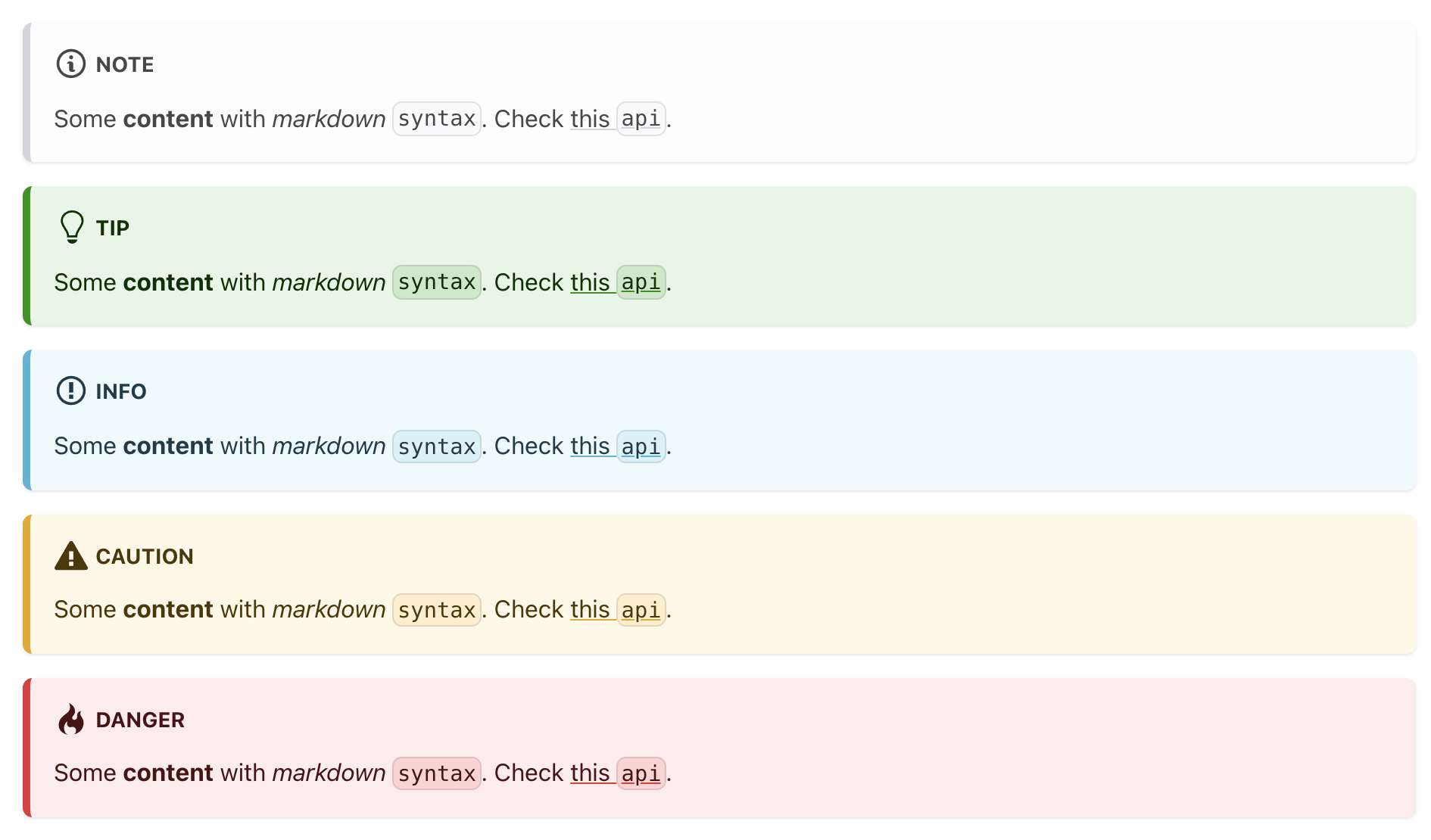
Similar to admonitions/notes, we defined 5 label types:
- required
- note
- info
- caution
- success
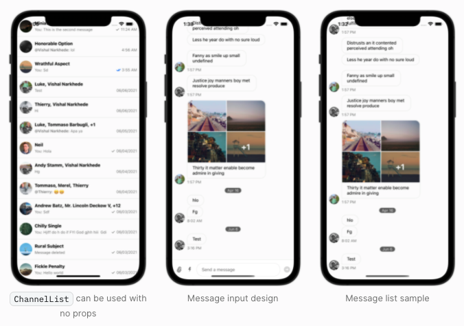
Component created to display images inside a flex container, fully responsive and interactive (hover the images to slightly expand them) out of the box 🙂
To make use of the <ImageShowcase /> component, remember to add the correct import at the beginning of your .mdx file.
Example of how to use it:
import ImageShowcase from "@site/src/components/ImageShowcase"

import channelList from "../assets/channel_list.png"
import messageInput from "../assets/message_input.png"
import messageList from "../assets/message_list.png"

;<ImageShowcase
  items={[
    {
      image: channelList,
      caption: (
        <span>
          <code>ChannelList</code> can be used with no props
        </span>
      ),
      alt: "Example of how to use channelList component",
    },
    { image: messageInput, caption: "Message input design" },
    { image: messageList, caption: "Message list sample" },
  ]}
/>
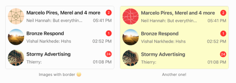
You can also add border to the images using the boolean prop border like the following:
<ImageShowcase
  border
  items={[
    {
      image: image1,
      caption: <span>Images with border 🙂</span>,
      alt: "Example of custom message",
    },
    {
      image: image2,
      caption: <span>Another one!</span>,
      alt: "Example of custom message part 2",
    },
  ]}
/>If you're working on a page and want its content to be hidden from our search, you can add the flag hide_from_search
to your frontmatter and this file will be ignored during the search indexing:
---
slug: /
hide_from_search: true
---