


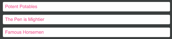
This module was built to tackle the common but arduous problem of animating a list of items when the list's order changes.
CSS transitions only work for CSS properties. If your list is shuffled, the items have rearranged themselves, but without the use of CSS. The DOM nodes don't know that their on-screen location has changed; they've just been removed and inserted elsewhere in the document.
Flip Move uses the FLIP technique to work out what such a transition would look like, and fakes it using 60+ FPS hardware-accelerated CSS transforms.

- Installation
- Features
- Quickstart
- Compatibility
- Enter/Leave Animations
- Options
- Gotchas
- Changelog
- Contributions
- Development
- License
npm i -S react-flip-move
UMD builds are also available via CDN:
Flip Move was inspired by Ryan Florence's awesome Magic Move, and offers:
-
Full compatibility with React 0.13, 0.14, and 15-rc2. Will be maintained.
-
Exclusive use of hardware-accelerated CSS properties (
transform: translate) instead of positioning properties (top,left). Read why this matters. -
Full support for enter/exit animations, including some spiffy presets, that all leverage hardware-accelerated CSS properties.
-
Ability to 'humanize' transitions by staggering the delay and/or duration of subsequent elements.
-
Ability to provide
onStart/onFinishcallbacks. -
Implementation based on the FLIP technique, a beautiful-in-its-simplicity method of tackling this problem. UMD build, when minified and gzipped, is only 6kb! ⚡
The implementation couldn't be simpler. Just wrap the items you'd like to move in a FlipMove, with any custom options:
import FlipMove from 'react-flip-move';

class TopArticles extends Component {
  renderTopArticles() {
    return this.props.articles.map( article => <Article {...article} key={article.id} /> );
  }

  render() {
    return (
      <div className="top-articles">
        <FlipMove easing="cubic-bezier(0, 0.7, 0.8, 0.1)">
          { this.renderTopArticles() }
        </FlipMove>
      </div>
    );
  }
}| Chrome | Firefox | Safari | IE | Edge | iOS Safari/Chrome | Android Chrome | |
|---|---|---|---|---|---|---|---|
| Supported | ✔ 10+ | ✔ 4+ | ✔ 6.1+ | ✔ 10+ | ✔ | ✔ 6.1+ | ✔ |
Curious how this works, under the hood? Read the Medium post.
v2.0 introduces Enter/Leave animations. For convenience, several presets are provided:

<FlipMove enterAnimation="elevator" leaveAnimation="elevator" />
<FlipMove enterAnimation="fade" leaveAnimation="fade" />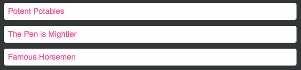
<FlipMove enterAnimation="accordianVertical" leaveAnimation="accordianVertical" />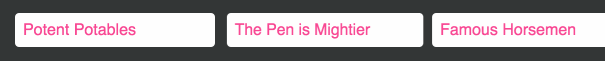
<FlipMove enterAnimation="accordianHorizontal" leaveAnimation="accordianHorizontal" />You can supply your own CSS-based transitions to customize the behaviour. Both enterAnimation and leaveAnimation take an object with from and to properties. You can then provide any valid CSS properties to this object, although for performance reasons it is recommended that you stick to transform and opacity.
<FlipMove
  staggerDelayBy={50}
  enterAnimation={{
    from: {
      transform: 'rotateX(135deg)'
    },
    to: {
      transform: ''
    }
  }}
  leaveAnimation={{
    from: {
      transform: ''
    },
    to: {
      transform: 'rotateX(-120deg)',
      opacity: 0.6
    }
  }}
/>| Accepted Types: | Default Value |
|---|---|
Array, Object |
undefined |
The children passed to FlipMove are the component(s) or DOM element(s) that will be moved about. Accepts either a single child (as long as it has a unique key property) or an array of children.
| Accepted Types: | Default Value |
|---|---|
String |
"ease-in-out" |
Any valid CSS3 timing function (eg. "linear", "ease-in", "cubic-bezier(1, 0, 0, 1)").
| Accepted Types: | Default Value |
|---|---|
Number |
350 |
The length, in milliseconds, that the transition ought to take.
| Accepted Types: | Default Value |
|---|---|
Number |
0 |
The length, in milliseconds, to wait before the animation begins.
| Accepted Types: | Default Value |
|---|---|
Number |
0 |
The length, in milliseconds, to be added to the duration of each subsequent element.
For example, if you are animating 4 elements with a duration of 200 and a staggerDurationBy of 20:
- The first element will take 200ms to transition.
- The second element will take 220ms to transition.
- The third element will take 240ms to transition.
- The fourth element will take 260ms to transition.
This effect is great for "humanizing" transitions and making them feel less robotic.
| Accepted Types: | Default Value |
|---|---|
Number |
0 |
The length, in milliseconds, to be added to the delay of each subsequent element.
For example, if you are animating 4 elements with a delay of 0 and a staggerDelayBy of 20:
- The first element will start transitioning immediately.
- The second element will start transitioning after 20ms.
- The third element will start transitioning after 40ms.
- The fourth element will start transitioning after 60ms.
Similarly to staggerDurationBy, This effect is great for "humanizing" transitions and making them feel less robotic.
Protip: You can make elements animate one-at-a-time by using an identical duration and staggerDelayBy.
| Accepted Types: | Default Value |
|---|---|
String, Boolean, Object |
'elevator' |
Control the onEnter animation that runs when new items are added to the DOM. For examples of this property, see the feature description above.
Accepts several types:
String: You can enter one of the following presets to select that as your enter animation:
elevator(default)fadeaccordionVerticalaccordionHorizontalnone
View the CSS implementation of these presets.
Boolean: You can enter false to disable the enter animation, or true to select the default enter animation (elevator).
Object: For fully granular control, you can pass in an object that contains the styles you'd like to animate.
It requires two keys: from and to. Each key holds an object of CSS properties. You can supply any valid camelCase CSS properties, and flip-move will transition between the two, over the course of the specified duration.
Example:
const customEnterAnimation = {
  from: { transform: 'scale(0.5, 1)' },
  to:   { transform: 'scale(1, 1)' }
};

<FlipMove enterAnimation={customEnterAnimation}>
  {renderChildren()}
</FlipMove>
It is recommended that you stick to hardware-accelerated CSS properties for optimal performance: transform and opacity.
| Accepted Types: | Default Value |
|---|---|
String, Boolean, Object |
'elevator' |
Control the onLeave animation that runs when new items are removed from the DOM. For examples of this property, see the feature description above.
This property functions identically to enterAnimation.
Accepts several types:
String: You can enter one of the following presets to select that as your enter animation:
elevator(default)fadeaccordionVerticalaccordionHorizontalnone
View the CSS implementation of these presets.
Boolean: You can enter false to disable the leave animation, or true to select the default leave animation (elevator).
Object: For fully granular control, you can pass in an object that contains the styles you'd like to animate.
It requires two keys: from and to. Each key holds an object of CSS properties. You can supply any valid camelCase CSS properties, and flip-move will transition between the two, over the course of the specified duration.
Example:
const customLeaveAnimation = {
  from: { transform: 'scale(1, 1)' },
  to:   { transform: 'scale(0.5, 1) translateY(-20px)' }
};

<FlipMove leaveAnimation={customLeaveAnimation}>
  {renderChildren()}
</FlipMove>
It is recommended that you stick to hardware-accelerated CSS properties for optimal performance: transform and opacity.
| Accepted Types: | Default Value |
|---|---|
Function |
undefined |
A callback to be invoked once per child element at the start of the animation.
The callback is invoked with two arguments:
childElement: A reference to the React Element being animated.domNode: A reference to the unadulterated DOM node being animated.
In general, it is advisable to ignore the domNode argument and work with the childElement. The domNode is just an escape hatch for doing complex things not otherwise possible.
| Accepted Types: | Default Value |
|---|---|
Function |
undefined |
A callback to be invoked once per child element at the end of the animation.
The callback is invoked with two arguments:
childElement: A reference to the React Element being animated.domNode: A reference to the unadulterated DOM node being animated.
In general, it is advisable to ignore the domNode argument and work with the childElement. The domNode is just an escape hatch for doing complex things not otherwise possible.
| Accepted Types: | Default Value |
|---|---|
Function |
undefined |
A callback to be invoked once per group at the start of the animation.
The callback is invoked with two arguments:
childElements: An array of the references to the React Element(s) being animated.domNodes: An array of the references to the unadulterated DOM node(s) being animated.
These arguments are similar to the ones provided for onStart, except we provide an array of the elements and nodes. The order of both arguments is guaranteed; this means you can use a zipping function like lodash's .zip to get pairs of element/node, if needed.
In general, it is advisable to ignore the domNodes argument and work with the childElements. The domNodes are just an escape hatch for doing complex things not otherwise possible.
| Accepted Types: | Default Value |
|---|---|
Function |
undefined |
A callback to be invoked once per group at the end of the animation.
The callback is invoked with two arguments:
childElements: An array of the references to the React Element(s) being animated.domNodes: An array of the references to the unadulterated DOM node(s) being animated.
These arguments are similar to the ones provided for onFinish, except we provide an array of the elements and nodes. The order of both arguments is guaranteed; this means you can use a zipping function like lodash's .zip to get pairs of element/node, if needed.
In general, it is advisable to ignore the domNodes argument and work with the childElements. The domNodes are just an escape hatch for doing complex things not otherwise possible.
| Accepted Types: | Default Value |
|---|---|
String |
'div' |
Flip Move wraps your children in a container element. By default, this element is a div, but you may wish to provide a custom HTML element (for example, if your children are list items, you may wish to set this to ul).
Any valid HTML element type is accepted, but peculiar things may happen if you use an unconventional element.
| Accepted Types: | Default Value |
|---|---|
Boolean |
false |
Sometimes, you may wish to temporarily disable the animations and have the normal behaviour resumed. Setting this flag to true skips all animations.
FlipMove creates its own DOM node to wrap the children it needs to animate. Sometimes, you'll want to be able to pass specific HTML attributes to this node.
All props other than the ones listed above will be delegated to this new node, so you can apply them directly to FlipMove. For example:
<div>
  <FlipMove typeName="ul" className="row" style={{ backgroundColor: 'red' }}>
    <li className="col">Column 1</li>
    <li className="col">Column 2</li>
  </FlipMove>
</div>
FlipMove passes the className and style props along to the ul that needs to be created. Here's how it renders:
<div>
  <ul class="row" style="background-color: red">
    <li class="col">Column 1</li>
    <li class="col">Column 2</li>
  </ul>
</div>
This works for all HTML props - there's no validation.
-
Does not work with stateless functional component children. This is because Flip Move uses refs to identify and apply styles to children, and stateless functional components cannot be given refs.
-
All children need a unique
keyproperty. Even if Flip Move is only given a single child, it needs to have a uniquekeyprop for Flip Move to track it. -
Existing transition/transform properties will be overridden. I am hoping to change this in a future version, but at present, Flip Move does not take into account existing
transitionortransformCSS properties on its direct children. -
Elements whose positions have not changed between states will not be animated. This means that no
onStartoronFinishcallbacks will be executed for those elements.
See the GitHub releases for version changes.
Many articles I've seen claim that in order to force browsers to use hardware acceleration, you need to resort to hacky fixes like transformZ(0) or use the new will-change property.
In my personal experimentations on modern versions of Chrome, Safari, Firefox and IE, these properties offer little to no gain (in Chrome's timeline I saw a savings of ~0.5ms on a 24-item shuffle).
Applying will-change too willy-nilly can have an adverse effect on mobile browsers, so I have opted to not use it at all.
YMMV: Feel free to experiment with the property in your CSS. Flip Move will respect the wishes of your stylesheet :)
Further reading: CSS will-change Property
Contributors welcome! Please discuss new features with me ahead of time, and submit PRs for bug fixes with tests (Testing stack is Mocha/Chai/Sinon, tested in-browser by Karma).
This project uses React Storybook in development. The developer experience is absolutely lovely, and it makes testing new features like enter/leave presets super straightforward.
After installing dependencies, launch the Storybook dev server with npm run storybook.