{ggplot} from Yhat
read more on our blog
from ggplot import *

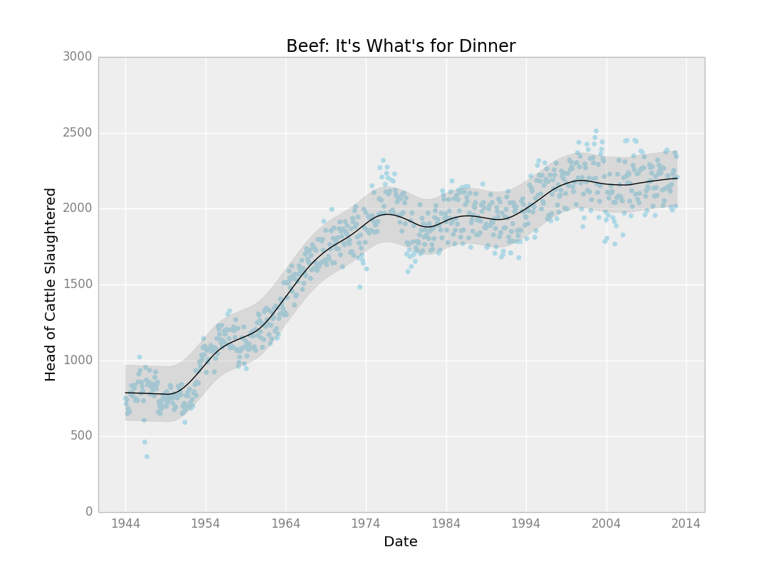
ggplot(aes(x='date', y='beef'), data=meat) + \
    geom_point(color='lightblue') + \
    stat_smooth(span=.15, color='black', se=True) + \
    ggtitle("Beef: It's What's for Dinner") + \
    xlab("Date") + \
    ylab("Head of Cattle Slaughtered")
Yes, it's another port of ggplot2. One of the biggest reasons why I continue to reach for R instead of Python for data analysis is the lack of an easy to use, high level plotting package like ggplot2. I've tried other libraries like bokeh and d3py but what I really want is ggplot2.
ggplot is just that. It's an extremely un-pythonic package for doing exactly what ggplot2 does. The goal of the package is to mimic the ggplot2 API. This makes it super easy for people coming over from R to use, and prevents you from having to re-learn how to plot stuff.
- same API as
ggplot2forR - never use matplotlib again
- ability to use both American and British English spellings of aesthetics
- tight integration with
pandas - pip installable
I realize that these are not fun to install. My best luck has always been using brew if you're on a Mac
or just using the binaries if you're on Windows. If you're using Linux then this should be relatively
painless. You should be able to apt-get or yum all of these.
matplotlibpandasnumpyscipystatsmodelspatsy
Ok the hard part is over. Installing ggplot is really easy. Just use pip!
$ pip install ggplot
# run an IPython shell (or don't)
$ ipython
In [1]: from ggplot import *
That's it! You're ready to go!
meat_lng = pd.melt(meat[['date', 'beef', 'pork', 'broilers']], id_vars='date')
ggplot(aes(x='date', y='value', colour='variable'), data=meat_lng) + \
    geom_point() + \
    stat_smooth(color='red')
####geom_point
from ggplot import *
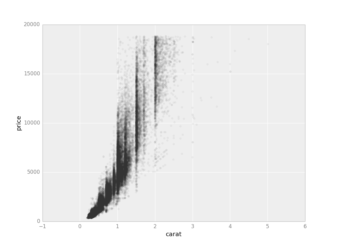
ggplot(diamonds, aes('carat', 'price')) + \
    geom_point(alpha=1/20.) + \
    ylim(0, 20000)
####geom_histogram
p = ggplot(aes(x='carat'), data=diamonds)
p + geom_histogram() + ggtitle("Histogram of Diamond Carats") + labs("Carats", "Freq")
####geom_density
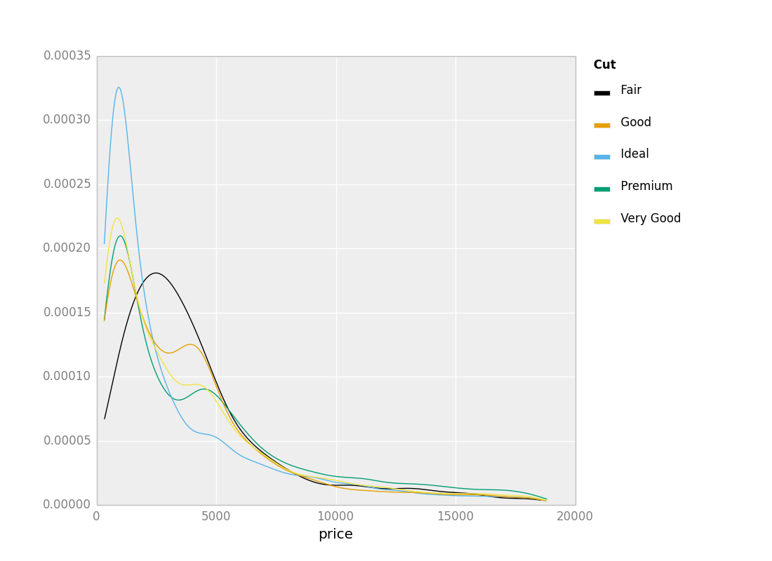
ggplot(diamonds, aes(x='price', color='cut')) + \
    geom_density()
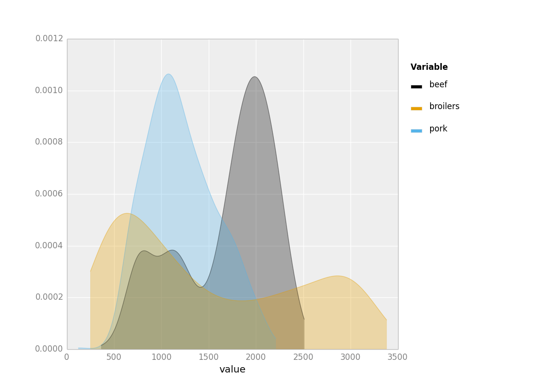
meat_lng = pd.melt(meat[['date', 'beef', 'broilers', 'pork']], id_vars=['date'])
p = ggplot(aes(x='value', colour='variable', fill=True, alpha=0.3), data=meat_lng)
p + geom_density()
####geom_bar
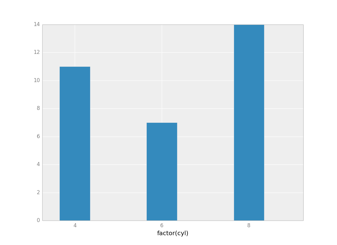
p = ggplot(mtcars, aes('factor(cyl)'))
p + geom_bar()
The list is long, but distinguished. We're looking for contributors! Email greg at yhathq.com for more info. For getting started with contributing, check out these docs
