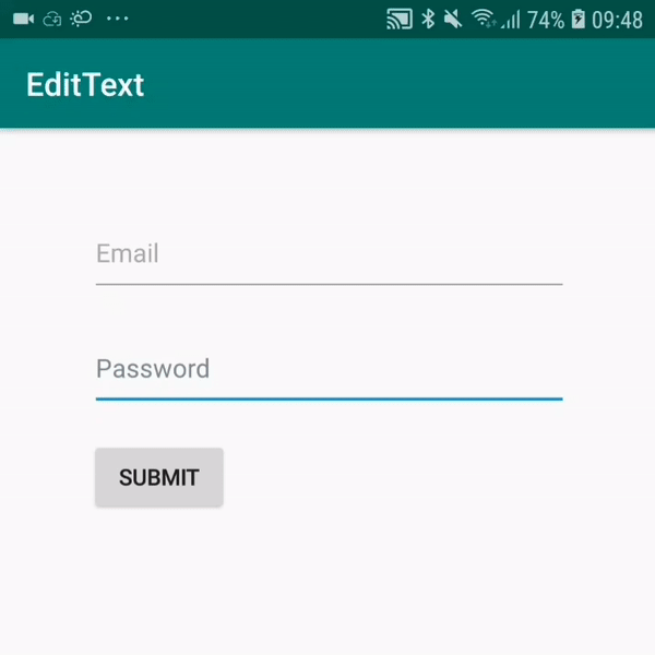
Custom EditText which follows the latest Material guidelines with animated underline and custom error settings.
Make sure you have jitpack.io included in your gradle repositories.
maven { url "https://jitpack.io" }
implementation 'com.github.edgar-zigis:materialtextfield:1.2.0'
<com.zigis.materialtextfield.MaterialTextField
    android:id="@+id/mail"
    android:layout_width="match_parent"
    android:layout_height="wrap_content"  //  -> default 56dp
    android:hint="E-mail"
    android:text="admin@bio-matic.com"
    app:isMultiline="true" //  -> enable multiline support
    app:undelineHeight="1.5dp" //  -> set underline height
    app:isClearEnabled="true" //  -> toggle clear button, default true
    app:rightIcon="@drawable/ic_clear"  //  -> set custom right icon, default null
    app:rightButtonColor="@color/grey"  //  -> set right icon tint, default grey
    app:cursorDrawableColor="@color/colorAccent"  //  -> change cursor, selection & selection handles color
    app:defaultHintColor="@android:color/darker_gray" //  -> set inactive hint color
    app:activeHintColor="@android:color/holo_blue_dark" //  -> set floating hint color
    app:defaultUnderlineColor="@android:color/darker_gray"  //  -> set non-focused underline color
    app:activeUnderlineColor="@android:color/holo_blue_dark"  //  -> set focused underline color
app:errorColor="@android:color/holo_red_dark" /> // -> set error icon, text and underline colorAt the moment height is automatically overriden to match original Material guideline height. Also consider using margins instead of paddings.