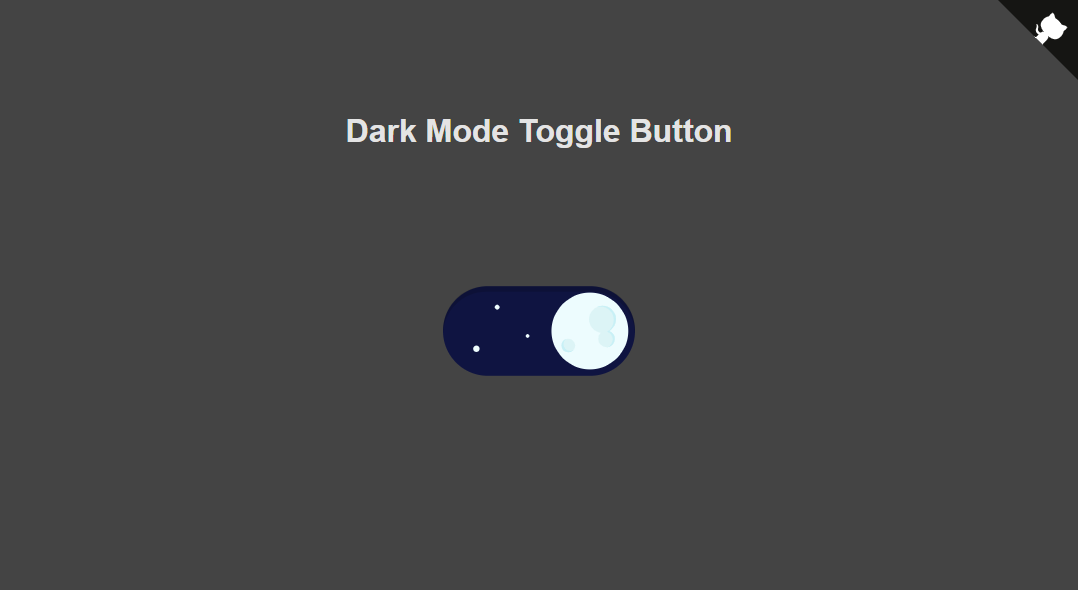
A simple toggle button, which can be used in any context. It's built as WebComponent and available as npm package.
The animation data is from cawfree/react-dark-mode-toggle, which only supports react. This project shall allow the usage of the nice animations in non-react enviroments. It also supports a very basic implementation for changing dark/ light themes.
Please checkout the demo. You can add the resources either locally, via a CDN or as npm package:
<!-- @h0rn0chse/dark-mode-toggle dependency -->
<script src="https://unpkg.com/lottie-web@5.7/build/player/lottie.min.js"></script>

<script src="https://unpkg.com/@h0rn0chse/dark-mode-toggle@2/dist/bundle.min.js"></script>

<!--The css is only required when the button is NOT used as WebComponent-->
<link rel="stylesheet" href="https://unpkg.com/@h0rn0chse/dark-mode-toggle@2/dist/bundle.min.css">
You can either add a Button as WebComponent
<dark-mode-toggle
    id="toggle"
    width="320"
/>
or via a scrict dynamically:
const { Button, ThemeHandler } = globalThis.darkModeToggle;

const button = new Button(document.querySelector("#container"), { width: 320 });Creates a new Button and places it into the provided container.
The width of the button in pixels. Be aware that options.height will be preferred over options.width to keep the button`s aspect ratio.
The height of the button in pixels. Be aware that options.height will be preferred over options.width to keep the button`s aspect ratio.
A boolean wether to use the themeHandler and its logic. Be aware that once a button was created using the themeHandler it's not possible to remove the themeHandler.
A enum which can be either dark or light. Defines the initial state of the button. You might use this option when you are using your own theme handler.
Sets the width of the button. The width is required to be provided as number (of pixels). Keeps the aspect ratio of the button.
Sets the height of the button. The height is required to be provided as number (of pixels). Keeps the aspect ratio of the button.
Sets the theme of the button by toggling the button to the desired state. Valid values for theme are dark and light. You can skip the animation by setting skipAnimation to true.
Please look for Events on details how to register and deregister to events.
Gets emitted once the button was clicked. Provides the upcoming theme via the eventData as parameter theme.
Gets emitted once the button starts an animation. This might also abort the previous animation. Provides the upcoming theme via the eventData as parameter theme.
Gets emitted once the button completes an animation. This will not be called on aborted animations. Provides the final theme via the eventData as parameter theme.
Handles the dark and light theming. The application is required to load both themes as separate css files. These css nodes are required to have the id="dark" and "light". The ThemeHandler swaps those files according to the current theme.
Sets the current Theme which can be either dark or light.
Returns the current Theme which is either dark or light.
Please look for Events on details how to register and deregister to events.
Gets emitted once the theme was changed either via system preferences, via setTheme or via the ToggleButton. Provides the new theme via the eventData as parameter theme. Be aware that the theme was not loaded yet.
Gets emitted once the loading of the theme was completed. Provides the new theme via the eventData as parameter theme.
The ThemeHandler and the Button implement Events via the EventProvider. These events aren't native and get called synchronously after the event was emitted. Therefore it's also necessary to remove the handlers again to avoid memory leaks.
Subscribes to an event. Please be aware that a handler cannot be subscribed multiple times for the same scope.
Subscribes once to an event. Please be aware that a handler which was already attached to an event via EventProvider.on cannot be attached via EventProvider.once.
Removes the subscription to an event. This method also works for handlers attached via EventProvider.once and which were not triggered yet.
The WebComponent accepts all the options the Button provides. It also provides the API of the EventProivder and the Button. The WebComponent reacts dynamically on width, height and theme. Simliar to the options you cannot simultaneously set width and height.
- AnimationData cawfree/react-dark-mode-toggle
- Player LottieFiles/lottie-web
- Feather Icons github.com/feathericons/feather
- Github Corners github.com/YuskaWu/github-corner-element
