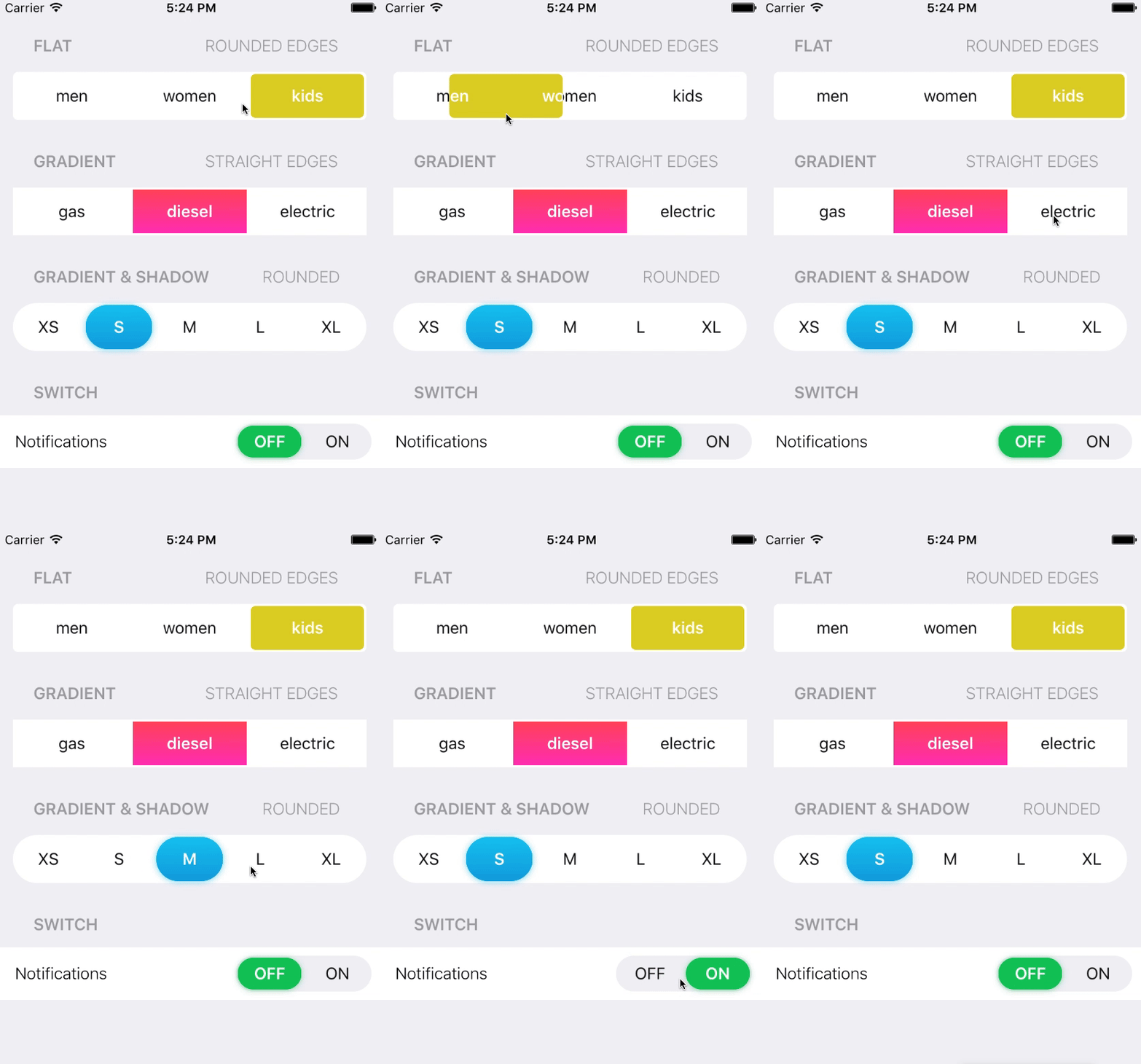
An elegant, animated and customizable segmented control for iOS.
This project is maintained by Tapptitude, a mobile app development agency specialized in building high-quality iOS and Android mobile apps, for startups and brands alike. A lively team of skilled app developers and app designers based in Europe, we provide full-stack mobile app development services to entrepreneurs looking to innovate on mobile.
- Variable number of items
- Animated transition
- Bounce animation
- Fully configurable (color, gradient, shadow, corner radius)
- Designable into Interface Builder
- iOS 8.0+
- Xcode 7.3+
CocoaPods
Swift 4.0
pod 'TTSegmentedControl'Swift 3.X
pod 'TTSegmentedControl', '~>0.3'Swift 2.x
pod 'TTSegmentedControl', '0.1.1'Carthage
github "tapptitude/TTSegmentedControl"
Manually
Add the TTSegmentedControl.swift file to your project.
- Programatic:
let segmentedControl = TTSegmentedControl()
segmentedControl.allowChangeThumbWidth = false
segmentedControl.frame = CGRect(x: 50, y: 200, width: 100, height: 50)
segmentedControl.didSelectItemWith = { (index, title) -> () in
    print("Selected item \(index)")
}
view.addSubview(segmentedControl)
- Interface Builder:
Add a UIView and set it's class to TTSegmentedControl. You can customize the control directly from the interface builder.
Checkout the playground and see how to implement and customize the SegmentedControl.
pod try TTSegmentedControlIn order to customize the segmented control you'll have to edit it's properties.
segmentedControl.defaultTextColor = UIColor.blackColor()
segmentedControl.selectedTextColor = UIColor.whiteColor()
segmentedControl.thumbGradientColors = [UIColor.redColor(), UIColor.blueColor()]
segmentedControl.useShadow = trueFeel free to Fork, submit Pull Requests or send us your feedback and suggestions!
TTSegmentedControl is available under the MIT license. See the LICENSE file for more info.


