Exercise for HTML & CSS - lesson 1
Clone this repository onto your machine. Remember the git cheat-sheet if you get stuck!
Open up the repository you just cloned (again, check the git cheat-sheet if you need help!)
You're now ready to code!
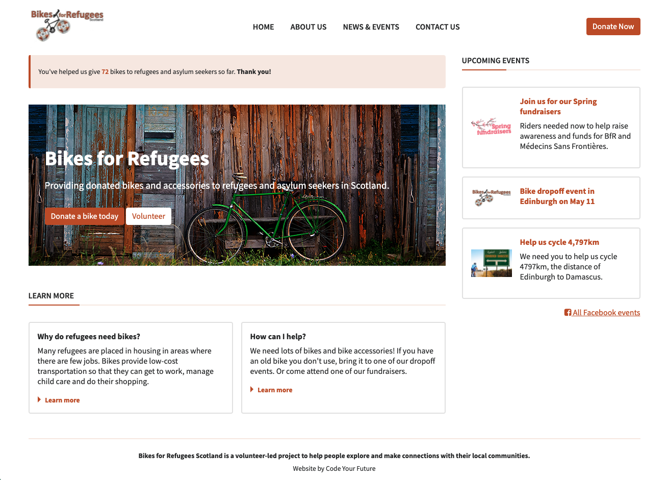
The aim of the exercise is for your webpage to look like the following screenshot:
Open the index.html file in your browser, and compare it to the image of the final result. What's different?
Where necessary, replace the <div>s with semantic HTML tags. This will not render differently in the browser, but it's good practice to use semantic markup when you can!
Some of the links to images are broken. The images you need are in the images folder - please replace any broken image links with the correct paths.
It's also good practice to include a description of the image in the alt attribute.
Make sure to add some CSS to make the images look the same as in the design!
There are 3 buttons on the page: can you style them correctly so they follow the design? Remember, re-use styles as much as possible by using CSS classes.
- Add more space inside the hero section so that more of the image is visible.
- Add more space below the hero section to move the 'Learn more' section down.
- Use the
paddingproperty to add some more horizontal space between the navigation links in the header.
Compare what you can see in your browser with the design provided. Can you spot the differences in layout? Use CSS Flexbox to move elements around so they are positioned correctly.
Also add borders and spacing if required to match the design.
Add a hover effect using CSS, so that:
- The links in the top menu navigation become orange on hover
- The colours of the buttons are inverted on hover
Once you've finished, open a pull request so your work can be reviewed by a mentor.
As always, you can check the git cheatsheet if you get stuck!
