This README file contains the following project delieverables
- Project statement
- 'Making-of' documentation
- Intermediate visualization prototypes
- Final data visualization
- Road map with future features
- Conclusion
- Additional Sources
- Showcase video
Obesity in the United States has been a growing issue for the past few decades. We are interested to know what factors lead to obesity in this nation. Some claim that obesity goes hand-in-hand with poverty because underprivileged people live in neighborhoods where there have access to nearby parks. Because of this, they don’t get the opportunity to exercise since they don’t have many options and are forced to stay at home most of time. In addition, underprivileged people don’t have affordable grocery stores and healthy restaurants within walking distance, so they are limited to only cheap fast food chains. However some may argue that obesity rates are also rising amongst the rich, which leads us to believe that this growing issue is linked to a person's lifestyle and his/her choices.
So in this project, we will analyze the possible causes for obesity from various perspectives.
We intend to expose the factors behind this complex issue in order to educate future parents and raise awareness.
Together, we found and used following data:
-
This dataset describes National Health and Nutrition Examination Survey (NHANES), 2007-2008.
-
Ranking of states based on well-being of children:
This set of data is based on a long term study by philanthropy group called the Annie E. Casey Foundation. This study is aimed at providing information for advocates, non-profits, funders, and policymakers to achieve targeted wins. It also aims at delivering more effective programs and allocating funds appropriately. This study has been releasing updated data every year since 1990.
This set of data ranks all the states in the United States using an index of key indicators in the areas of economic, education, health, and family and community. Below are a detailed description of all four areas:
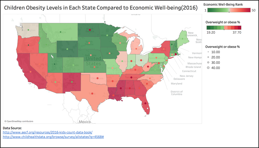
Economic well-being: This indicator looks at the numbers of children whose parents lack secure employment, children living in households with a high housing cost burden, and teens not in school or working. The states with higher numbers in these areas will be ranked relatively lower.
Education Indicators: This indicator looks at the number of young children not in school, fourth graders not proficient in reading, eighth graders not proficient in math, and high school students not graduating on time. This indicator is not only examining education levels, but is also looking at the quality of education.
Health Indicators: This indicator looks at low-birthweight babies, children without health insurance, child and teen deaths per 100,000, and teens who abuse alcohol or drugs.
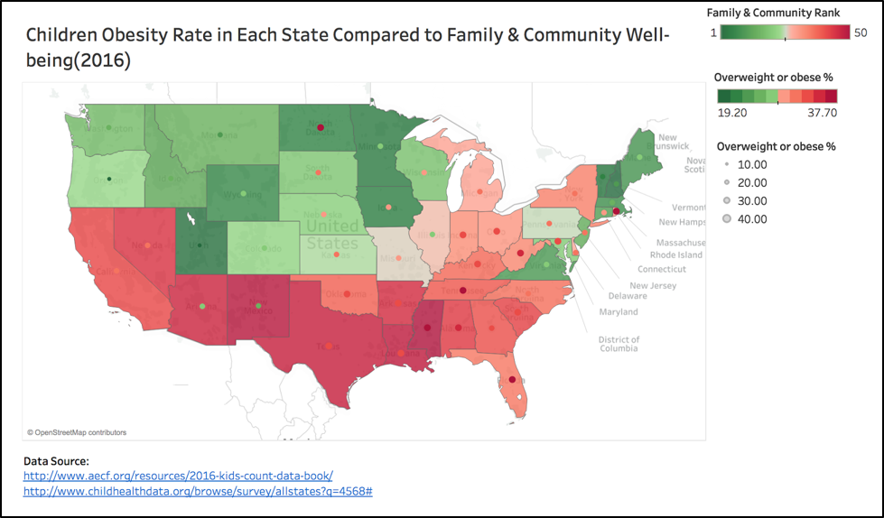
Family and Community: This indicator looks at the number of children in single-parent families, children in families where the head of household lacks a high school diploma, children living in high-poverty areas, and teen births per 1,000.
These combination of indicators makes up the “Kids Count Index”, which looks at the well-being of children in the states from a developmental perspective; because it is updated often and consistently measured, it can be used as a measurement across states. -
% of Obese children by state: Combined overweight and obesity rates for kids ages 10 to 17 ranged from 19.2 percent in Utah to 37.7 percent in Tennessee. Nationally, 31.2 percent of youth in this age range are overweight or obese.
Overweight/obese children are those that have a BMI at or above the 85 percentile. The assessment of body fat in children and teenagers takes a different approach than adults since growth patterns differ; BMI in kids/youth is age and gender specific. BMI-for-age categories are: Underweight - Less than the 5th percentile; Healthy weight - 5th percentile to less than the 85th percentile; Overweight - 85th to less than the 95th percentile; Obese - Equal to or greater than the 95th percentile. -
School Characteristics & Programs, by state:: This dataset, from the National Center for Education Statistics, shows elementary school characteristics and demographics of the student body and households of students, organized by state. Data includes income levels, race/ethnicity, household size, gender, student/teacher ratios, and more. From here we found that many schools offer a free or discounted lunch program for students in poverty. With this information we wanted to see if this has any relationship to obesity.
-
The following data set contains information on youths’ physical activity levels and their obesity rates per state. The original data set was provided by the CDC.
-
The following data set contains information on the physical inactivity levels per state. We used this information to see if there was a correlation between physical inactivity and obesity.
-
This dataset includes the prevalence of sugar-sweetened beverage consumption among adults by state. This dataset was used to confirm the relationship between sugar intake and obesity. If the results were significant, we can say sugar would affect obesity. The makeup of beverages such as soda is very simple, it is mostly water or sugar. Therefore this makes the consumption of sugar-sweetened beverages a good example of sugar consumption.
-
This dataset describes the adult obesity rate by state
-
Other resources that we used to research obesity are below:
The following pdf contains information on state ranking based on obesity and the number of city parks, community centers and sidewalks. The following website contains information on obesity and has helpful visualizations that show how obesity is getting worse in the United States.
1.1 Data Wrangling in Jupyter Notebook
1.2 Load data into Tableau
1.3 Reload saved csv file into Tableau and refine the visualization
The following data wrangling is for obeisty and four other factors.
The state ranking data based on kid’s well-being comes in a CSV format; we imported it into Tableau and merged it with kids’ obesity rate for 2016. See below for data wrangling for both.
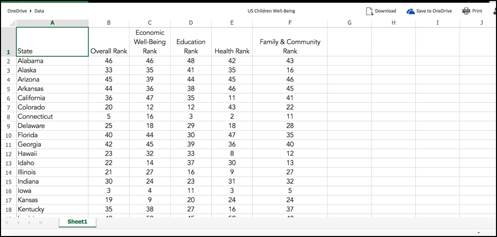
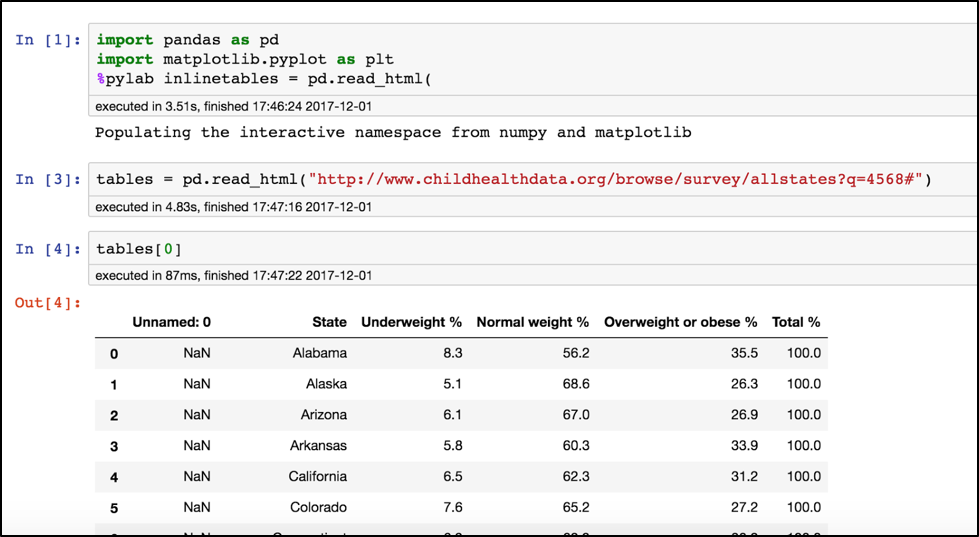 Table is read directly from website. Only preserve ‘State’ and ‘Overweight or obese %’ columns.

The following wrangling is for obesity and education level and poverty ratio.
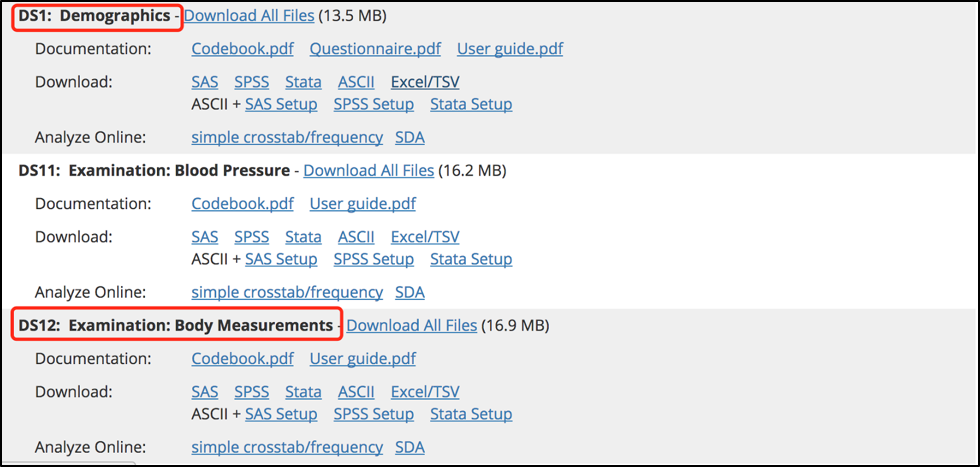
The National Health and Nutrition Examination Survey has 10 datasets released between 2007-2008. We care about respondent's BMI, income and education, therefore we download the two highlighted datasets.
 Load them into Jupyter notebook:
For Demographics:
 For body measurement:
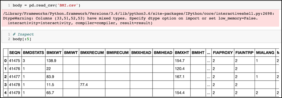 We can see that both dataframes have codes in their columns.
To better see what the columns are, we need to translate the code back to its literal meaning.
Later we need to join both tables on the common key ‘SEQN’ so leave this column alone at first.
Now, transform the demographic columns:
According to the codebook published along with this survey, column codes and meaning mapping are listed here:
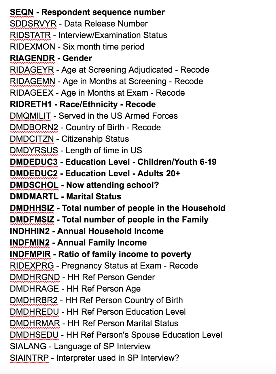
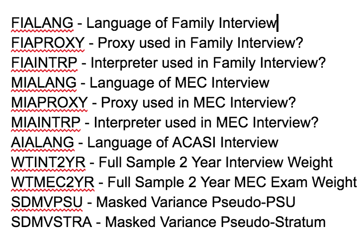 We care about the highlighted ones so drop the unrelated columns first:
 Then we translate the columns back to literal meaning:
 Inspect
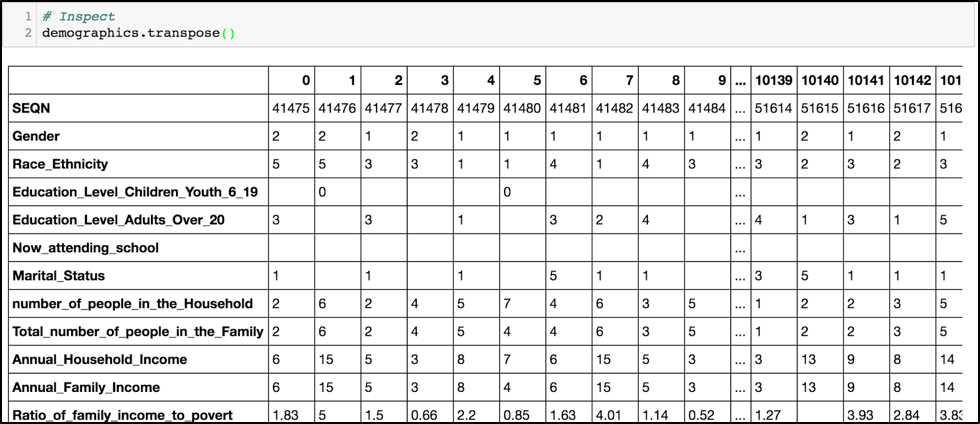 Now we get the BMI of every respondent
First read the body measurement csv in
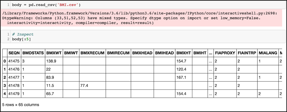 Get the Respondent number and its BMI
 Merge two tables together and inspect
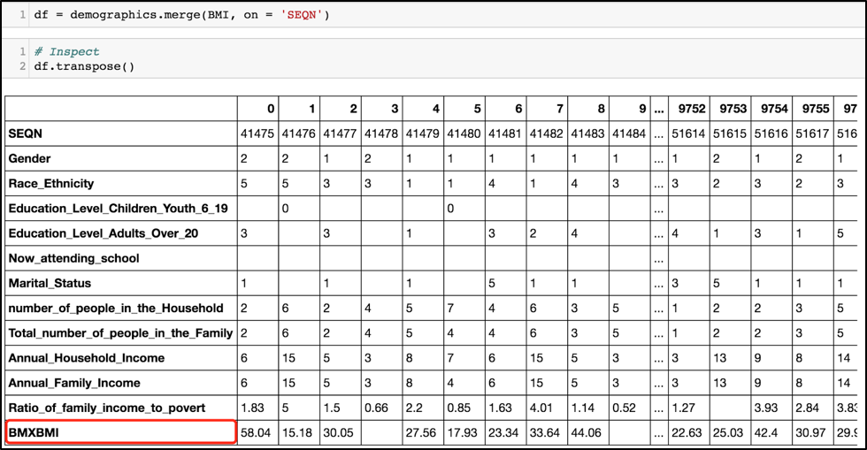 Now translate ‘SEQN’ to 'Respondent_number'
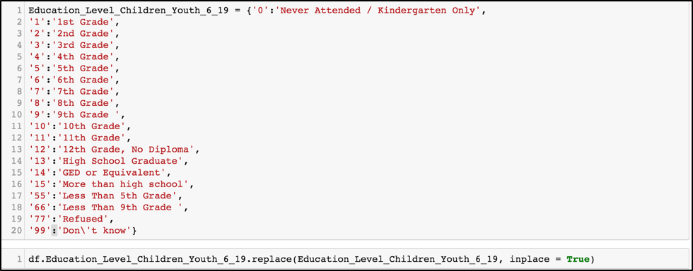
 Now translate the value back to words:



 Create a new column to show directly whether this respondent is obese or not
 Leave out data that doesn’t have BMI info.
 Get the adult data
 Inside Edcuation_Level_Adults_Over_20, there are two values that are not helpful
 Eliminate ‘Don’t know’ and ‘Refused’ data
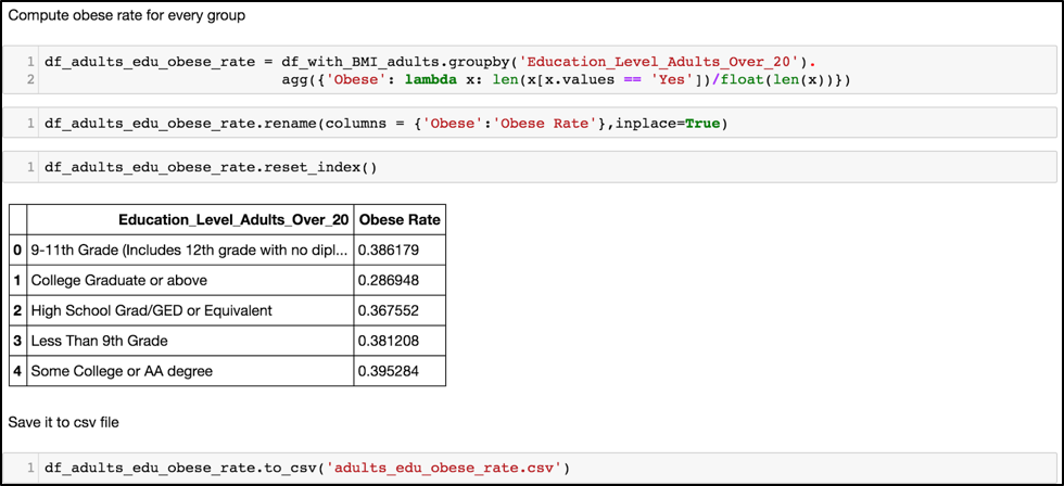
 Now we compute the obese rate for every remaining group:
 Now compute the obese rate for family income to poverty ratio range.
There are some rows that don't have the 'Ratio_of_family_income_to_poverty' information
so to compute further, we have to eliminate them as well.
 Use pd.cut to allocate range for ratio of family income to poverty
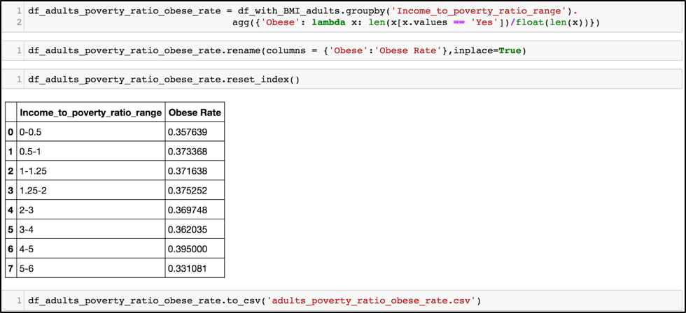
 Compute obese rate for every poverty level
 Now compute kids, essentially following the same process.


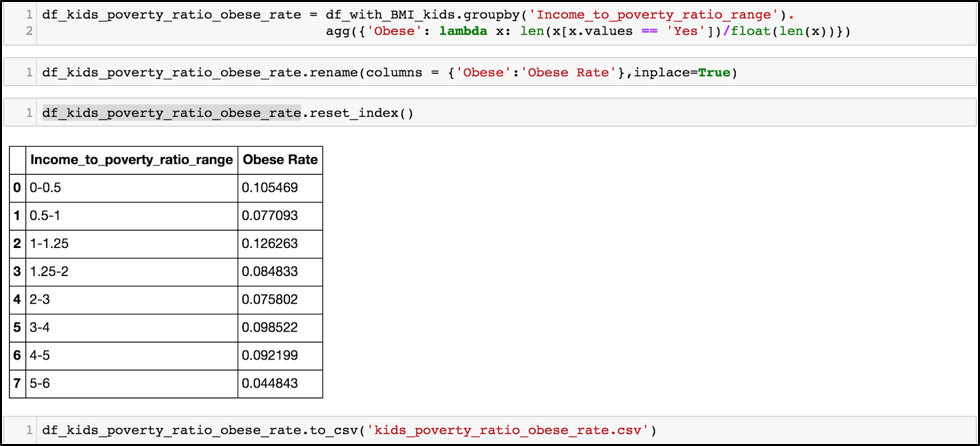 Now we have three files:
adults_edu_obese_rate.csv
adults_poverty_ratio_obese_rate.csv
kids_poverty_ratio_obese_rate.csv
The following wrangling is for lunch programs in each state is in separate web pages, so need to manually click through each state’s data to record number of students in lunch program and student populations
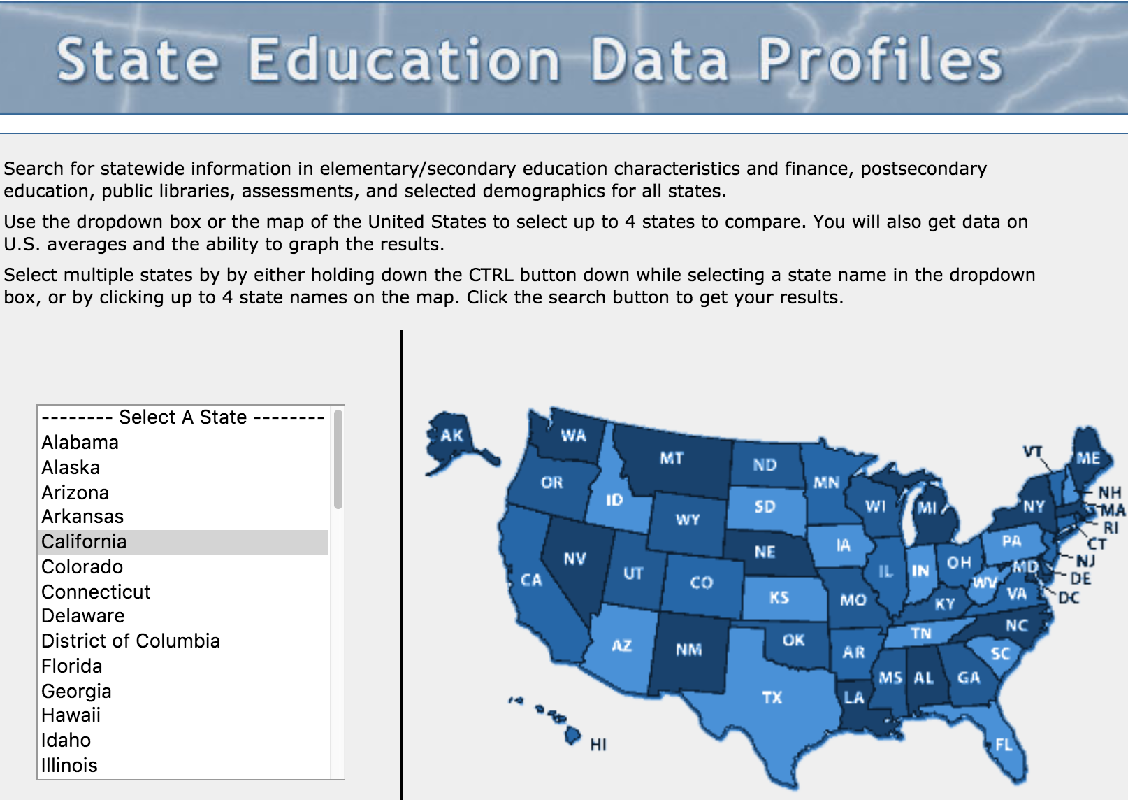 Each state’s page has several datasets:
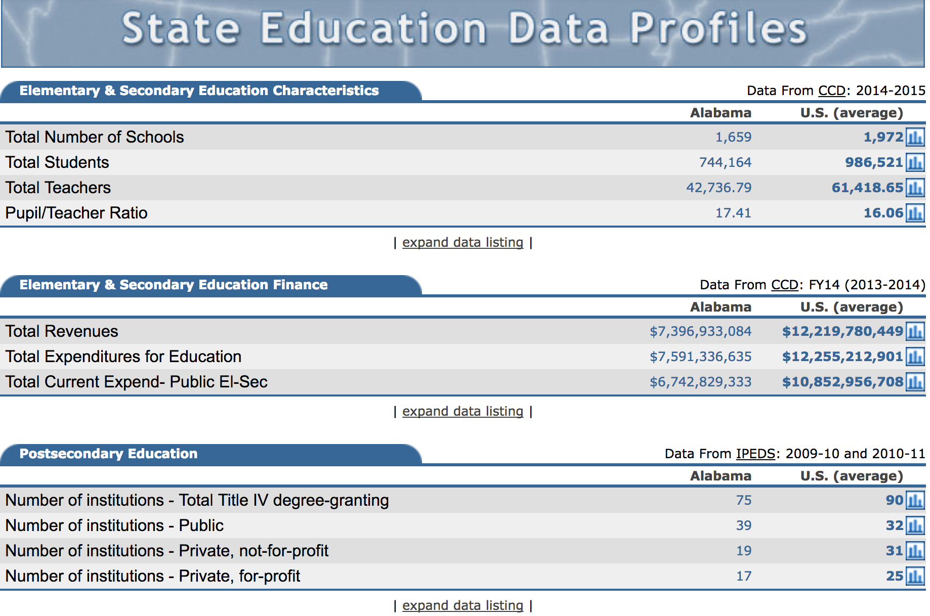 We are only concerned with the first set - Elementary & Secondary Education Characteristics, which gives Total Students in the state, as well as number of students in free lunch program.
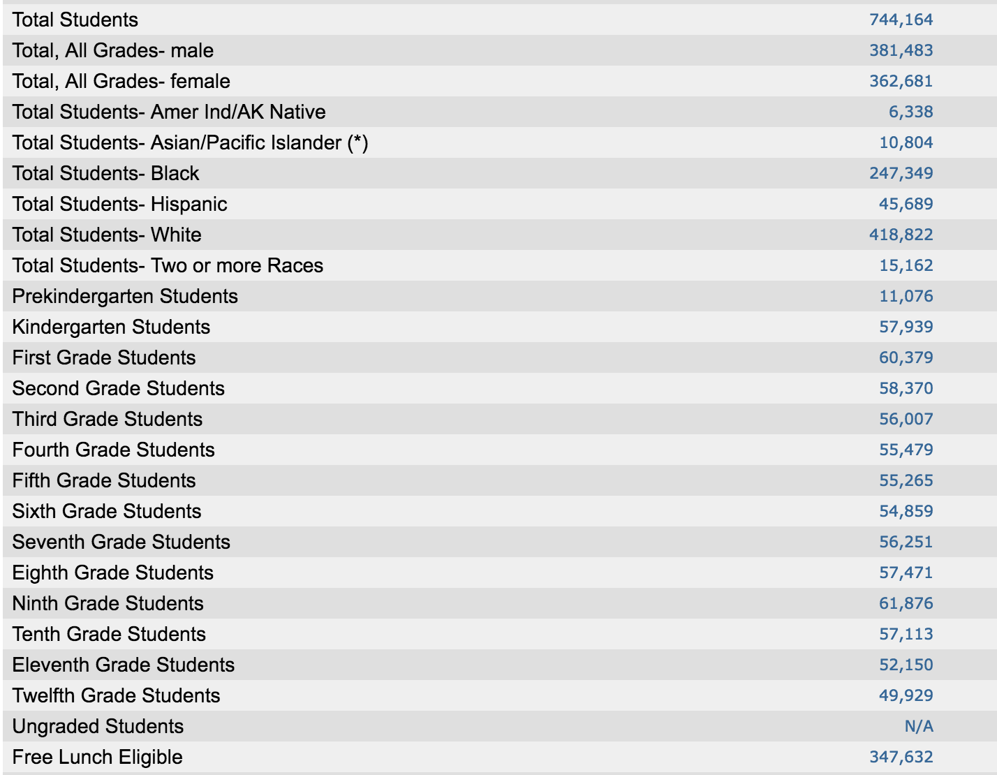 Each number was copy/pasted into a self-made CSV file.
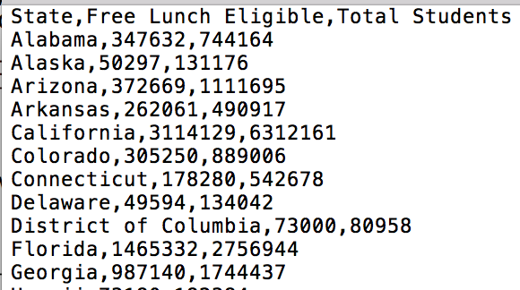
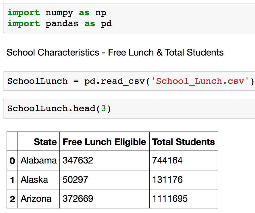
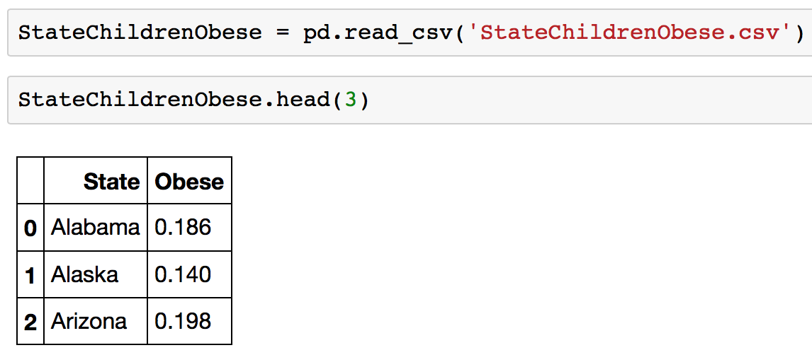
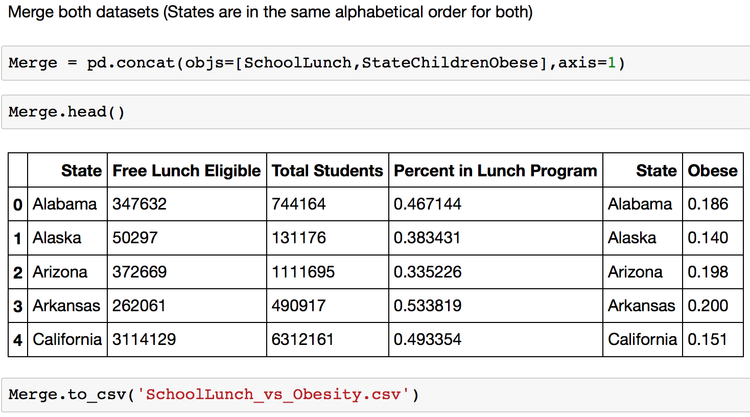
Which gets uploaded into Python to merge with a dataset on child obesity rates by state
The following wrangling is for obseity and activity exercise and TV consumption.
First import pandas library so that we can update the raw data to have the columns that we are interested in and to clean the data for any errors that might be in the raw data.

For the first data set, we were only interested in the state, year, question/answer and the category of the answer. In this case, we want to know what percent of youths are obese in each state. We also want to know the category as we only need to total amount rather than the individual breakdown such as male or female. After getting the columns, they were renamed to make it easier to create visuals in Tableau.
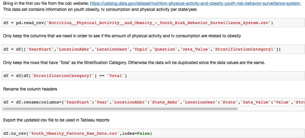 For the second data set, we are looking at the number of city parks/resources and obesity rates per state. The number of existing columns matched what was needed so we didn’t have to limit our data. However, we did want to still drop any rows that were null as we don’t want to include incorrect data that would skew our results.

The following dataset is for sugar intake and obseity level.
Get the data and inspect the raw data
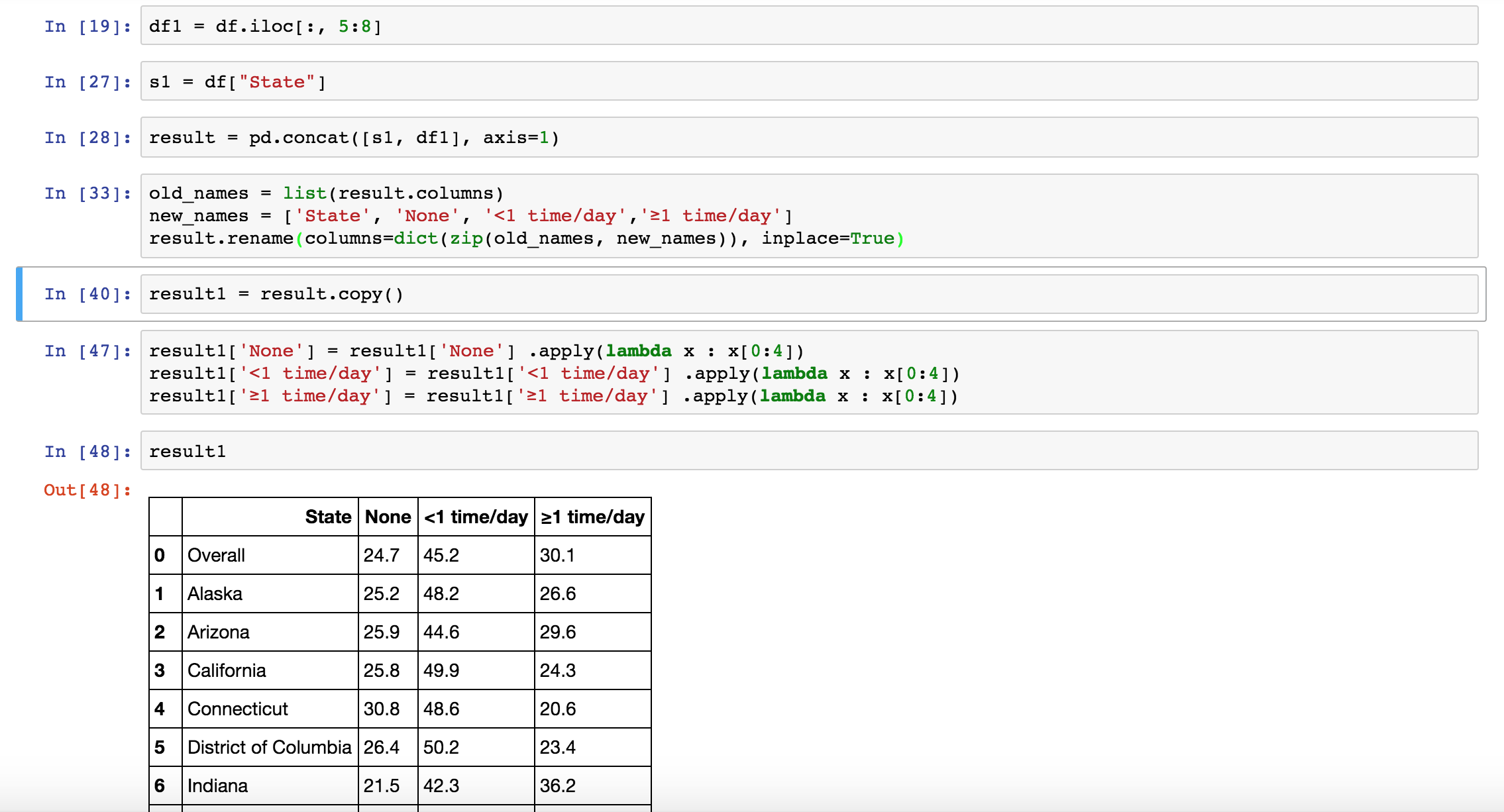
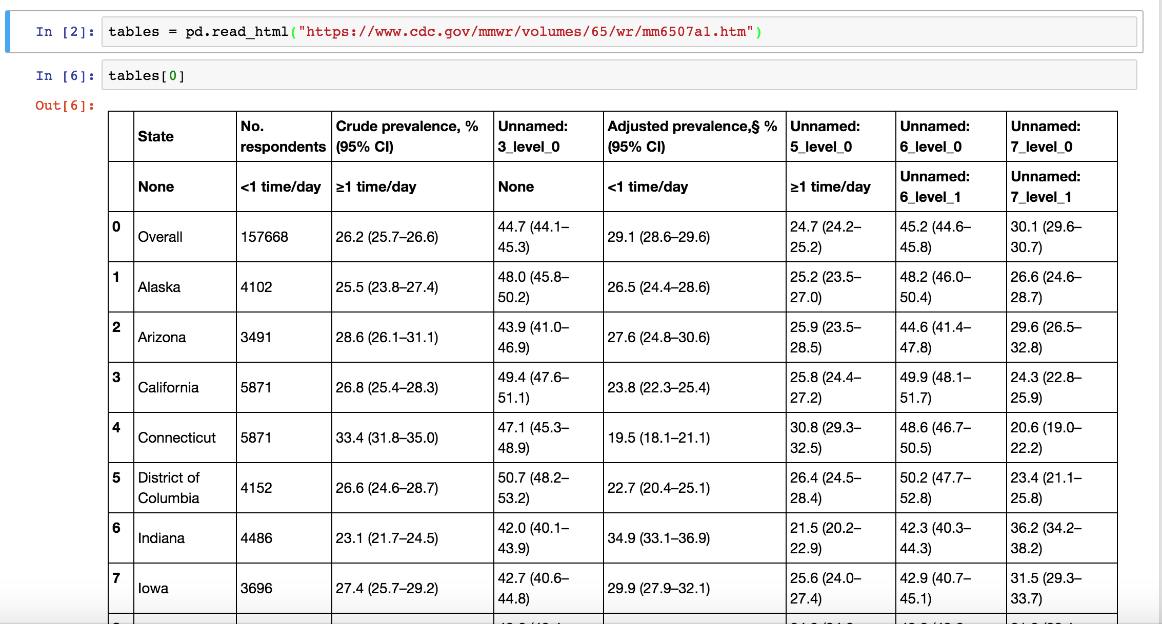 Discard the unwanted columns and extract the useful columns (State, None, Sugar Intake, <1 time/day, ≥1 time/day)
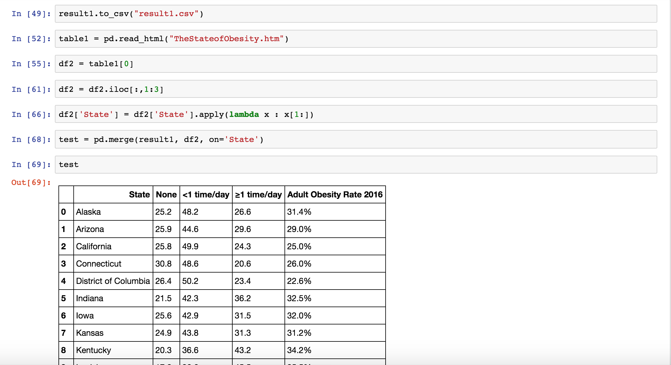
 Collect the data of adult obesity rate by state and merge two datasets
To present the relationship between education and obesity, we tried to compare the percentage of people going to college and not going for obese and non-obese people.
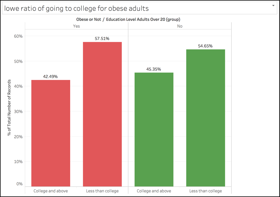
Then we realized this does not show any correlation between education level and how obese the population is.
Intermediate for viz 1 - viz 4
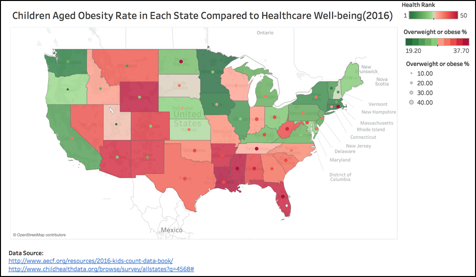
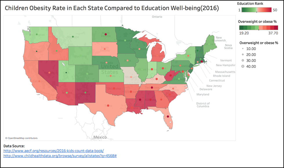
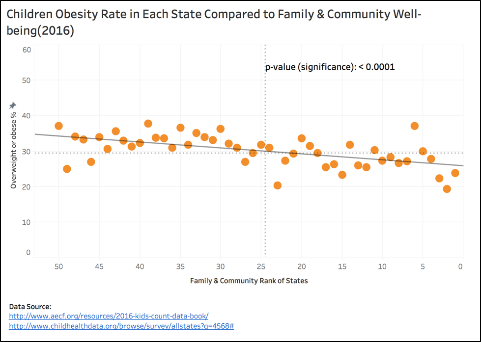
For this first version, we compared the ranking of each state in the four areas described in dataset 1 with the obesity levels of kids and teens (age 10-17) in dataset 2.The assumption is that if kids are raised in the states that are ranked high, they are growing up in a better environment than those kids living in lower ranking states. This should have an effect on their obesity levels, as they are receiving better healthcare, education, economic resources, and family/community support. However, looking at this version of visualizations, the trend is hard observe with the amount of different visualization aspects included; while red and green is used to indicate bad and good, the size of data points is also used to indicate different levels of obesity. The audience will not have a clear idea of the trend we are trying to show. The color element also weakens our argument by showing data points that are not conforming to the trend: states ranked in the top 20 are showing obesity rates above 35% (see North Dakota)
Intermediate for viz 5 - viz 6
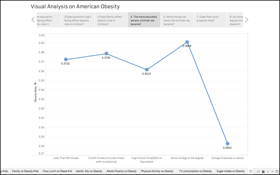
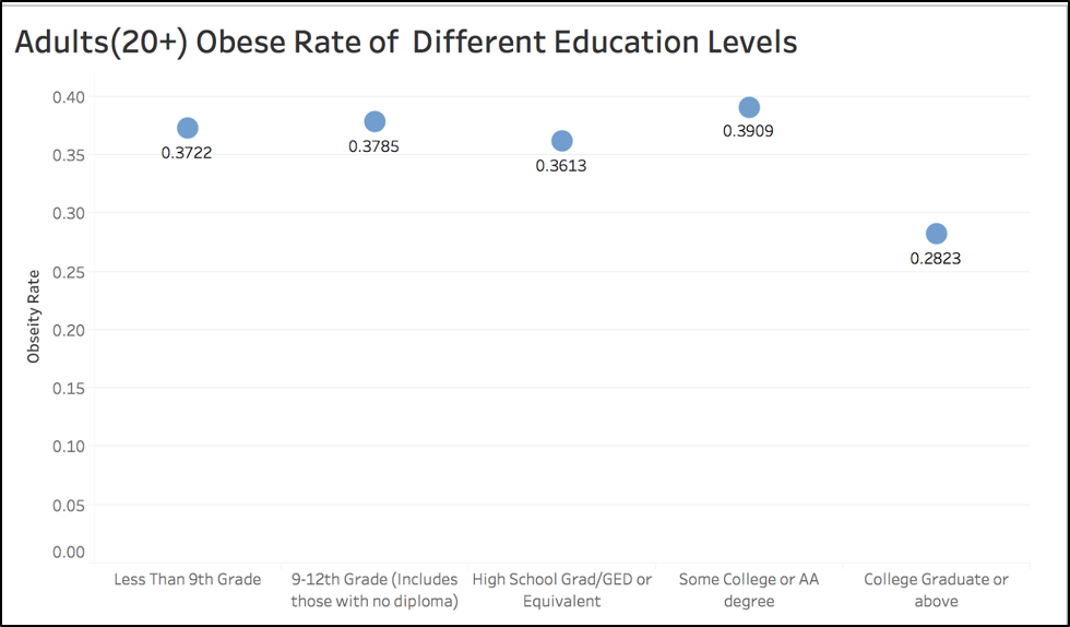
This following scatter plot shows the obesity rate for each education background. However the data/viz ratio is not good. And the fluctuation is not very evident.
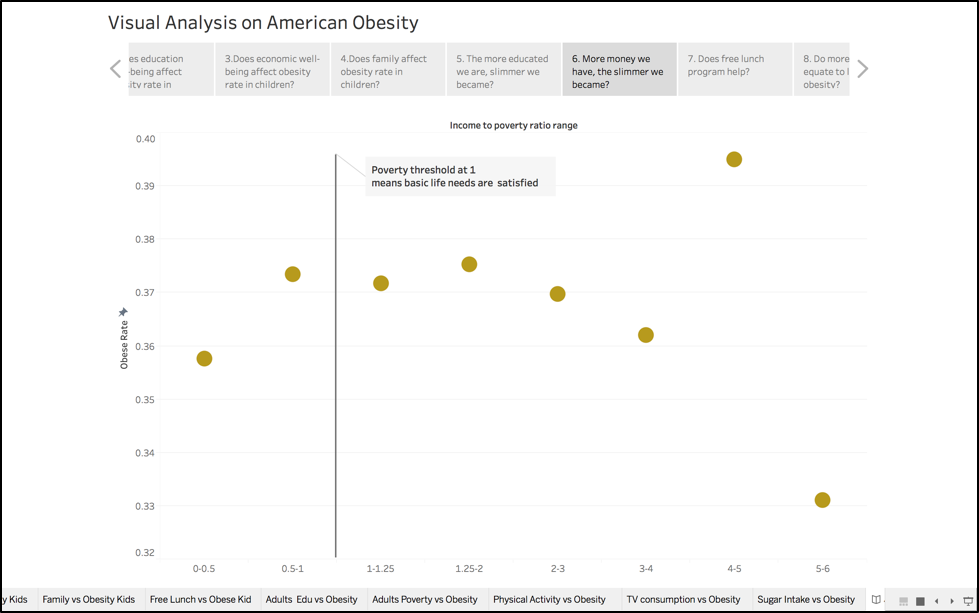
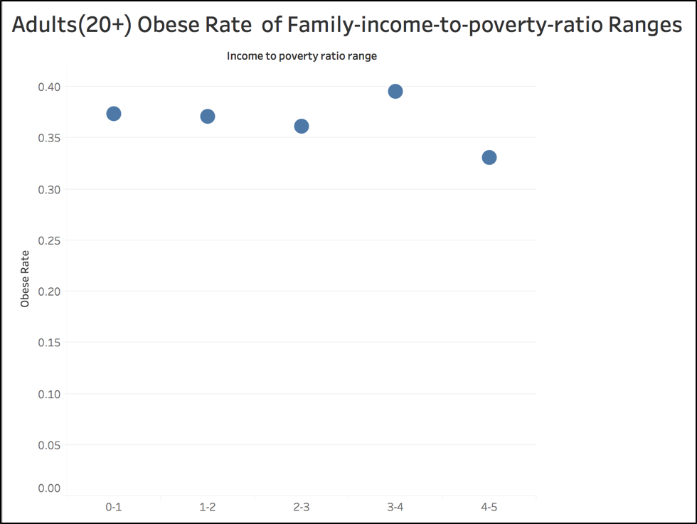
 The following visualization is the prototype for correlation between family income-to-poverty ratio. However this data/viz ratio is not good either. In addition, audience may get lost at understanding the x-axis. They may not know what each unit represents.
Intermediate for viz 7
Version1: We originally wanted to compare obesity in two states, so here only the states of Massachusetts and West Virginia are included. Without the other 48 states, we are eliminating most of the information about the obesity situation in the United States, which means this visualization distorts the truth, so next we added more states.
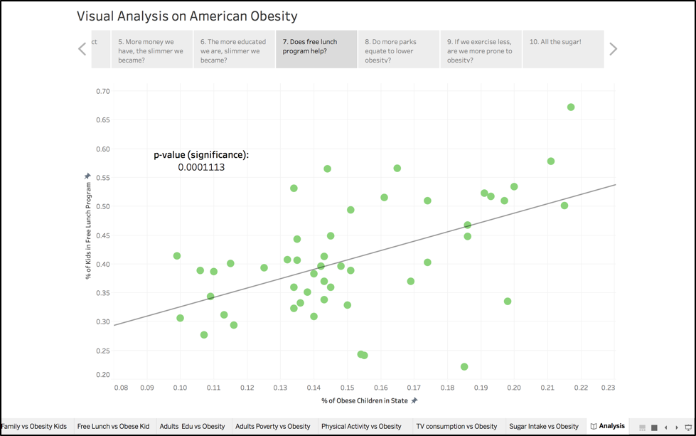
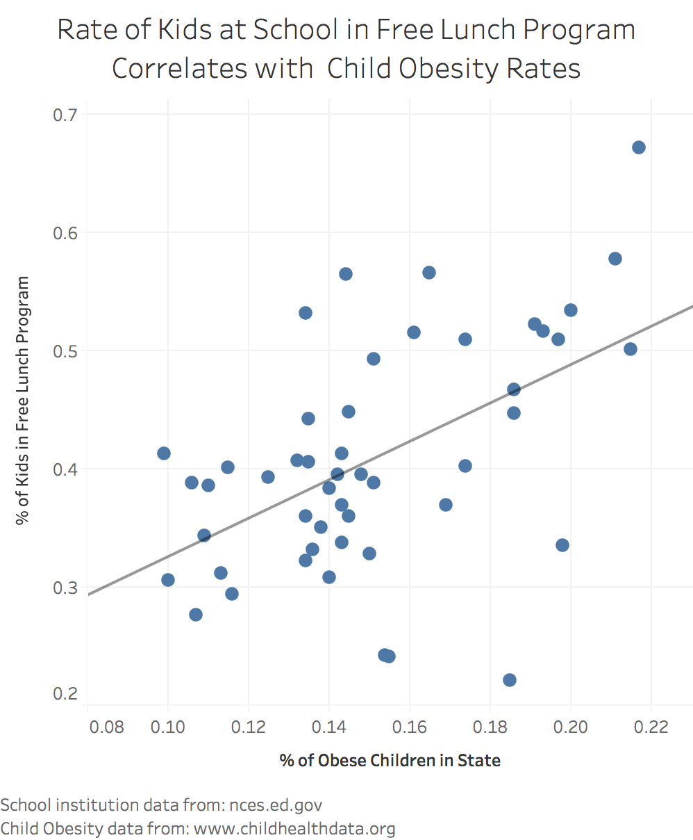
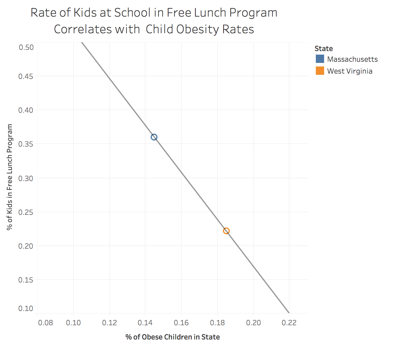 Version2: The objective was to show a trend among states, not where each state is positioned. So the legend is removed, because having so many other states in the chart has increased the clutter. In this version there is too much white space on the bottom and left side of the chart. Axes parameters should be changed to bring the dots to the center of the chart. Also, the dots colors should be consolidated to a single color because again, exact position of each state doesn’t matter here - only the trend among other states.
Intermediate for viz 8
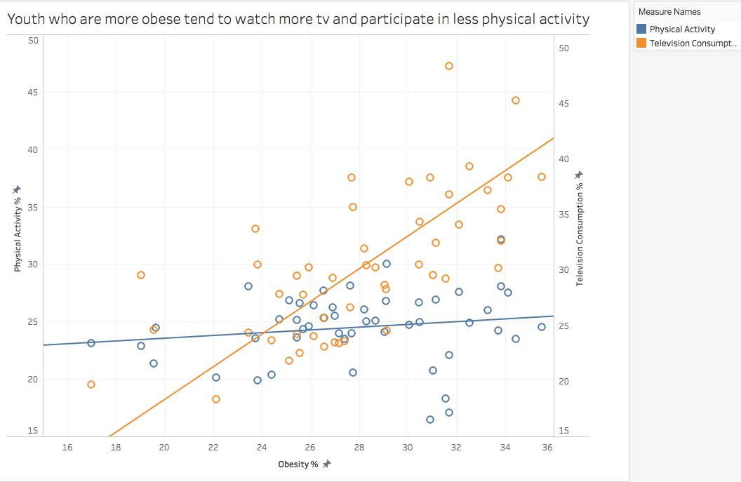
In this graph, we can see that youth who watch more television and participate in less physical activity are more obese. This chart is good because it shows three dimensions and adds more complexity. However it is confusion to see television consumption and physical activity side by side. Therefore, in the next version, I am going to take the ratio of tv consumption versus physical activity and then plot that against obesity. This way, we’ll be able to see if physical activity and tv consumption together play an equal role in obesity.
Intermediate for viz 10
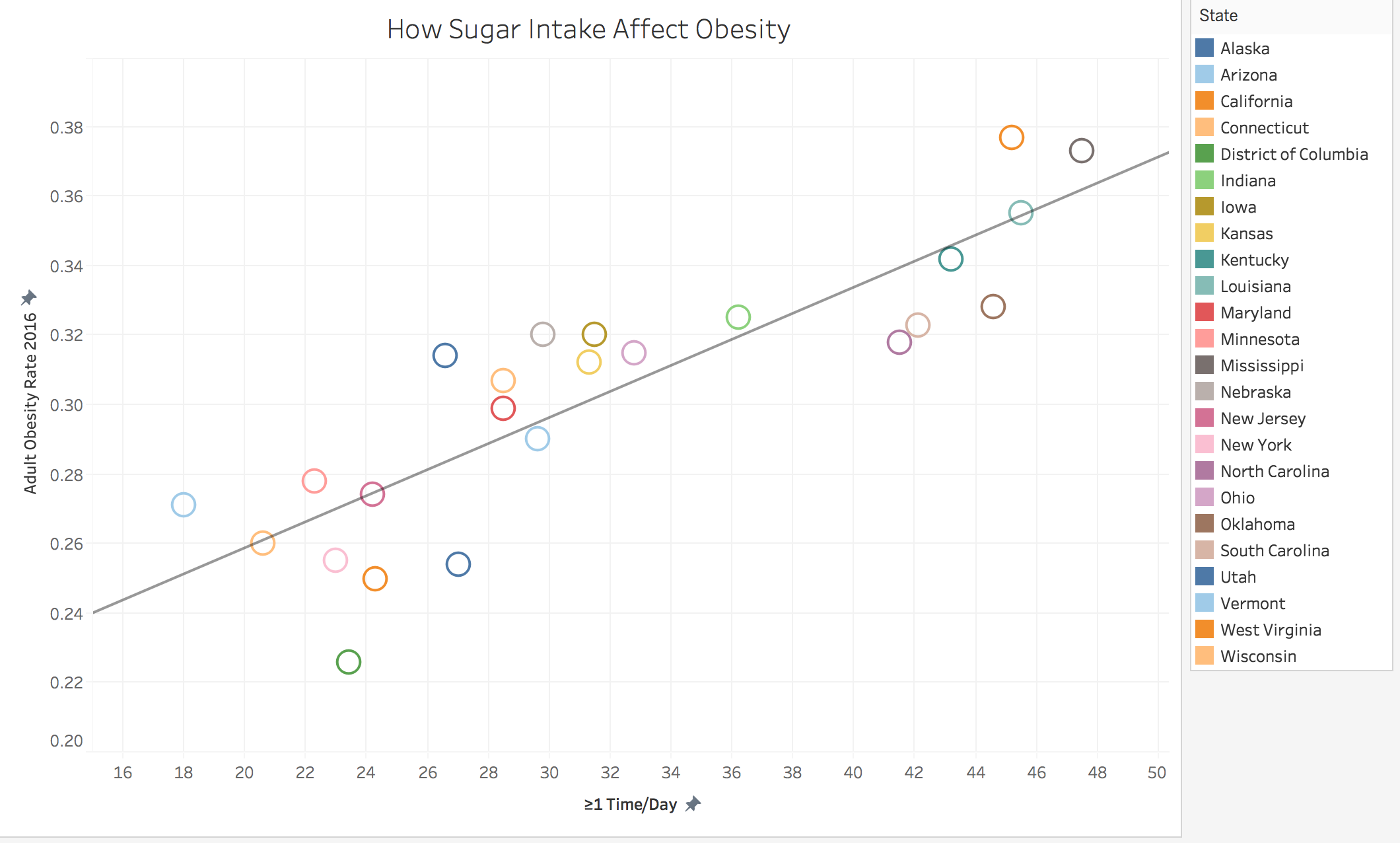
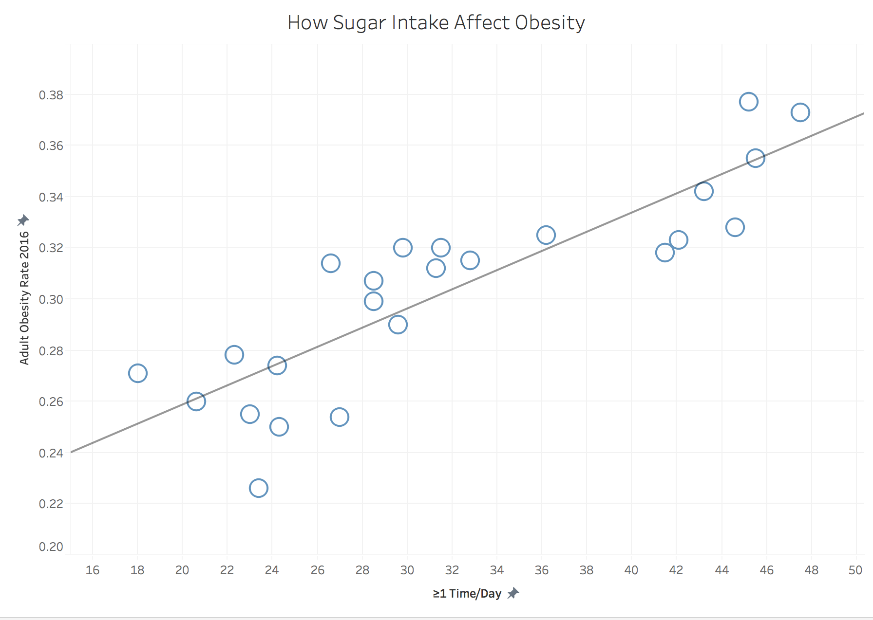
On the first edition, we integrated the adult obesity rate by state with the number of >=1 Time Day Sugar Intake as a scale chart. That visualization result has too many colors on the chart, which detracts our claim.
 For second edition, I took out those colors. However as a result, the legend would be redundant and the audience wouldn’t be able to tell which circle correlates to which state.
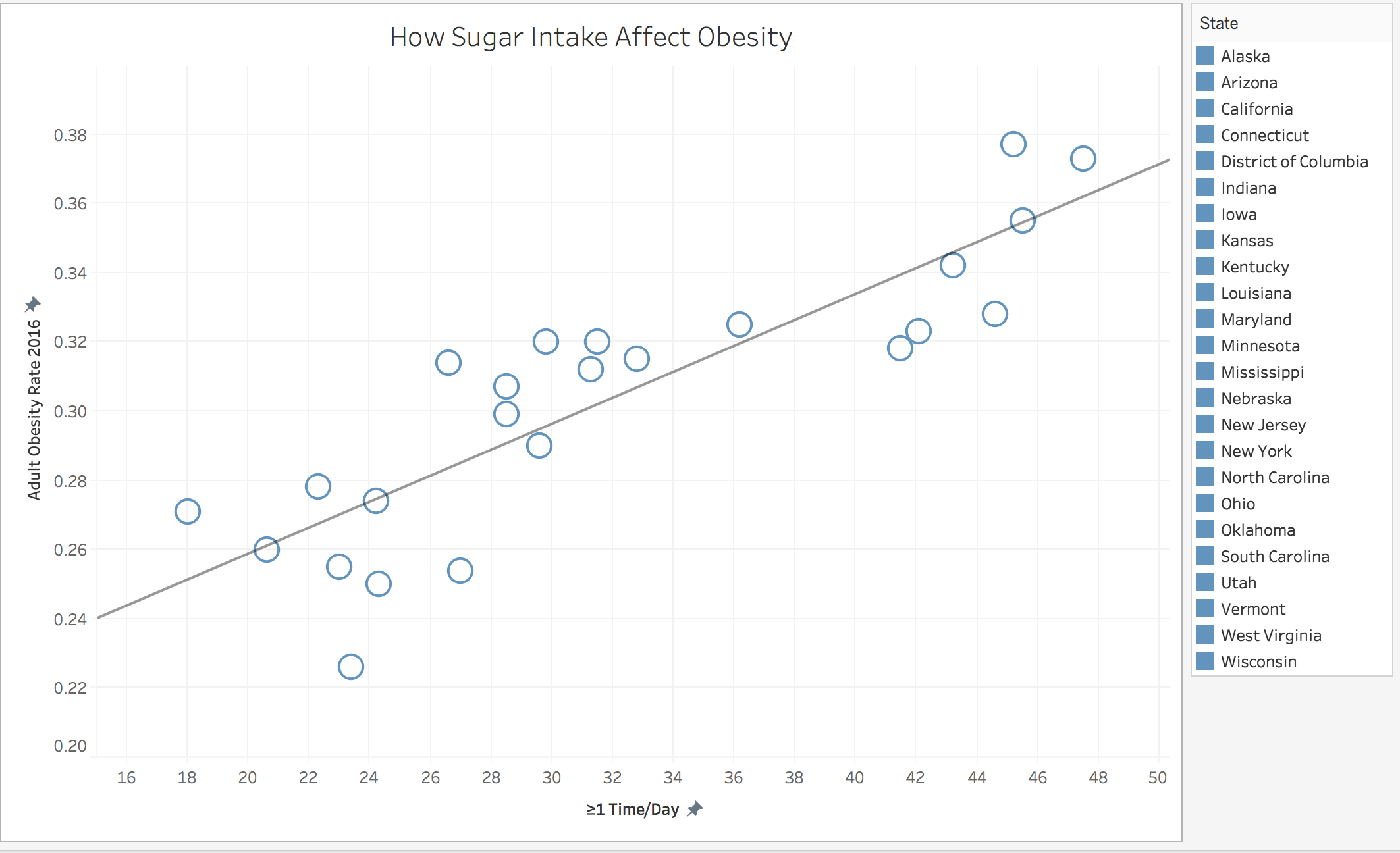 On the third version, I changed the axis to show a transparent trend; if the visualization is zoomed in too much, the data points will seem more scattered around the trendline, thus decreasing the strength of the argument I am trying to convey to the audience.
Final version for viz 1 - 4
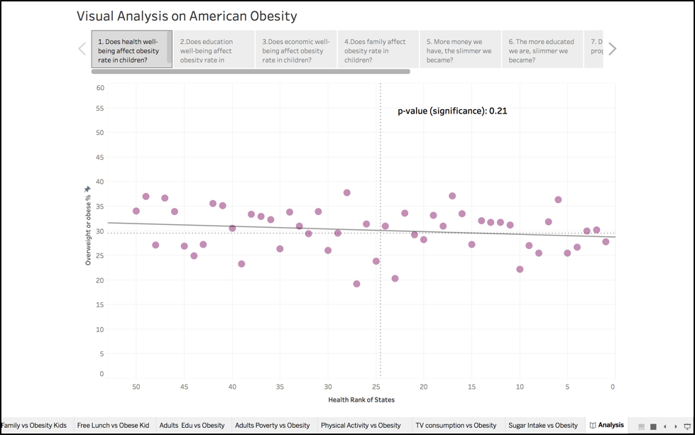
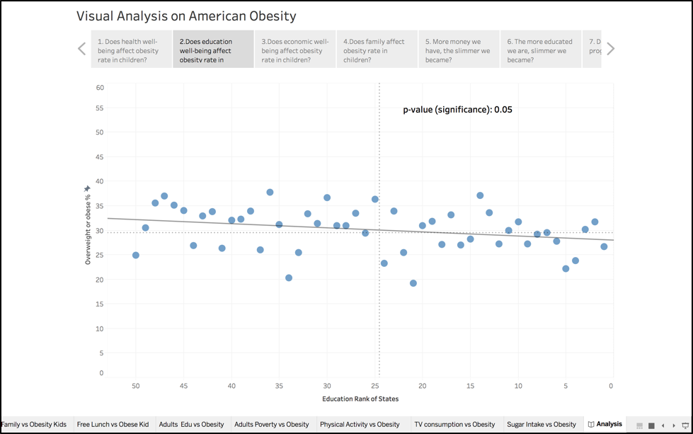
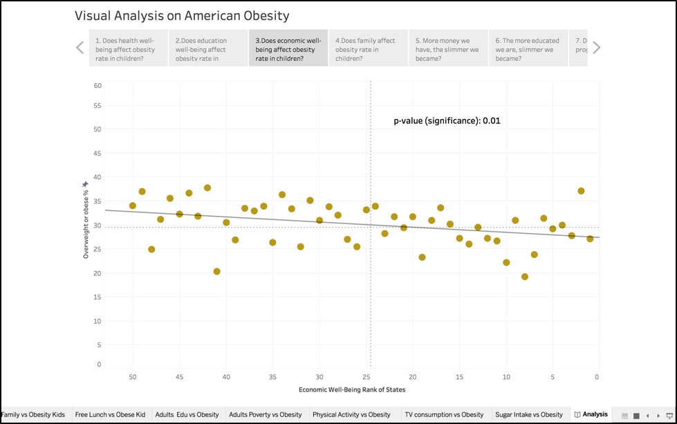
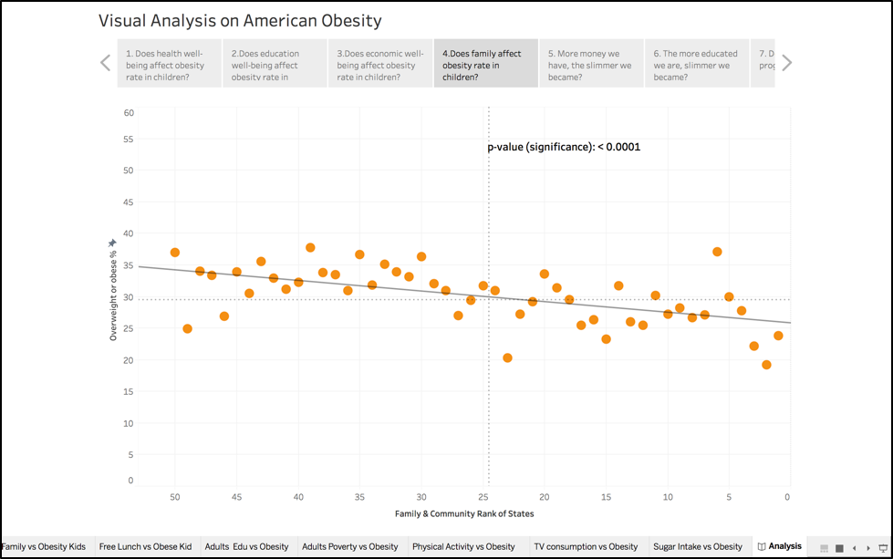
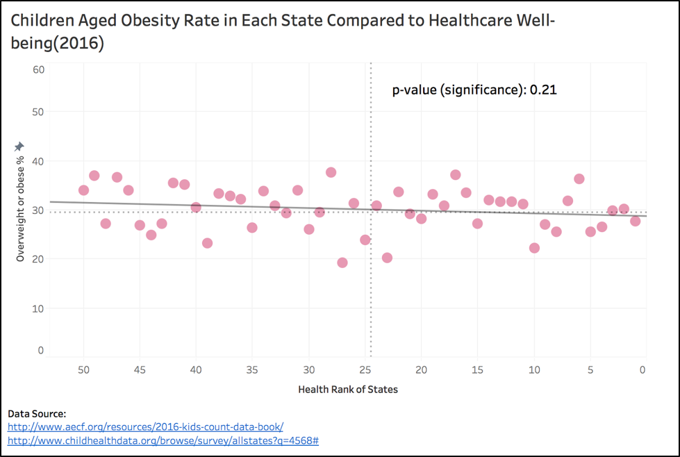
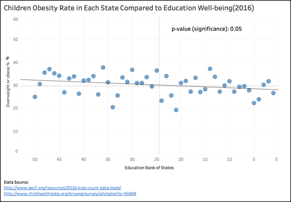
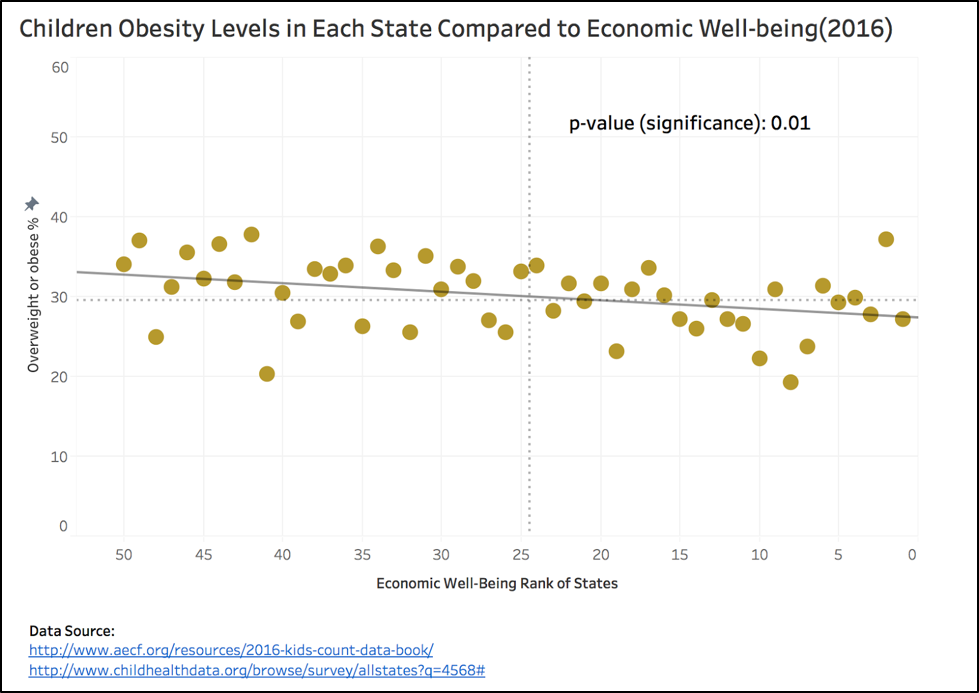
In this version, we used scatter plot instead, which shows a clear trend between the two datasets. As expected, we see that there is a negative correlation with the state rank and obesity level of kids; states ranked higher will have a lower obesity rank than those that rank lower. By using this format, I am also able to use the regression model to interpret the data; small p-values (< 0.05) indicates a significance of results, and those below or close to 0.05 is weak or marginal results and need to be reconsidered for the argument the data is trying to convey. Looking at the four charts, family and community and economic ranks have the strongest correlation with obesity rate. The education chart is also significant but to a lesser degree. The health rank in comparison, has the weakest correlation to obesity rate, since the p-value is well above 0.05
Final version for viz 5
Since we are unsure whether obesity relates to poverty, we want to see whether there is correlation between poverty level and obesity rate for children and adults.
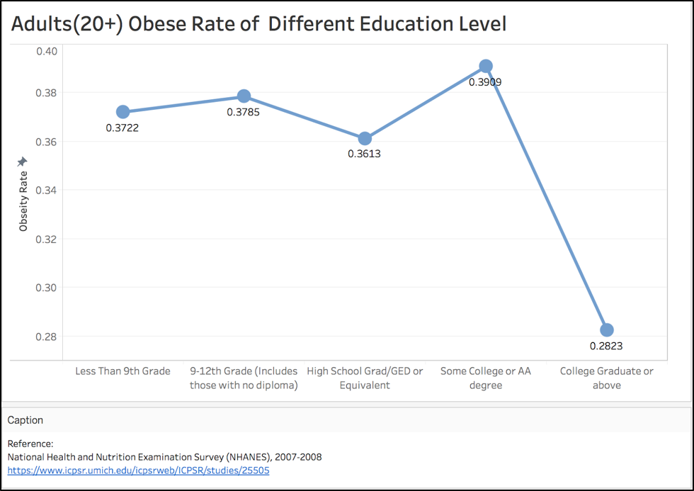
The other angle we are looking at is the correlation between education background and obesity rate. The reasoning is that if people are more educated, they will be more aware of their well-being. Therefore they will be more likely to maintain a healthy diet and stay away from being overweight or obese.
For adults, education level has an interesting relationship with obesity rate. It shows college graduates having the lowest obesity rate whereas college students or those with AA degrees have the highest rate.
The reasons behind this odd relationship is that college students don’t get enough sleep, are often sitting and have poor eating habits.
Improvement from intermediate:
Add line to show the trend as a visual aid to help the audience to see the ups and downs more clearly.
Also, axis is cut to 0.38 - 0.4 to improve the data/viz ratio.
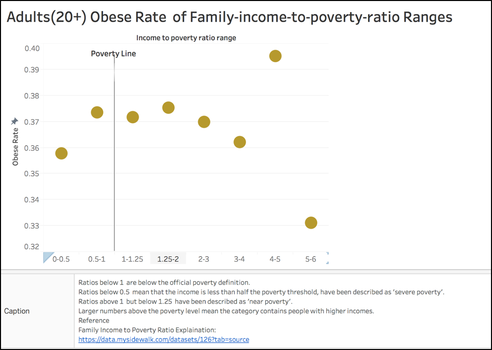
 Obesity rates for adults over 20 are suggesting there is somewhat a correlation between poverty and obesity. The trend began when people move away from poverty (1.25-2). There is outlier at range (4-5) in which the rate drastically decreases when it is in range (5-6). People in ‘severe poverty’ suggest that if you are too poor to afford food, you are less obese than folks who around the poverty line.
Final version for viz 6
Improvement from intermediate:
Cut the axis to improve the data/viz ratio
Add a line to indicate the poverty threshold
Add a caption to explain what the numbers represent
Further divide to category near poverty line
Final version for viz 7
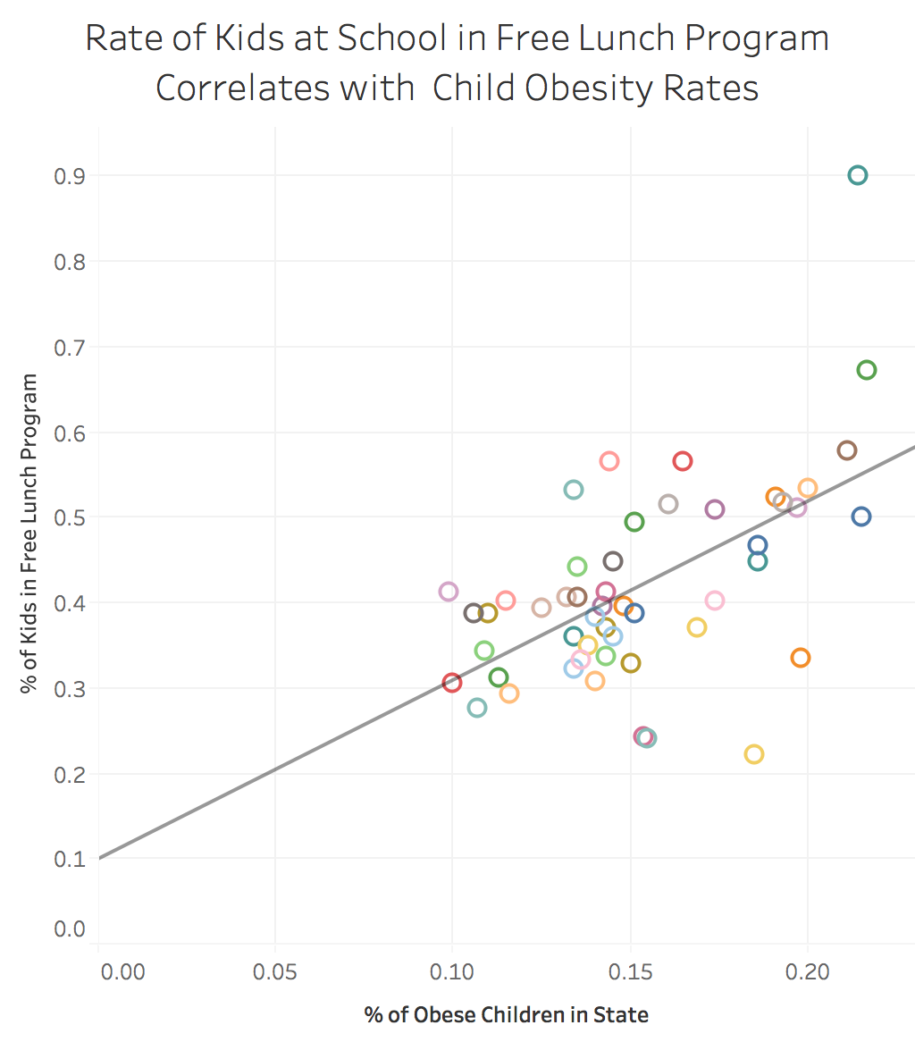
Lunch Program Correlations:
Final version for viz 8
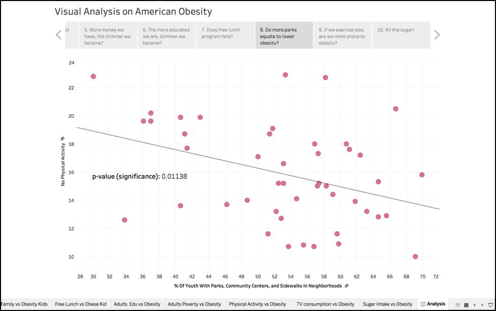
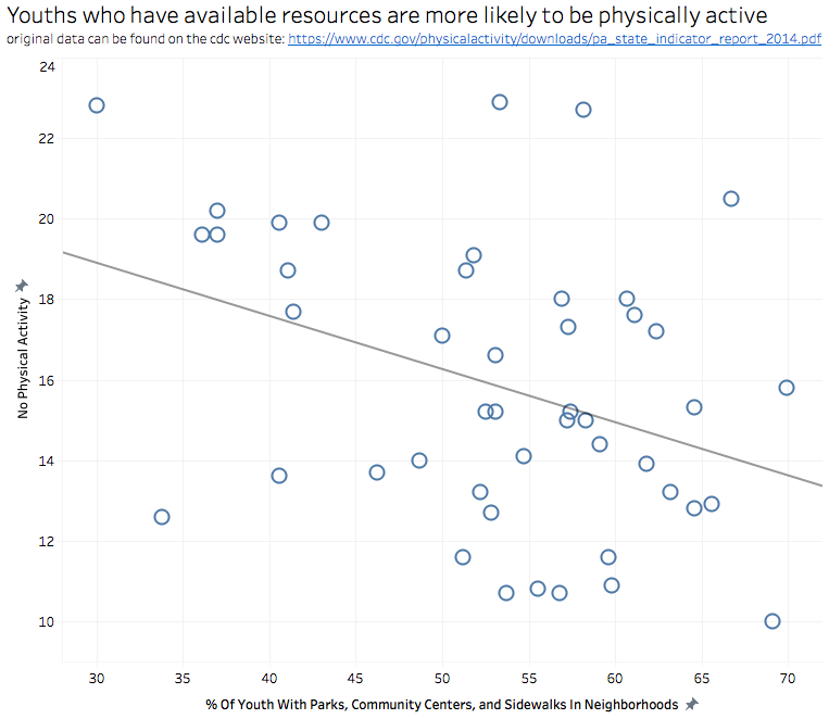
The southern states surrounding Mississippi and Louisiana have some of the lowest numbers of city parks available within their neighborhoods. As a result, physical activity is seen as a lower priority, which leads to higher rates of obesity. Although there is a downward trend that indicates more parks can lead to more physical activity, the correlation isn't that strong so we aren't able to say that parks are the direct cause of physical inactivity. This confirms our claim that obesity is a complex issue that can't be resolved with one solution. However, this is a potential factor that states should keep in mind when creating initiatives to combat obesity.
Final version for viz 9
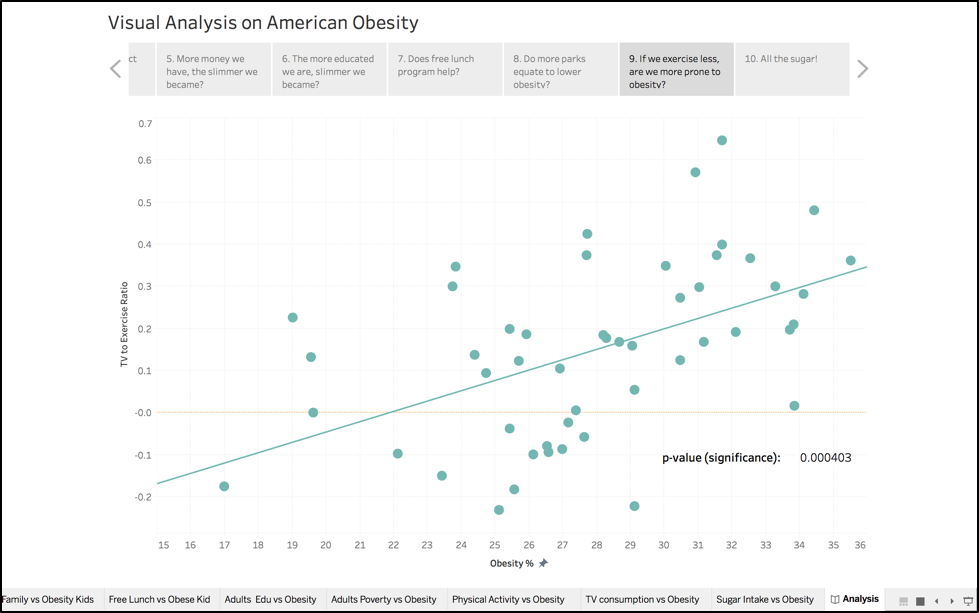
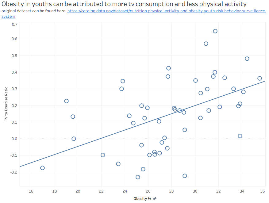
In the chart down below, we are comparing television consumption and physical activity to obesity levels. We would expect that if you watch more television, there is a direct correlation to obesity. However in the visualization it is evident that television consumption is only directly related to obesity if the youths are not physically active. If a youth is watching several hours of television but is also playing sports for several hours, they are less likely to be obese as they are still getting exercise. This visual has a stronger correlation than city parks and physical activity, which indicate that youths don't necessarily need parks to get exercise. Instead they can find other methods to get exercise such as going for a brisk walk or run around the neighborhood. However, some neighborhoods may not be well developed and may have dangerous street conditions. These states should follow successful initiatives that were implemented by others.
For example, Michigan's Department of Community Health passed a legislation in which the Department of Transportation will consider all types of transportation (pedestrians, bicyclists, motorists and public transportation riders) when they design their transportation. This encourages more people to be physically active as they have easier access to safely walk or bike. Another successful initiative was in Minnesota in which they implemented a Safe Routes to School program. This program fosters a better environment for youths to bike or walk to school. They were able to accomplish this by creating safer routes, educating on the importance of exercise and creating after-school programs that encourage physical activity.
Final version for viz 10
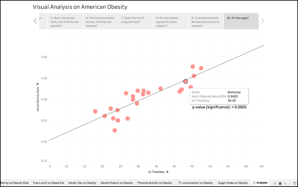
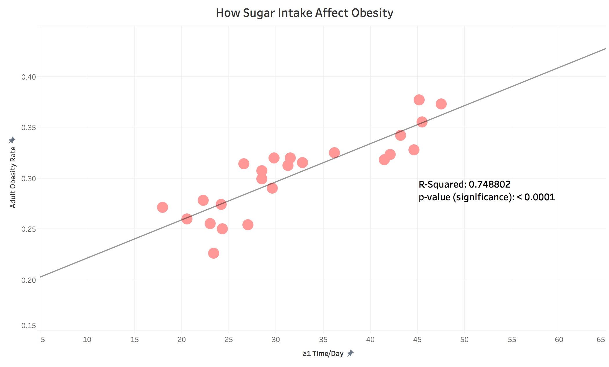
In this version, We change the original hollow circle to solid circle to be consist with our teammates. Because the p-value and r-squared are both good, I choose to present it on my final visualization. We can easily say sugar intake has a significant influence on obesity. Based on that, we can conclude that sugar consumption caused the obesity.
There are so many factors contributing to obesity, it’s impossible to control every single one of them; some factors potentially correlation for obesity, but they are not the causation for it.
However we can start tending to what we know are heavily correlating factors:
Obesity in Children: http://www.heart.org/HEARTORG/HealthyLiving/HealthyKids/ChildhoodObesity/What-is-childhood-obesity_UCM_304347_Article.jsp#.WiDI77T83L8
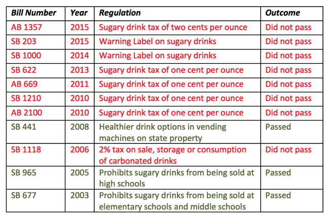
Sugar drinks regulations: http://www.csus.edu/calst/legischool_project/ls_publications/soda%20tax%20guide.pdf
Sugar industry skew health research: https://www.npr.org/sections/thetwo-way/2016/09/13/493739074/50-years-ago-sugar-industry-quietly-paid-scientists-to-point-blame-at-fat
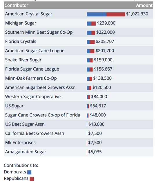
Sugar lobbying costs: https://www.opensecrets.org/lobby/clientsum.php?id=D000029610&year=2017
Sugar industry spending on different political parties https://www.opensecrets.org/industries/indus.php?ind=A1200
US Physical Education: http://healthland.time.com/2011/12/07/childhood-obesity-most-u-s-schools-dont-require-p-e-class-or-recess/
PE guidelines for California: https://www.cde.ca.gov/ls/fa/sf/peguidemidhi.asp
