This package, as the name suggests, will become a “sort of” port of ggplot2 for Nim.
It is based on the ginger package.
If you’re unfamiliar with the Grammar of Graphics to create plots, one
of the best resources is probably Hadley Wickham’s book on ggplot2,
for which also an online version exists at:
https://ggplot2-book.org/
In general this library tries (and will continue to do so) to stay
mostly compliant with the ggplot2 syntax. So searching for a
solution in ggplot2 should hopefully be applicable to this (unless
the feature isn’t implemented yet of course).
v0.3.0 contains breaking changes regarding the usage of formulas via
the f{} macro and is mostly considered a stop-gap release until
v0.4.0 is released.
Originally v0.3.0 was supposed to contain:
geom_densitygeom_contour- working
facet_wrap
and some miscellaneous things like updated documentation.
Instead I started a rewrite of the data frame on top of arraymancer,
which was more successful, than I imagined. This sidelined my other
work. But since I don’t want to keep this out of ggplotnim anylonger,
I made this the main part of v0.3.0.
v0.4.0 will probably not take too long and will include proper
documentation on the formula syntax and the above. By then however the
data frame will also have been turned into its own module (probably
named) datamancer.
Short notes on formula syntax. The following rules apply:
Use:
- no infix symbol and only code, which does not involve a column in
the sense defined below in Column access:
f{1 + 2}
f{"aColumn"}
f{true}
a
FormulaNodeof kindfkVariable. Stores the values as aValuevariant object. <-for assignmentf{"newName" <- "oldName"}a
FormulaNodeof kindfkAssign. This does not involve a closure and is just a simple object storing a LHS as a string and the RHS as aValue(to also support constant columns viaf{"constantCol" <- 5}). Typically used forrenameor as an argument fortransmuteandmutateto just rename a column or to assign a constant column.<<for reduce operationsf{"meanHwy" << mean(`hwy`)}a
FormulaNodeof kindfkScalar. Used only forsummarizeand means we reduce a full column to a singleValue. This generates a closure, which computes the RHS and assigns it to a result variable of typeValue. Type hints are required (for now) if only a single proc call is involved on the RHS to tell the macro as what to read the column “hwy” and what the result variable is.~for vector like procf{"xSquared" ~ `x` * `x`}a
FormulaNodeof kindfkVector. Used inmutate,transmuteto calculate a full column. This also generates a closure as the reduce operations<<does, except here we loop over the length of the DF and access each read tensor via[idx].- a formula without any infix symbols will be considered:
fkVariableif no column involvedfkVectorelse
To access columns in the context of formula, the biggest change occured. In the old formula system, a literal string was attempted to be resolved as a DF column dynamically. Since the new formulas are compiled to closures, this would involve overhead and is thus avoided for clearer separation between columns and real strings. This also helps readers of a formula. This means:
`columnName`: accented quotes refer to a DF columnc"columnName": call string literals (by convention use acbefore the string) are interpreted as a column- or directly via:
df[<someIdent/Sym>/string literal]: to access columns using identifiers / symbols defined in the scope / or string literals (either including accented quotes, call string literals or just string literals). idx: can be used to access the loop iteration index
The closures take a data frame as an argument, which is named
df. The df["columnName"] refers to that argument, although not
literally (it is gen’symmed and df["columnName"] refers to a
Column). From that column we get the underlying Tensor.
In the context of calling procedures, e.g.:
f{"newCol" ~ someProc(c"columnName")}it may not be clear whether the procedure is supposed to take the whole tensor as an argument or hand each element of the tensor in a loop. By default it is assumed that a given column in a call refers to a full column (/ tensor). To clarify that the proc takes a value, you have to clarify it via:
f{string -> float: "asFloat" ~ parseFloat(df["colName"][idx])}
# ^--- type of the tensors involved on the RHS
#           ^--- type of the resulting tensor (the new column `asFloat`)
where parseFloat acts on each element individually. For such a proc
type hints are required, since it’s not clear as what type colName
is supposed to be read.
Type hints are required if the formula does not involve any more complex operations (e.g. single proc call to reduce, …). They are of the form:
<type>: <actualFormula>: simple type hint for the type of the underlying tensor of the columns involved in the formula.<type> -> <resDtype>: <actualFormula>: full type for closure.<type>is the dtype used for input tensors,<resDtype>the resulting type.
NOTE: it is not possible to include tensors of different data types
in a single formula. All input tensors of a computation will be read
either by the automatically deduced data type or the <type> argument
mentioned here. If an underlying tensor is not actually of the given
data type, it will be converted via T(val), where T is the type.
There is a step from an untyped to a typed macro involved, which tries
to determine data types, but that is very experimental.
Also the macro tries to guess data types based on symbols involved in
the computation of the formula, e.g. if *, / is involved, it’s
assumed that the input tensors are floats and the output as well. If
& or $ is involved, it’s assumed to be strings.
Finally if and and other logic keywords are used, the result is
assumed to be bool (not the input thought!). The full list of
symbols used is found here:
const floatSet = toSet(@["+", "-", "*", "/", "mod"])
const stringSet = toSet(@["&", "$"])
const boolSet = toSet(@["and", "or", "xor", ">", "<", ">=", "<=", "==", "!=",
                        "true", "false", "in", "notin"])
For now please mainly refer to the recipes on how to use this, because they are checked in the CI and will work for sure!
For a more nimish approach, check out the recipes, which should give you examples for typical use cases and things I encountered and the solutions I found. Please feel free to add examples to this file to help other people!
Note that all recipes shown there are part of the test suite. So it’s guaranteed that the plots shown there for a given version actually produce the shown result!
The documentation is found at:
https://vindaar.github.io/ggplotnim
Installation should be just a
nimble install ggplotnimaway. Maybe consider installing the #head, since new version
probably won’t be released after every change, due to rapid
development still ongoing.
Since this library is written from scratch there is only a single
external dependency, which is cairo.
Geoms:
geom_pointgeom_linegeom_histogramgeom_freqpolygeom_bargeom_errorbargeom_linerangegeom_tilegeom_text- soon:
geom_density- and possibly
geom_ridgeline
Facets:
facet_wrap
Scales:
- size (both for discrete and continuous data)
- color (both for discrete and continuous data)
Shape as a scale is not properly implemented, simply because ginger only provides 2 (circle, cross) different marker shapes so far. Feel free to add more!
The library implements a naive dynamic and column based data
frame. Each column is represented as a persistent vector of
Values. A Value is a variant object, similar to a JsonNode of
the standard library.
NOTE: Due to the dynamic nature and naive implementations performance is not a priority. Heavy calculations should be done before creation of the data frame. Simple arithmetic, filtering, reducing etc. is the main aim.
UPDATE: the note above does not hold for the arraymancer backend data frame. That implementation is plenty fast (for simple operations it’s faster than pandas!), see benchmarks/pandas_compare for a few numbers.
The data frame provides the “5 verbs” of dplyr and more. Main implemented functions:
filtermutate,transmuteselect,renamearrangesummarizegroup_byarrangeinner_joinset_diffcountbind_rowsgatherunique,
which are all based on the FormulaNode
object. Basically they all receive varargs[FormulaNode], which is
evaluated in context of the given dataframe.
Other convenience procs
Creationg of a FormulaNode can be done either directly via untyped
templates acting on +, -, *, /, ~. Using the mpg data set
as an example:
let f = displ ~ hwy / ctywould describe the dependence of the displacement (displ) of the
ratio of the highway to the freeway mpg.
Echoeing this formula prints it as a lisp like tree:
(~ displ (/ hwy cty))
Note that the ~ in the untyped templates always acts as the root
node of the resulting tree. The LHS of it is always considered the
dependend quantity.
In these templates however, the identifiers are converted to strings
and must match the names in the data frame!
The second way to create a FormulaNode is via the f{} macro. This
provides a little more flexibility:
let f = f{ "displ" ~ "hwy" / mean("cty") }Note that here all keys must be explicit strings. Everything that is not a string, will be interepreted in the calling scope.
If the identifier is the first element of a nnkCall, e.g. as in
mean("cty"), it will be stored in a FormulaNode of kind
fkFunction. An fkFunction itself may contain two different kinds
of functions, as evident by the implementation:
# storing a function to be applied to the data
fnName: string
arg: FormulaNode
case fnKind*: FuncKind
of funcVector:
  fnV: proc(s: PersistentVector[Value]): Value
  res: Option[Value] # the result of fn(arg), so that we can cache it
                     # instead of recalculating it for every index potentially
of funcScalar:
  fnS: proc(s: Value): Value
We store the name of the function as a string for debugging and
echoeing. The function must only take a single argument (this may be
changed in the future / we may wrap a function with multiple arguments
in a template in the future). It can either be a procedure taking a
vector of Values corresponding to a proc working on a whole column
as the input (e.g. mean) or a scalar function taking a single
Value (e.g. abs). In the latter case the function is applied to
each index of the key of the data frame given by arg.
Lifting templates are provided to lift any:
liftVector[T]Proc:proc (s: seq[T]): Tproc toproc(s: PersistentVector[Value]): ValueliftScalar[T]Proc:proc (s: T): Tproc toproc(s: Value): Value
where T may be float, int, string.
The PersistentVector is an implementation detail of the data frame
at the moment and may be changed back to seq soon.
On the other hand if an identifier is not part of a nnkCall it is
interpreted as a variable declared in the calling scope and will be
converted to a Value using % and stored as a fkVariable.
Literal interger and float values are also allowed.
Each formula can be evaluated using evaluate and reduce. The
available procs have the following signature
# for formulas independent of DFs, e.g. `evaluate f{1 + 2} == %~ 3`
proc evaluate*(node: FormulaNode): Value
# evaluate formula at row index `idx`. Possible calculation of a whole row
proc evaluate*(node: FormulaNode, data: DataFrame, idx: int): Value
# reduce a DF to a single `Value` based on a formula `reduce(f{mean("someCol")}, df)`
proc reduce*(node: FormulaNode, data: DataFrame): Value
# create new DF column based on formula and DF
proc evaluate*(node: FormulaNode, data: DataFrame): PersistentVector[Value]Using a lifted vector valued function and local variables as keys and integer values:
let val = 1000
let key = "cty"
let f = f{"cty_norm" ~ "cty" / mean(key) * val}
Using a lifted scalar valued function and local variables as keys and float literal values for a random calculation:
let g = f{"cty_by_2ln_hwy" ~ "cty" / (ln("hwy") * 2)}The following are just the first plots I reproduced. The mpg dataset
being used has to be read via the readCsv proc and be converted to a
dataframe via toDf. The file is located in data/mpg.csv part of
the repository. So the header of all examples below is simply:
import ggplotnim

let mpg = toDf(readCsv("data/mpg.csv"))
where it is assumed the current working directory is the ggplotnim
dir.
Consider looking at the recipes in addition to the below to get a fuller picture!
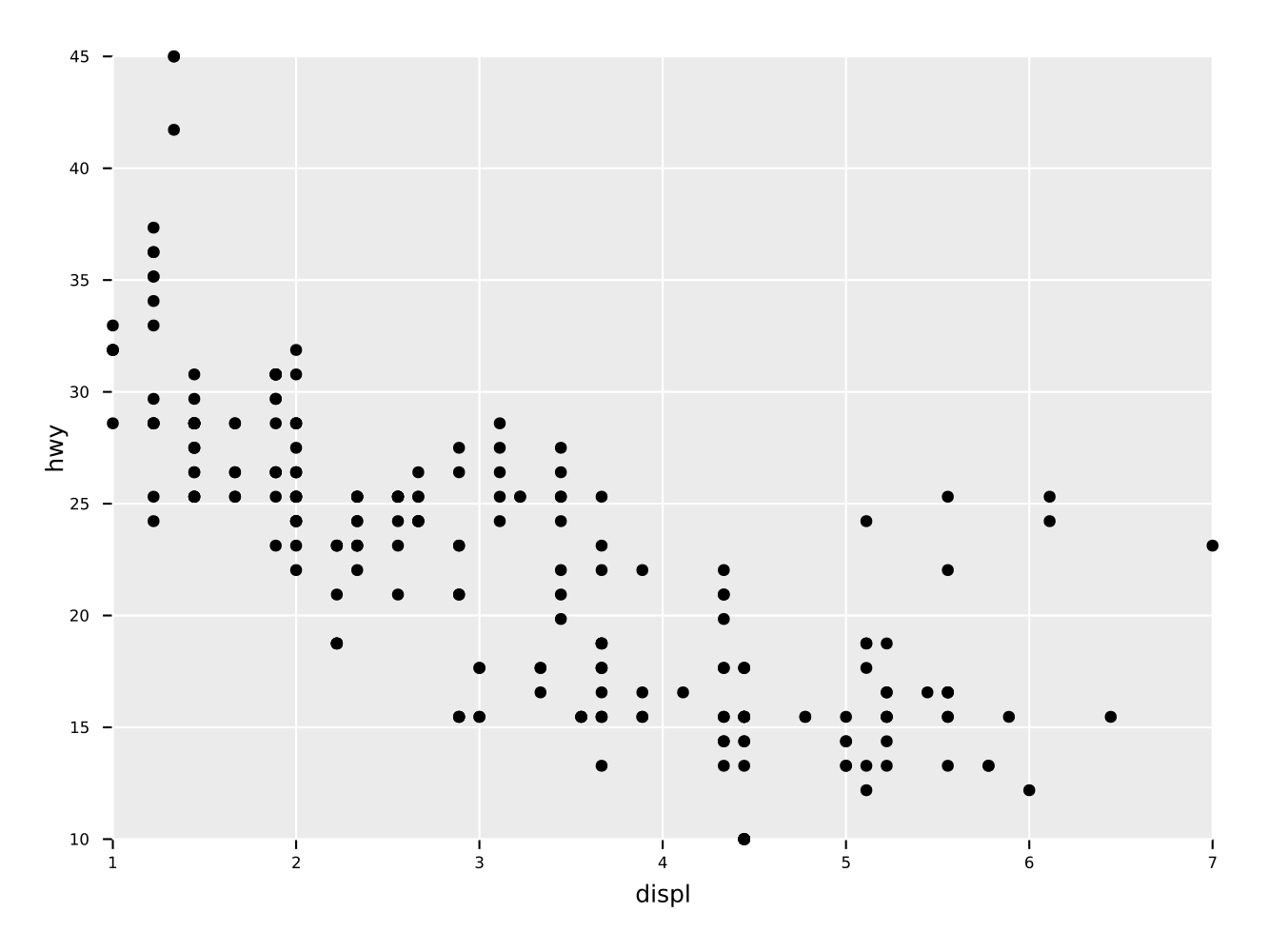
Simple scatter plot of two quantities "displ" vs. "hwy" of a
dataframe.
ggplot(mpg, aes(x = "displ", y = "hwy")) +
  geom_point() +
  ggsave("scatter.pdf")
Note: if the ggsave call is omitted, the return value will be a
GgPlot object, which can either be inspected or modified or called
upon with ggsave at a later time.
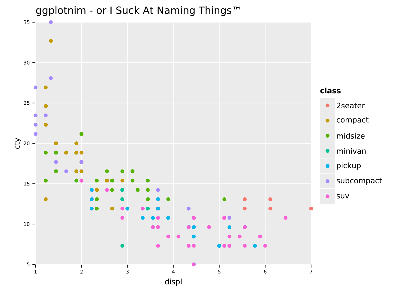
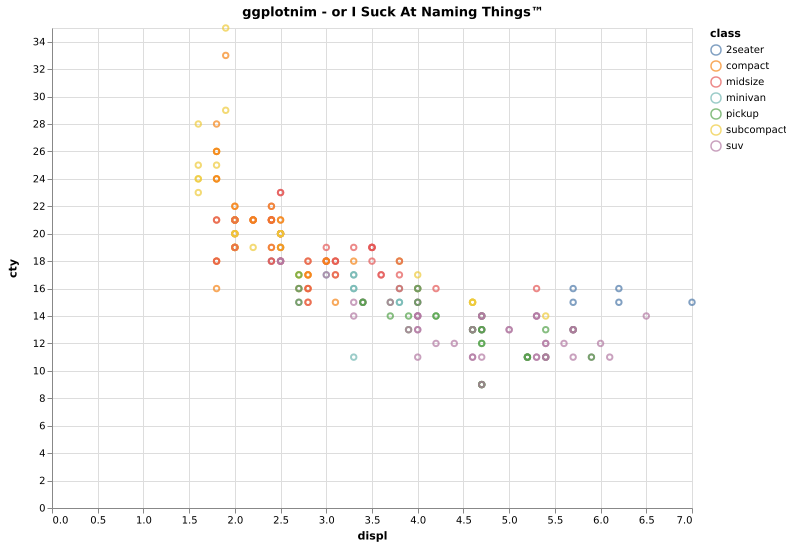
Same scatter plot as above, but with a grouping by a third quantity
"class" encoded in the dot color. Also adds a title to the plot.
ggplot(mpg, aes(x = "displ", y = "cty", color = "class")) +
  geom_point() +
  ggtitle("ggplotnim - or I Suck At Naming Things™") +
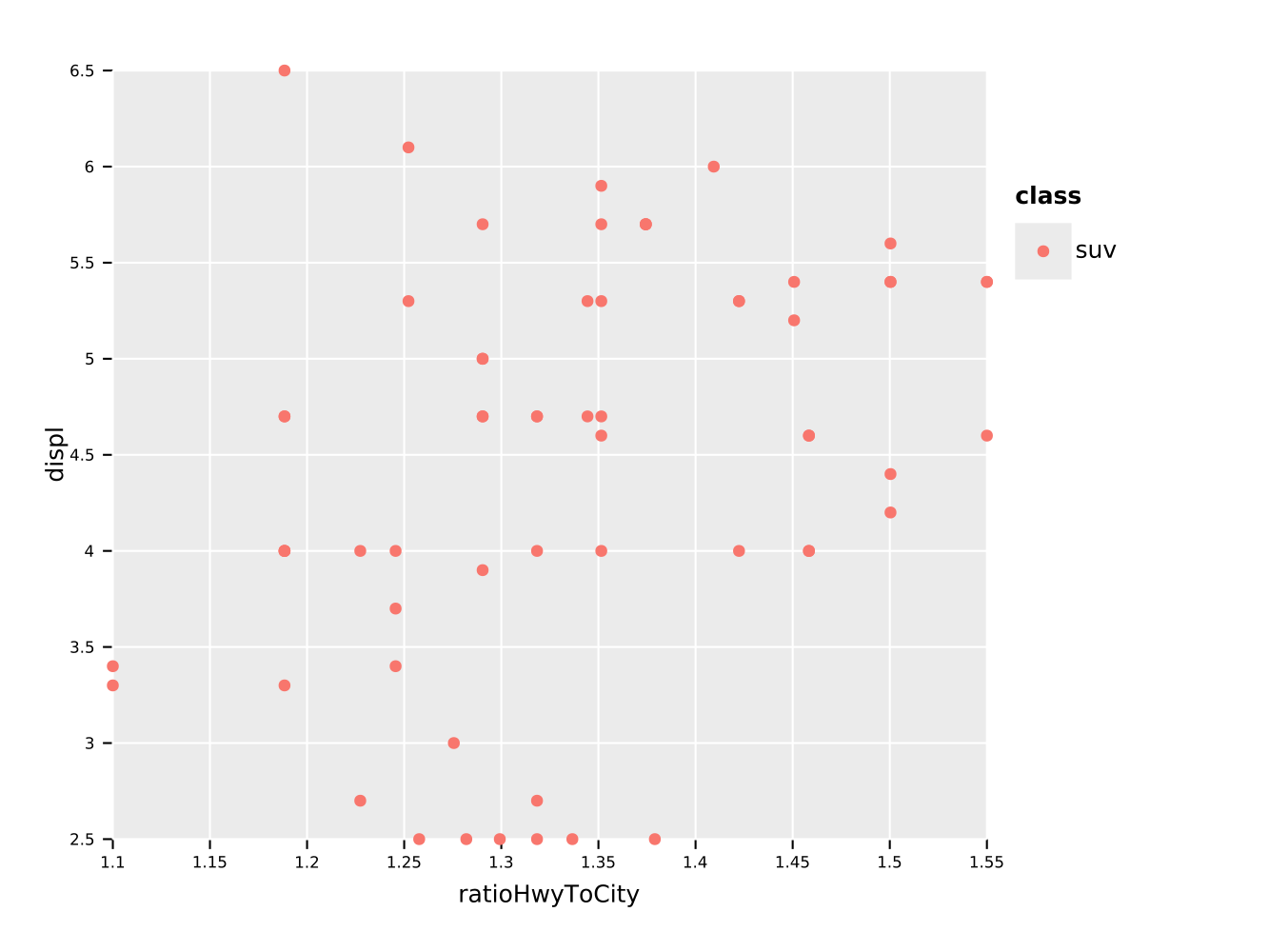
ggsave("scatterColor.pdf")We may now also perform some operations on the data frame, before we plot it. For instance we can filter on a string (or a number) and perform calculations on columns:
df.filter(f{"class" == "suv"}) # comparison via `f{}` macro
  .mutate(ratioHwyToCity ~ hwy / cty # raw untyped template function definition
  ) # <- note that we have to use normal UFCS to hand to `ggplot`!
  .ggplot(aes(x = "ratioHwyToCity", y = "displ", color = "class")) +
  geom_point() +
  ggsave("scatterFromDf.pdf")
And eeehm, I guess the legend is broken if we only have a single entry…
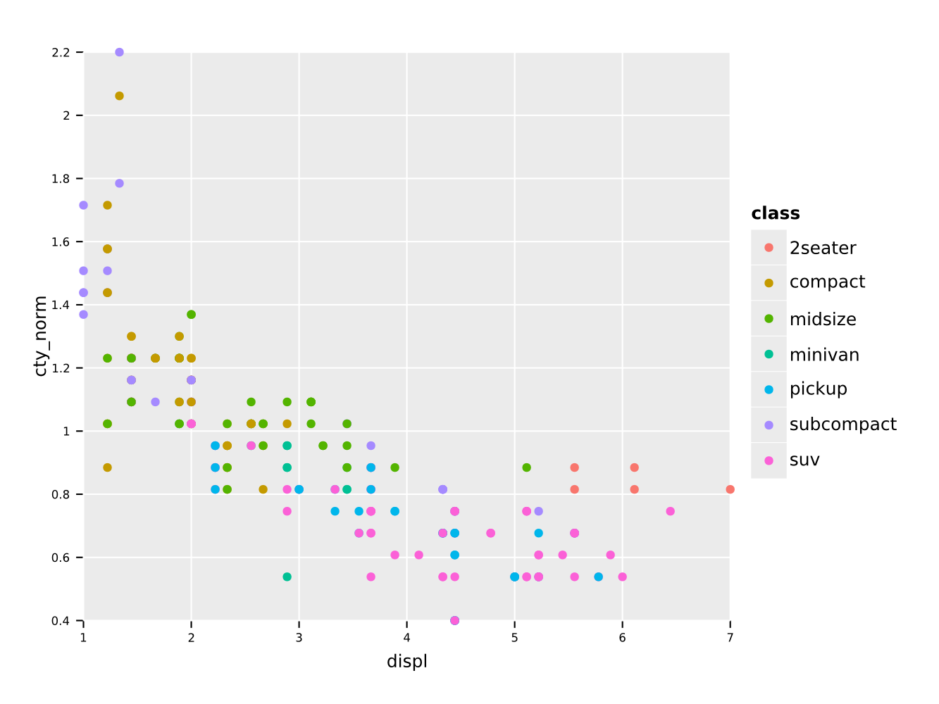
In addition we can use locally defined procedures in the f{} macro
as well (see above for caveats). For instance we can normalize a
column by dividing by the mean:
df.mutate(f{"cty_norm" ~ "cty" / mean("cty")}) # divide cty by mean
  .ggplot(aes(x = "displ", y = "cty_norm", color = "class")) +
  geom_point() +
  ggsave("classVsNormCty.pdf")
Note that calculations involving explicit numbers or constants is not
supported yet. For that the implementation of FormulaNode must be
changed to use Value as well.
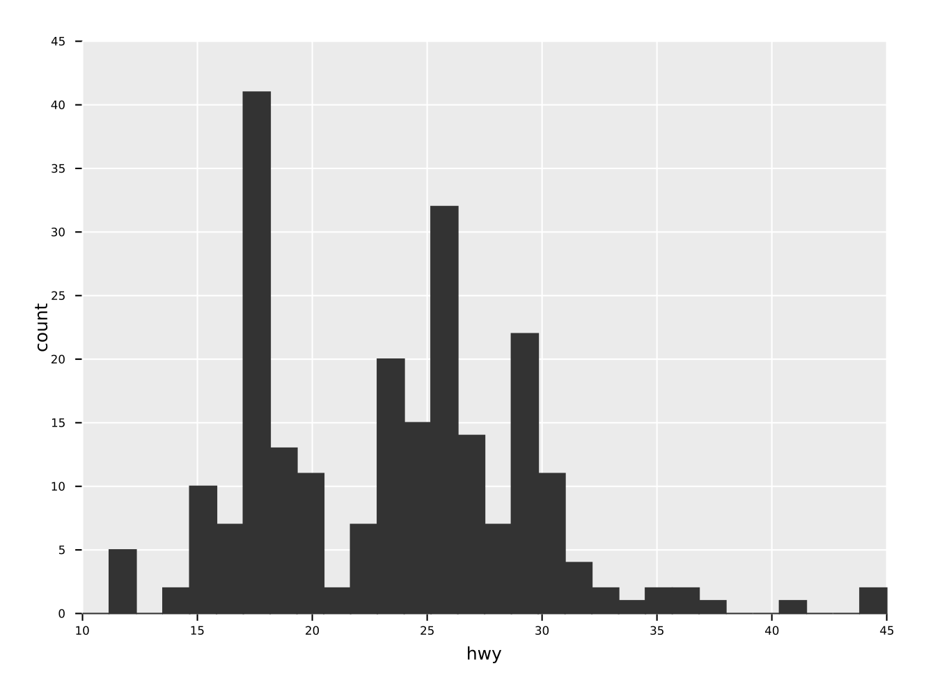
A simple histogram of one quantity "hwy" of a dataframe.
ggplot(mpg, aes("hwy")) +
  geom_histogram() +
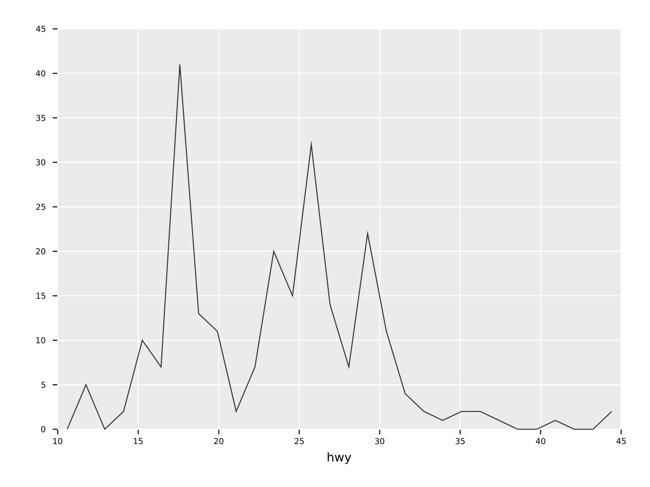
ggsave("simpleHisto.pdf")Same as the histogram above, but as a frequence line.
ggplot(mpg, aes("hwy")) +
  geom_freqpoly() +
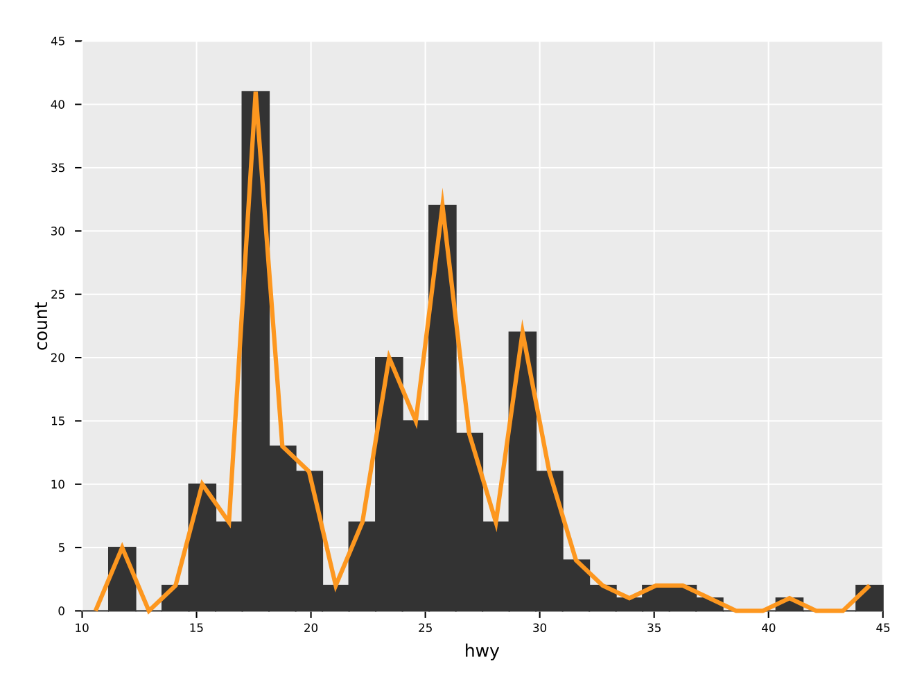
ggsave("freqpoly.pdf")A combination of a histogram and a frequency line plot. Also showcases
the ability to set aesthetics of specific geoms to a constant value
(in this case change line width and color of the freqpoly
line). Note that the arguments for style settings take Option[T]!
Note that the order in which the geom_* functions are called is also
the order in which they are drawn.
ggplot(mpg, aes("hwy")) +
  geom_histogram() +
  geom_freqpoly(color = some(parseHex("FD971F")),
                size = some(3.0)) +
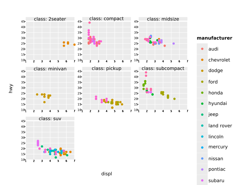
ggsave("histoPlusFreqpoly.pdf")Although still somewhat ugly, because the scaling is off, facet wrapping is working in principle:
ggplot(mpg, aes("displ", "hwy")) +
  geom_point(aes(color = "manufacturer")) +
  facet_wrap(~ class) +
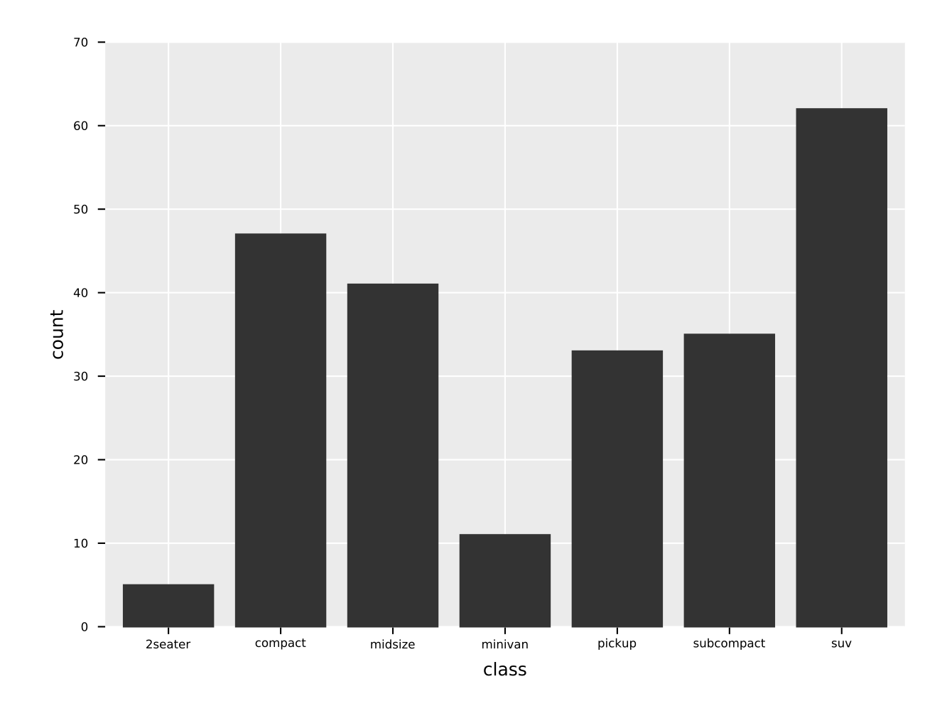
ggsave("facet_wrap_manufacturer.pdf")A simple bar plot of a variable with discrete data (typically a column of strings, bools or a small subset of ints).
ggplot(mpg, aes(x = "class")) +
  geom_bar() +
ggsave("bar_example.pdf")From the beginning one of my goals for this library was to provide not only a Cairo backend, but also to support Vega-Lite (or possibly Vega) as a backend. To share plots and data online (and possibly add support for interactive features) is much easier in such a way.
For now only a proof of concept is implemented in
vega_utils.nim. That is only geom_point with the "x", "y",
"color" scale set on the main aesthetic are supported. Generalizing
this is mostly a tediuos process, since the GgPlot object fields
etc. have to be mapped to the appropriate Vega-Lite JSON nodes.
A simple example:
let vegaJson = ggplot(mpg, aes(x = "displ", y = "cty", color = "class")) +
  geom_point() +
  ggtitle("ggplotnim - or I Suck At Naming Things") +
  ggvega()
show(vegaJson)
creates the equivalent plot from above using Vega-Lite. Note that it still uses the Vega-Lite default theming.
It generates the following Vega-Lite JSON:
{
  "$schema": "https://vega.github.io/schema/vega-lite/v4.json",
  "description" : "Vega-lite plot created by ggplotnim",
  "width" : 640,
  "height" : 480,
  "title": "ggplotnim - or I Suck At Naming Things",
  "data": {"values" : [{"displ": 1.8, "cty": 18.0, "class": "compact"},
                       {"displ": 1.8, "cty": 21.0, "class": "compact"},
                       {"displ": 2.0, "cty": 20.0, "class": "compact"},
                       ... ]
]},
  "mark": "point",
  "encoding": {
    "x": {"field": "displ", "type": "quantitative"},
    "y": {"field": "cty", "type": "quantitative"},
    "color": {"field": "class", "type": "nominal"}
   }
}
And results in the following Vega-Lite plot:
Or if you want to look at the interactive version in your browser, see here:
- facet wrap layout is quite ugly still
- …
