Automatic insights extraction and visualization specification in data analysis.
visual insights helps you extract insights from data warehouse automatically and generate visualization with interesting findings.
Now, there are three main modules in visual-insights application.
dataSource board is for data uploading and defining fields type(dimensions, measures). In visual insights, we regard dimensions as independent variable and measures as dependent variable.
Notebook is a board for user to know what happened in the automatic analysis process. It shows how decisions are made by the application and provide interactive interface to adjust some of the parameters and operators used by the algorithm.
Gallery displays parts of the visualization with interesting findings. There are some settings here to adjust some of the visual elements in the chart.
Details of the test result can be accessed here
- try online demo Here
- use the whole application
npm run ui. - or run
yarn workspace frontend startfor front end dev, runyarn work space backend devfor backend.
only use the algorithm package. (/packages/visual-insights)
npm i visual-insights --saveThe working process are visualized in notebook board in the application. *** Main process of the algorithm is shown in the notebook board. ***
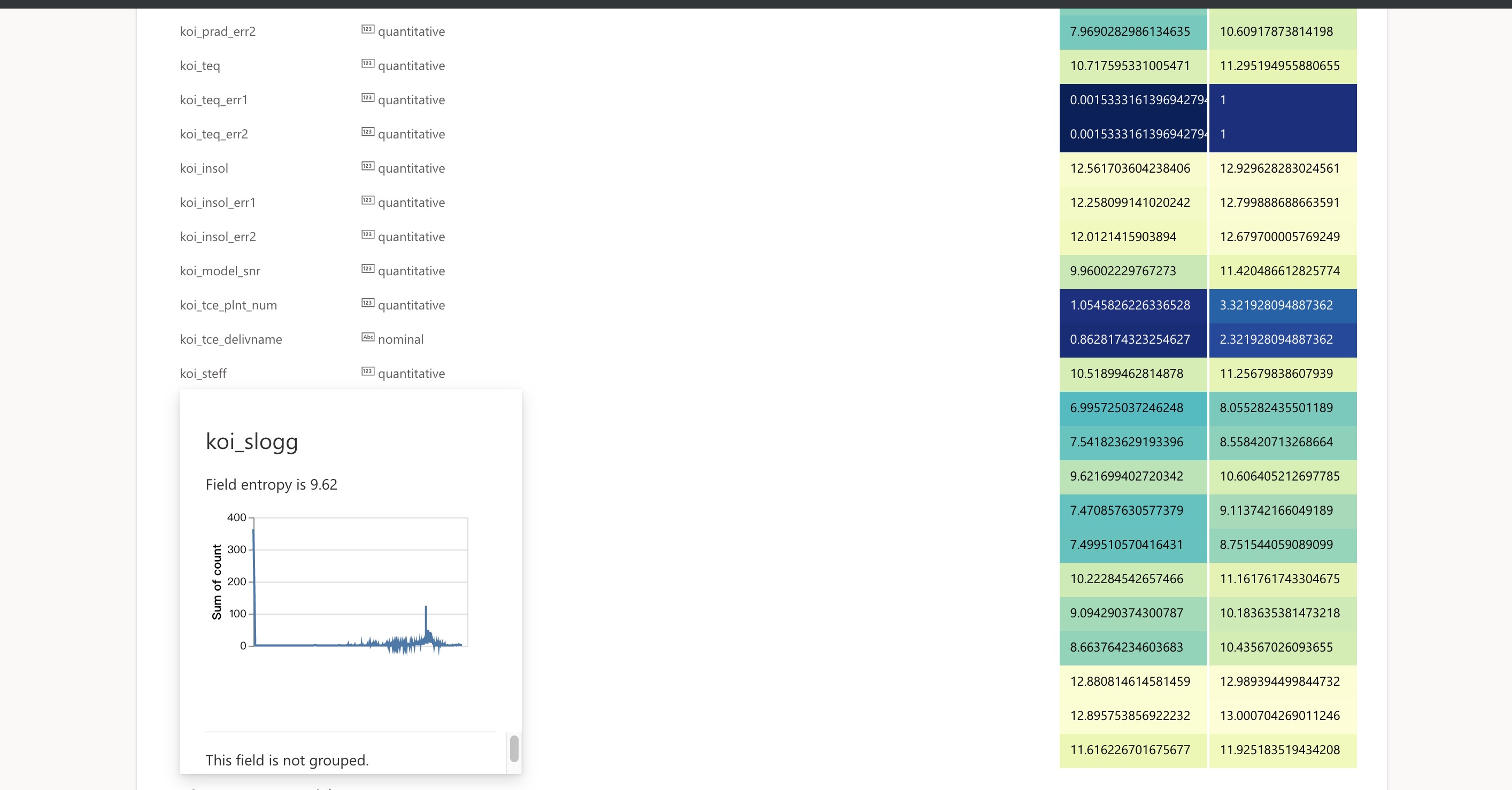
For the first step, visual-insights analyze all the fields in the dataset independently. It gets the fields' distributions and calculate its entropy. Besides, it will define a semantic type (quantitative, ordinal, temporal, nominal) for each field. More details of the field will be displayed when hover your mouse on the fields.
Then, it will find the fields with high entropy and try to reduce it by grouping the field (for example). Only dimensions participates this process.
In this step, visual insights search the combination of fields, and calculate the entropy of each measure with some aggregation operators.
After one subspace is specified (try to click one row of subsapce in notebook), it will analyze the correlation of measures in the space.
It helps you to cluster all the measures based on their correlation. It puts all the variables who are strongly related together to make a specific view (with specified dimenions).
Click one group of measures and visualization will be shown at the bottom of the page.
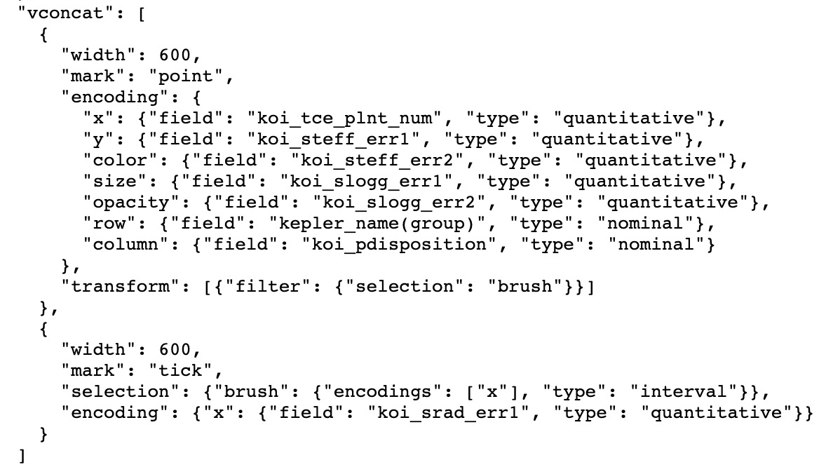
specification
visualization.
- doc for core-algorithm: visual-insights
- doc for react components: todos
- T. Sellam, E. Müller and M. Kersten, "Semi-automated exploration of data warehouses," in 2015, . DOI: 10.1145/2806416.2806538.
- Wongsuphasawat, Kanit, et al. "Voyager 2: Augmenting visual analysis with partial view specifications." Proceedings of the 2017 CHI Conference on Human Factors in Computing Systems. ACM, 2017.
- B. Tang et al, "Extracting top-K insights from multi-dimensional data," in 2017, . DOI: 10.1145/3035918.3035922.
- A. Satyanarayan, K. Wongsuphasawat and J. Heer, "Declarative interaction design for data visualization," in 2014, . DOI: 10.1145/2642918.2647360.
- P. Tan, M. Steinbach and V. Kumar, Introduction to Data Mining. (Pearson New International First ed.) Essex: Pearson, 2014.


