Expander/Collapsible card for HomeAssistant
First a few words to start with. A big thank you goes to @Alia5 (https://github.com/Alia5/lovelace-expander-card), who initially launched the card. I forked this card for my own HomeAssistant to make a few improvements. I give no guarantee for the functionality and no promise of lifelong maintenance, as I do the whole thing in my free time. Of course, I am happy about every contribution and PR
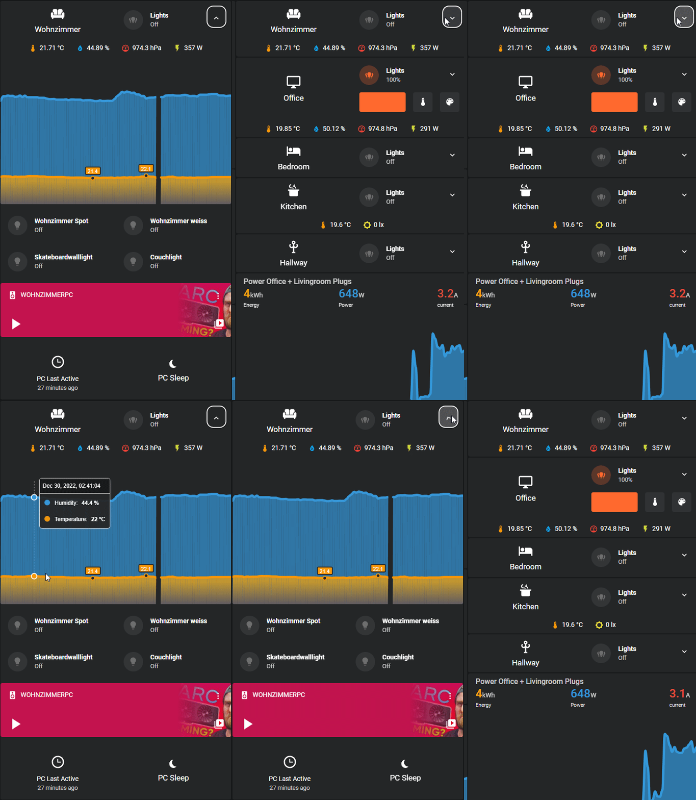
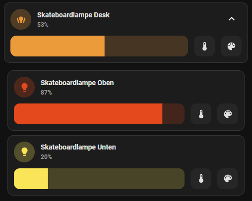
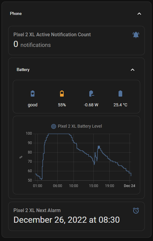
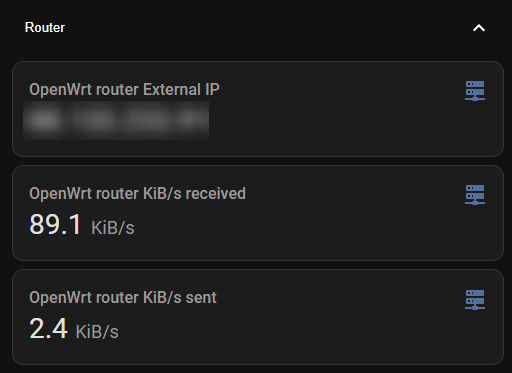
You can even nest expanders!
Clear Background (default theme):
Graphical config Editor is currently not supported. Contribution welcome!
Yaml Options:
| Name | Type | Default | Supported options | Description |
|---|---|---|---|---|
| type | string | Required | custom:expander-card |
Type of the card. |
| title | string | Empty | * | Title (Not displayed if using Title-Card) |
| clear | boolean | false | true|false | Remove Background |
| expanded | boolean | false | true|false | Start expanded |
| min-width-expanded | number | 0 | number | Min screen width (px) to be expanded on start (use with start expanded above) |
| max-width-expanded | number | 0 | number | Max screen width (px) to be expanded on start (use with start expanded above) |
| expander-card-background | string | ha-card-background, card-background-color,#fff | css-color | Expander Card Background |
| expander-card-background-expanded | string | Empty | css-color | Expander Card Background when card is opened/expanded |
| header-color | string | primary-text-color,#fff | css-color | Color of expand button |
| button-background | string | transparent | css-color | Background color of expand button |
| arrow-color | string | primary-text-color,#fff | css-color | Color of ico expand button |
| gap | string | 0.0em | css-size | gap between cards when expander closed |
| expanded-gap | string | 0.6em | css-size | gap between child cards when expander open |
| padding | string | 1em | css-size | padding of all card content |
| child-padding | string | 0.0em | css-size | padding of child cards |
| child-margin-top | string | 0.0em | css-size | Margin top of child cards |
| title-card | object | optional | LovelaceCardConfig | Replace Title with card |
| title-card-padding | string | 0px | css-size | padding of title-card |
| title-card-button-overlay | boolean | false | true|false | Overlay expand button over title-card |
| title-card-clickable | boolean | false | true|false | Should the complete diff clickable? |
| overlay-margin | string | 0.0em | css-size | Margin from top right of expander button (if overlay) |
| cards | object[] | optional | LovelaceCardConfig[] | Child cards to show when expanded |
| expander-card-display | string | block | css-display | Layout/Display of the card |
Here are a few examples of usage.
Example title card that is clickable and has 2 nested cards, which is directly expanded
    - type: custom:expander-card
      child-margin-top: 0.6em
      padding: 0
      clear: true
      title-card-button-overlay: true
      title-card-clickable: true
      expanded: true
      title-card:
        type: "custom:digital-clock"
        dateFormat:
          weekday: "long"
          day: "2-digit"
          month: "short"
        timeFormat:
          hour: "2-digit"
          minute: "2-digit"
      cards:
        - type: custom:simple-weather-card
          entity: weather.openweathermap
          primary_info:
            - wind_speed
            - wind_bearing
          secondary_info:
            - precipitation
            - precipitation_probability
        - type: custom:hourly-weather
          entity: weather.openweathermap
          icons: true
          show_precipitation_probability: true
          show_precipitation_amounts: true
          forecast_type: "hourly"
          num_segments: 10"
          label_spacing: "1"
          name: null
          show_wind: speed
Example with title that is clickable and has 2 nested cards.
      - type: custom:expander-card
        child-margin-top: 0.6em
        padding: 0
        title: "Test"
        title-card-button-overlay: true
        title-card-clickable: true
        cards:
          - type: custom:simple-weather-card
            entity: weather.openweathermap
            primary_info:
              - wind_speed
              - wind_bearing
            secondary_info:
              - precipitation
              - precipitation_probability
          - type: custom:hourly-weather
            entity: weather.openweathermap
            icons: true
            show_precipitation_probability: true
            show_precipitation_amounts: true
            forecast_type: "hourly"
            num_segments: 10"
            label_spacing: "1"
            name: null
            show_wind: speed
Example with title that is clickable and has 2 nested cards with are automatically expanded when the screen is more than 300px.
      - type: custom:expander-card
        child-margin-top: 0.6em
        padding: 0
        title: "Test"
        title-card-button-overlay: true
        title-card-clickable: true
        min-width-expanded: 300
        cards:
          - type: custom:simple-weather-card
            entity: weather.openweathermap
            primary_info:
              - wind_speed
              - wind_bearing
            secondary_info:
              - precipitation
              - precipitation_probability
            name: in Gärtringen
          - type: custom:hourly-weather
            entity: weather.openweathermap
            icons: true
            show_precipitation_probability: true
            show_precipitation_amounts: true
            forecast_type: "hourly"
            num_segments: 10"
            label_spacing: "1"
            show_wind: speed
With the help of the integration card mod, the card can be flexibly adapted. This is also possible based on the card status. A CSS class “open” or “close” is always set.
Using an example to set the background based on the status
        card_mod:
          style: |
            ha-card.open {
              background: red !important;
            }
            ha-card.close {
              background: #C8A2C8 !important;
            }
Only the background of the button
        card_mod:
          style: |
            button.open {
              background: red !important;
            }
            button.close {
              background: #C8A2C8 !important;
            }
Expander-Card is not available in HACS (Home Assistant Community Store) by default, but you can add it as custom repositories.
- Install HACS if you don't have it already
- Open HACS in Home Assistant
- Add this repository (https://github.com/MelleD/lovelace-expander-card) via HACS Custom repositories (How to add Custom Repositories)
- Download
expander-card.jsfile from the latest release. - Put
expander-card.jsfile into yourconfig/wwwfolder. - Add reference to
expander-card.jsin Dashboard. There's two way to do that:- Using UI: Settings → Dashboards → More Options icon → Resources → Add Resource → Set Url as
/local/expander-card.js→ Set Resource type asJavaScript Module. Note: If you do not see the Resources menu, you will need to enable Advanced Mode in your User Profile - Using YAML: Add following code to
lovelacesection.resources: - url: /local/expander-card.js type: module
- Using UI: Settings → Dashboards → More Options icon → Resources → Add Resource → Set Url as
Clone and create a PR to help make the card even better.
Please ⭐️ or sponsor this repo when you like it.


