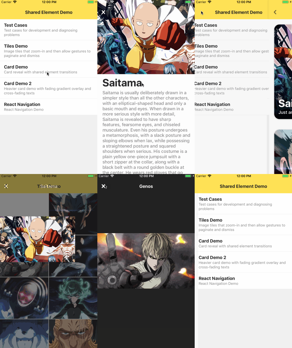
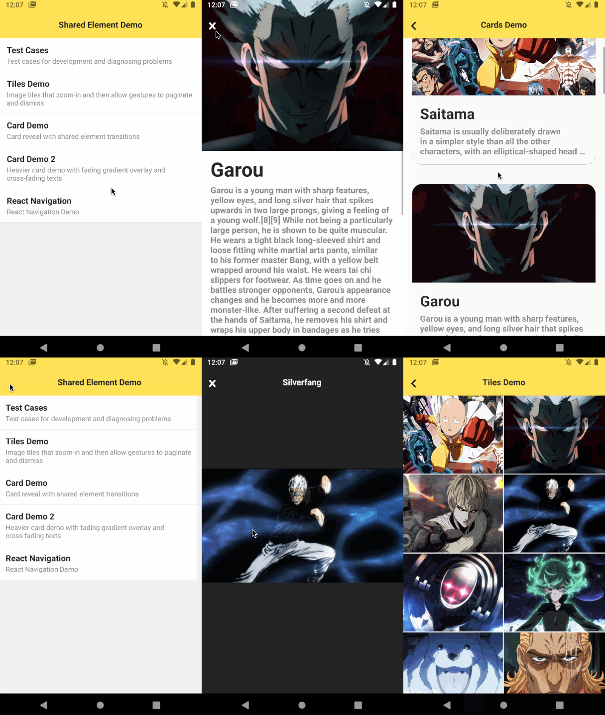
Native shared element transition "primitives" for react-native 💫
This library in itself is not a Navigation- or Router library. Instead, it provides a set of comprehensive full native building blocks for performing shared element transitions in Router- or Transition libraries. If you are looking for the React Navigation binding, you can find it here.
Shared-element transitions add shine to your app but can be hard to do in practise.
It's possible to achieve some nice transitions by building custom modals and using the core react-native API, But this also brings with it many restrictions. Things like resizing an image or making sure no "flicker" occurs even an older Android devices can be a real challenge.
This library solves that problem through an all native implementation which is very close to the metal of the OS. It solves the problem by providing a set of "primitives", which don't require any back and forth passes over the react-native bridge. This way, the best possible performance is achieved and better image transitions can be accomplished. The following list is an impression of the kinds of problems that are solved through the native implementation.
- No flickering
- CPU & GPU friendly
- Image resizeMode transitions
- Scrollview clipping
- Border (radius, color, width) transitions
- Background color transitions
- Shadow transitions
- Cross-fade transitions
- Clipping reveal transitions
- Motivation
- Under development
- Installation
- Basic usage
- How it works
- API Documentation
- Example apps
- License
- Credits
yarn add react-native-shared-elementAs of Expo SDK 49,
react-native-shared-elementis no longer shipped with Expo Go. If you want to use this library with Expo managed projects, create a development build.
import {
  SharedElement,
  SharedElementTransition,
  nodeFromRef
} from 'react-native-shared-element';

// Scene 1
let startAncestor;
let startNode;
<View ref={ref => startAncestor = nodeFromRef(ref)}>
  ...
  <SharedElement onNode={node => startNode = node}>
    <Image style={styles.image} source={...} />
  </SharedElement>
  ...
</View>


// Scene2
let endAncestor;
let endNode;
<View ref={ref => endAncestor = nodeFromRef(ref)}>
  ...
  <SharedElement onNode={node => endNode = node}>
    <Image style={styles.image} source={...} />
  </SharedElement>
  ...
</View>

// Render overlay in front of screen
const position = new Animated.Value(0);
<View style={StyleSheet.absoluteFill}>
  <SharedElementTransition
    start={{
      node: startNode,
      ancestor: startAncestor
    }}
    end={{
      node: endNode,
      ancestor: endAncestor
    }}
    position={position}
    animation='move'
    resize='auto'
    align='auto'
     />
</View>react-native-shared-element is a "primitive" that runs shared element transitions
entirely native without requiring any passes over the JavaScript bridge. It works by taking in a start- and end node, which are obtained using the <SharedElement> component.
Whenever a transition between screens occurs (e.g. performed by a router/navigator), a view in
front of the app should be rendered to host the shared element transition. The position prop is used to interpolate between the start- and end nodes, 0 meaning "Show the start node" and 1 meaning "Show the end node".
Whenever the <SharedElementTransition> component is rendered, it performs the following tasks:
- Measure the size and position of the provided element
- Obtain the styles of the elements
- Obtain the visual content of the elements (e.g. an image or a view snapshot)
- Render a visual copy of the start element at its current position
- Hide the original elements whenever the visual copy are on the screen
- Monitor the
positionprop and render the shared element transition accordingly - Upon unmount, unhide the original elements
You typically do not use this component directly, but instead use a Router or Transition-engine which provides a higher-level API.
See ./example/src/components/Router.tsx for an example implementation of a simple stack router using
shared element transitions.
The <SharedElement> component accepts a single child and returns a node to it through the onNode event handler. The child must correspond to a "real" View which exists in the native view hierarchy.
| Property | Type | Description |
|---|---|---|
children |
element |
A single child component, which must map to a real view in the native view hierarchy |
onNode |
function |
Event handler that sets or unsets the node-handle |
View props... |
Other props supported by View |
The <SharedElementTransition> component executes a shared element transition natively. It natively performs the following tasks: measure, clone, hide, animate and unhide, to achieve the best results.
| Property | Type | Description |
|---|---|---|
start |
{ node: SharedElementNode, ancestor: SharedElementNode } |
Start node- and ancestor |
end |
{ node: SharedElementNode, ancestor: SharedElementNode } |
End node- and ancestor |
position |
number | Animated.Value | Reanimated.Value |
Interpolated position (0..1), between the start- and end nodes |
animation |
SharedElementAnimation | Type of animation, e.g move start element or cross-fade between start- and end elements (default = move) |
resize |
SharedElementResize | Resize behavior (default = auto) |
align |
SharedElementAlign | Alignment behavior (default = auto) |
debug |
boolean |
Renders debug overlays for diagnosing measuring and animations |
onMeasure |
function |
Event handler that is called when nodes have been measured and snapshotted |
The transition effect can be controlled using the animation, resize and align props.
In most cases you should leave these to their default values for the best possible results.
If however the start- element and end elements are visually different, then it can make
sense to choose different values. For instance, if you are transitioning from a <Text>
with a white color to a <Text> with a black color, then using animation="fade" will
create a cross-fade between them.
Another case is when you have a single-line of <Text> in the start- view and a full
description in the end- view. A stretch effect would in this case not look good, because
the end- element is much larger in size compared the start- element.
In this case you can use resize="clip" and align="left-top" to create a text reveal effect.
| Animation | Description |
|---|---|
move |
Moves the start- element to the end position |
fade |
Cross-fades between the start- and end elements |
fade-in |
Fade-in the end element coming from the start position (start-element is not visible) |
fade-out |
Fade-out the start element to the end position (end-element is not visible) |
| Resize | Description |
|---|---|
auto |
Automatically selects the default resize behavior. For images this will perform the best possible transition based on the resizeMode of the image. For other kinds of views, this will default to stretch. |
stretch |
Stretches the element to the same shape and size of the other element. If the aspect-ratio of the content differs, you may see stretching. In that case consider the clip or none resize options. |
clip |
Do not resize, but clip the content to the size of the other content. This option is for instance useful in combination with <Text> components, where you want to reveal more text. |
none |
Do not resize the content. When combined with fade, this creates a plain cross-fade effect without any resizing or clipping |
auto, left-center, left-top, left-right, right-center, right-top, right-right, center-top center-center, center-bottom
When auto is selected, the default alignment strategy is used, which is center-center.
- The main example & test app is located in
./exampleand serves as an exploration and testing tool. It features a custom stack router which implements the shared element primitives. It also implements the react-navigation binding and serves as a testing tool for that. - Demo app for react-navigation
- Simple demo app using RN60 and the react-navigation binding
Shared element transition library is licensed under The MIT License.
This project is supported by amazing people from Expo.io
Both react-native-shared-element and react-navigation-shared-element are always looking for new Maintainers. It is no longer possible for me (@author) to maintain these repositories. Please reach out to me personally if you have ideas or suggestions.
Read the full statement here.

