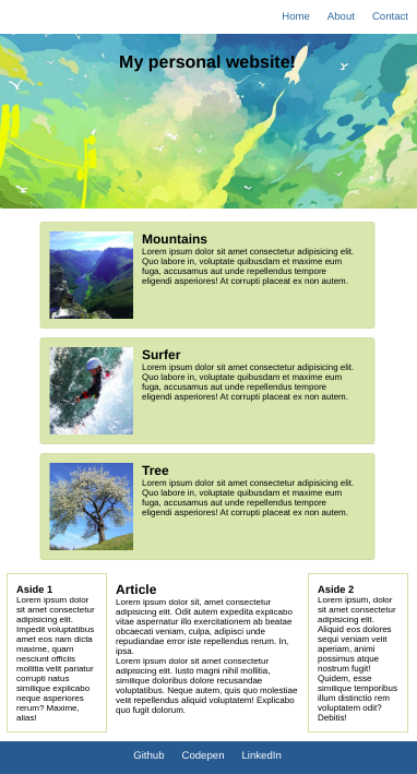
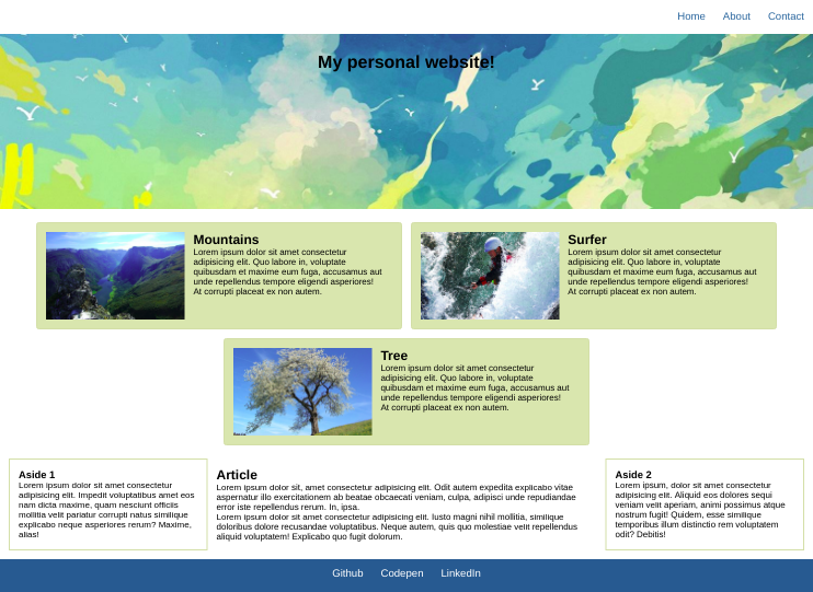
Create a mockup website as seen in the reference image folder.
Pre start:
This repository comes with a package.json inculding definitions of dependencies. This one uses the sass preprocessor (next to others).
First after cloning, resolve dependencies for the exercise repository:
npm installFrom now on you can use the build-scripts, that are defined within the package.json.
To start writing your code use the start script:
npm run startThis will start 'sass' in a watching mode, permanently transpiling from the files inside /scss into /styles. Also this starts a 'http-server' that delivers the content of the project-directory over http on localhost.
Now, go for it!
Instructions:
- Use sass to create the mockup.
- Make use of nesting and variables where possible.
- Make sure to design for mobile first!
- Breakpoints:
- tablet:
768px - desktop:
1024px
- tablet:
- Colors for styling:
- Card background color:
#e0ddb2 - Card and aside borders:
#dad6ab - Color used for nav and footer:
#016690
- Card background color:
- Use the images in the images folder for the header and cards.
| mobile | tablet | desktop |
|---|---|---|
  |
 |
 |