By XMARTLABS.
XLActionController is an extensible library to quickly create any custom action sheet controller.
|
|
|
|
|
|
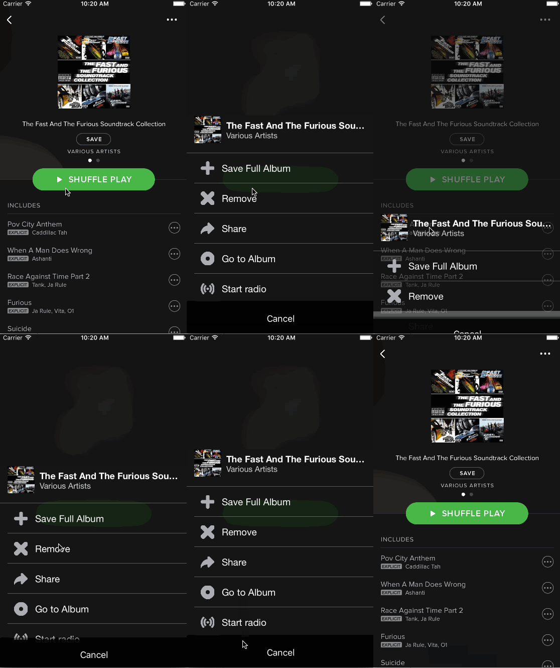
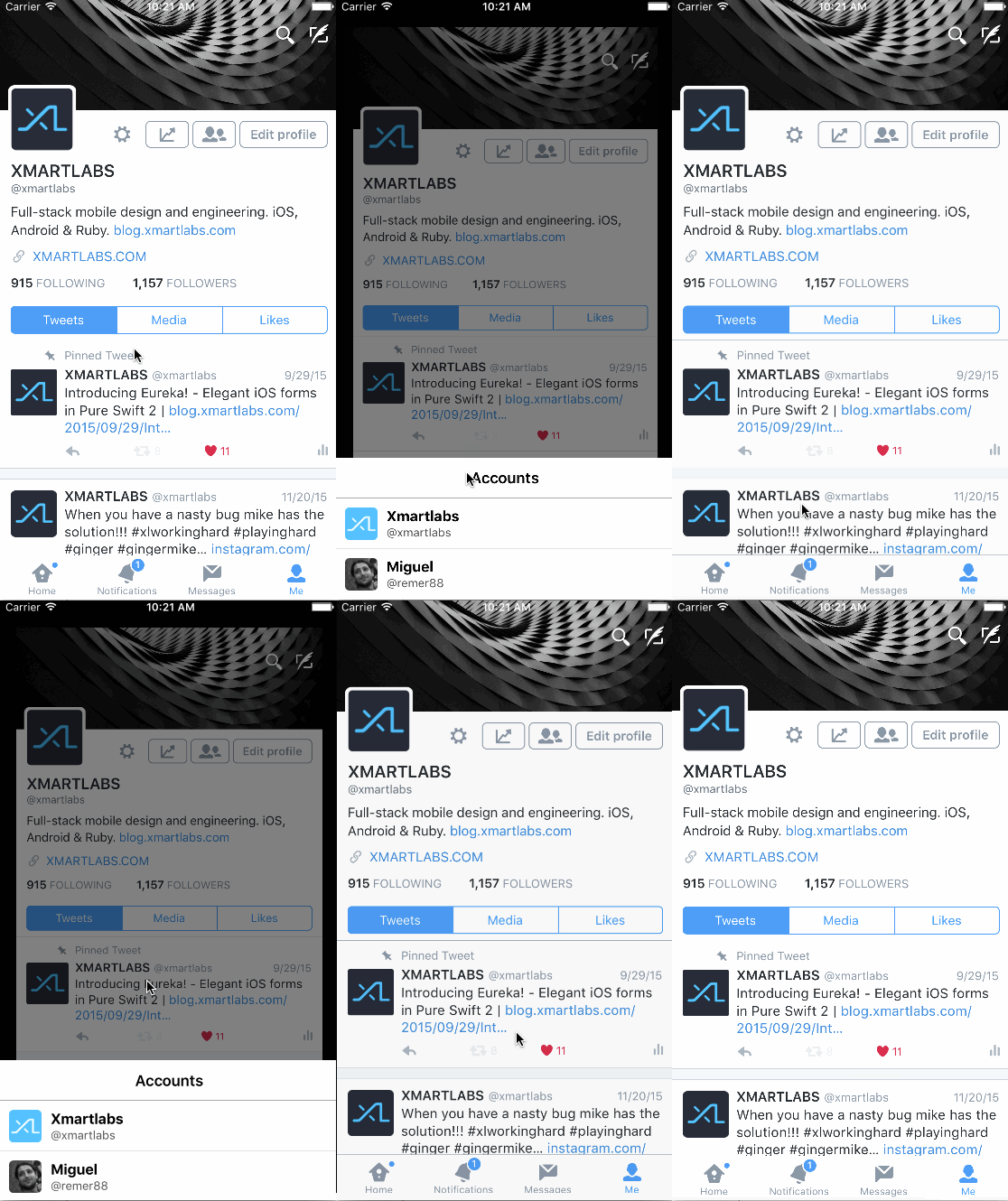
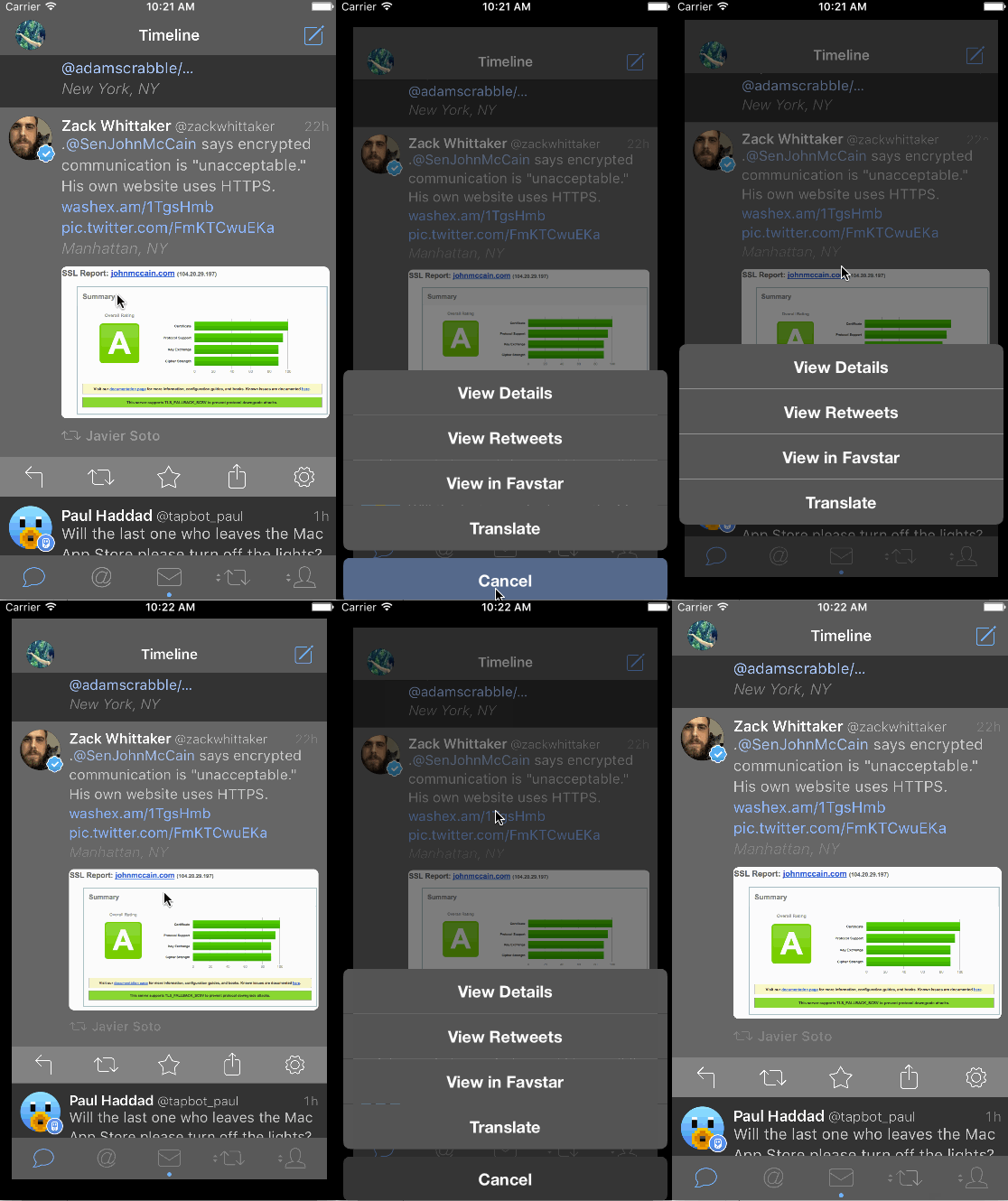
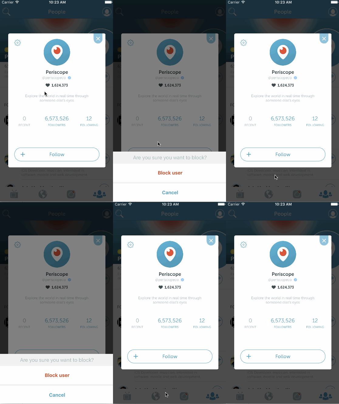
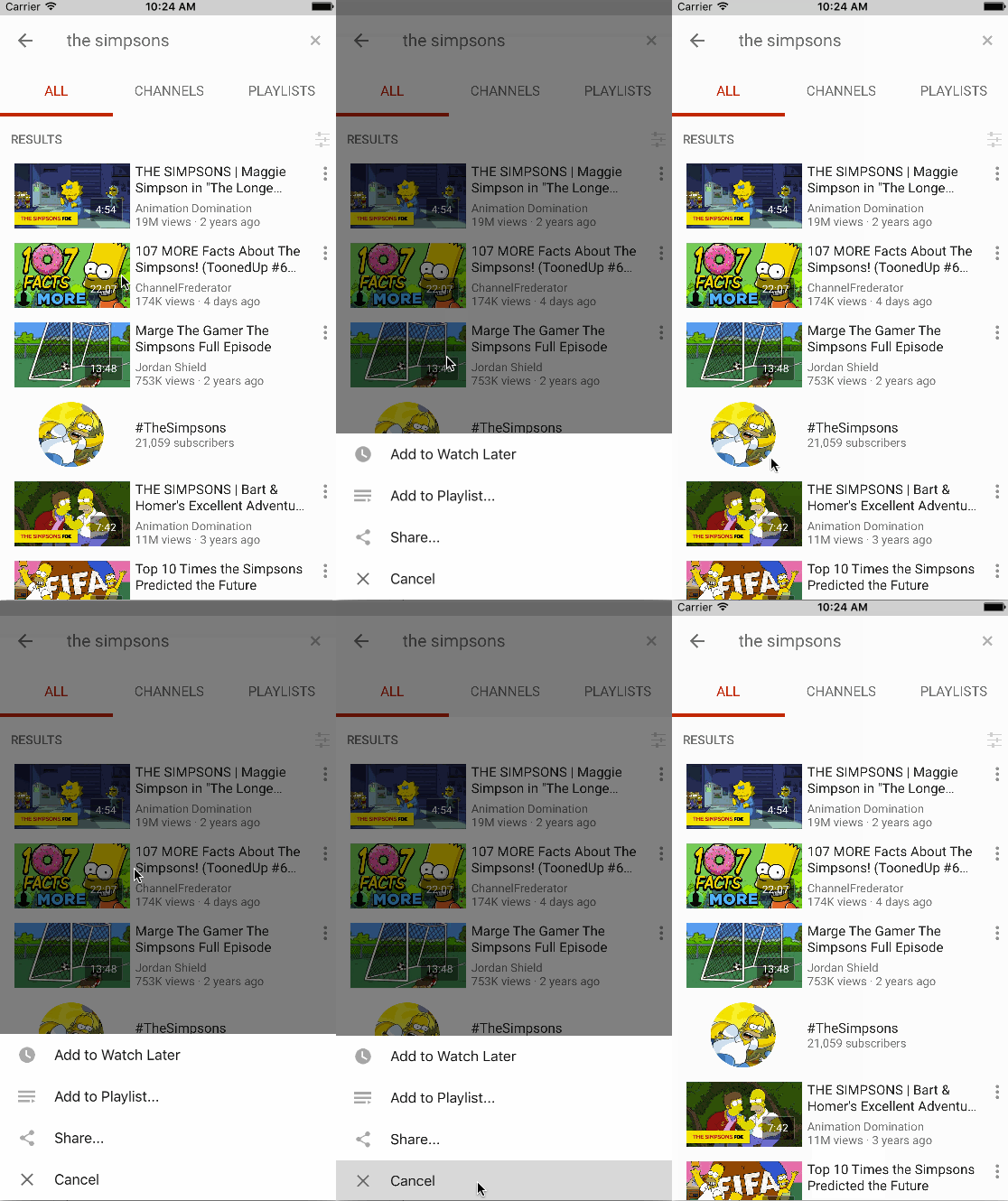
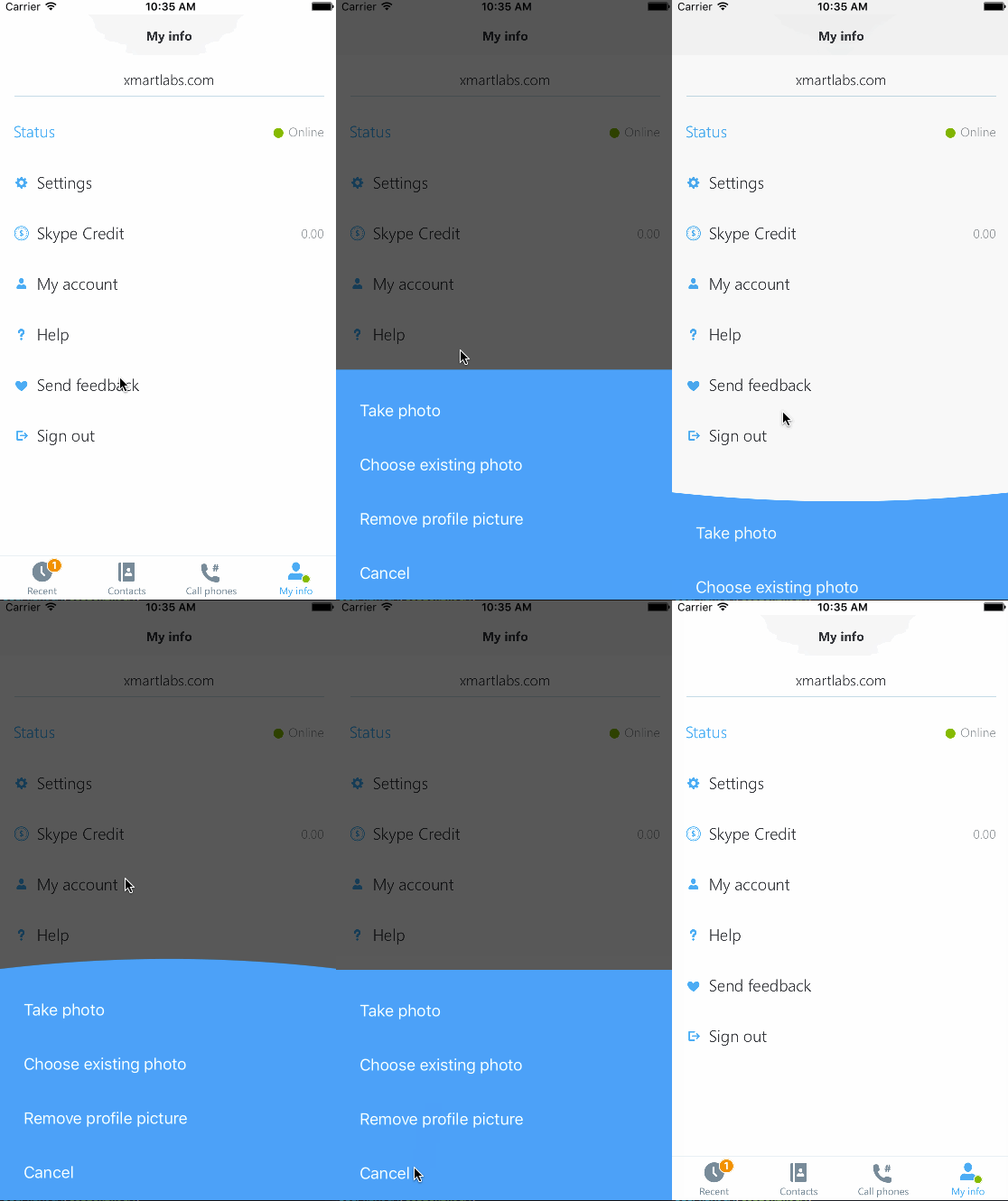
The action sheet controllers shown above were entirely created using XLActionController and are included in the Examples. To run the Example project: clone XLActionController repository, open XLActionController workspace and run the Example project.
The code snippet below shows how to present the Tweetbot action sheet controller:
let actionController = TweetbotActionController()

actionController.addAction(Action("View Details", style: .Default, handler: { action in
  // do something useful
}))
actionController.addAction(Action("View Retweets", style: .Default, handler: { action in
  // do something useful
}))
actionController.addAction(Action("View in Favstar", style: .Default, handler: { action in
  // do something useful
}))
actionController.addAction(Action("Translate", style: .Default, handler: { action in
  // do something useful
}))

actionController.addSection(Section())
actionController.addAction(Action("Cancel", style: .Cancel, handler:nil))

presentViewController(actionController, animated: true, completion: nil)
As you may have noticed, the library usage looks pretty similar to UIAlertController.
Behind the scenes XLActionController uses a UICollectionView to display the action sheet.
First create a custom action sheet view controller by extending from the ActionController generic class. For details on how to create a custom action sheet controller look at the Extensibility section.
For instance, let's suppose we've already created TwitterActionController.
// Instantiate custom action sheet controller
let actionSheet = TwitterActionController()
// set up a header title
actionSheet.headerData = "Accounts"
// Add some actions, note that the first parameter of `Action` initializer is `ActionData`.
actionSheet.addAction(Action(ActionData(title: "Xmartlabs", subtitle: "@xmartlabs", image: UIImage(named: "tw-xmartlabs")!), style: .Default, handler: { action in
   // do something useful
}))
actionSheet.addAction(Action(ActionData(title: "Miguel", subtitle: "@remer88", image: UIImage(named: "tw-remer")!), style: .Default, handler: { action in
   // do something useful
}))
// present actionSheet like any other view controller
presentViewController(actionSheet, animated: true, completion: nil)
As the code above illustrates, there are no relevant differences compared to the UIAlertController API.
The main difference is that XLActionController works with any header data type and not only the standard UIAlertController title and message properties.
Similarly XLActionController's Action works with any data Type and not only the title string.
// XLActionController:
xlActionController.headerData = SpotifyHeaderData(title: "The Fast And The Furious Soundtrack Collection", subtitle: "Various Artists", image: UIImage(named: "sp-header-icon")!)

// vs UIAlertController:
uiActionController.title = "The Fast And The Furious Soundtrack Collection" // no way to pass an image
uiActionController.message = "Various Artists"
// XLActionController:
let xlAction = Action(ActionData(title: "Save Full Album", image: UIImage(named: "sp-add-icon")!), style: .Default, handler: { action in })
// notice that we are able to pass an image in addition to the title
xlActionController.addAction(xlAction)
// vs UIAlertController:
let uiAction = UIAlertAction(title: "Xmartlabs", style: .Default, handler: { action in }))
uiActionController.addAction(uiAction)This can be accomplished because XLActionController is a generic type.
Another important difference is that XLActionController provides a way to add action sections as illustrated in the code below:
actionController.addSection(Section())and also each section has a data property. This property is generic, so that it can hold any type. This data will be used to create this section's header view.
let section = actionController.addSection(Section())
section.data = "String" // assuming section data Type is String
Each section contains a set of actions. We typically use sections to show a header view above a set of actions.
ActionController uses a UICollectionView to show actions and headers on screen. Actions will be rendered as instances of UICollectionViewCell. You can use your own subclass of UICollectionViewCell by specifying it in the action controller declaration. Additionally, ActionController allows you to specify a global header and a section header. Headers are shown as collection view's supplementary views.
The ActionController class is a generic type that works with any cell, header, section header type and its associated data types.
XLActionController provides extension points to specify a whole new look and feel to our custom sheet controller and to tweak present and dismiss animations. Let's see an example:
// As first step we should extend the ActionController generic type
public class PeriscopeActionController: ActionController<PeriscopeCell, String, PeriscopeHeader, String, UICollectionReusableView, Void> {

    // override init in order to customize behavior and animations
    public override init(nibName nibNameOrNil: String? = nil, bundle nibBundleOrNil: NSBundle? = nil) {
        super.init(nibName: nibNameOrNil, bundle: nibBundleOrNil)
        // customizing behavior and present/dismiss animations
        settings.behavior.hideOnScrollDown = false
        settings.animation.scale = nil
        settings.animation.present.duration = 0.6
        settings.animation.dismiss.duration = 0.5
        settings.animation.dismiss.options = .CurveEaseIn
        settings.animation.dismiss.offset = 30

        // providing a specific collection view cell which will be used to display each action, height parameter expects a block that returns the cell height for a particular action.
        cellSpec = .NibFile(nibName: "PeriscopeCell", bundle: NSBundle(forClass: PeriscopeCell.self), height: { _ in 60})
        // providing a specific view that will render each section header.
        sectionHeaderSpec = .CellClass(height: { _ in 5 })
        // providing a specific view that will render the action sheet header. We calculate its height according the text that should be displayed.
        headerSpec = .CellClass(height: { [weak self] (headerData: String) in
            guard let me = self else { return 0 }
            let label = UILabel(frame: CGRectMake(0, 0, me.view.frame.width - 40, CGFloat.max))
            label.numberOfLines = 0
            label.font = .systemFontOfSize(17.0)
            label.text = headerData
            label.sizeToFit()
            return label.frame.size.height + 20
        })

        // once we specify the views, we have to provide three blocks that will be used to set up these views.
        // block used to setup the header. Header view and the header are passed as block parameters
        onConfigureHeader = { [weak self] header, headerData in
            guard let me = self else { return }
            header.label.frame = CGRectMake(0, 0, me.view.frame.size.width - 40, CGFloat.max)
            header.label.text = headerData
            header.label.sizeToFit()
            header.label.center = CGPointMake(header.frame.size.width  / 2, header.frame.size.height / 2)
        }
        // block used to setup the section header
        onConfigureSectionHeader = { sectionHeader, sectionHeaderData in
            sectionHeader.backgroundColor = UIColor(white: 0.95, alpha: 1.0)
        }
        // block used to setup the collection view cell
        onConfigureCellForAction = { [weak self] cell, action, indexPath in
            cell.setup(action.data, detail: nil, image: nil)
            cell.separatorView?.hidden = indexPath.item == self!.collectionView.numberOfItemsInSection(indexPath.section) - 1
            cell.alpha = action.enabled ? 1.0 : 0.5
            cell.actionTitleLabel?.textColor = action.style == .Destructive ? UIColor(red: 210/255.0, green: 77/255.0, blue: 56/255.0, alpha: 1.0) : UIColor(red: 0.28, green: 0.64, blue: 0.76, alpha: 1.0)
        }
    }
}
ActionController type declaration:
public class ActionController<ActionViewType: UICollectionViewCell, ActionDataType, HeaderViewType: UICollectionReusableView, HeaderDataType, SectionHeaderViewType: UICollectionReusableView, SectionHeaderDataType>When extending ActionController we must specify the following view types ActionViewType, HeaderViewType, SectionHeaderViewType. These types are the cell type used to render an action, the view used to render the action sheet header and the view used to render the section header.
Each view type has its associated data: ActionDataType, HeaderDataType, SectionHeaderDataType respectively.
If your custom action sheet doesn't have a header view we can use
UICollectionReusableViewasHeaderViewTypeandVoidasHeaderDataType. If it doesn't have a section header view you can useUICollectionReusableViewasSectionHeaderViewTypeandVoidasSectionHeaderDataType.
The code below shows how we specify these types for the action controllers provided in the example project:
class PeriscopeActionController: ActionController<PeriscopeCell, String, PeriscopeHeader, String, UICollectionReusableView, Void> { ... } // doesn't need to show a section header
class SpotifyActionController: ActionController<SpotifyCell, ActionData, SpotifyHeaderView, SpotifyHeaderData, UICollectionReusableView, Void> { ... } // doesn't need to show a section header
class TwitterActionController: ActionController<TwitterCell, ActionData, TwitterActionControllerHeader, String, UICollectionReusableView, Void> { ... } // doesn't need to show a section header
class YoutubeActionController: ActionController<YoutubeCell, ActionData, UICollectionReusableView, Void, UICollectionReusableView, Void>By following the previous section steps you should already be able to play with your custom action controller. It happens quite often that we need some other customization such as zooming out the presenting view, changing the status bar color or customizing the default present and dismiss animation.
ActionController class defines the settings property of type ActionSheetControllerSettings to tweak all these.
// Indicates if the action controller must be dismissed when the user taps the background view. `true` by default.
settings.behavior.hideOnTap: Bool
// Indicates if the action controller must be dismissed when the user scrolls down the collection view. `true` by default.
settings.behavior.hideOnScrollDown: Bool
// Indicates if the collectionView's scroll is enabled. `false` by default.
settings.behavior.scrollEnabled: Bool
// Controls whether the collection view scroll bounces past the edge of content and back again. `false` by default.
settings.behavior.bounces: Bool
// Indicates if the collection view layout will use UIDynamics to animate its items. `false` by default.
settings.behavior.useDynamics: Bool// Margins between the collection view and the container view's margins. `0` by default
settings.collectionView.lateralMargin: CGFloat
// Cells height when UIDynamics is used to animate items. `50` by default.
settings.collectionView.cellHeightWhenDynamicsIsUsed: CGFloatStruct that contains all properties related to presentation & dismissal animations
// Used to scale the presenting view controller when the action controller is being presented. If `nil` is set, then the presenting view controller won't be scaled. `(0.9, 0.9)` by default.
settings.animation.scale: CGSize? = CGSizeMake(0.9, 0.9)// damping value for the animation block. `1.0` by default.
settings.animation.present.damping: CGFloat
// delay for the animation block. `0.0` by default.
settings.animation.present.delay: NSTimeInterval
// Indicates the animation duration. `0.7` by default.
settings.animation.present.duration: NSTimeInterval
// Used as `springVelocity` for the animation block. `0.0` by default.
settings.animation.present.springVelocity: CGFloat
// Present animation options. `UIViewAnimationOptions.CurveEaseOut` by default.
settings.animation.present.options: UIViewAnimationOptions// damping value for the animation block. `1.0` by default.
settings.animation.dismiss.damping: CGFloat
// Used as delay for the animation block. `0.0` by default.
settings.animation.dismiss.delay: NSTimeInterval
// animation duration. `0.7` by default.
settings.animation.dismiss.duration: NSTimeInterval
// springVelocity for the animation block. `0.0` by default
settings.animation.dismiss.springVelocity: CGFloat
// dismiss animation options. `UIViewAnimationOptions.CurveEaseIn` by default
settings.animation.dismiss.options: UIViewAnimationOptions// Indicates if the status bar should be visible or hidden when the action controller is visible. Its default value is `true`
settings.statusBar.showStatusBar: Bool
// Determines the style of the device’s status bar when the action controller is visible. `UIStatusBarStyle.LightContent` by default.
settings.statusBar.style: UIStatusBarStyleSometimes we need to show a cancel view below the collection view. This is the case of the SpotifyActionController.
These properties have nothing to do with the actions added to an action Controller nor with the actions with .Cancel as style value.
 // Indicates if the cancel view is shown. `false` by default.
settings.cancelView.showCancel: Bool
 // Cancel view's title. "Cancel" by default.
settings.cancelView.title: String?
 // Cancel view's height. `60` by default.
settings.cancelView.height: CGFloat
 // Cancel view's background color. `UIColor.blackColor().colorWithAlphaComponent(0.8)` by default.
settings.cancelView.backgroundColor: UIColorIf tweaking previous settings is not enough to make the animations work like you want, XLActionController allows you to change the present/dismiss animation by overriding some functions.
public func presentView(presentedView: UIView, presentingView: UIView, animationDuration: Double, completion: ((completed: Bool) -> Void)?)The function above is responsible for making the present animation. It encapsulates how the presentation is performed and invokes onWillPresentView, performCustomPresentationAnimation and onDidPresentView to allow you to change a specific point of the animation.
Typically we don't need to override
presentViewfunction because overriding eitheronWillPresentView,performCustomPresentationAnimationoronDidPresentViewis enough.
public func onWillPresentView()onWillPresentView is called before the animation block starts. Any change here won't be animated. It's intended to set the initial animated properties values.
public func performCustomPresentationAnimation(presentedView: UIView, presentingView: UIView) {performCustomPresentationAnimation is called from within the main animation block.
public func onDidPresentView()After the present animation is completed, presentView calls onDidPresentView from within completion callback.
onWillPresentView,performCustomPresentationAnimation,onDidPresentViewwon't be invoked if you overridepresentViewimplementation.
Dismissal animation can be customized in the same way as presentation animation.
public func dismissView(presentedView: UIView, presentingView: UIView, animationDuration: Double, completion: ((completed: Bool) -> Void)?)The function above is responsible for making the dismissal animation. It encapsulates how the dismissal animation is performed and invokes onWillDismissView, performCustomDismissingAnimation and onDidDismissView to allow you to change an specific point of the animation.
Typically we don't need to override
dismissViewmethod because overriding either onWillDismissView,performCustomDismissingAnimationoronDidDismissView` is enough.
public func onWillDismissView()Overrides onWillDismissView to perform any set up before the animation begins.
public func performCustomDismissingAnimation(presentedView: UIView, presentingView: UIView)performCustomDismissingAnimation function is invoked from within the main animation block.
public func onDidDismissView()After the dismissal animation completes, dismissView calls onDidDismissView from within completion callback.
onWillDismissView,performCustomDismissingAnimation,onDidDismissViewwon't be invoked if you overridedismissViewimplementation.
To show how simple and powerful XLActionController is and give several examples of how to extend ActionController we have mimicked the Skype, Tweetbot, Twitter, Youtube, Periscope and Spotify action controllers.
- iOS 8.0+
- Xcode 7.0+
- If you want to contribute please feel free to submit pull requests.
- If you have a feature request please open an issue.
- If you found a bug or need help please check older issues or threads on StackOverflow before submitting an issue.
If you use XLActionController in your app we would love to hear about it! Drop us a line on twitter.
CocoaPods is a dependency manager for Cocoa projects.
Specify XLActionController into your project's Podfile:
source 'https://github.com/CocoaPods/Specs.git'
platform :ios, '8.0'
use_frameworks!

# This will install just the library's core, won't include any examples
pod 'XLActionController'

# Uncomment depending on the examples that you want to install
#pod 'XLActionController/Periscope'
#pod 'XLActionController/Skype'
#pod 'XLActionController/Spotify'
#pod 'XLActionController/Tweetbot'
#pod 'XLActionController/Twitter'
#pod 'XLActionController/Youtube'
Then run the following command:
$ pod installCarthage is a simple, decentralized dependency manager for Cocoa.
Specify XLActionController into your project's Carthage:
github "xmartlabs/XLActionController" ~> 1.0
Clone XLActionController as a git submodule by running the following command from your project root git folder.
$ git submodule add https://github.com/xmartlabs/XLActionController.gitOpen XLActionController folder that was created by the previous git submodule command and drag the XLActionController.xcodeproj into the Project Navigator of your application's Xcode project.
Select the XLActionController.xcodeproj in the Project Navigator and verify the deployment target matches with your application deployment target.
Select your project in the Xcode Navigation and then select your application target from the sidebar. Next select the "General" tab and click on the + button under the "Embedded Binaries" section.
Select XLActionController.framework and we are done!
The MIT License (MIT)
Copyright (c) 2015-2016 XMARTLABS (http://xmartlabs.com)
Permission is hereby granted, free of charge, to any person obtaining a copy of this software and associated documentation files (the "Software"), to deal in the Software without restriction, including without limitation the rights to use, copy, modify, merge, publish, distribute, sublicense, and/or sell copies of the Software, and to permit persons to whom the Software is furnished to do so, subject to the following conditions:
The above copyright notice and this permission notice shall be included in all copies or substantial portions of the Software.
THE SOFTWARE IS PROVIDED "AS IS", WITHOUT WARRANTY OF ANY KIND, EXPRESS OR IMPLIED, INCLUDING BUT NOT LIMITED TO THE WARRANTIES OF MERCHANTABILITY, FITNESS FOR A PARTICULAR PURPOSE AND NONINFRINGEMENT. IN NO EVENT SHALL THE AUTHORS OR COPYRIGHT HOLDERS BE LIABLE FOR ANY CLAIM, DAMAGES OR OTHER LIABILITY, WHETHER IN AN ACTION OF CONTRACT, TORT OR OTHERWISE, ARISING FROM, OUT OF OR IN CONNECTION WITH THE SOFTWARE OR THE USE OR OTHER DEALINGS IN THE SOFTWARE.


