A sophisticated WPF ListBox-based CustomControl for creating animated, mobile-style navigation bars


NavigationBar is a custom WPF control that demonstrates advanced techniques in creating a mobile-inspired navigation interface. It showcases the power and flexibility of WPF in implementing complex UI behaviors and animations, particularly focusing on CustomControl development and efficient animation design.


- Extension of WPF ListBox for specialized navigation functionality
- Implementation of complex UI elements using pure XAML and C#
- Project structure optimized for modularity with separate application and library projects
- Utilization of Jamesnet.Wpf animation wrapper classes (ValueItem, ThickItem, ColorItem) for concise and efficient animations
- Custom animation logic for smooth transitions between navigation items
- Innovative design to operate animations outside of ItemsPresenter for enhanced flexibility
- Creation of complex shapes using Path and Geometry in Visual Studio for Blend
- Implementation of vector-based icons for scalable and high-quality visuals
- Sophisticated ControlTemplate design for ListBox, enabling unique layout and behavior
- Implementation of custom ItemsPanel for flexible item layout
- Efficient rendering using clipping and layout techniques
- Optimized animation performance through careful resource management
- CustomControl Architecture: Demonstrates the power of CustomControl in WPF, allowing for complete control over behavior and appearance.
- Animation Outside ItemsPresenter: Innovative approach to design animations that operate outside the ItemsPresenter, a key feature of this control.
- Jamesnet.Wpf Animation Integration: Utilizes ValueItem, ThickItem, and ColorItem from Jamesnet.Wpf for simplified and more readable animation code.
- Geometry Creation in Blend: Showcases the use of Visual Studio for Blend to create complex geometries directly, enhancing the design process.
- ListBox ControlTemplate Redesign: Completely overhauls the ListBox template to achieve a unique navigation bar layout and functionality.
- WPF (Windows Presentation Foundation)
- .NET 8.0
- C# 10.0
- XAML
- Jamesnet.Wpf (for animation wrapper classes)
- Application project for demo and testing
- Library project for the NavigationBar control, promoting reusability
- Visual Studio 2022 or later
- .NET 8.0 SDK
git clone https://github.com/vickyqu115/navigationbar.git
- Visual Studio
- Visual Studio Code
- Blend for Visual Studio
- JetBrains Rider


- Set the startup project
- Press F5 or click the Run button
- Windows 11 recommended
Contributions to NavigationBar are welcome! Feel free to submit issues, create pull requests, or suggest improvements.
This project is licensed under the MIT License - see the LICENSE file for details.
- Website: https://jamesnet.dev
- Email: vickyqu115@hotmail.com, james@jamesnet.dev
Explore advanced WPF techniques and create engaging navigation experiences with NavigationBar!
WPF applications traditionally prefer a programmatic approach that connects multiple screens through menu configurations and presents them in a unified manner. This technique, often referred to as the menu or Navigation, is one of the core implementations in WPF. It also has a direct correlation with the architecture (design) of the project, so paying more attention to its implementation can positively impact the quality of the project.
This control features a design and animations specialized for mobile, but it can be elegantly and structurally implemented using ListBox and Animation technologies available in WPF. Additionally, it can be similarly implemented in Cross-Platform environments such as AvaloniaUI, Uno, OpenSilver, MAUI, which allows this project to be researched and applied across various platforms.
The goal is also to widely promote the flexibility and excellence of WPF implementation and share the technology. Through this project, we hope you will deeply experience the charm of WPF.
This project can be joined not only in WPF but also in various Cross-Platform environments. You can check out the MAUI/AvaloniaUI versions by Lukewire129, furesoft and furesoft through Discussions.
This control style is one used widely through web or mobile navigation configurations. Therefore, it's commonly seen implemented using IOS, Android, or HTML/CSS technologies. Implementing it with CSS/HTML and JavaScript allows for relatively easy construction of structure and animation functions. In contrast, WPF, through XAML, might feel comparatively complex in terms of design, event, and animation implementation. Thus, the key to this control's implementation is to make the most of WPF's characteristics and provide a high-level implementation method that lets users feel the structural strengths of WPF.
A lot of focus has been put into the quality of the Source code through Refactoring. The project minimizes/optimizes hierarchical XAML structures and emphasizes enhancing code quality through interaction between XAML and Behind code using CustomControl. The control isn't just about providing basic functionality; it's about conveying technical inspiration and encouraging diverse applications through its structural philosophy.
MagicBar, the core control of this project, is a CustomControl inheriting from ListBox control. In most development scenarios, UserControl is the usual choice, but for functions involving complex features, animations, and repetitive elements like in this case, it's more effective to divide and implement them as smaller Control (CustomControl) units.
If you're not familiar with CustomControl, please read the following:
The CustomControl approach itself is technically challenging and conceptually different from traditional desktop methods like Windows Forms, making it somewhat difficult to approach easily. Additionally, finding reference materials for guidance is challenging. However, this is an important process to elevate your WPF technical skills. We encourage you to open-mindedly take on the challenge of CustomControl implementation with this opportunity.
CustomControl is characterized by its separation and management of the XAML Design area. Therefore, it doesn't provide direct interaction between the XAML area and the control (Class). Interaction between these two areas is supported through other indirect methods. The first method involves exploring the Template area through the OnApplyTemplate timing. The second method extends binding through DependencyProperty declarations.
This structural feature allows for a perfect separation of design and code, enhancing code reusability and extensibility, and understanding the traditional structure of WPF in depth. All controls used in WPF follow this same method. To verify this, you can directly explore the open-source dotnet/WPF repository available on GitHub.
Geometry is one of the design elements provided in WPF, used for vector-based designs. Traditionally, development methods preferred bitmap images like PNG or JPEG, but there's a growing preference for vector-based designs in recent times. This change can be attributed to improvements in computer performance, developments in monitor resolutions, and shifts in design trends. Hence, the role of Geometry elements is significant in this control. The process of implementing the Circle in the latter part is explained in more detail.
MagicBar inherits from the ListBox control and uniquely uses the ItemsPresenter element provided through the ItemsControl feature. However, interaction between child elements within the ItemsPresenter is not possible, implying that continuing Animation actions among child items is also unfeasible.
The behavior of ListBoxItem is determined by the type of Panel specified through the ItemsPanelTemplate in the ItemsPresenter element. Therefore, the choice of Panel layout significantly affects the behavior of ListBoxItem. In the case of StackPanel, the order of the added child elements in the Children collection determines their position. For Grid, placement is determined by Row/Column settings.
Thus, linking Animation actions between child elements structurally is not possible.
However, there are exceptions. In the case of Canvas, interaction through Animation is possible using the concept of coordinates, but it requires complex calculations and precise implementation for all controls. Yet, better implementation methods exist, so Canvas control content is omitted in this context.
Usually, in implementing ListBox control, greater emphasis is placed on the child element ListBoxItem. However, for this control, the key feature - the Circle structure - needs to be positioned outside the area of the ItemsPresenter element. Therefore, forming a complex Template in the ListBox control is crucial.
The hierarchy of the ControlTemplate is as follows:
The following is a simplified representation for clarity and differs from the actual Source code content. The Circle part can easily be found in the text as "PART_Circle".
<ControlTemplate TargetType="{x:Type ListBox}">
     <Grid>
        <Circle/>
        <ItemsPresenter/>
     </Grid>
</ControlTemplate>
As seen above, the key is to position the ItemsPresenter and Circle at the same hierarchical level. This arrangement allows the Circle element's Animation range to appear as if freely moving across the ItemsPresenter's child elements. Moreover, it's essential to place the ItemsPresenter element in front of the Circle so that the ListBoxItem element's icons and text do not visually cover the Circle.
Having discussed the theory, let's now delve into the actual source code for a detailed comparison.
The area with x:Name="PART_Circle" corresponds to the Circle.
<Style TargetType="{x:Type local:MagicBar}">
<Setter Property="ItemContainerStyle" Value="{StaticResource MagicBarItem}"/>
<Setter Property="SnapsToDevicePixels" Value="True"/>
<Setter Property="UseLayoutRounding" Value="True"/>
<Setter Property="Background" Value="Transparent"/>
<Setter Property="Width" Value="440"/>
<Setter Property="Height" Value="120"/>
<Setter Property="Template">
    <Setter.Value>
    	<ControlTemplate TargetType="{x:Type local:MagicBar}">
    	    <Grid Background="{TemplateBinding Background}">
    		<Grid.Clip>
    		    <RectangleGeometry Rect="0 0 440 120"/>
    		</Grid.Clip>
    		<Border Style="{StaticResource Bar}"/>
    		<Canvas Margin="20 0 20 0">
    		    <Grid x:Name="PART_Circle" Style="{StaticResource Circle}">
    			<Path Style="{StaticResource Arc}"/>
    			<Ellipse Fill="#222222"/>
    			<Ellipse Fill="CadetBlue" Margin="6"/>
    		    </Grid>
    		</Canvas>
    		<ItemsPresenter Margin="20 40 20 0"/>
    	    </Grid>
    	</ControlTemplate>
    </Setter.Value>
</Setter>
<Setter Property="ItemsPanel">
    <Setter.Value>
    	<ItemsPanelTemplate>
    	    <UniformGrid Columns="5"/>
    	</ItemsPanelTemplate>
    </Setter.Value>
  </Setter>
</Style>Unlike the ListBox control's Template, the configuration of the ListBoxItem is relatively simple. Also, since it's unrelated to the Circle Animation element, it comprises only the menu item's icon and text.
<Style TargetType="{x:Type ListBoxItem}" x:Key="MagicBarItem">
    <Setter Property="FocusVisualStyle" Value="{x:Null}"/>
    <Setter Property="Background" Value="Transparent"/>
    <Setter Property="Template">
        <Setter.Value>
            <ControlTemplate TargetType="{x:Type ListBoxItem}">
                <Grid Background="{TemplateBinding Background}">
                    <james:JamesIcon x:Name="icon" Style="{StaticResource Icon}"/>
                    <TextBlock x:Name="name" Style="{StaticResource Name}"/>
                </Grid>
            </ControlTemplate>
        </Setter.Value>
    </Setter>
</Style>
In addition, Animation that changes the position and color of the icon and text is included. As previously mentioned, no special functionality needs to be implemented in this ListBoxItem element.
JamesIcon is a control provided through the Jamesnet.Wpf library available via NuGet, offering various icons. To substitute it, you can either use the Path control for direct Geometry design implementation or use images with a transparent (Transparent) background.
JamesIcon internally includes a Path control and provides various DependencyProperty attributes to allow flexible design definitions from the outside. Key properties include Icon, Width, Height, Fill, etc.
Vector-based Geometry icons offer consistent designs, which is one way to enhance the quality of the control. Therefore, it's worth examining these differences closely.
<Style TargetType="{x:Type james:JamesIcon}" x:Key="Icon">
    <Setter Property="Icon" Value="{TemplateBinding Tag}"/>
    <Setter Property="Width" Value="40"/>
    <Setter Property="Height" Value="40"/>
    <Setter Property="Fill" Value="#44333333"/>
</Style>Since the JamesIcon style is separated from the Template, it's impossible to use TemplateBinding Tag binding as shown below:
// Binding method that's not possible</code>
<Setter Property="Icon" Value="{TemplateBinding Tag}"/>
Therefore, RelativeSource binding is used to search for the ListBoxItem, the parent element, and bind its Tag property, as shown below:
<... Value="{Binding RelativeSource={RelativeSource AncestorType=ListBoxItem}, Path=Tag}"/>Using RelativeSource binding, the original TemplateBinding of the icon defined within the ListBoxItem area can be individually moved to the JamesIcon area. This approach allows each component (JamesIcon) to have its own definition and style, making the code more modular, easier to maintain, and reusable. Separating bindings and styles into their respective areas clarifies the overall code structure, making it easier to understand and modify. Additionally, this separation provides greater flexibility, allowing individual components' styles and behaviors to be adjusted without affecting other components.

Microsoft Blend, the successor to Expression Blend, continues to hold its name despite a reduction in certain features. This program can be added during the installation process of Visual Studio. If you can't find this program, it's possible to add it via the Visual Studio Installer.
Although Microsoft Blend shares most features with Visual Studio, it includes some additional features specialized in design. Among them are functions related to Geometry, partially resembling features found in Adobe's Illustrator.
Using Microsoft Blend in WPF development isn't essential, nor is it exclusively for designers. Instead, it serves as a valuable tool for developers to create professional and attractive design elements without extensive design training.
However, most of the design features provided by Microsoft Blend can be more powerfully utilized in environments like Figma and Illustrator, so there's no pressing need to learn it. But some features related to Geometry are easy to use without separate training, and thus worth examining closely.
The Circle in the MagicBar control is a crucial point of this project, visually functioning as the menu changes. It includes smooth Animation, adding a contemporary and trendy design element.
The Circle element doesn't necessarily have to be implemented based on Geometry. Using an image could be a simpler method. However, in terms of quality, Geometry designs are becoming more popular as they can handle resolution changes due to size variations more delicately.
As shown in the image below, a characteristic of Geometry is that you can resize it as much as you want without losing clarity.

If you look closely at the Circle design, you'll see that it creates a sense of space by overlapping a black circle and a green circle. Additionally, rounding the lines on both sides makes it blend naturally into the MagicBar area. This not only looks visually smooth but also appears more elegant when animated. However, implementing this arc can be challenging and is often abandoned during practical implementation.
But this is where Microsoft Blend becomes useful in easily creating these special shapes.
The design process involves drawing a large circle with a convex arc at the bottom, then adding smaller circles of the same height on both sides of the large circle. By adjusting the diameter of the large circle, ensure that the large and small circles intersect perfectly.

Next, use the merge function to cut the unnecessary parts of the large circle and the subtract function to remove unwanted parts of the small circle, leaving only the arc shape at the intersection. Finally, add a rectangle and remove unnecessary parts to create a unique and natural arc shape.

This method of implementing design elements not only demonstrates how to use Microsoft Blend for complex graphics but also provides a new perspective on thinking and solving design problems. This approach makes the circle not only aesthetically appealing but also technically innovative, enhancing quality.
The animation behavior in the ListBoxItem area, which includes icons and text, is relatively simple. It features moving components upwards and adjusting opacity transparency when IsSelected is set to true.
Please carefully observe the animation path and effects through the image below:
As shown in the image above, the animation is triggered each time the IsSelected value of the ListBox control changes. Additionally, since the movement of the icon and text doesn't go beyond the ListBoxItem area, it's preferable to implement a static Storyboard element directly within XAML.
This can be controlled using a Trigger or VisualStateManager module. For this control, a simple Trigger module approach is utilized for handling just the IsSelected action.
For the ListBoxItem area's animation behavior, it's necessary to prepare scenarios for both when IsSelected is true and when it's false.
<Storyboard x:Key="Selected">
	<james:ThickItem Mode="CubicEaseInOut" TargetName="icon" Duration="0:0:0.5" Property="Margin" To="0 -80 0 0"/>
	<james:ThickItem Mode="CubicEaseInOut" TargetName="name" Duration="0:0:0.5" Property="Margin" To="0 45 0 0"/>
	<james:ColorItem Mode="CubicEaseInOut" TargetName="icon" Duration="0:0:0.5" Property="Fill.Color" To="#333333"/>
	<james:ColorItem Mode="CubicEaseInOut" TargetName="name" Duration="0:0:0.5" Property="Foreground.Color" To="#333333"/>
</Storyboard>

<Storyboard x:Key="UnSelected">
	<james:ThickItem Mode="CubicEaseInOut" TargetName="icon" Duration="0:0:0.5" Property="Margin" To="0 0 0 0"/>
	<james:ThickItem Mode="CubicEaseInOut" TargetName="name" Duration="0:0:0.5" Property="Margin" To="0 60 0 0"/>
	<james:ColorItem Mode="CubicEaseInOut" TargetName="icon" Duration="0:0:0.5" Property="Fill.Color" To="#44333333"/>
	<james:ColorItem Mode="CubicEaseInOut" TargetName="name" Duration="0:0:0.5" Property="Foreground.Color" To="#00000000"/>
</Storyboard>
The key here is specifying the movement path in 'Selected' and the return path in 'UnSelected'.
Finally, the implementation of animation in the ListBoxItem area concludes by declaring BeginStoryboard using Trigger to activate the respective (Selected/UnSelected) Storyboards.
Unlike typical Trigger property changes, animations require a return scenario as well.
<ControlTemplate.Triggers>
    <Trigger Property="IsSelected" Value="True">
        <Trigger.EnterActions>
            <BeginStoryboard Storyboard="{StaticResource Selected}"/>
        </Trigger.EnterActions>
        <Trigger.ExitActions>
            <BeginStoryboard Storyboard="{StaticResource UnSelected}"/>
        </Trigger.ExitActions>
    </Trigger>
</ControlTemplate.Triggers>
The method of configuring animation in the ListBoxItem area is relatively simple. However, implementing the movement of the Circle component, which is introduced next, requires more complex calculations for dynamic behavior.
Now it's time to implement the animation for the movement of the Circle component. Below is a video showing the dynamic movement of the Circle.
The movement of the Circle component must be precisely calculated based on the clicked position, so it can't be implemented in XAML and needs to be handled dynamically in C# code. Therefore, a method for connecting XAML and Code Behind is required.
This method is used to retrieve the Circle area inside the MagicBar control. It's called internally at the connection point between the control and the template. Hence, it's implemented in the MagicBar class via override.
Then, the 'PART_Circle' named circle element is searched using the GetTemplateChild method. This Grid will be the target element for displaying the animation effect during interaction.
public override void OnApplyTemplate()
{
    base.OnApplyTemplate();
    Grid grid = (Grid)GetTemplateChild("PART_Circle");

    InitStoryboard(grid);
}This method initializes the animation. Instances of ValueItem (_vi) and Storyboard (_sb) are created first. The animation effect set in ValueItem is QuinticEaseInOut, which slows down at the start and end of the animation, making it look smooth and natural.
The movement path for the Circle is specified as Canvas.LeftProperty, meaning it changes the horizontal position of the target element. The duration of the animation is set to 0.5 seconds. Finally, the animation target is set as the Circle component (Grid), and the defined animation is added to the storyboard.
private void InitStoryboard(Grid circle)
{
    _vi = new();
    _sb = new();

    _vi.Mode = EasingFunctionBaseMode.QuinticEaseInOut;
    _vi.Property = new PropertyPath(Canvas.LeftProperty);
    _vi.Duration = new Duration(new TimeSpan(0, 0, 0, 0, 500));

    Storyboard.SetTarget(_vi, circle);
    Storyboard.SetTargetProperty(_vi, _vi.Property);

    _sb.Children.Add(_vi);
}The scenario for moving the Circle component is now implemented. In the MagicBar class, the OnSelectionChanged event method is implemented to handle the 'PART_Circle' (Grid) element and to execute (Begin) the storyboard.
The MagicBar control, being a CustomControl derived from ListBox, has the advantage of flexibly implementing override features.
protected override void OnSelectionChanged(SelectionChangedEventArgs e)
{
    base.OnSelectionChanged(e);

    _vi.To = SelectedIndex * 80;
    _sb.Begin();
}
In this method, the logic to dynamically calculate and change the To value based on the SelectedIndex is implemented every time the selected menu changes.
Finally, it's time to take a look at the complete structure of the XAML/Csharp code for the MagicBar control. This is an opportunity to see how elegantly and succinctly the control is implemented within the CustomControl structure.
Despite the implementation of various features, you can observe the maximally streamlined structure of XAML. Notably, the ControlTemplate structure included in the MagicBar simplifies complex layer hierarchies for easy viewing. Additionally, even small elements like Storyboard, Geometry, TextBlock, and JamesIcon are organized in a regular and systematic manner.
<ResourceDictionary
    xmlns="http://schemas.microsoft.com/winfx/2006/xaml/presentation"
    xmlns:x="http://schemas.microsoft.com/winfx/2006/xaml"
    xmlns:james="https://jamesnet.dev/xaml/presentation"
    xmlns:local="clr-namespace:NavigationBar">

    <Storyboard x:Key="Selected">
        <james:ThickItem Mode="CubicEaseInOut" TargetName="icon" Duration="0:0:0.5" Property="Margin" To="0 -80 0 0"/>
        <james:ThickItem Mode="CubicEaseInOut" TargetName="name" Duration="0:0:0.5" Property="Margin" To="0 45 0 0"/>
        <james:ColorItem Mode="CubicEaseInOut" TargetName="icon" Duration="0:0:0.5" Property="Fill.Color" To="#333333"/>
        <james:ColorItem Mode="CubicEaseInOut" TargetName="name" Duration="0:0:0.5" Property="Foreground.Color" To="#333333"/>
    </Storyboard>

    <Storyboard x:Key="UnSelected">
        <james:ThickItem Mode="CubicEaseInOut" TargetName="icon" Duration="0:0:0.5" Property="Margin" To="0 0 0 0"/>
        <james:ThickItem Mode="CubicEaseInOut" TargetName="name" Duration="0:0:0.5" Property="Margin" To="0 60 0 0"/>
        <james:ColorItem Mode="CubicEaseInOut" TargetName="icon" Duration="0:0:0.5" Property="Fill.Color" To="#44333333"/>
        <james:ColorItem Mode="CubicEaseInOut" TargetName="name" Duration="0:0:0.5" Property="Foreground.Color" To="#00000000"/>
    </Storyboard>

    <Style TargetType="{x:Type james:JamesIcon}" x:Key="Icon">
        <Setter Property="Icon" Value="{Binding RelativeSource={RelativeSource AncestorType=ListBoxItem},Path=Tag}"/>
        <Setter Property="Width" Value="40"/>
        <Setter Property="Height" Value="40"/>
        <Setter Property="Fill" Value="#44333333"/>
    </Style>

    <Style TargetType="{x:Type TextBlock}" x:Key="Name">
        <Setter Property="Text" Value="{Binding RelativeSource={RelativeSource AncestorType=ListBoxItem},Path=Content}"/>
        <Setter Property="HorizontalAlignment" Value="Center"/>
        <Setter Property="FontWeight" Value="Bold"/>
        <Setter Property="FontSize" Value="14"/>
        <Setter Property="Foreground" Value="#00000000"/>
        <Setter Property="Margin" Value="0 60 0 0"/>
    </Style>

    <Style TargetType="{x:Type ListBoxItem}" x:Key="MagicBarItem">
        <Setter Property="FocusVisualStyle" Value="{x:Null}"/>
        <Setter Property="Background" Value="Transparent"/>
        <Setter Property="Template">
            <Setter.Value>
                <ControlTemplate TargetType="{x:Type ListBoxItem}">
                    <Grid Background="{TemplateBinding Background}">
                        <james:JamesIcon x:Name="icon" Style="{StaticResource Icon}"/>
                        <TextBlock x:Name="name" Style="{StaticResource Name}"/>
                    </Grid>
                    <ControlTemplate.Triggers>
                        <Trigger Property="IsSelected" Value="True">
                            <Trigger.EnterActions>
                                <BeginStoryboard Storyboard="{StaticResource Selected}"/>
                            </Trigger.EnterActions>
                            <Trigger.ExitActions>
                                <BeginStoryboard Storyboard="{StaticResource UnSelected}"/>
                            </Trigger.ExitActions>
                        </Trigger>
                    </ControlTemplate.Triggers>
                </ControlTemplate>
            </Setter.Value>
        </Setter>
    </Style>

    <Geometry x:Key="ArcData">
        M0,0 L100,0 C95.167503,0 91.135628,3.4278221 90.203163,7.9846497 L90.152122,8.2704506 89.963921,9.1416779 C85.813438,27.384438 69.496498,41 50,41 30.5035,41 14.186564,27.384438 10.036079,9.1416779 L9.8478823,8.2704926 9.7968359,7.9846497 C8.8643732,3.4278221 4.8324914,0 0,0 z
    </Geometry>

    <Style TargetType="{x:Type Path}" x:Key="Arc">
        <Setter Property="Data" Value="{StaticResource ArcData}"/>
        <Setter Property="Width" Value="100"/>
        <Setter Property="Height" Value="100"/>
        <Setter Property="Fill" Value="#222222"/>
        <Setter Property="Margin" Value="-10 40 -10 -1"/>
    </Style>

    <Style TargetType="{x:Type Border}" x:Key="Bar">
        <Setter Property="Background" Value="#DDDDDD"/>
        <Setter Property="Margin" Value="0 40 0 0"/>
        <Setter Property="CornerRadius" Value="10"/>
    </Style>

    <Style TargetType="{x:Type Grid}" x:Key="Circle">
        <Setter Property="Width" Value="80"/>
        <Setter Property="Height" Value="80"/>
        <Setter Property="Canvas.Left" Value="-100"/>
    </Style>

    <Style TargetType="{x:Type local:MagicBar}">
        <Setter Property="ItemContainerStyle" Value="{StaticResource MagicBarItem}"/>
        <Setter Property="SnapsToDevicePixels" Value="True"/>
        <Setter Property="UseLayoutRounding" Value="True"/>
        <Setter Property="Background" Value="Transparent"/>
        <Setter Property="Width" Value="440"/>
        <Setter Property="Height" Value="120"/>
        <Setter Property="Template">
            <Setter.Value>
                <ControlTemplate TargetType="{x:Type local:MagicBar}">
                    <Grid Background="{TemplateBinding Background}">
                        <Grid.Clip>
                            <RectangleGeometry Rect="0 0 440 120"/>
                        </Grid.Clip>
                        <Border Style="{StaticResource Bar}"/>
                        <Canvas Margin="20 0 20 0">
                            <Grid x:Name="PART_Circle" Style="{StaticResource Circle}">
                                <Path Style="{StaticResource Arc}"/>
                                <Ellipse Fill="#222222"/>
                                <Ellipse Fill="CadetBlue" Margin="6"/>
                            </Grid>
                        </Canvas>
                        <ItemsPresenter Margin="20 40 20 0"/>
                    </Grid>
                </ControlTemplate>
            </Setter.Value>
        </Setter>
        <Setter Property="ItemsPanel">
            <Setter.Value>
                <ItemsPanelTemplate>
                    <UniformGrid Columns="5"/>
                </ItemsPanelTemplate>
            </Setter.Value>
        </Setter>
    </Style>
</ResourceDictionary>The process of locating the disjointed ControlTemplate elements through OnApplyTemplate is a very important and fundamental task, akin to a symbol of WPF. Finding the designated PART_Circle object (Grid) and dynamically composing and activating the Circle's movement (Move) animation whenever the menu changes serves to vividly demonstrate the vitality and dynamic capabilities of WPF.
using Jamesnet.Wpf.Animation;
using Jamesnet.Wpf.Controls;
using System;
using System.Collections.Generic;
using System.Linq;
using System.Text;
using System.Threading.Tasks;
using System.Windows;
using System.Windows.Controls;
using System.Windows.Data;
using System.Windows.Documents;
using System.Windows.Input;
using System.Windows.Media;
using System.Windows.Media.Animation;
using System.Windows.Media.Imaging;
using System.Windows.Navigation;
using System.Windows.Shapes;
namespace NavigationBar
{

    public class MagicBar : ListBox
    {
        private ValueItem _vi;
        private Storyboard _sb;

        static MagicBar()
        {
            DefaultStyleKeyProperty.OverrideMetadata(typeof(MagicBar), new FrameworkPropertyMetadata(typeof(MagicBar)));
        }

        public override void OnApplyTemplate()
        {
            base.OnApplyTemplate();
            Grid grid = (Grid)GetTemplateChild("PART_Circle");

            InitStoryboard(grid);
        }

        private void InitStoryboard(Grid circle)
        {
            _vi = new();
            _sb = new();

            _vi.Mode = EasingFunctionBaseMode.QuinticEaseInOut;
            _vi.Property = new PropertyPath(Canvas.LeftProperty);
            _vi.Duration = new Duration(new TimeSpan(0, 0, 0, 0, 500));

            Storyboard.SetTarget(_vi, circle);
            Storyboard.SetTargetProperty(_vi, _vi.Property);

            _sb.Children.Add(_vi);
        }

        protected override void OnSelectionChanged(SelectionChangedEventArgs e)
        {
            base.OnSelectionChanged(e);

            _vi.To = SelectedIndex * 80;
            _sb.Begin();
        }
    }
}
As such, by implementing features that would normally be handled through UserControl in a CustomControl approach at the control level, we can achieve more sophisticated and efficient modularization.
With this, I conclude the explanation of the main features. Detailed information about this control is freely available through the GitHub source code. Additionally, in-depth tutorials are provided in both English and Chinese on YouTube and Bilibili, respectively. I look forward to seeing the diverse research and application of this control in XAML-based platforms.
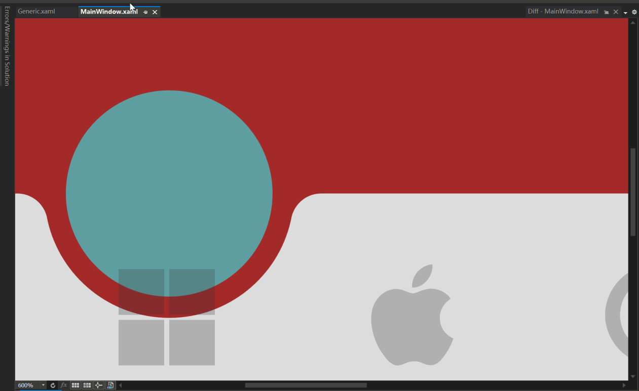
This guide explains how to customize the navigation bar by binding a model to ItemsSource instead of directly creating ListBoxItem elements in XAML. This approach enhances the flexibility and scalability of your application.
First, define a model to represent the navigation items. This model includes a display name and an icon.
public class NavigationModel
{
    public string DisplayName { get; set; }
    public IconType MenuIcon { get; set; }
}Modify the binding in your Generic.xaml to reflect the model properties. This allows the navigation bar to display the appropriate text and icon for each item.
<Setter Property="Text" Value="{Binding DisplayName}"/>
<Setter Property="Icon" Value="{Binding MenuIcon}"/>Remove the manually defined ListBoxItem elements from MainWindow.xaml and ensure the MagicBar control is ready to bind to a source.
<navigation:MagicBar x:Name="bar"/>In your MainWindow.xaml.cs or a ViewModel file, create a list of NavigationModel items and set it as the ItemsSource for the MagicBar.
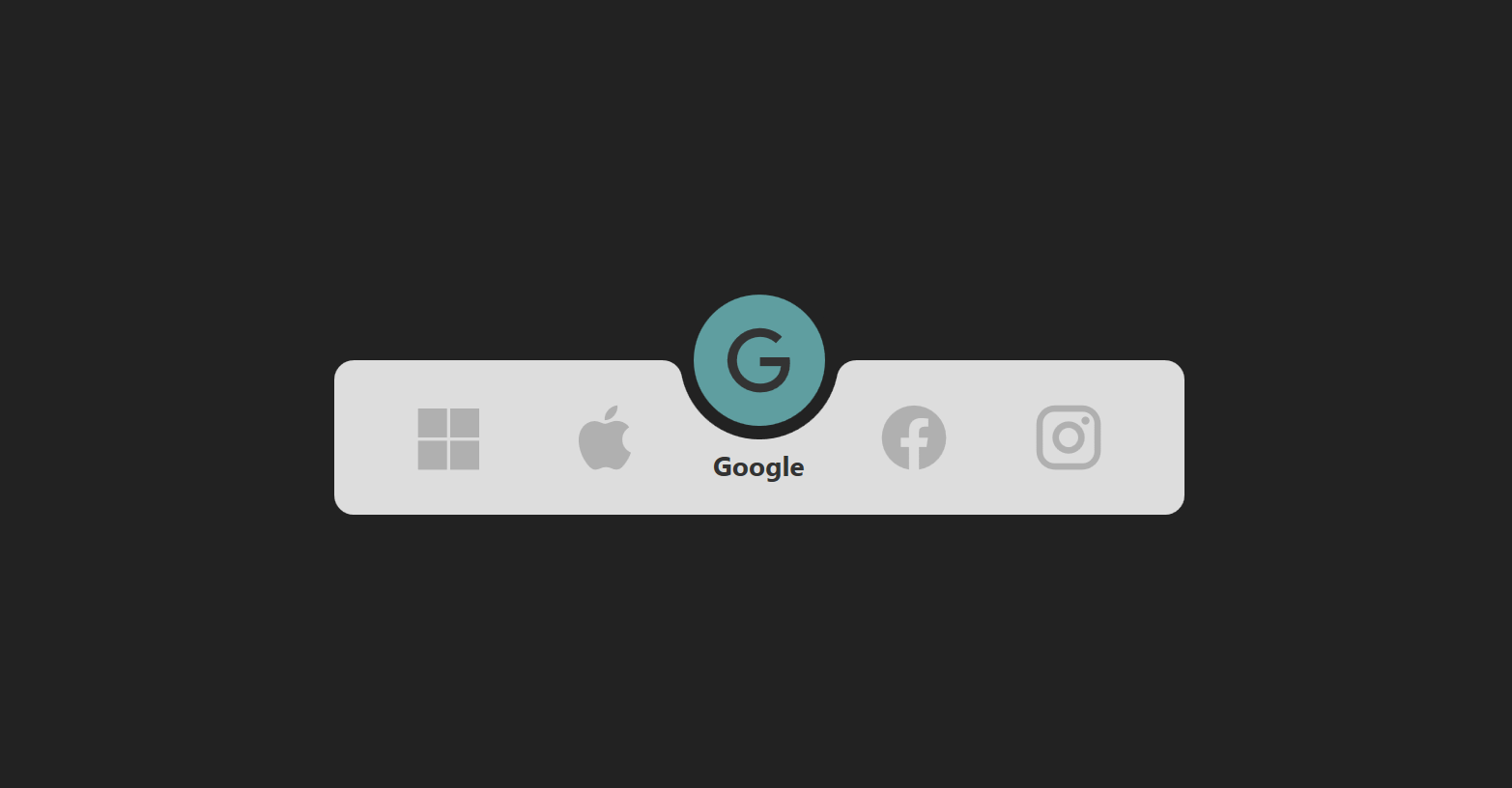
private void PopulateNavigationItems()
{
    List<NavigationModel> items = new List<NavigationModel>
    {
        new NavigationModel { DisplayName = "Microsoft", MenuIcon = IconType.Microsoft },
        new NavigationModel { DisplayName = "Apple", MenuIcon = IconType.Apple },
        new NavigationModel { DisplayName = "Google", MenuIcon = IconType.Google },
        new NavigationModel { DisplayName = "Facebook", MenuIcon = IconType.Facebook },
        new NavigationModel { DisplayName = "Instagram", MenuIcon = IconType.Instagram }
    };

    bar.ItemsSource = items;
}Finally, customize the ItemsPanel template in Generic.xaml to dynamically adjust the number of columns based on the item count, using a UniformGrid.
<ItemsPanelTemplate>
    <UniformGrid Columns="{Binding RelativeSource={RelativeSource AncestorType=ListBox}, Path=Items.Count}"/>
</ItemsPanelTemplate>Following these steps allows you to dynamically create a navigation bar with customizable items. This method provides a more scalable and maintainable approach to managing navigation elements in your application.
In the third Magic Navigationbar WPF tutorial video, a viewer raised the following question:
"I see very thin white lines in the XAML designer of VS. I have seen this white line occasionally in other projects as well."
- The white line is not visible when running at normal size.
- The white line appears when the scale is increased beyond a certain level.
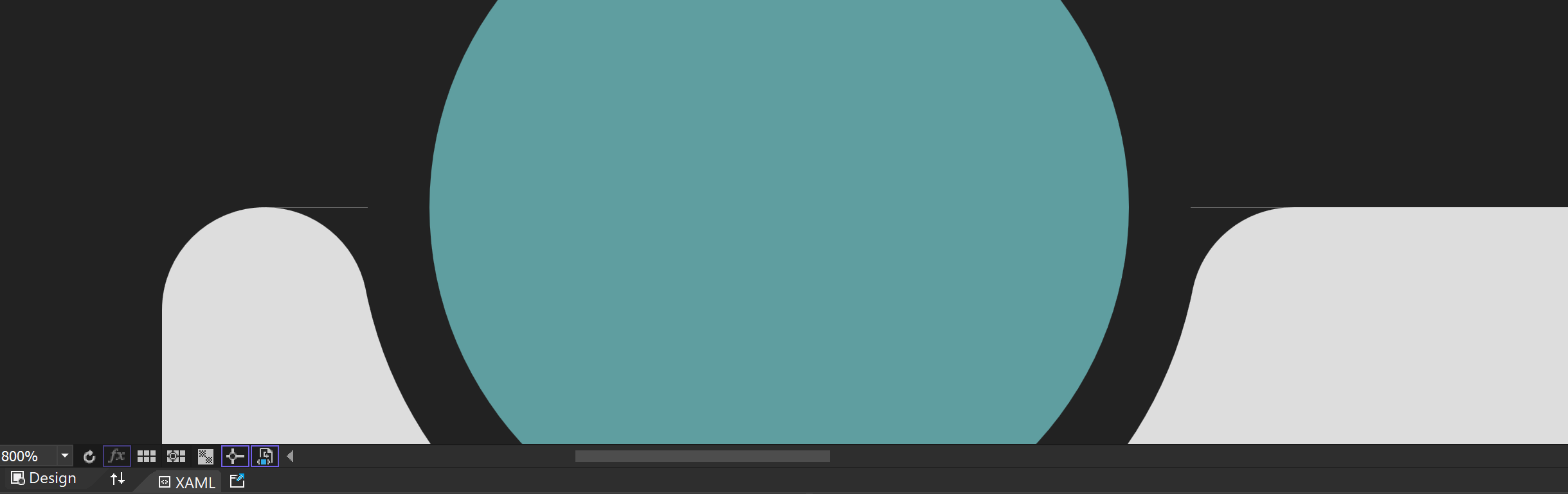
This issue is related to floating-point arithmetic precision and its impact on graphics when zoomed in. While floating-point precision issues are not noticeable in everyday calculations, they become prominent when zoomed in or when precise manipulation is required. When graphics are zoomed in, minor errors are magnified, making them visually prominent.
Floating-point issues become more pronounced when zoomed in due to the following reasons:
- Smaller Pixel Units: After zooming in, individual pixel sizes become smaller, requiring more precise calculations.
- More Decimal Places Needed: When calculating in smaller units, the errors in floating-point arithmetic become more apparent.
- Limitations of Floating-Point Representation: Floating-point represents real numbers approximately, so when zoomed in, these errors are more noticeable.
At normal size, minor floating-point errors are not noticeable. For example, setting the Margin at the top of the Arc to 40 pixels in this project works fine without any issues.
<Style TargetType="{x:Type Path}" x:Key="Arc">
    ...
    <Setter Property="Margin" Value="-10 40 -10 -1"/>
</Style>
[Arc at Normal Size]
When the graphics are zoomed in, minor floating-point errors are magnified, making them visually prominent.
[White Line When Zoomed In]
To compensate for the error, you can adjust the Margin value to fit the actual situation. For example, adjust the Margin value to 39.66 pixels to correct the error.
[Effect After Adjustment]
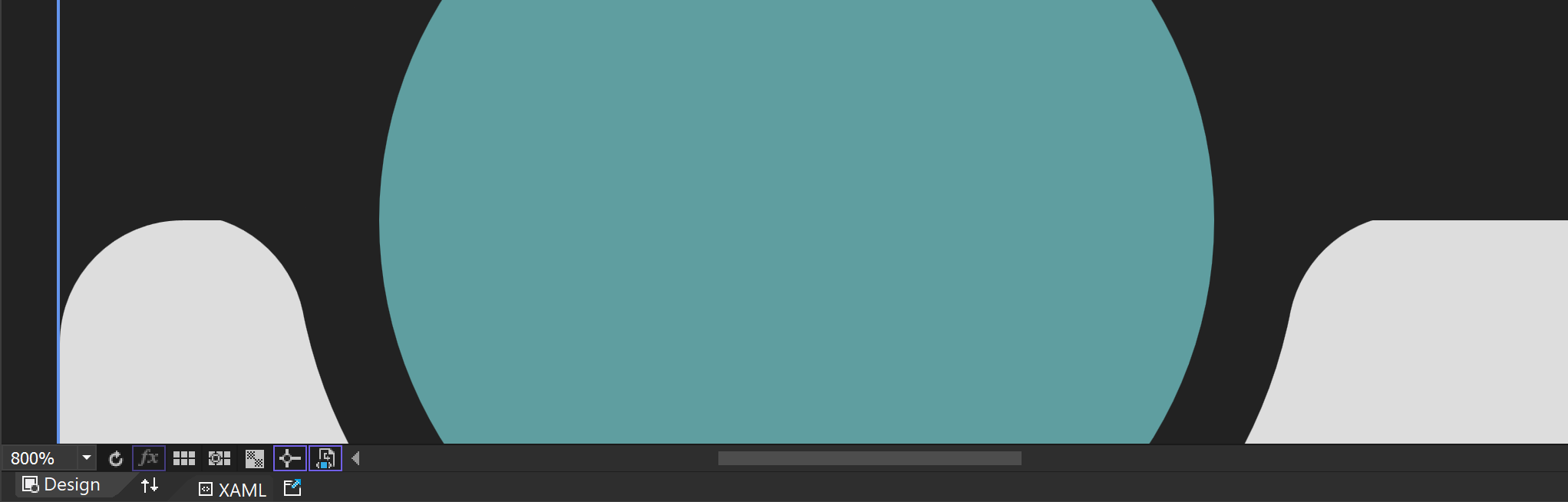
Computers approximate real numbers with floating-point, so these approximation errors become more pronounced when zoomed in. For example, a Margin value originally set to 40 can cause issues due to minor errors when zoomed in.
Floating-point errors can cause visual artifacts, especially at the boundaries or edges of graphics. This can result in jagged edges or positional deviations.
To address floating-point precision issues, particularly those that occur when zooming in, the following methods can be used:
If the required precision range is known exactly, fixed-point arithmetic can be used instead of floating-point to resolve the issue.
Use fixed-point arithmetic libraries or fixed-precision data types for calculations.
If possible, avoid extreme zooming of graphics. Set a reasonable zoom range when designing the application to prevent floating-point errors from becoming prominent.
These properties can be used to align boundaries to pixel units. While this may cause performance degradation, it can be easily activated in higher-level controls like Window to solve the issue simply.
UseLayoutRounding="True"
SnapsToDevicePixels="True"
Floating-point precision issues can become prominent when graphics are zoomed in, but these issues can be effectively resolved with appropriate methods and techniques. I hope this explanation helps you understand and resolve floating-point precision issues.