Deployment : https://otakedev.com/jasonhaenlin
Just so you know, I used the BEM (Block Element Modifier) naming convention to structure my css classes.
For example, item and item__title means that item__title is nested in a item class. It much more easier to read et to reuse the css with that convention. Also in item--bottom-line, the '--' is used when we use a modifier for a class. In this example, we take the class item and we had a modifier --bottom-line.
On the header I used a flex Container to display the header title and subtitle on the same column and the image on an other column
.flex-container {
    display: flex;
    flex-flow: row wrap;
}

.flex-container--col1 {
    flex: 1 1 auto;
}

.flex-container--col4 {
    flex: 4 1 auto;
}

@media (max-width: 1100px) {
    .flex-container {
        justify-content: center;
    }
}I used a flex container to make the two section of my main sections.
.main {
    display: flex;
    background-color: var(--clear);
    z-index: 8;
}

.main>.section:nth-child(1) {
    width: 40%;
    box-shadow: 3px -6px 13px var(--grayB);
}

.main>.section:nth-child(2) {
    width: 55%;
}
Also, like you can notice, I used a z-index to put this container bellow the other, to achieve that, I needed to add a relative position in my header. That way, I created a new Stacking context and was able to manage which one was above and bellow. I needed to do that to hide the box-shadow on the top of the main container.
I had some issue to justify my text properly
.item__title {
    font-weight: bold;
}

.item__title--justify {
    display: inline-block;
    width: 6em;
}
To achieve that, It was necessary to add a modifier on my Block with display: inline-block because, I used a <span> to put all the element on the same row, but at default, a span don't have a width or height because, it's inline. Like that, I was able to put the same width on all the title and have something cleaner.
I have also used a ::before to add a bottom line on each element.
I had to do something tricky to be able to use the width: 100% because it take the Stacking context max width, so I had to put a relative position on my item class.
.item--bottom-line::before {
    position: absolute;
    height: 1px;
    width: 100%;
    background-color: var(--grayB);
    content: "";
    bottom: -0.5em;
}
For the progress bar, I used a simple svg with a mask to change the level of the bar.
    <svg>
        <defs>
            <mask id="progress100">
                <rect width="100%" height="100%" x="-0%" y="0"
                    fill="#fff" />
            </mask>
            <!-- other masks from 90 to 20 -->
            <mask id="progress10">
                <rect width="100%" height="100%" x="-20%" y="0"
                    fill="#fff" />
            </mask>
        </defs>
        <rect class="background" width="100%" height="100%" rx="2" />
        <g mask="url(#progress90)">
            <rect class="fill" width="100%" height="100%" rx="2" />
        </g>
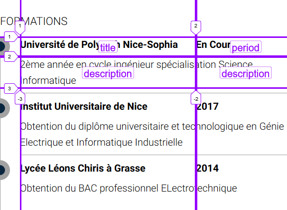
</svg>To display properly the information, I used a grid container to structure my elements.
.card {
    display: grid;
    grid-template-columns: 1fr 10em;
    grid-template-rows: minmax(2em, auto) minmax(3em, auto);
    grid-template-areas:
        "title period"
        "description description";
}

.card__title {
    grid-area: title;
}

.card__period {
    grid-area: period;
}

.card__description {
    grid-area: description;
}
Also the Circle on the timeline is just a <div class="timeline-circle"></div> with a relative position to move the circle on the left.
.timeline-circle {
    position: relative;
    right: 1em;
    height: 2em;
    width: 2em;
    border: 0.5em solid var(--grayB);
    border-radius: 50%;
    background-color: var(--blue1);
    float: left;
}

