smart_grid_view
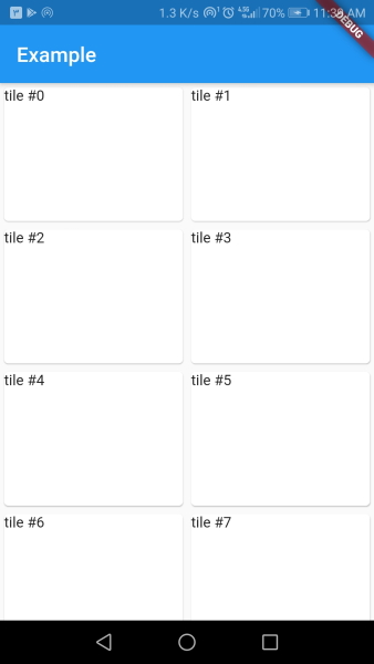
A responsive grid view that changes it's cross axis child count based on the available horizontal size.
This widget is great for creating responsive designs as the sized of tiles stays about the same across different screen sizes.
How does it work
Using the width of tiles, SmartGridview will calculate the crossAxisCount for the underlying GridView with maxWidth ~/ tileWidth.
The tileHeight is used with tileWidth to calculate gridChildRatio.
Example
class MyApp extends StatelessWidget {
  const MyApp({Key? key}) : super(key: key);

  @override
  Widget build(BuildContext context) {
    return MaterialApp(
      home: Scaffold(
        appBar: AppBar(title: const Text('Example')),
        body: SmartGridView(
          tileWidth: 128,
          tileHeight: 168,
          children: List.generate(
            80,
            (index) => Card(
              child: GridTile(
                child: Text('tile #$index'),
              ),
            ),
          ),
        ),
      ),
    );
  }
}
