interactive-climate-map
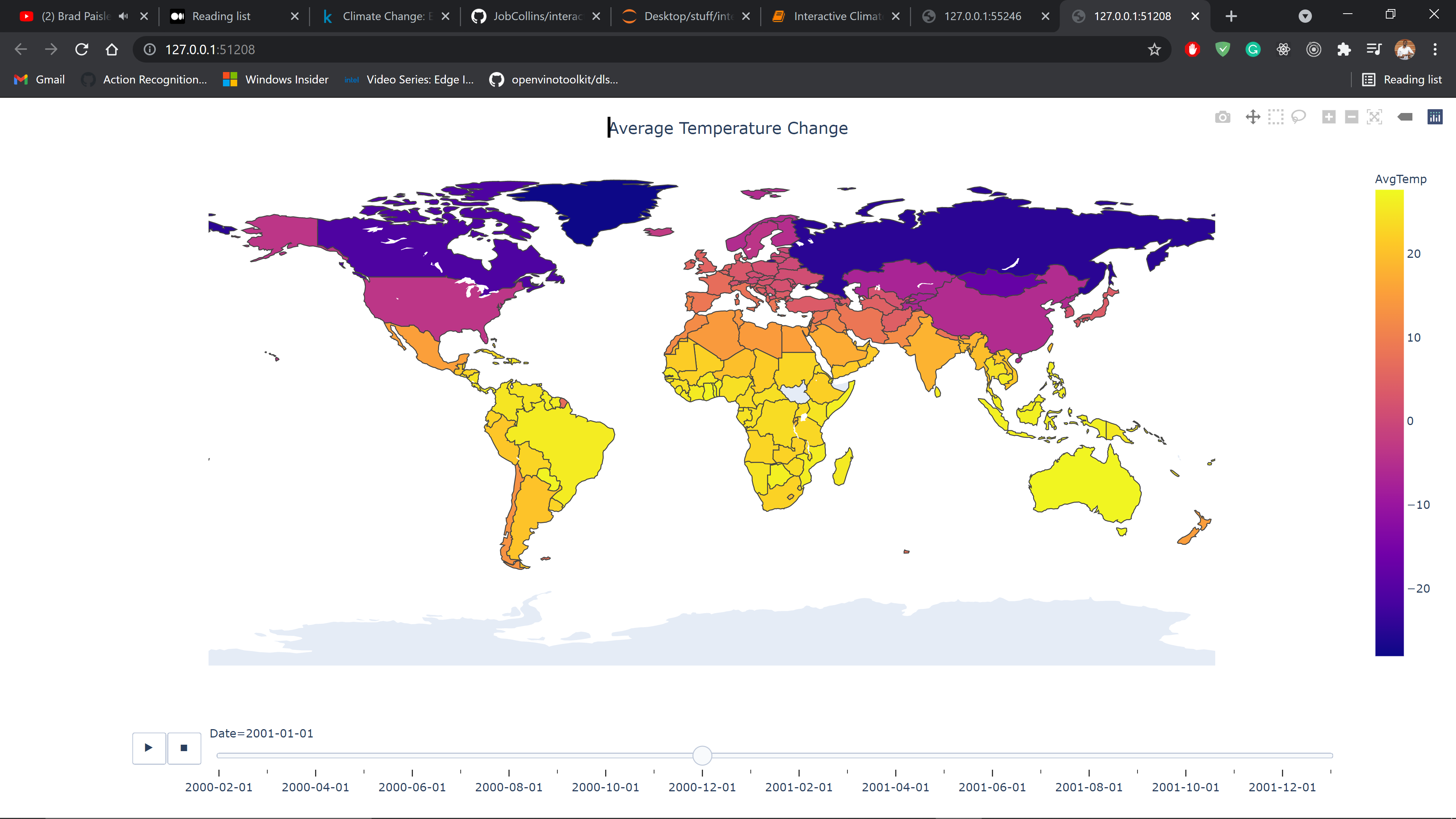
Two interactive climate maps. The first one will be showing the climate change of each country, and the second one will be showing the temperature change over time.
Understanding the Data
The Berkeley Earth Surface Temperature Study combines 1.6 billion temperature reports from 16 pre-existing archives. It is nicely packaged and allows for slicing into interesting subsets (for example by country). They publish the source data and the code for the transformations they applied.
