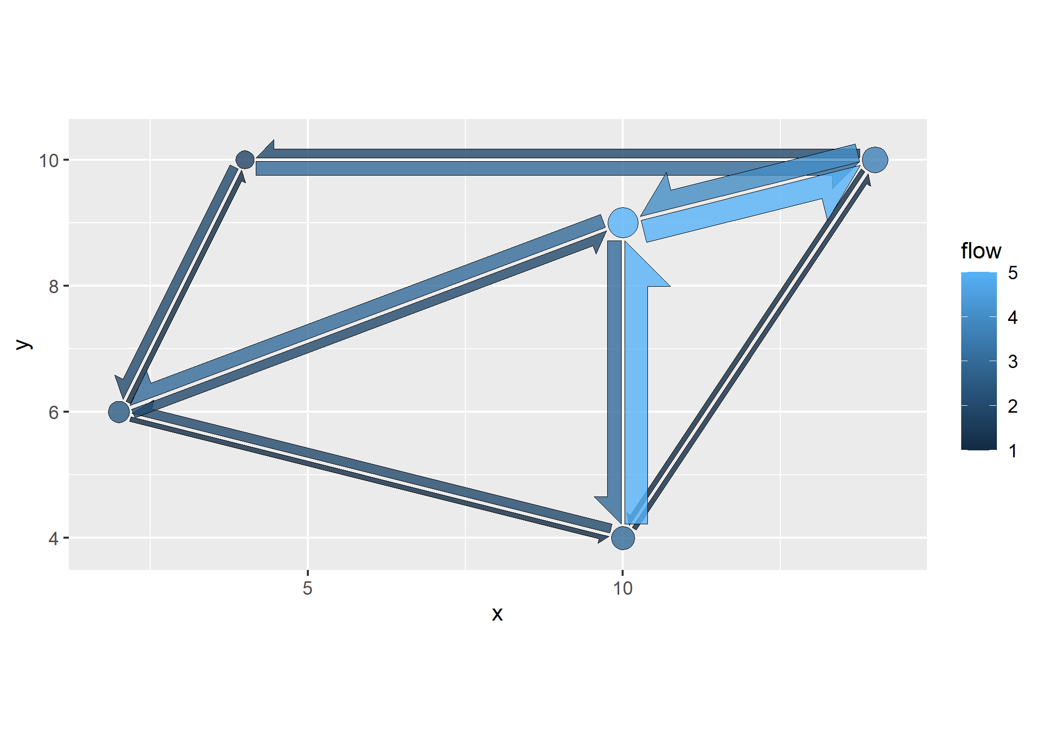
flowmapper allows to create ggplots with flowmaps in the style of https://flowmap.gl/.
For interactive flowmaps in R, also check out the flowmapblue package!
You can install the released version of flowmapper from CRAN:
install.packages("flowmapper")Or, you can install the development version of flowmapper like so:
devtools::install_github("https://github.com/JohMast/flowmapper")flowmapper uses a single function add_flowmap to add a flowmap layer
to an existing ggplot. add_flowmap requires as inputs a single
data.frame (or tibble) that contains for every combination of two nodes
a and b
-
the x and y coordinates of each these nodes,
-
a unique id for each of these nodes,
-
the intensity of flow between those nodes in both directions (from a to b, and from b to a).
The data.frame should have the following columns:
testdata <-
data.frame(
   id_a = c("X1","X2","X3","X3","X1","X2","X2"),
   id_b = c("X5","X4","X1","X5","X4","X5","X3"),
   xa = c(2,14,10,10,2,14,14),
   ya = c(6,10,9,9,6,10,10),
   xb = c(10,4,2,10,4,10,10),
   yb = c(4,10,6,4,10,4,9),
   flow_ab = c(1,2,3,3,1,1,4),
   flow_ba = c(2,3,2,5,2,1,5)
)
The dataframe and the ggplot that the flowmap should be added to are
then passed into add_flowmap.
library(ggplot2)
plot <- ggplot() # empty ggplot

library(flowmapper)
plot |>
  add_flowmap(testdata)+
  coord_equal()  # coord equal is highly recommended to create symmetric shapes
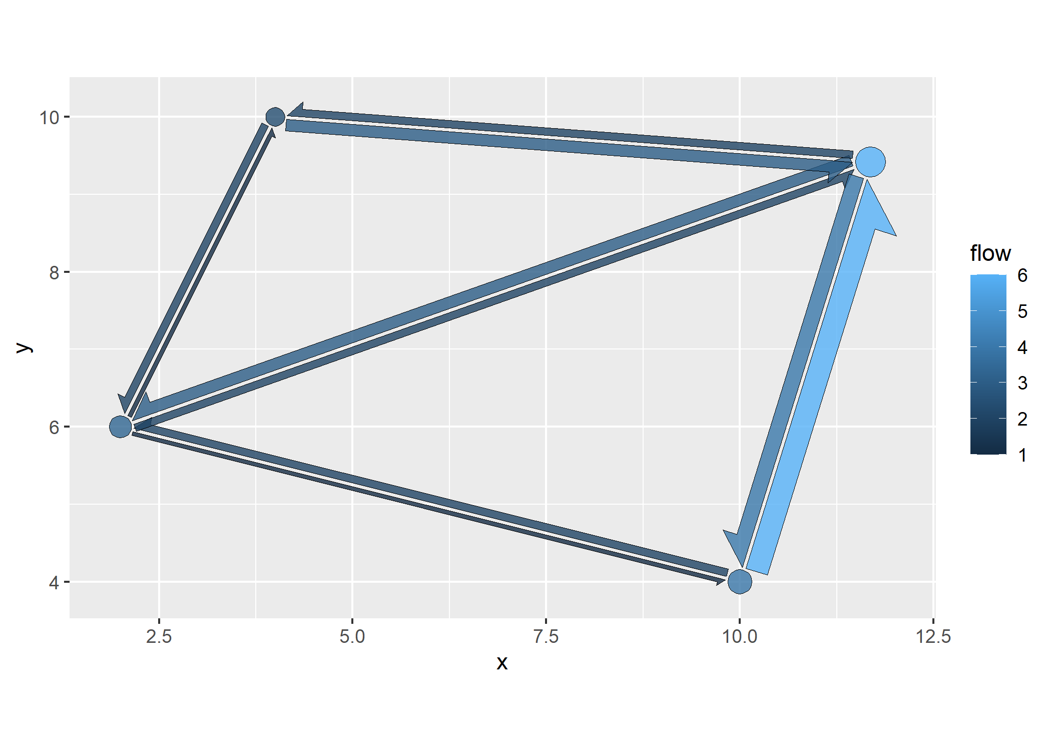
If the number of nodes is very high, the plot will appear cluttered. In
that case, nodes can be clustered and merged by proximity, with
k_nodes controlling the number of clusters.
plot |>
  add_flowmap(testdata,k_nodes = 4)+
  coord_equal()
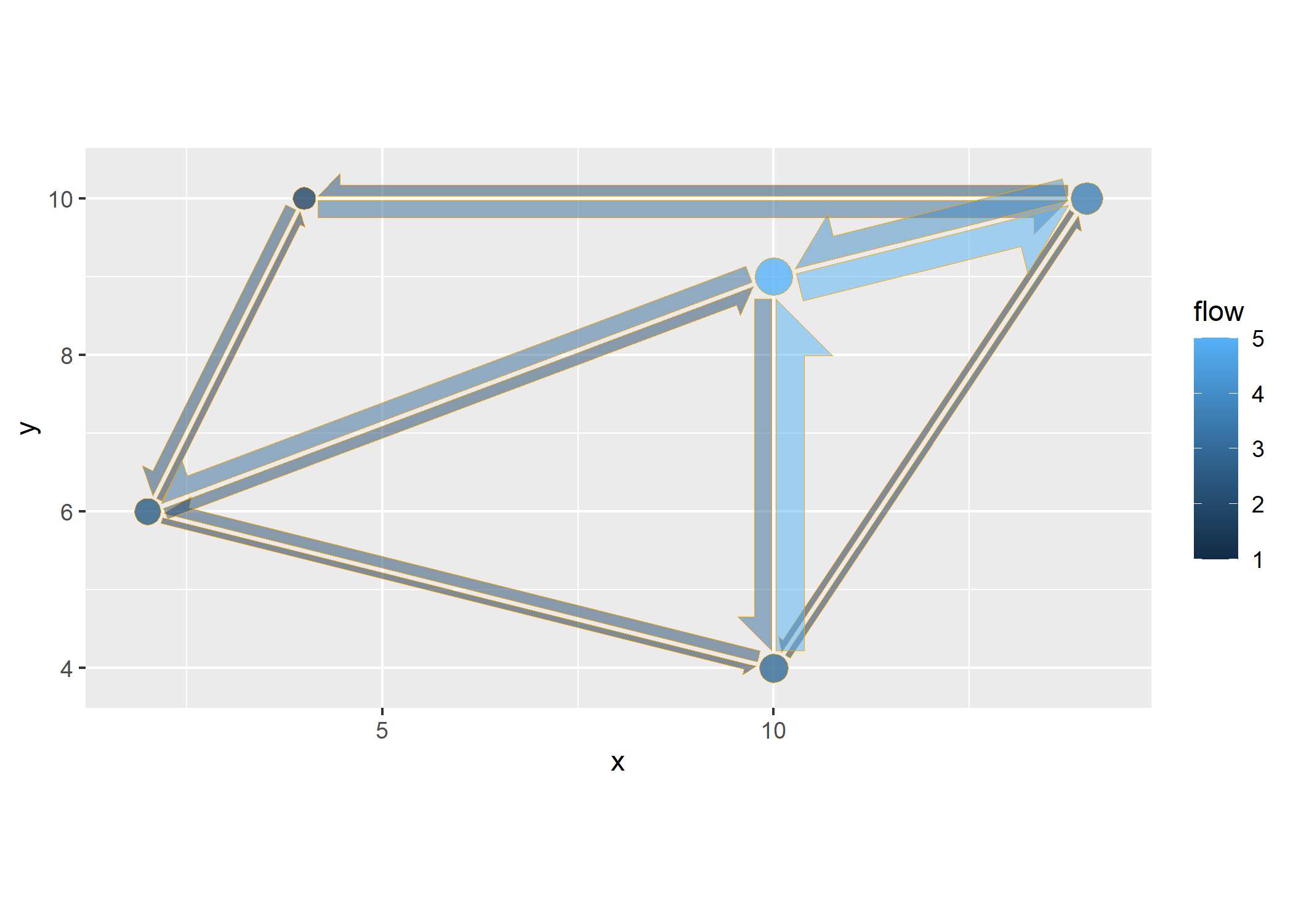
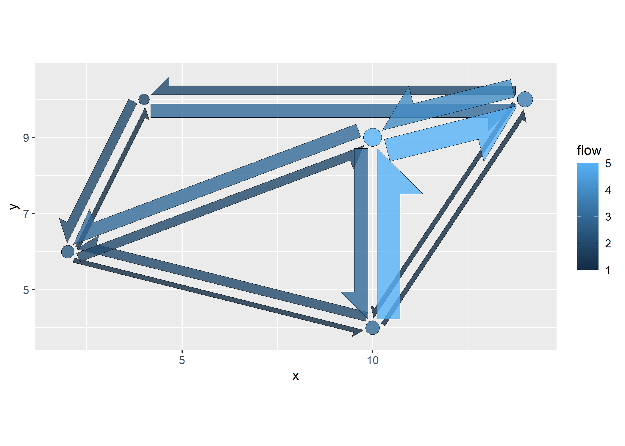
Transparency and outline of the arrows can be controlled with the
outline_col and alpha arguments.
plot |>
  add_flowmap(testdata, outline_col = "orange", alpha=0.5)+
  coord_equal()  # coord equal is highly recommended to create symmetric shapes
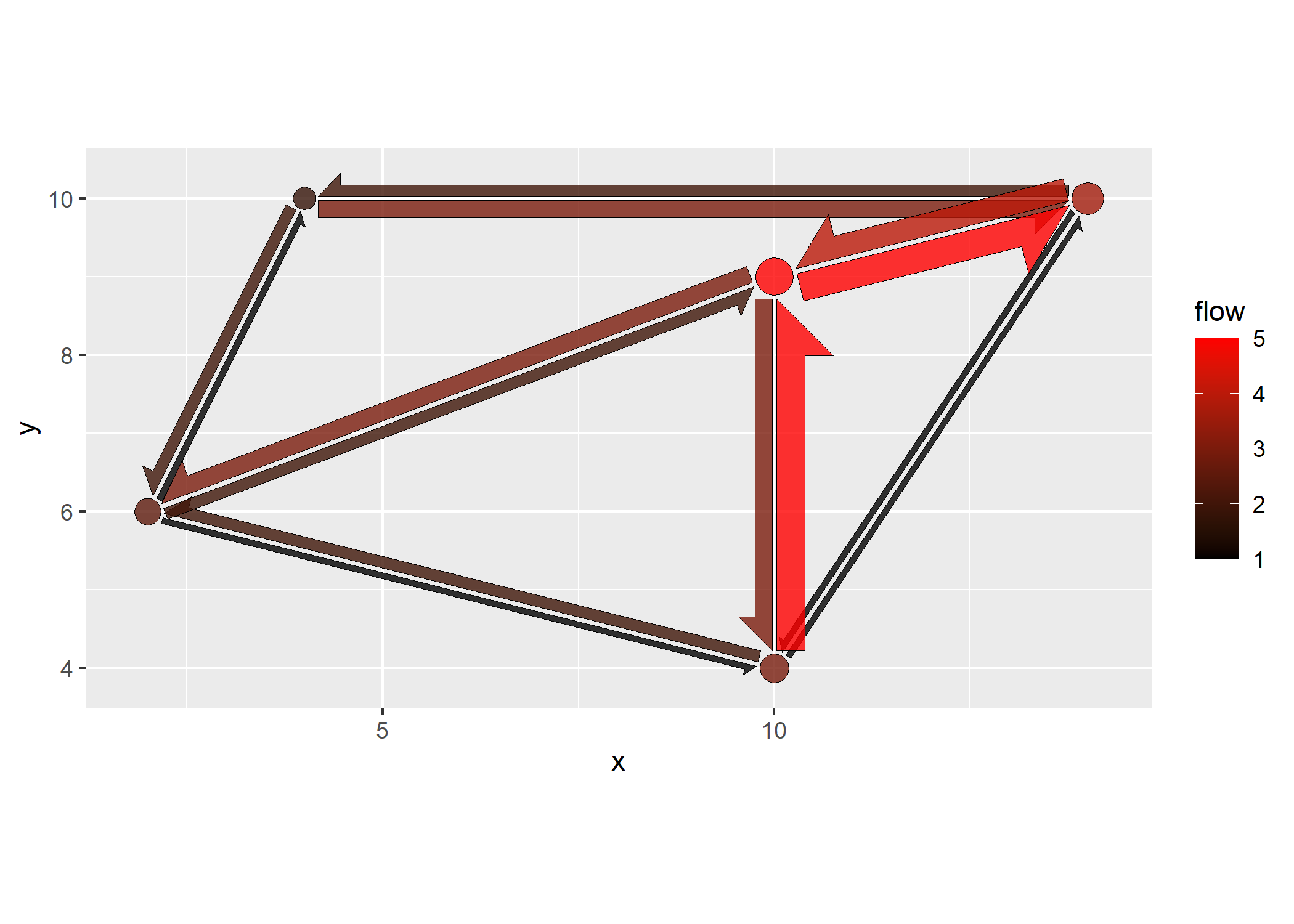
The flow arrows are geom_polygons, with the flow mapped to the fill aesthetic. Thus, the fill can be adjusted like for any geom.
plot |>
  add_flowmap(testdata)+
  coord_equal() +
  scale_fill_gradient(low="black", high = "red")
Size of the edges and offset (distance between two paired edges) can be
controlled with edge_width_factor and edge_offset_factor .
plot |>
  add_flowmap(testdata, edge_offset_factor = 4, edge_width_factor = 2)+
  coord_equal()
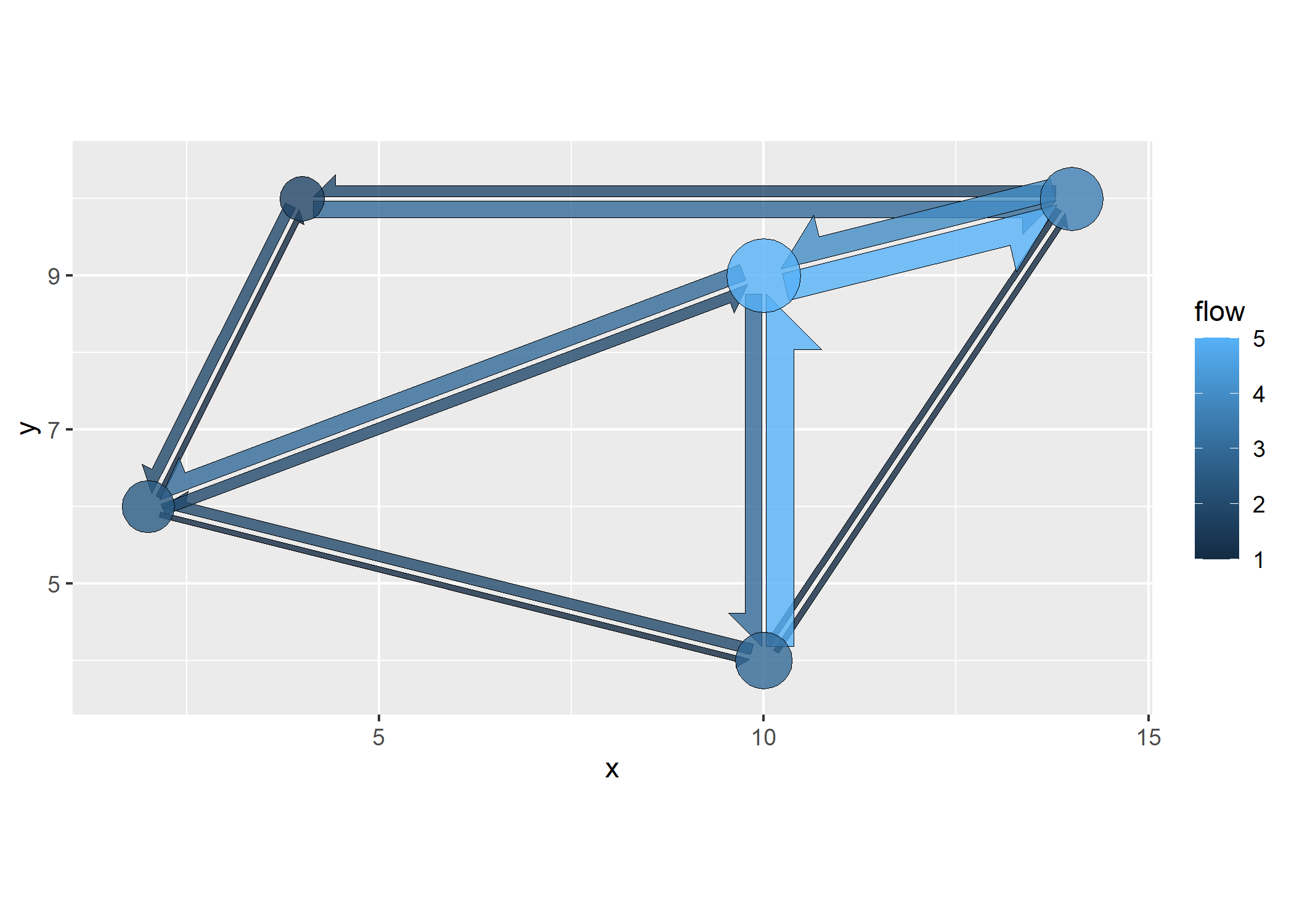
Finally, the size of the nodes can be adjusted with
node_radius_factor, and the distance between nodes and edges with
node_buffer_factor.
plot |>
  add_flowmap(testdata, node_radius_factor = 2, node_buffer_factor = 0.5)+
  coord_equal()
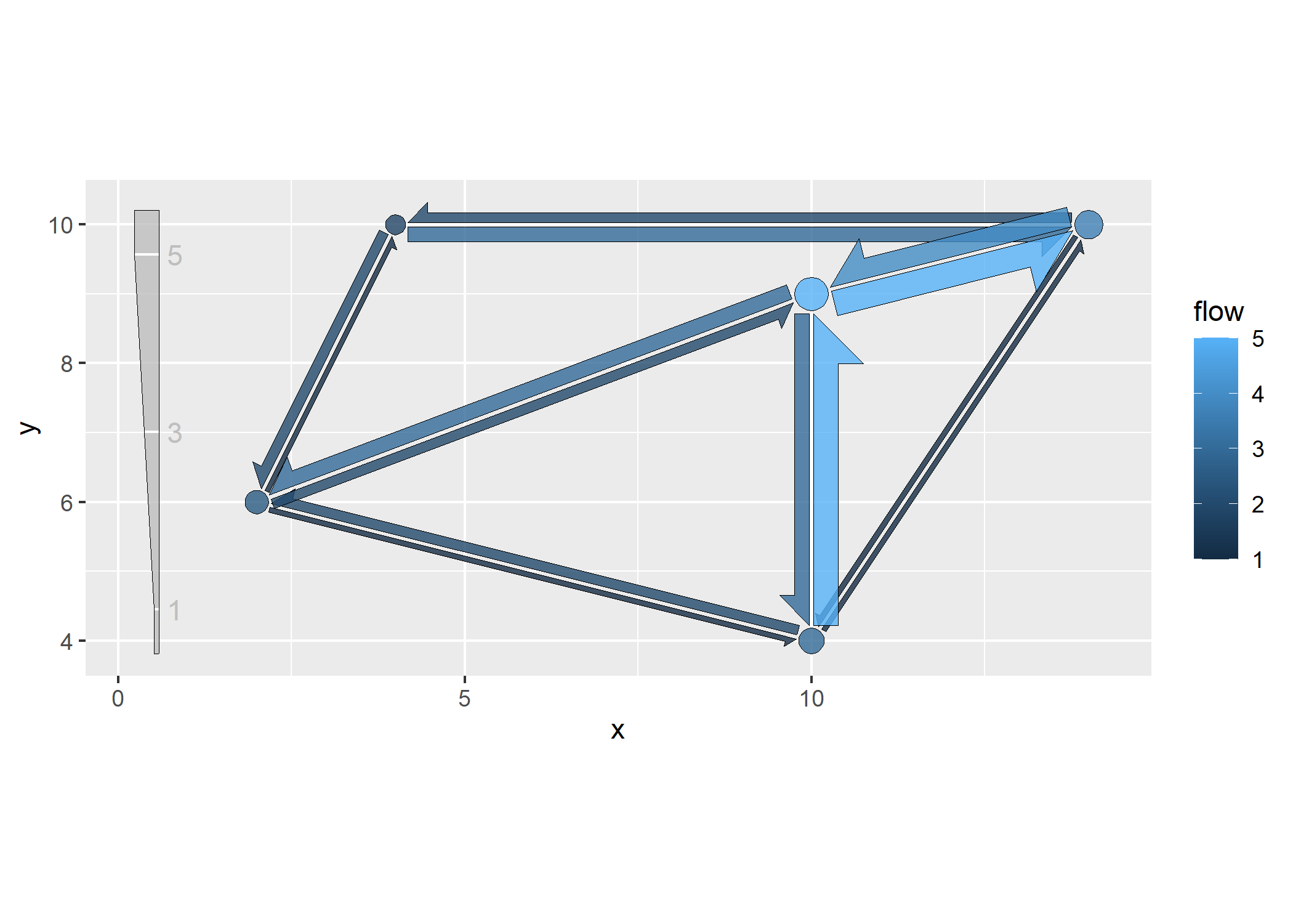
Because the edges are polygons and not linked to an aesthetic, a typical
ggplot legend cannot be created for their width. As an alternative, a
legend can be added to the bottom of the main panel by using
add_legend.
# debug(add_flowmap)
plot |>
  add_flowmap(testdata,add_legend = "left")+
  coord_equal()
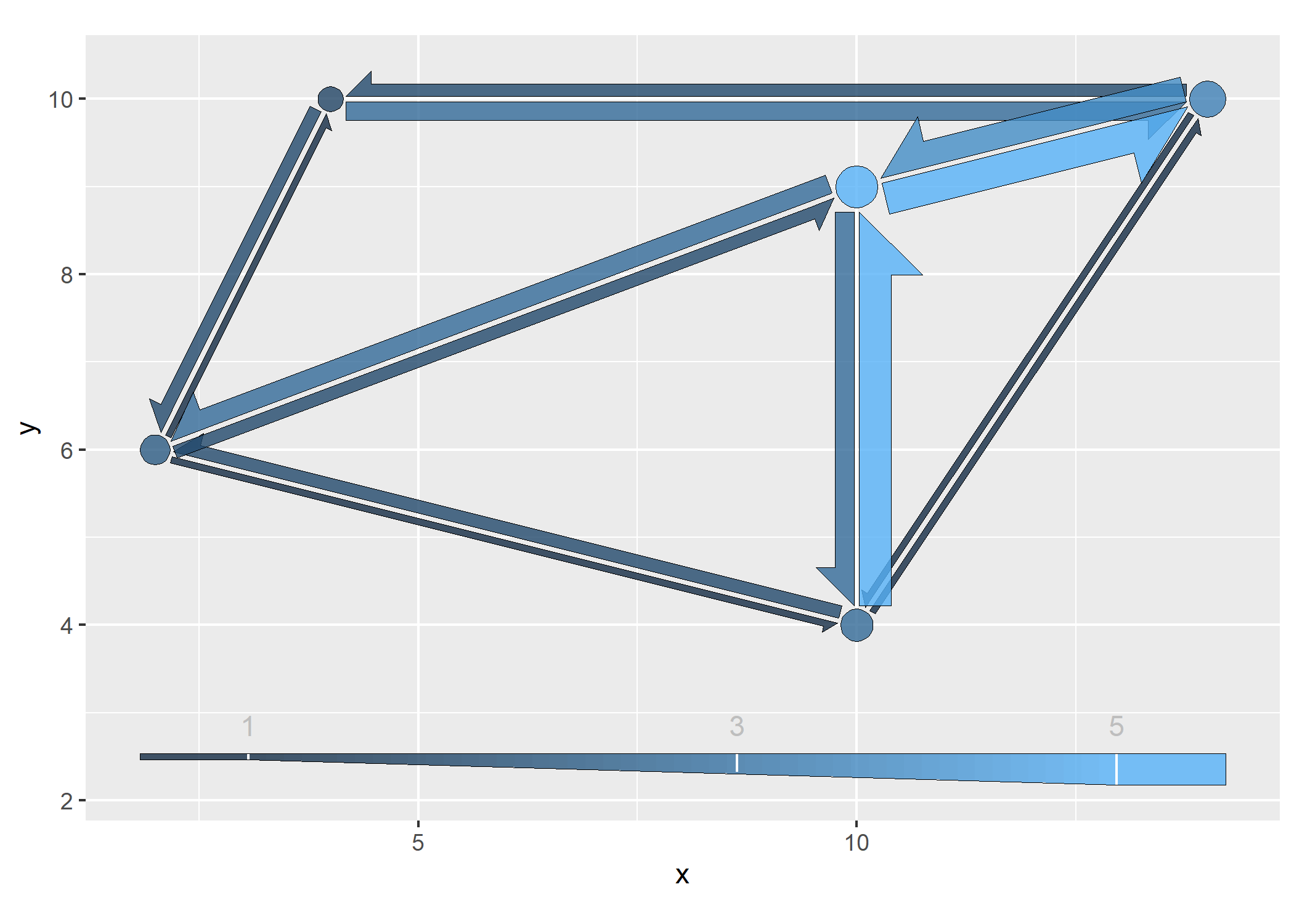
Instead of a monotone legend, the legend color can be set to represent
the flow intensity with legend_gradient.
# debug(add_flowmap)
plot |>
  add_flowmap(testdata, add_legend = "bottom",legend_gradient=T)+
  coord_equal()+
  theme(legend.position = "none")
The flowmap can be turned into an interactive plot using the
plotly library. The names of the
nodes and flows are mapped to the text aesthetic and can be used in
the tooltips.
library(plotly)
plot <-
  plot |>
  add_flowmap(testdata)+
  coord_equal()
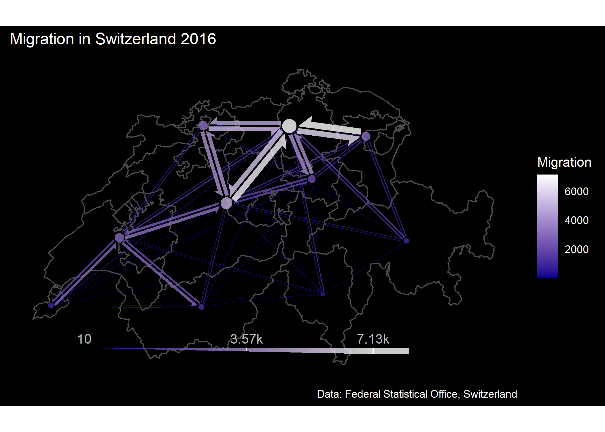
ggplotly(plot,tooltip = c("text","fill"))The code below shows an example of real world data from Switzerland (same data used in this flowmap). The data contains migration flows between the 26 Cantons of Switzerland.
library(dplyr,warn.conflicts = FALSE)
library(ggplot2,warn.conflicts = FALSE)
library(sf)
library(flowmapper)

# load migration data
data <-
  flowmapper::CH_migration_data
head(data)
#> # A tibble: 6 × 8
#>   id_a   id_b      flow_ab      xa       ya      xb       yb flow_ba
#>   <chr>  <chr>       <dbl>   <dbl>    <dbl>   <dbl>    <dbl>   <dbl>
#> 1 Zurich Bern         1673 963578. 6010540. 848945. 5913828.    2097
#> 2 Zurich Lucerne      1017 963578. 6010540. 903672. 5953394.    1530
#> 3 Zurich Uri            84 963578. 6010540. 960416. 5905545.     110
#> 4 Zurich Schwyz       1704 963578. 6010540. 975336. 5952572.    1428
#> 5 Zurich Obwalden       70 963578. 6010540. 917705. 5918015.     107
#> 6 Zurich Nidwalden      94 963578. 6010540. 936303. 5930028.     132
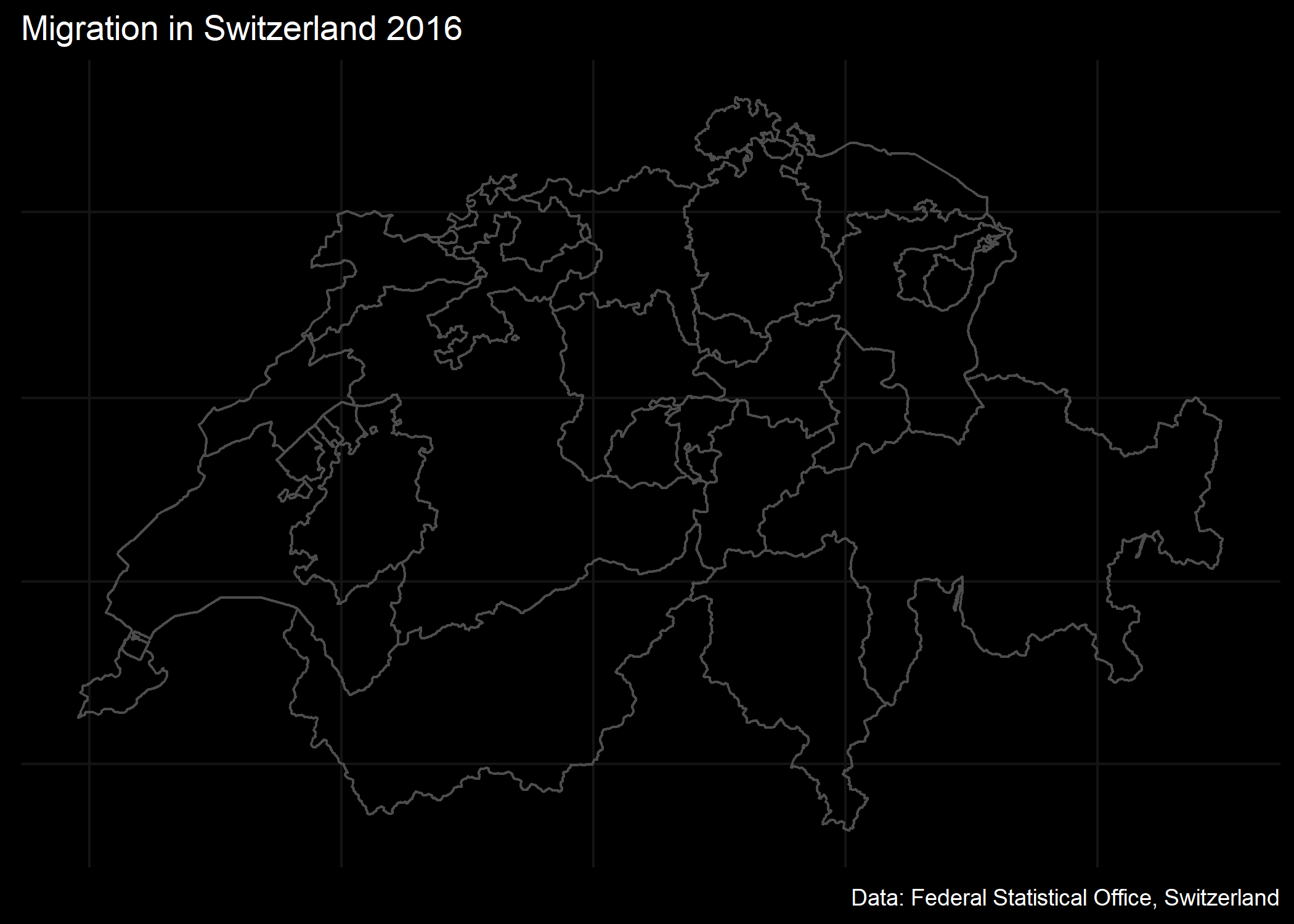
As a background for the flow map, a ggplot is created using the administrative boundaries, sourced from the GADM dataset.
cantons <- flowmapper::cantons
st_crs(cantons) <- 3857

# basic plot with just the admin units
p <- ggplot(cantons)+
  geom_sf(fill=NA,col="gray30",linewidth=0.5) +
  ggdark::dark_theme_bw()+
  theme(panel.border = element_blank(),
        axis.title = element_blank(),
        axis.text = element_blank(),
        axis.ticks = element_blank())+
  labs(title = "Migration in Switzerland 2016",
       caption = "Data: Federal Statistical Office, Switzerland")
p
The flowmap is then added to the base plot by using add_flowmap,
applying some clustering to reduce the number of nodes from 26 to 10. A
custom color scale is applied which matches the dark background.
p2 <-
  p|>
  add_flowmap(flowdat = data,
              add_legend = "bottom",
              edge_width_factor = 0.7,
              k_nodes = 10,legend_gradient=T,
              outline_col = NA)+
  theme(panel.grid = element_blank())+
  scale_fill_gradient("Migration",
                      low = "darkblue",
                      high="white")
p2
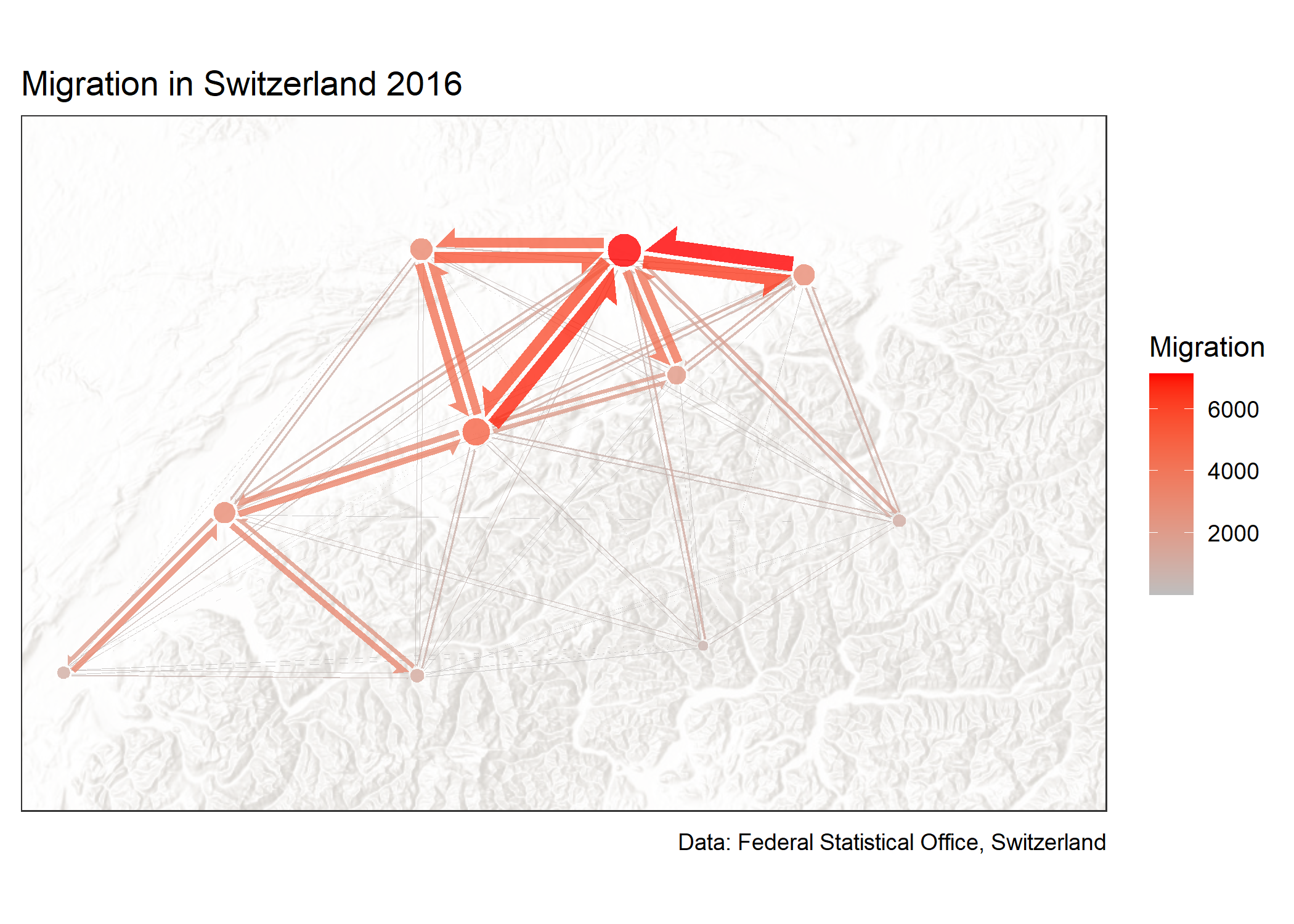
The flowmap uses the color and fill aesthetics, which can be limiting when the ggplot also should contain other layers using the same aesthetic. In such cases, the ggnewscale package can be used to enable a new scale for those aesthetics. The following example shows a flowmap being added to a basemap from the basemaps package, which itself uses the fill aesthetic.
library(basemaps)

p <- basemap_ggplot(cantons,
                    map_service = "esri",
                    map_type = "world_hillshade",
                    alpha=0.3)+
  theme_bw()+
  theme(
    axis.title = element_blank(),
    axis.text = element_blank(),
    axis.ticks = element_blank())+
  scale_x_continuous(expand = expansion(0,0))+
  scale_y_continuous(expand = expansion(0,0))+
  ggnewscale::new_scale_fill()+
  labs(title = "Migration in Switzerland 2016",
       caption = "Data: Federal Statistical Office, Switzerland")
#> Loading basemap 'world_hillshade' from map service 'esri'...

p|>
  add_flowmap(flowdat = data,
              edge_width_factor = 0.7,k_nodes = 10,
              outline_col = NA)+
  theme(panel.grid = element_blank())+
  scale_fill_gradient("Migration",low = "gray",high="red")
