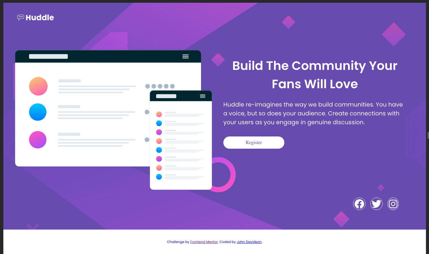
This is a solution to the Huddle Landing Page challenge on Frontend Mentor. Frontend Mentor challenges help you improve your coding skills by building realistic projects.
Users should be able to:
- View the optimal layout for the component depending on their device's screen size
- See a hover state on desktop for the Sign Up call-to-action
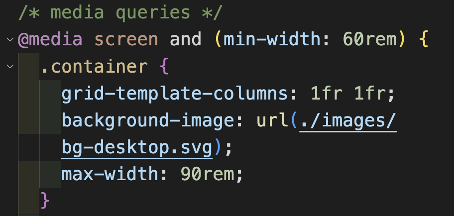
I began mobile first using grid one column. For larger screens I added a media query at 60rem width which added a second column.
- Semantic HTML5 markup
- CSS custom properties
- CSS Grid
- Mobile-first workflow
I learned loads in this project as it is my second using CSS Grid. I found after watching tutorials and reading docs on Grid, that putting the theory into practice was challenging. This was a challenging project as I struggled with the transition from mobile view to desktop. The issue was at the 700px width which is tablet width. I am not too happy with the final outcome as I had to use negative margins on the header image, however, this at times of transition covers the logo in the header.
One aspect I relearned on this project was deploying background images through css rather than embedding within the html. I used a url to place a background svg file in the media query.
I also learned about negative margins in this project. Where an image element had to be out of its usual place. And also, I re-learned how to deploy icons from Fontawsome. I forgot the part of placing the link inside the html head. This link I got from .
This is the html below, I have included the entire head as it contains the google fonts also. It is handy for future reference. I was able to style the icons in the css, that code is below also.
<!DOCTYPE html>
<html lang="en">
  <head>
    <meta charset="UTF-8" />
    <meta name="viewport" content="width=device-width, initial-scale=1.0" />
    <!-- displays site properly based on user's device -->
    <!-- font awesome -->
    <link
      rel="stylesheet"
      href="https://cdnjs.cloudflare.com/ajax/libs/font-awesome/6.4.2/css/all.min.css"
      integrity="sha512-z3gLpd7yknf1YoNbCzqRKc4qyor8gaKU1qmn+CShxbuBusANI9QpRohGBreCFkKxLhei6S9CQXFEbbKuqLg0DA=="
      crossorigin="anonymous"
      referrerpolicy="no-referrer"
    />
    <link
      rel="icon"
      type="image/png"
      sizes="32x32"
      href="./images/favicon-32x32.png"
    />

    <title>
      Frontend Mentor | Huddle landing page with single introductory section
    </title>
    <!-- google fonts -->
    <link rel="preconnect" href="https://fonts.googleapis.com" />
    <link rel="preconnect" href="https://fonts.gstatic.com" crossorigin />
    <link
      href="https://fonts.googleapis.com/css2?family=Open+Sans&family=Poppins:wght@400;600&display=swap"
      rel="stylesheet"
    />
    <link rel="stylesheet" href="styles.css" />
  </head>
</html>.icon {
font-size: 1rem;
color: white;
border: 1px solid white;
border-radius: 50%;
padding: 0.2rem;
}This is my second project using css grid at its most basic level. However, I feel it is beneficial to break in gently with it as it seems there is much to learn. I also incorporated flexbox which is now becoming second nature.
- John Smilga's Udemy tutorials - This helped me to learn a great deal of html and css. I re-watched the section on CSS Grid.
- Shruti Balasa's book on CSS Flex and Grid - This is an amazing book which helped me finally understand aspects of Flex-box and Grid. I'd recommend it to anyone still learning this concept.
- Website - John Davidson
- Frontend Mentor - @John-Davidson-8
Big shout out to @Grace-snow (https://fedmentor.dev/) and @Chamu at Frontend Mentor for their help as always. Thanks guys.


