TauriGrid
TauriGrid is a template for creating desktop applications using Tauri and React. It has a pre-built grid layout that allows you to quickly prototype desktop applications by rendering multiple flexible components at once to test their responsiveness. It also comes with a pre-built Redux store that allows you to defy scopes and manage states across the application with ease.
Note
This is a work in progress. Nothing is entirely optimized.
Table of Contents
Setup
Reccomended IDE Setup: VS Code + Tauri + rust-analyzer
- Install Rust
- Install Node.js
- Install Yarn
- Install Tauri
- Install Vite
- Clone this repository:
git clone https://github.com/JohnKearney1/TauriGrid.gitor click the Use this Template button! - Enter the directory:
cd TauriGrid - Install dependencies with yarn:
yarn - Start the app in development mode:
yarn tauri dev
Build
To build the app: yarn tauri build
Usage
General Architecture
The main entry point for the application is src/main.tsx. This file is responsible for starting the React application and creating the Tauri window. This is also where the Redux store is created and passed to the React application as a provider object.
The React application is located in src/App.tsx. This is where the main UI is created and where the main organization of the application is located. The App component renders the Toolbar component (/src/components/Toolbar.tsx) and the Workspace component (/src/components/Workspace.tsx).
These two main components are how you will interact with the application. The Toolbar component is where you will find the main controls for the application. The Workspace component is where you will find the main grid layout and window spawning functionality of the application.
Toolbar Component
The Toolbar component (src/components/Toolbar.tsx) is where you will find the main controls for the application. The Toolbar comes with a few buttons by default:
-
File
- Shows a dropdown menu with the following options:
- Reload
- Reloads the application
- Preferences
- Changes the layout state of the application to display only the preferences window
- Exit
- Exits the application
- Reload
- Shows a dropdown menu with the following options:
-
Edit
- Basic dummy controls, no functionality as of now.
-
Profiles
- Switches the layout between three radio selectable menu items:
- Basic (Three Windows)
- Advanced (Four Windows)
- Dev (Six Windows)
- Switches the layout between three radio selectable menu items:
The Toolbar component can be used like so:
src/App.tsx
import Toolbar from './components/Toolbar.tsx'

...

<>
    <Toolbar />
</>
Workspace Component
The workspace component (src/components/Workspace.tsx) is where you will find the main grid layout and window spawning functionality of the application. The Workspace component is responsible for rendering the grid layout and spawning windows based on the layout state of the application.
The workspace component is rendered in src/App.tsx and is passed the one prop layout which is the current layout state of the application. The layout state is stored in the Redux store and is updated via the Toolbar component. More on layout states can be found in the Layouts section.
The Workspace component takes two optional props:
- layout : The current layout state of the application
- windowTitles : An array of strings that are used as the window titles for the windows in the grid layout
src/App.tsx
import Workspace from './components/Workspace.tsx'

...

<>
    <Workspace
        layout={layout}
        windowTitles={windowTitles}
    />
Window Component
Windows are pulled from the src/components/Window.tsx component. This component is responsible for rendering the window and its contents. The window component is passed a children prop which allows you to render any React component inside the window like so:
src/components/Workspace.tsx
import Window from './components/Window.tsx'

...

<>
    <Window>
        {/* Your component here */}
    </Window>
</>
Window components also accept four additional props:
- width : CSS Styling for the width of the window
- height : CSS Styling for the height of the window
- windowTitle : The title of the window as a string. This is displayed in the title bar of the window
- tooltipText : The tooltip text that is displayed when you hover over the window's information icon.
You can pass one or multiple of these props to the window component like so:
src/components/Workspace.tsx
import Window from './components/Window.tsx'

...

<>
    <Window
        width="100%"
        height="100%"
        windowTitle="Window Title"
        tooltipText="Tooltip Text"
    >

        {/* Your component here */}

    </Window>
</>
Layouts
Changes to the layout are propogated via the Redux store to the Workspace component. The Workspace component then renders the grid layout based on the layout state. The layout state is stored in the Redux store and is updated via the Toolbar component.
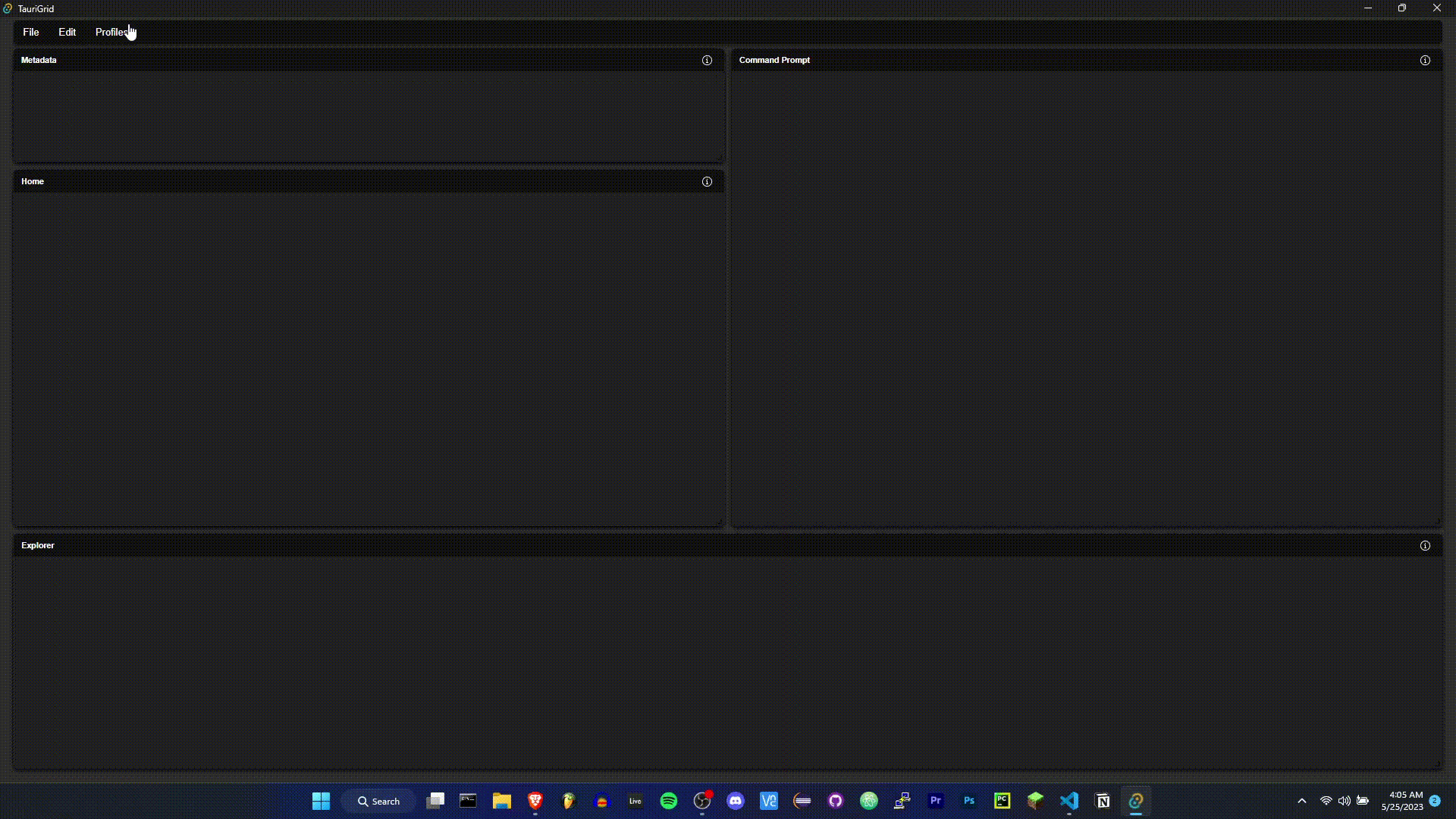
When the application is first started, the layout state is set to basic. The basic layout is a three window layout with an explorer window on the left and two more windows on the right.
The Workspace component renders the grid layout based on the layout state.
Q: What is a layout state?
A: The layout state is an object that stores information about how many windows to render inside of the grid layout, and what to name them. The layout state is loaded into the Redux store from src/reducers/layouts.json.
TLDR: The layouts.json file mentioned above is where you customize the arrangements of the windows in the grid layout.
src/reducers/layouts.json
{
    "id": "layout_name",
    "layouts": {
        "lg": [
        { "i": "window1", "x": 0, "y": 0, "w": 2, "h": 6 },
        { "i": "window2", "x": 2, "y": 0, "w": 10, "h": 4 }
        ],
        "sm": [
        { "i": "window1", "x": 0, "y": 0, "w": 2, "h": 6 },
        { "i": "window2", "x": 2, "y": 0, "w": 4, "h": 4 }
        ]
    },
    "windowTitles": [
        "Window 1",
        "Window 2",
    ]
},
lg and sm denote the which layout to use for different screen sizes (large and small respectively). The i property is the name of the window component that you want to render in that grid location. The x and y properties are the x and y coordinates of the grid location. The w and h properties are the width and height of the grid location.
The names of the windowTitles and the names of the layouts must match. The windowTitles are used to display the window titles in the title bar of the window. The layouts are used to position the windows on the grid layout.
All text is transformed to lowercase and spaces are removed when comparing the windowTitles and the layouts. This means that the title "Window 1" will appear in the window with the layout "window1".
Since you will need to render child components within each window, a mapping between the window titles and their corresponding components exists in src/components/Workspace.tsx. This mapping is defined as follows:
src/components/Workspace.tsx
const windowComponents: { [key: string]: JSX.Element } = {

  "Window 1": <>Explorer</>,
  "Window 2": <>Home</>,
  "Metadata": <>Metadata</>,
  "System Logs": <>System Logs</>,
  "Command Prompt": <>Command Prompt</>,
  "Preferences": <>Preferences</>,
  // Add more mappings as needed
};
Making Changes to the Layouts
You can add more mappings as needed. The key of the mapping is the window title, and the value is the component that you want to render inside of the window.
Here's the basic flow of adding a new window to the application (or editing the title of an exisitng window), and adding a new component to render inside of that window:
- Add to or edit the
layouts.jsonfile using the provided format.- Make sure that the window title matches the name of the layout
- Remember: The
windowTitlecan be anything you want, but must match the name of the layout (without spaces or caps). For example:windowTitle: "Window 1"andi: "window1"are valid, butwindowTitle: "Window 1"andi: "firstwindow"are not. - The
idproperty of the layout is used to identify the layout in the Redux store. Make sure that it is unique; it doesn't need to match your window name(s).
src/reducers/layouts.json
{
    "id": "LayoutName",
    "layouts": {
        "lg": [
        { "i": "preferences", "x": 0, "y": 0, "w": 12, "h": 3 },
        { "i": "systemlogs", "x": 3, "y": 0, "w": 12, "h": 3 }
        ],
        "sm": [
        { "i": "preferences", "x": 0, "y": 0, "w": 1, "h": 1 },
        { "i": "systemlogs", "x": 1, "y": 0, "w": 1, "h": 1 }
        ]
    },
    "windowTitles": [
        "Preferences",
        "System Logs",
    ]
}
- Add the window title to the
windowComponentsmapping insrc/components/Workspace.tsx- Make sure that the
windowTitleand thewindowComponentskey match exactly.
- Make sure that the
src/components/Workspace.tsx
import Component1 from './components/Component1.tsx'
import Component2 from './components/Component2.tsx'

...

const windowComponents: { [key: string]: JSX.Element } = {

  // Add more mappings as needed
  "Preferences": <Component1 />,
  "System Logs": <Component2 />,
};
Rapid Prototyping
The whole purpose of this template is to allow for rapid prototyping of desktop applications by creating a basic ui that allows you to see multiple component drafts at once, test their responsiveness, and more.
The easiest way to prototype with TauriGrid is to import new components to the src/components/Workspace.tsx file and display them in the windowComponents const. You can add as many components as you want and map them to existing windows, or change the window names by editing the src/reducers/layouts.json file.
Using this method, you can create a new directory somewhere to hold all the components of your application and restrict your workspace to that directory. This manages a large portion of the boilerplate for you, and allows you to focus on the components themselves.
For components that need to interact with the backend, you can use the tauri API to send and receive messages from the backend. For more information on how to do this, see the Tauri API Docs.
Redux State Management
For components that need to interact with data outside of their scope, you can use the Redux store to store and retrieve data. For more information on how to do this, see the Redux Docs. TauriGrid is setup to work with the Redux Store Devtools extension.
Looking for the redux store code? Check here:
src/main.tsx: This is where the Redux store is created.src/actions.tsx: This is where the Redux actions are defined.src/reducers/reducers.tsx: This is where the Redux reducers are combined.src/reducers/: This is where the reducers are stored.
Contributing
Please.