Interactive wind roses simplified using Plotly and pandas
Rosely leverages the polar bar char of Plotly and pandas to simplyfy the creation of beautiful and interactive wind rose diagrams. This package was inspired by the Plotly polar bar chart with hoverable tooltips, zoom, pan, and other interactive features. Rosely makes use of the Plotly polar bar chart for wind rose diagrams more accessable and efficient for custom workflows using pandas and a simple object-oriented implementation.
Rosely's dependencies are Python 3.4+, NumPy, pandas, and Plotly.
You may install the dependencies using the conda virtual environment (recommended), the environment file can be downloaded here and installed and activated by
conda env create -f environment.yml
conda activate rosely
Once activated install with PIP:
pip install roselyGiven arbitrary time series data that contains wind speed and direction (degrees) Rosely can quickly produce wind statistics and interactive wind rose diagrams once the data is loaded into a pandas.DataFrame.
This example uses the provided example CSV containing meterological data.
import pandas as pd
from rosely import WindRose
df = pd.read_csv('path/to/example_data.csv')
# make a WindRose object from the dataframe with "ws" and "wd" columns
WR = WindRose(df)
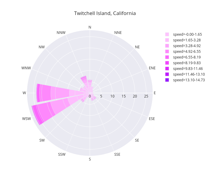
WR.plot(
    template='seaborn', colors='Plotly3',
    title='Twitchell Island, California'
)
The resulting wind rose diagram saved as a png (download this file for an interactive example):
Details and examples of plot customization, output options, and wind rose calculation options can be found in the online documentation.
