Visit the Live Site!
This is a test app for me; I'm coding from memory with minimal checks of my notes. My aim is to gain a greater understanding of state and practice using memory. I notice that I didn't put the notes in one central place, so I'll be documenting the process.
This is Grocery List App can:
- Add new items to the list either by pressing
Enteror clicking the plus button - Display current items with the ability to check them off and delete
- A count of remaining items in the list
- Search ability
- The Process
- Add the Dependencies
- On to the Code!
I'm working in VS Code on a Windows 11 computer, so all shortcuts I use are for those. I'm also using the ES7+ React/Redux/React-Native snippets extension.
To follow along, ensure you have:
- the latest Node version installed. You can check in the terminal with
node -v
- dido for Yarn
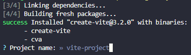
- Create a new React project from the command line using the Vite tool by typing:
yarn create vite
-
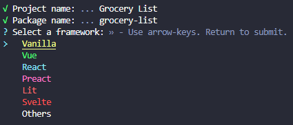
Enter your project name at the prompt after the quick installation.
-
Press
Enterto have the package automatically named. -
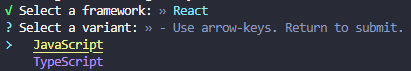
Use the arrow keys to choose a framework.
-
Pick JavaScript or TypeScript (I went with JavaScript)
-
Check out the cool file structure!
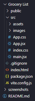
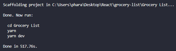
I later moved README and screenshots folder up one level.
And the message that the scaffolding is complete.
-
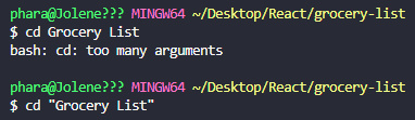
Change directories. I got my first learning moment here as I had used two words, so I had to enclose it in commas.
-
Install dependencies with:


yarn
Super-fast success is proven with the node_modules folder being added to our file structure and this command line message:

- Start the development server on your computer with
yarn run dev
Ctrl + click the blue link to verify everything's working.

- Check it out on your mobile - Yes, you heard that right! Either stop the current server with
Ctrl+C, or just open up a new terminal.

cd back to your directory, and type:
yarn dev run --host
You will get

Type the network address (the one with all the numbers), then you can check out your changes on desktop and/or mobile!
Now it's time to get rid of the defaults!
- It's all coming from our
/srcfolder, as you can see by listing all the files:
ls src/
- Remove all the files except
main.jsxwith
rm src/App.css
- Now we can actually work within our files! In
main.jsx, remove the reference toindex.csson line 4.


I had come across Dracula UI in my reading and really wanted to try it out! It describes itself as a:
Dark-first collection of UI patterns and components.
First we need to install it to our project.
-
In your terminal, type
yarn add dracula-ui. -
I like to verify things, so you can check
package.jsonto see it listed as a dependency on line 11.

Let's take advantage of the in-editor docs and autocomplete function in VS Code, by installing an extension to bring in Design System Packages.
Ctrl+Shift+Xto open Extensions and search for Adobe XD extension.

- Click on the extension icon in the sidebar, probably in the bottom right corner.

- Click on Load package.

- Choose
node_modules/dracula-ui/dspby navigating through all the files.

- Choose the Code Snippets for CSS and React, click Next and you can see the docs!

-
In the
srcfolder, add a new file called (capital!)App.jsx. -
Create a exported function component called
App. -
Add the import statements at the top.
-
Check it's working by adding a
mainwithh1.

- Bring in the Dracula UI components and styling! I'm not sure if I was doing this optimally, but... I set up my reset in
index.csswith styles on thebody. I centered my list with CSS Grid and set the background colour.
body {
  display: grid;
  place-items: center;
  height: 100%;
  background-color: black;
}- Import the
Boxcomponent from Dracula UI, add it to our App JSX and style it up with colour, margin, padding, rounded and width properties special to the Design System.

-
Add a
componentsfolder withHeader.jsx. -
Import Heading from Dracula UI on line 2.
-
Add the inline styles.

- Import Header in
App.jsx, then add component.

The result so far...

I got ahead of myself here and jumped straight to
AddItem, but it does make more sense to start with a static list.
- Create an
ItemListcomponent. Import it inApp.jsxand add the component in the returned JSX:
return (
  <Box>
    <Header />
    <ItemList />
  </Box>
);- Set up a default list of grocery items to get the list started. This goes within the
ItemListfunction and before returning the JSX. Include the following import statement:
import { useState } from "react";Set the list as a const with destructuring of items and setItems equal to useState() with an array of objects.

Add to
ItemList.jsx, even though it may be moved later on toApp.jsx.
- Use
react-iconsfrom NPMJS to import only the icons used in this project. In your terminal, typeyarn add react-icons --save-prodThen verify it inpackage.json.

- Optional: Go to Font Awesome to search for
plus. Make sure to click the Free tab.- Add the import statement to the top of the component where it will be used. Like
import { Fa< name of icon >} from "react-icons/fa";- Add to the JSX just like a component -
<FaCheck>.
- Include two more import statements for our Dracula UI components and Font Awesome icon:
import { List, Checkbox } from "dracula-ui";
import { FaTrashAlt } from "react-icons/fa";-
Have the
ItemListfunction return a<List>component from Dracula UI. -
Get ready to have lots of fun creating the
<li>s! Use.map()onitemscreated on line 8. This will go over eachitem, creating the JSX.
{items.map((item) => (...))}- Create an
<li>with a couple important attributes to enclose each line.
<li className="item" key={item.id}>
  ...
</li>-
Use the Dracula UI checkbox component passing all the properties (pictured below).
-
Use the
labelas the actual item to display. Don't worry, I'll go over all that's going on there later! -
Add the Font Awesome trash can icon on line 55.

-
Style it! Much of this could be done through Dracula UI including:
py,pb,sizeonListandli, andcoloronCheckbox. -
Some were easier to control with regular CSS, like
font-sizeand hover/focus effects. The icons can be targetted by thesvgselector. -
The most complex thing was getting the item text to change colour when the
liwas hovered on. I had to grab the class name using DevTools.
li.item:hover .drac-text,
li.item:focus .drac-text {
  color: #ff80bf;
}- Set up the
handleCheckfunction to take in theid. Create alistItemsvariable to map over each item: checking if it is the clickedid, if so create a new array so we don't directly change the state and then flip that item's checked value. Afterwards set the items to the updated state.

- Set up conditional styling to add a line through the item to further indicate that it's checked. To the
labeltag, add astyleattribution with double curly brackets,{ }so we can use a ternary operator to only apply the rule when the item has been checked.

-
Improve UX by adding a double click event on the item to trigger
handleChecklike on line 51 above. -
This is an intermediate step, to be changed later. To have the app store the user changes, add this line to the function:
localStorage.setItem("shoppinglist", JSON.stringify(listItems));This saves the state to local storage.
- Add an
onClickevent to the trash can icon and use an anonymous function so we can pass in the item's id.

- Write the function which will create an array of only the items not matching that
id, set the state, and save tolocalStorage.

-
Add
<>and</>tags as the first item, then tab everything over. This is needed because we will use a ternary operator on<List>and React must have one element to render. -
Tab over and begin the ternary with
{items.length ? (, then cut the)}- to be added afterwards. In essence, this is saying if there are items, then proceed with all the existing code. -
Tab all the code over once, so no indentation errors will be thrown.
-
After the closing
</List>tag and one indentation in, continue the ternary like on line 77. -
Add the Dracula UI
Textcomponent to the import statement on line 2. -
Add a
<Text>tag with a style expression and our message. -
Paste the
)}to close out the ternary operator. -
One indent in add the closing fragment,
</>. -
Close the return statement and function.

Note: I had quite the difficult time finding exactly which bracket (rounded, curly) was wrong. I've included a copy of the code up to this state to compare. I suggest using DiffChecker to compare. It's so easy to make a single, critical mistake here! 😭
This tells our user how many items are on their list.
-
In
ItemList.jsx, highlight the entire list variable, useCtrl+Xto cut it. -
In
App.jsx, pressCtrl+Cto copy it in the App function, right above the return statement.

- Pass
itemsandsetItemsdown as props to theItemListcomponent.

-
Repeat for
handleCheckandhandleDeletefunctions: cut and copy, and pass as props. -
Back in
ItemList.jsx, destructure the props to gain access. Pay attention to any that are grayedout, likesetItems. A quick scan shows that it isn't used in this file (only used in the functions). So you can delete it from this file.

-
Remove
setItems={setItems}on line 48 inApp.jsx. -
Add
import { useState } from 'react';toApp.jsxand remove fromItemList.jsx.
This will show the user how many items are on their Grocery List.
- Create
Footer.jsxusing theParagraphycomponent from Dracula UI, orTextwill work too.

- Import the component into
App.jsx.

-
Add component to the JSX.
-
Pass the prop down to Footer. We can name it whatever we want, so we'll call it
length.

-
Add
colorandalignDracula UI attributes to style. -
Within the
Paragraph, use the expression{length}to get the passed number of list items. -
Use a ternary expression after
Listto displayItemorItem(s)based on the number.

ItemList.jsx is a bit unwieldy as we had a ternary expression to display our Empty List. message. But it started on line 10 and went all the way until line 49. We can make it a lot more readable!
-
Create a new component called
ListLi.jsx. -
Look at the parent to copy the props and drill them down.
-
Cut and copy the
<List>fromItemListtoListLi. -
Update the import statements for the new component.

- Import the component into
ItemListand add to the JSX with props.

- Create the component with imports of Dracula UI and Input component. Add
Inputtag to JSX with the style attributes.

- Add the import line and component to
App.jsx.

-
In
AddItem.jsxand addimport { FaPlus } from 'react-icons/fa'to the top of the file. -
Because we have more than one item in the JSX, add the
<form className="inputBlock"></form>tags to enclose<Input>and the add button we will have. -
Add a
<label>withsr-onlyclass, so it's accessible but visually hidden. -
Add the
Inputcomponent, imported from Dracula UI, withautoFocus,id,type,placeholderandrequiredattributes. -
Add
FaPlus(with import statement on line 3) with attributes to add it'srole,tabIndexandaria-label.

- Over in
index.css, putflexon ourinputBlockclass.

-
Import and add the component to
App.jsx, then set up the state withconst [newItem, setNewItem] = useState("");. -
Pass the props to the component:
newItem,setNewItem, and thehandleSubmitfunction we will create. -
Add destructured props to
AddItem.jsxon line 5:export default function AddItem({ newItem, setNewItem, handleSubmit }). -
Set the
Inputtag to be the one source of truth for this controlled input withvalue={newItem}. -
Use
onChange={(e) => setNewItem(e.target.value)}to change the state as the user types. -
Add
onSubmit={handleSubmit}on the<form>element itself. -
Back in the
handleSubmitfunction inApp.jsx, we first want to prevent the page reloading, then check if there is indeed an item to add, call theaddItemfunction and set the state back to empty.

-
Create the
addItemfunction. -
Add the item
idwithconst id = items.length ? items[items.length - 1] + 1 : 1;. This checks if there are items, returns the index of the item length minus 1, then increments the id, or adds an id of 1. -
Create a new item object with
const nextNewItem = { id, checked: false, item };. -
Create a new array to update the state of the list, using the spread operator and adding the newly entered item:
const listItems = [...items, nextNewItem];. -
Now we use the same code to set the new state and store it, like we already have in
handleCheckandhandleDelete. So we can make it DRYer with a new function to call each time.

I ran into some issues with line 39 with adding an
id, so I switched to using uuidv4. Add to dependencies with the CLI commandyarn add uuidv4, import inApp.jsxwithimport { v4 as uuidv4 } from 'uuid';, then call it in theaddItemfunction withconst id = uuidv4(). This is actually a more secure method!
- Finish up the
handleSubmitfunction.

- Add
onClick={handleSubmit}to the<FaPlus>tag to allow user to use bothEnterkey and button to submit.
-
In
App.jsx, importuseStateon line 6. -
Handle the state to immediately react to changes our user makes in the input. Define the what's used in state,
newItemandsetNewItem, using the array destructuring fromuseState.

I just noticed that I had
Headeras my export function inAddItem.jsx, so interesting that I was able to use it inApp.jsxas<AddItem />- the correct name!

- Pass the props to
AddItem.jsx, remembering to place them in curly brackets.

To-date the initial grocery list items are being added from our default list, so let's fix that!
-
Delete the array within
useStateon line 12 ofApp.jsx. -
Replace with
JSON.parse(localStorage.getItem("shoppinglist")).

-
Add a new component
SearchItem.jsx. -
Have it return a
<form>with aclassNameandonSubmit. -
As this form won't have a button, we will immediately prevent page reload in the
onSubmit. -
Add a label, like in
AddItem. -
Import Dracula UI and the
Inputcomponent. -
Add the
Inputtag with attributes, especiallyrole="searchbox".

-
Put the import statement under
AddItemimport inApp.jsx. -
Set the state on line 15:
const [search, setSearch] = useState("");. -
Add the component and props in the JSX.

- Use the wonders of Dracula UI to style it with a just 6 more attributes on the
Inputtag inSearchItem.jsx.

-
Now link it to the state. Add the destructured props to
SearchItem. -
Add the reference to the props to
Input.

- Filter the items in
App.jsxon line 65 by changing the expression:items={items.filter(item => ((item.item).toLowerCase()).includes(search.toLowerCase()))}.
Currently, when the user uses the Plus Button to add an item, the focus stays there.

-
Import
useRefinAddItem.jsxon line 4. -
Add it as a variable on line 7.
-
Add a
refattribute toInputon line 20. -
Send the focus back...
-
Add
useEffectto import statement on line 9 ofApp.jsxwith a comma afteruseState. -
Set up the function with a dependency, so it only changes when something in it's dependency changes rather than when anything changes.
useEffect(() => {}, []);-
Cut and copy the
JSON.parse... line from line 14'suseState. -
Within
useEffectsetItems()to this copied line. This will set the items state at load time. -
Initialize
useStateto an empty array.
