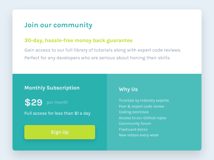
This is a solution to the Single price grid component challenge on Frontend Mentor. Frontend Mentor challenges help you improve your coding skills by building realistic projects.
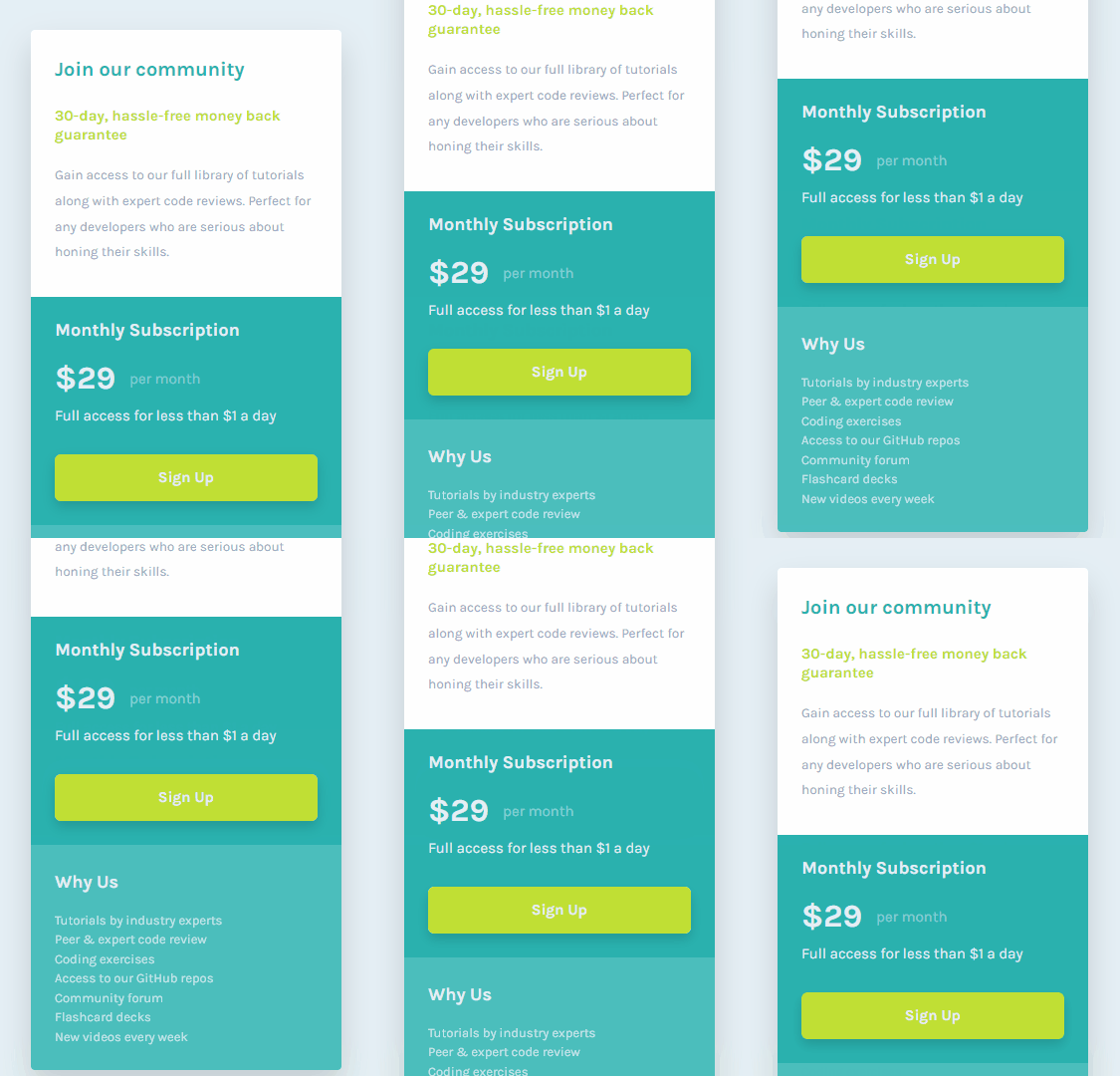
This project features a responsive layout made in a mobile-first workflow with Grid and media queries.
Users should be able to:
- View the optimal layout for the component depending on their device's screen size
- See a hover state on desktop for the Sign Up call-to-action
| Mobile | Desktop | |
|---|---|---|
 |
 |
In this project, I have practiced the following skills:
- Using Grid and media queries to create a responsive layout
- Using Flexbox to arrange content
- Styling a button's hover and focus states
- Styling elements with box shadows
- Using semantic HTML markup
- Using CSS relative units to ensure the text scales according to the user's font size settings
- Using CSS custom properties to allow easy customization and reusability of the component
- Using Git and GitHub
In future projects, I want to continue learning how to create responsive, two-dimensional layouts with Grid.
- Wes Bos: CSS Grid - I have started learning CSS Grid through this free course by Wes Bos, and it has been a great resource.
- Frontend Mentor - @JulioCinquina