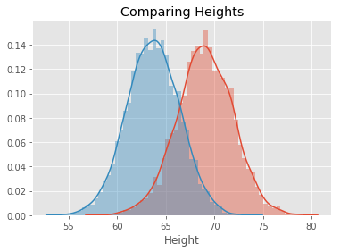
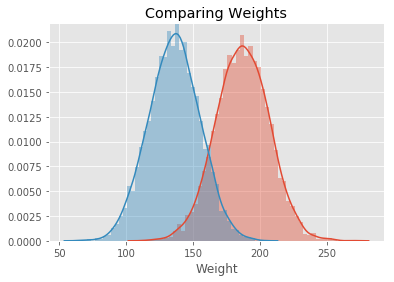
In this lab, we will look at building visualizations known as density plots to estimate the probability density for a given set of data.
You will be able to:
- Plot and interpret density plots and comment on the shape of the plot
- Estimate probabilities for continuous variables by using interpolation
Let's import the necessary libraries for this lab.
# Import required libraries
import numpy as np
import matplotlib.pyplot as plt
plt.style.use('ggplot')
import pandas as pd -
Import the dataset 'weight-height.csv' as a pandas dataframe.
-
Next, calculate the mean and standard deviation for weights and heights for men and women individually. You can simply use the pandas
.mean()and.std()to do so.
Hint: Use your pandas dataframe subsetting skills like loc(), iloc(), and groupby()
data = None
male_df =  None
female_df =  None

# Male Height mean: 69.02634590621737
# Male Height sd: 2.8633622286606517
# Male Weight mean: 187.0206206581929
# Male Weight sd: 19.781154516763813
# Female Height mean: 63.708773603424916
# Female Height sd: 2.696284015765056
# Female Weight mean: 135.8600930074687
# Female Weight sd: 19.022467805319007
Male Height mean: 69.02634590621737
Male Height sd: 2.8633622286606517
Male Weight mean: 187.0206206581929
Male Weight sd: 19.781154516763813
Female Height mean: 63.708773603424916
Female Height sd: 2.696284015765056
Female Weight mean: 135.8600930074687
Female Weight sd: 19.022467805319007
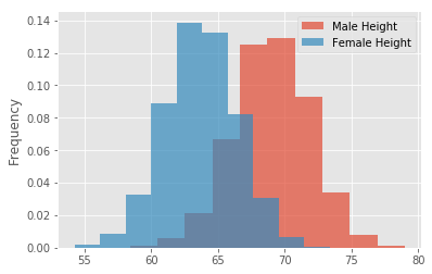
- Make sure to create overlapping plots
- Use binsize = 10, set alpha level so that overlap can be visualized
# Your code here# Record your observations - are these inline with your personal observations?- Write a density function density() that uses interpolation and takes in a random variable
- Use
np.histogram() - The function should return two lists carrying x and y coordinates for plotting the density function
def density(x):

    pass


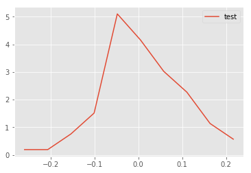
# Generate test data and test the function - uncomment to run the test
# np.random.seed(5)
# mu, sigma = 0, 0.1 # mean and standard deviation
# s = np.random.normal(mu, sigma, 100)
# x,y = density(s)
# plt.plot(x,y, label = 'test')
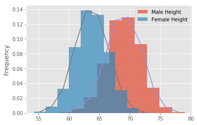
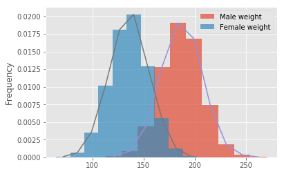
# plt.legend()# Your code here # Your code here # Record your observations - are these inline with your personal observations?
# What is the takeaway when comparing male and female heights and weights?# Code for heights here# Code for weights here# Your comments on the two approaches here.
# are they similar? what makes them different if they are?In this lesson, you learned how to build the probability density curves visually for a given dataset and compare the distributions visually by looking at the spread, center, and overlap. This is a useful EDA technique and can be used to answer some initial questions before embarking on a complex analytics journey.
