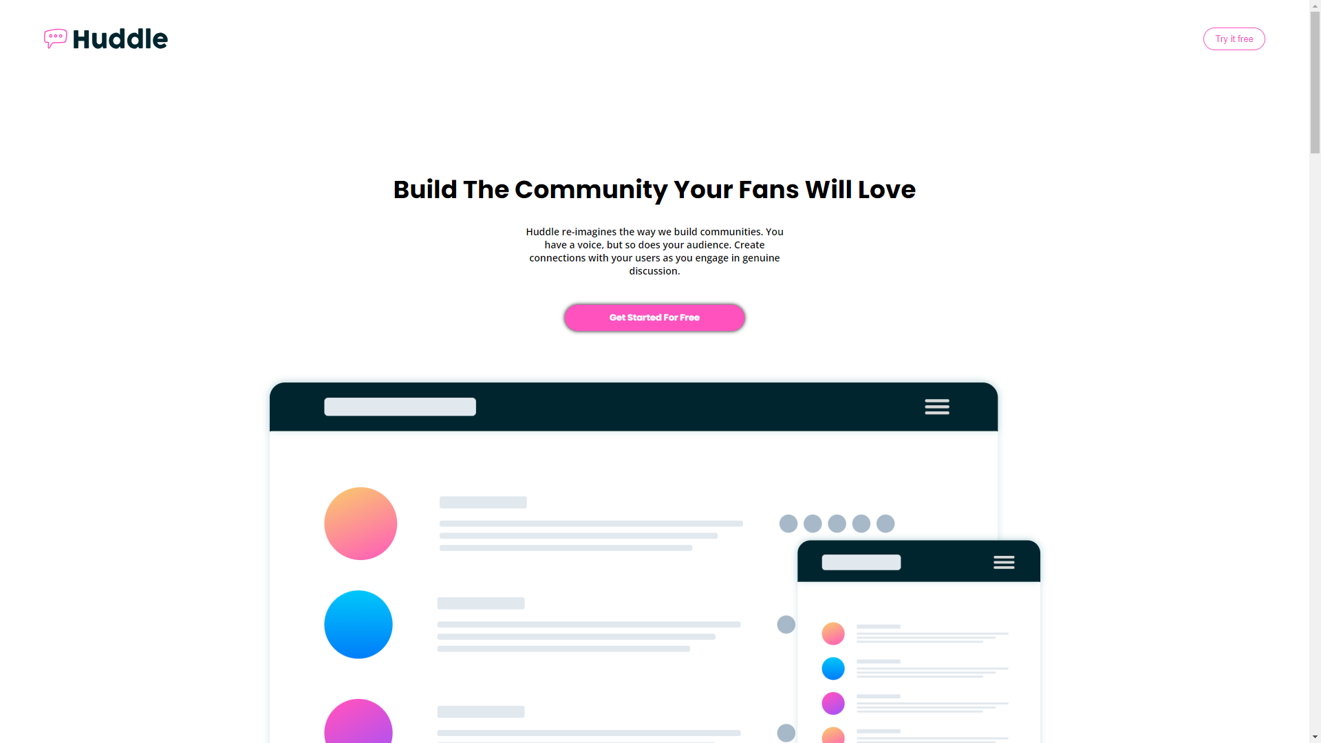
Solution for a challenge from frontendmentor.io.
This HTML & CSS only challenge is perfect for anyone just starting out or anyone wanting a small project to play around with.
Your users should be able to:
1. View the optimal layout depending on their device's screen size
2. See hover states for interactive elements
- Semantic HTML5 markup
- CSS custom properties
- Flexbox
- Desktop-first workflow
There was nothing new that I didn't know before however the postioning of svg and centering of background was a bit of a challange. But it worked out in the end.
