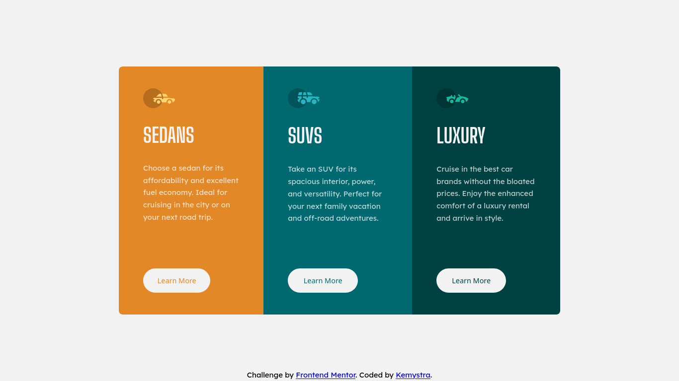
This is a solution to the 3-column preview card component challenge on Frontend Mentor. Frontend Mentor challenges help you improve your coding skills by building realistic projects.
Users should be able to:
- View the optimal layout depending on their device's screen size
- See hover states for interactive elements
- Semantic HTML5 markup
- SASS loops
- Flexbox
You can use a large value for border-radius to make a rounded ends containers (buttons, divs, etc).
/* Just don't use percentage for its unit */
border-radius: 999px;
This is also my first time using clamp() function in CSS!
height: clamp(250px, 60%, 1000px);A technique that I discovered is using viewport-relative units for containters, and use percentages for content inside it. This way the content would follow the container size, not the viewport.
