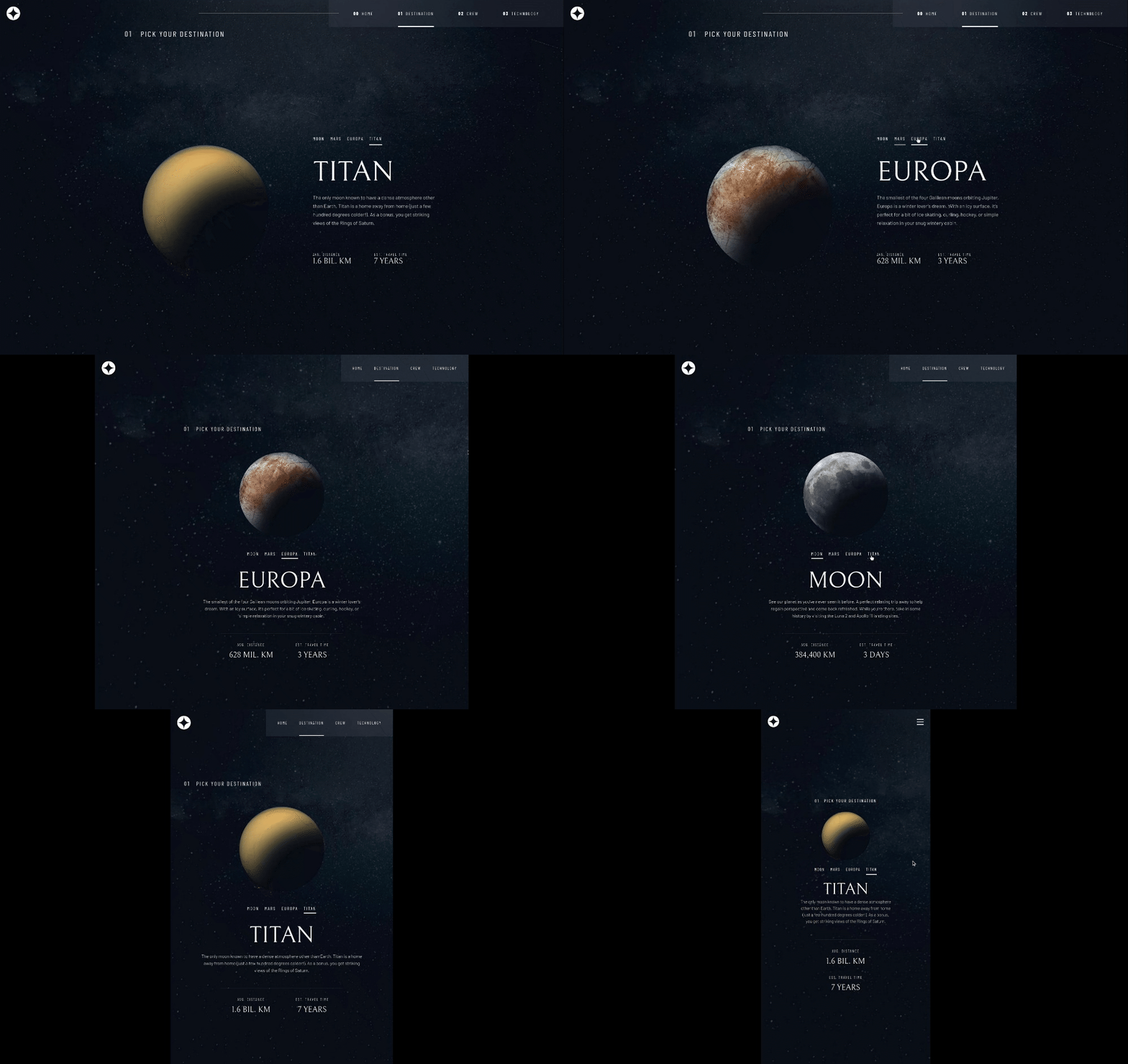
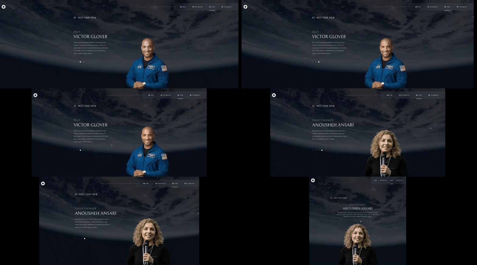
This is a solution to the Space tourism website challenge on Frontend Mentor. Frontend Mentor challenges help you improve your coding skills by building realistic projects.
Note: Delete this note and update the table of contents based on what sections you keep.
Users should be able to:
- View the optimal layout for each of the website's pages depending on their device's screen size
- See hover states for all interactive elements on the page
- View each page and be able to toggle between the tabs to see new information
- Solution URL: https://github.com/KurtisIvey/space-tourism-nextjs
- Live Site URL: https://space-tourism-nextjs-uu85.vercel.app/
- Semantic HTML5 markup
- Sass
- TypeScript
- CSS custom properties
- Flexbox
- CSS Grid
- Mobile-first workflow
- React - JS library
- Next.js - React framework
- Styled Components - For styles
Note: These are just examples. Delete this note and replace the list above with your own choices
The important of uniformity when it comes to header and container styling. Building everything with a similar placement would have saved me a lot of time instead of having to go back and implement this myself.
Use this section to outline areas that you want to continue focusing on in future projects. These could be concepts you're still not completely comfortable with or techniques you found useful that you want to refine and perfect.
Note: Delete this note and the content within this section and replace with your own plans for continued development.
- Website - Kurtis Ivey
- Frontend Mentor - @KurtisIvey
This was a rough experience. I definitely got some practice with styling due to the different styling intricacies required to do this challenge

