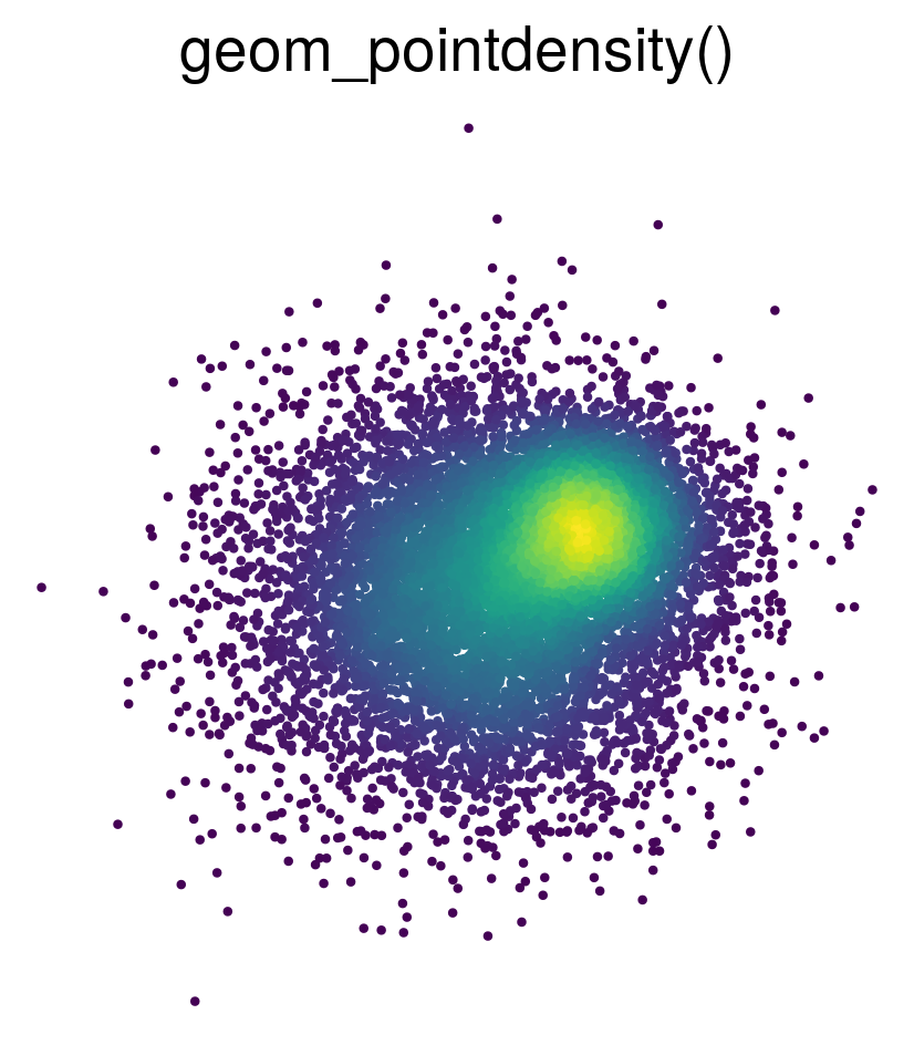
Introduces geom_pointdensity(): A cross between a scatter plot and a 2D density plot.
To install the package, type this command in R:
install.packages("ggpointdensity")

# Alternatively, you can install the latest
# development version from GitHub:
if (!requireNamespace("devtools", quietly = TRUE))
    install.packages("devtools")
devtools::install_github("LKremer/ggpointdensity")There are several ways to visualize data points on a 2D coordinate system:
If you have lots of data points on top of each other, geom_point() fails to
give you an estimate of how many points are overlapping.
geom_density2d() and geom_bin2d() solve this issue, but they make it impossible
to investigate individual outlier points, which may be of interest.
geom_pointdensity() aims to solve this problem by combining the best of both
worlds: individual points are colored by the number of neighboring points.
This allows you to see the overall distribution, as well as individual points.
Added method argument and renamed the n_neighbor stat to density. The available options
are method="auto",
method="default" and method="kde2d". default is the regular n_neighbor calculation
as in the CRAN package. kde2d uses 2D kernel density estimation to estimate the point density
(credits to @slowkow).
This method is slower for few points, but faster for many (ca. >20k) points. By default,
method="auto" picks either kde2d or default depending on the number of points.
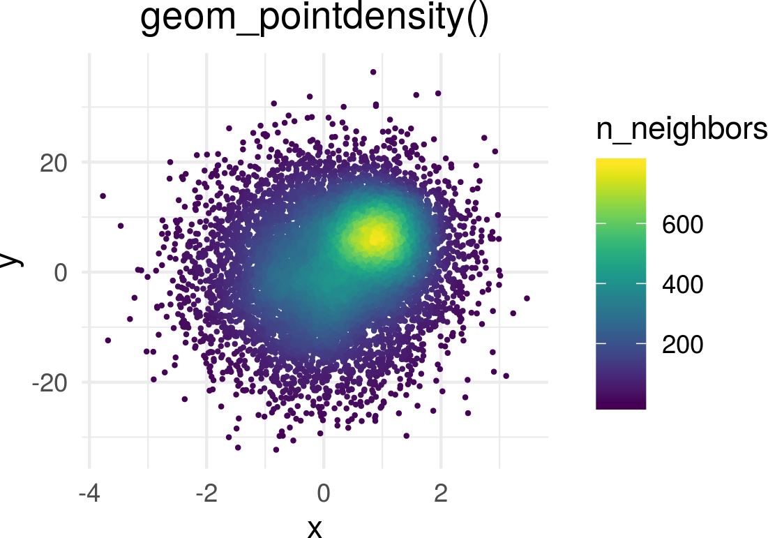
Generate some toy data and visualize it with geom_pointdensity():
library(ggplot2)
library(dplyr)
library(viridis)
library(ggpointdensity)

dat <- bind_rows(
  tibble(x = rnorm(7000, sd = 1),
         y = rnorm(7000, sd = 10),
         group = "foo"),
  tibble(x = rnorm(3000, mean = 1, sd = .5),
         y = rnorm(3000, mean = 7, sd = 5),
         group = "bar"))

ggplot(data = dat, mapping = aes(x = x, y = y)) +
  geom_pointdensity() +
  scale_color_viridis()
Each point is colored according to the number of neighboring points.
(Note: this here is the dev branch, where I decided to plot the density estimate
instead of n_neighbors now.)
The distance threshold to consider two points as neighbors (smoothing
bandwidth) can be adjusted with the adjust argument, where adjust = 0.5
means use half of the default bandwidth.
ggplot(data = dat, mapping = aes(x = x, y = y)) +
  geom_pointdensity(adjust = .1) +
  scale_color_viridis()

ggplot(data = dat, mapping = aes(x = x, y = y)) +
  geom_pointdensity(adjust = 4) +
  scale_color_viridis()
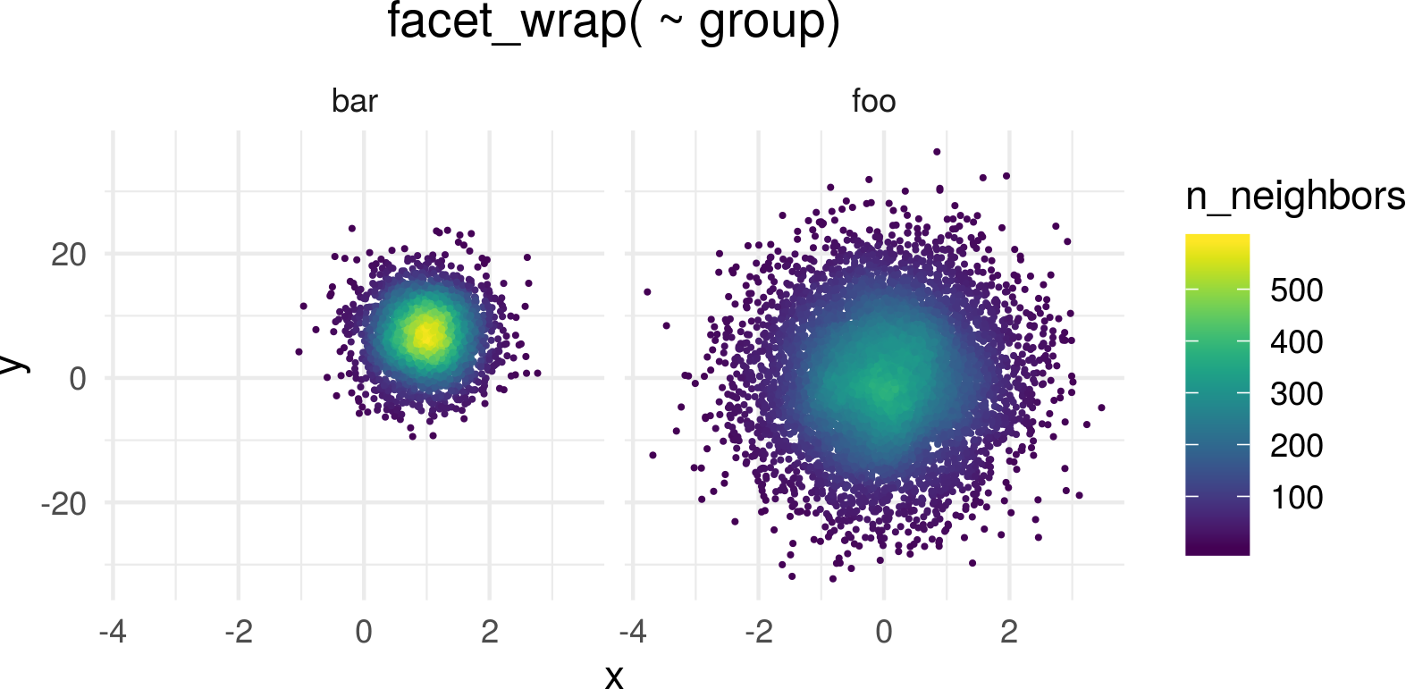
Of course you can combine the geom with standard ggplot2 features
such as facets...
# Facetting by group
ggplot(data = dat, mapping = aes(x = x, y = y)) +
  geom_pointdensity() +
  scale_color_viridis() +
  facet_wrap( ~ group)
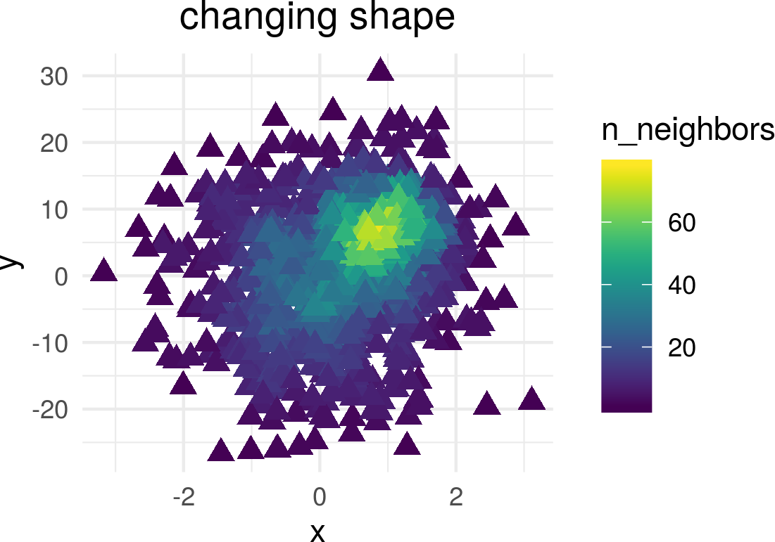
... or point shape and size:
dat_subset <- sample_frac(dat, .1)  # smaller data set
ggplot(data = dat_subset, mapping = aes(x = x, y = y)) +
  geom_pointdensity(size = 3, shape = 17) +
  scale_color_viridis()
Zooming into the axis works as well, keep in mind that xlim() and
ylim() change the density since they remove data points.
It may be better to use coord_cartesian() instead.
ggplot(data = dat, mapping = aes(x = x, y = y)) +
  geom_pointdensity() +
  scale_color_viridis() +
  xlim(c(-1, 3)) + ylim(c(-5, 15))

ggplot(data = dat, mapping = aes(x = x, y = y)) +
  geom_pointdensity() +
  scale_color_viridis() +
coord_cartesian(xlim = c(-1, 3), ylim = c(-5, 15))Lukas PM Kremer (@LPMKremer) and Simon Anders (@s_anders_m), 2019


